Columbia Pictures
Jump to navigation
Jump to search
Logo descriptions by Jason Jones and James Fabiano
Logo captures by Eric S., Logophile, Mr.Logo, naxo-ole, Sagan Blob, Gilblitz112, TimYeiLogoCollector, and Edc4
Additional edits by Eric S., V of Doom, Logophile, CBS/FoxKid999, Chowchillah, Shadeed A. Kelly, bmasters9, Lee Cremeans, PluMGMK, Kramden II, and Edc4
Video captures courtesy of Peakpasha, WaluigiN64HD, Logo Archive, Sagan Blob Enterprises, mulog29, Avdhesh Mystry. vhsclassic90s, and Edc4
Cohn-Brandt-Cohn (CBC) Film Sales
Background: This predecessor company of Columbia Pictures was originally founded in 1918 by Harry Cohn, his brother Jack Cohn, and Jack's friend Joe Brandt. Brandt was president of CBC Film Sales, handling sales, marketing and distribution from New York along with Jack Cohn, while Harry Cohn ran production in Hollywood. Many of the studio's early productions were low-budget affairs; the start-up CBC leased space in a poverty row studio on Hollywood's Gower Street. Among Hollywood's elite, CBC's reputation led some to joke that "CBC" stood for "Corned Beef and Cabbage".
______________________________________________________________________________
Columbia Pictures Industries, Inc.
Background: Following a reorganization, the Cohn brothers renamed the predecessor company as "Columbia Pictures Corporation" on January 10, 1924. Columbia's product line consisted mostly of moderately budgeted features and a short-subject program of comedies, serials, cartoons, and sports films. Columbia gradually moved into the production of higher-budget fare, building a reputation as one of Hollywood's more important studios. On December 23, 1968, it was reorganized as "Columbia Pictures Industries" (commonly known as "Columbia Pictures") after Columbia Pictures Corporation merged with its television division Screen Gems. On June 22, 1982, Columbia Pictures was sold to the Coca-Cola Company for $750 million, became part of Columbia Pictures Entertainment in December 1987 with Coke owning 49%, and since November 8, 1989, it's owned by Sony Corporation of Japan. Since 1998, it is part of the Columbia TriStar Motion Picture Group (now Sony Pictures Entertainment Motion Picture Group since 2013), which is a division of Sony Pictures Entertainment, a subsidiary of the mentioned multinational conglomerate.
1st Logo
(March 15, 1924-December 29, 1927)
Nicknames: "Myriad Lady", "Female Roman Soldier"
Logo: On a dark gray background with arch clouds below, we see a female Roman soldier dressed in a soldier's outfit, covered in a toga, holding a shield in her left hand and holding a grain of wheat (or possibly <a class="external" href="http://en.wikipedia.org/wiki/Festuca" rel="nofollow" target="_blank" title="festuca">festuca</a>, associated with Libertas) in her right hand. We see the text "COLUMBIA PICTURES CORPORATION Presents" with "COLUMBIA PICTURES" appearing in an arched text and the text "CORPORATION" underneath the arched words in a straight line and the text "Presents" below.
Trivia: The Roman soldier depicted in the logo is actually a depiction of the goddess Liberty (or the Roman goddess Libertas) as seen on the obverse of the 1916 US quarter, also known as the "Standing Liberty quarter".
FX/SFX: TBA
Music/Sounds: The intro of any movie.
Availability: Ultra rare. Seen on very early films by Columbia Pictures. Last seen on The Lady with the Torch documentary on Encore Drama (whenever the network decides to rebroadcast it).
Editor's Note: TBA.
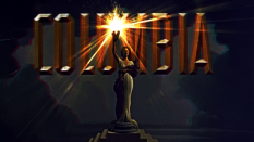
2nd Logo
(January 1928-May 25, 1936)
Nicknames: "Early Torch Lady", "Sparkler Torch Lady", "'20s Torch Lady", "Torch Lady"
Logo: We see a medium shot of a lady (Columbia, a representation of the USA), holding a light torch in her right hand. The lady is featured with a dark bob and a kind of Cleopatra-like headdress across her forehead. She is draped in an American flag complete with the stars on her left shoulder and the stripes coming across her middle, supported by her left arm, and hanging down her right side. Her torch is displayed with a rather primitive, flickering style of animation emitting lines of light as rays. The Torch Lady's head is under an arch of chiseled, square-shaped letters reading the words "A COLUMBIA PRODUCTION". At the end of the movie or short subject, the words are "THIS IS A COLUMBIA PICTURE" with "The End" below it in a script font.
Trivia: The Torch Lady shown here is actress Claudia Dell; she appeared as Spanky's mother in the Our Gang shorts "Mama's Little Pirate" and "Anniversary Trouble."
Variants:
Music/Sounds: A majestic horn sounder, much like the Fox logo, or the opening/closing theme of the short or feature.
Availability: Uncommon. It was seen on It Happened One Night. Also can be seen on The Three Stooges releases on DVD. Can still be seen on reruns of 1934-1936 Three Stooges shorts on IFC, AMC, and Antenna TV. It can also be found on TCM and Sony Movie Channel. Don't expect this to appear on original prints of Walt Disney's Mickey Mouse and Silly Symphony cartoons from 1930-1932, as Columbia only distributed those shorts.
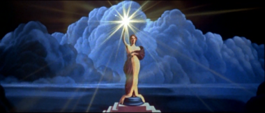
3rd Logo
(May 28, 1936-December 21, 1976)
Nicknames: "Classic Torch Lady", "'30s Torch Lady", Torch Lady II"
Logo: We see the lady, this time standing on top of a pedestal with a backdrop of clouds over her, while she is holding her light torch. Much more refined, ethereal and goddess-like, her facial features became less pronounced and she looked away (up and to the right) instead of straight ahead. Her headdress was removed and her hair swept back instead of hanging by the sides of her face. The drape over her shoulder became less-obviously an American flag, the stars on the left shoulder having been toned down in a shadow, and the stripes visible only on the portion of the drape hanging down her right side. "A COLUMBIA PRODUCTION" was replaced with the tall chiseled letters of "COLUMBIA" (which fades in a second afterward) running straight across the top section of the screen, with the lady's torch glowing in front of the "U". A new form of animation was used on the logo as well, with a torch that radiates light instead of flickers. Until the mid-1960s, this logo would also appear at the end of films, sometimes with the words "The End" in a script font.
Trivia: The Torch Lady happens to be Pittsburgh native Jane Chester Bartholomew, discovered by Harry Cohn.
Byline: Starting in 1974, the company byline "A DIVISION OF COLUMBIA PICTURES INDUSTRIES, INC." appears at the bottom of the screen.
Evolution Variants:
FX/SFX: The torch rays shine more realistically in this version.
Music/Sounds: Usually, the beginning/end of a movie's score plays over the logo. On some films, the logo appears completely silent. However, on several mid to late '30s Three Stooges shorts, it has a majestic theme before playing the Stooges' theme. On several other films, it would have a different theme.
Availability: Fairly common. Can still be seen on Columbia Pictures films of this period on home video formats and on TV airings.
(June 23, 1976-February 11,1982)

<iframe frameborder="0" height="167" src="http://wikifoundrytools.com/wiki/closinglogos/widget/unknown/600b0fd47295f704f8628916709a72179234d694" width="296"></iframe><iframe frameborder="0" height="167" src="http://wikifoundrytools.com/wiki/closinglogos/widget/unknown/19ae19d691e5efd31c7f453ed2aa780d9a4f95ab" width="296"></iframe>
Left: The Torch Lady.
Right: The sunburst.
Nicknames: "'70s Torch Lady", "The Abstract Torch", "The Sunburst", Torch Lady III"
Logo: It begins with the familiar Columbia Torch Lady (a less-detailed yellow-toned 1942 Torch Lady), standing on the pedestal holding her light torch against the backdrop of clouds. Then, the picture moves upward and towards the torch as the rays pull in, which shines even more as the picture blurs around it. It then emits a flash that fills the screen. When the flash dissolves, the light torch itself appears, as if in sunburst, against a black screen and as it shrinks, it changes into a more "abstract" torch: a blue half circle, or a semicircle, with thirteen white light rays in the center and the words "Columbia Pictures" in Souvenir medium font under it. The entire logo then slowly backs away as it fades out.
Trivia:
FX/SFX: The Torch Lady's torch zooming in, then turning into the Sunburst. As noted above, very well-done, motion-controlled cel animation that still looks good over 40 years later.
Music/Sounds: It begins with a dramatic theme that builds up as the camera zooms in on the torch, and with the flash/sunburst, it takes an inspirational, majestic tone. This theme was composed by Suzanne Ciani. Of course, like many other movie logos, this could also be silent or have the opening music from any soundtrack play over it, but usually not.
Availability: Common. Sony is much better at keeping older theatrical logos on current releases of their films than their TV output (which is another story). In the early days of Columbia Pictures' video division, however, this logo would be plastered by their home video logo. Otherwise, all later video releases, DVDs/Blu-rays, and TV broadcasts retain this logo.
Editor's Note: This is a favorite of many.
5th Logo
(June 5, 1981-May 14, 1993)
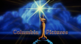
Logo: We see the standard Columbia Torch Lady (a somewhat less detailed version of the '70s Torch Lady) standing on a pedestal with her torch against the backdrop of clouds. The torch then shines into a bright abstract shape, as if in sunburst, then dims back in place. The words "Columbia Pictures" (appearing in the same font from the last logo) fade to the left and right of the Torch Lady. Her torch "shines".
Variants:
6th Logo
(June 13, 1993- )
Nicknames: "'90s Torch Lady", Torch Lady V, "Majestic Torch Lady", "The Jenny Joseph Logo"
Logo:
Trivia:
Bylines:
Variants:
(January 1928-May 25, 1936)
Columbia Pictures Corporation Presents (1930)Columbia ProductionColumbia Pictures - CLG WikiA Columbia Production (1928, Colorized)
<iframe frameborder="0" height="150" src="http://wikifoundrytools.com/wiki/closinglogos/widget/unknown/98e1bb58250e3762847847e7cf986c360547180d" width="199"></iframe>
Nicknames: "Early Torch Lady", "Sparkler Torch Lady", "'20s Torch Lady", "Torch Lady"
Logo: We see a medium shot of a lady (Columbia, a representation of the USA), holding a light torch in her right hand. The lady is featured with a dark bob and a kind of Cleopatra-like headdress across her forehead. She is draped in an American flag complete with the stars on her left shoulder and the stripes coming across her middle, supported by her left arm, and hanging down her right side. Her torch is displayed with a rather primitive, flickering style of animation emitting lines of light as rays. The Torch Lady's head is under an arch of chiseled, square-shaped letters reading the words "A COLUMBIA PRODUCTION". At the end of the movie or short subject, the words are "THIS IS A COLUMBIA PICTURE" with "The End" below it in a script font.
Trivia: The Torch Lady shown here is actress Claudia Dell; she appeared as Spanky's mother in the Our Gang shorts "Mama's Little Pirate" and "Anniversary Trouble."
Variants:
- Earlier movies until 1932 would feature the name in a different typeface, and will sometimes read as "COLUMBIA PICTURES CORPORATION" at the start of the film (sometimes also with the word "Presents" below, in a script font), and "A COLUMBIA PRODUCTION" at the end of the film, like on The Miracle Woman.
- Another variation consists of the words "A COLUMBIA PRODUCTION" and "The End" below. It was spotted on The Miracle Woman, Platinum Blonde, Three Wise Girls, The Final Edition, High Speed, American Madness, and the Three Stooges short "Restless Knights".
- A rare opening variation has the words "COLUMBIA PICTURES" on top and "Presents" below. It was spotted on The Pagan Lady, The Guilty Generation, The Deadline, The Secret Witness, and the early John Wayne film Maker of Men (all 1931).
- There is another closing variant that has the words "COLUMBIA PICTURES", with "The End" appearing below, which can be found at the end of The Secret Witness, Maker of Men, and Forbidden (1932).
- In 2004, Columbia TriStar Home Entertainment released several colorized Three Stooges shorts; these had the Torch Lady in color as well, and the words are in yellow.
FX/SFX: The torch rays shining. This was done using moiré effects and clever editing.
Music/Sounds: A majestic horn sounder, much like the Fox logo, or the opening/closing theme of the short or feature.
Availability: Uncommon. It was seen on It Happened One Night. Also can be seen on The Three Stooges releases on DVD. Can still be seen on reruns of 1934-1936 Three Stooges shorts on IFC, AMC, and Antenna TV. It can also be found on TCM and Sony Movie Channel. Don't expect this to appear on original prints of Walt Disney's Mickey Mouse and Silly Symphony cartoons from 1930-1932, as Columbia only distributed those shorts.
3rd Logo
(May 28, 1936-December 21, 1976)

Columbia (1943)
 Columbia Pictures (1947)Columbia Pictures (1953, Color)Columbia Pictures (1968)Columbia Pictures - CLG WikiColumbia (1970) Reuploaded

 Columbia Pictures (1947)Columbia Pictures (1953, Color)Columbia Pictures (1968)Columbia Pictures - CLG WikiColumbia (1970) Reuploaded
<iframe frameborder="0" height="135" src="http://wikifoundrytools.com/wiki/closinglogos/widget/unknown/5006e6483091367578d326b4ceef7bcfdff722ea" width="180"></iframe><iframe frameborder="0" height="135" src="http://wikifoundrytools.com/wiki/closinglogos/widget/unknown/ef7a7b697d6a06ae27b9a91eb3e93bdc66b004e4" width="180"></iframe><iframe frameborder="0" height="135" src="http://wikifoundrytools.com/wiki/closinglogos/widget/unknown/2e63484c100474ab33187cc399553039b2f699f7" width="180"></iframe><iframe frameborder="0" height="135" src="http://wikifoundrytools.com/wiki/closinglogos/widget/unknown/dcd69d69db92c4b30b3f6e62090ba9f52ffa96ec" width="239"></iframe><iframe frameborder="0" height="135" src="http://wikifoundrytools.com/wiki/closinglogos/widget/genericvideo/cb43ae28846e8927bfa7c4765b6d8b515d21233c" width="239"></iframe><iframe frameborder="0" height="135" src="http://wikifoundrytools.com/wiki/closinglogos/widget/unknown/fbb2c9df720474630ed9e3b92774305b34910020" width="239"></iframe><iframe frameborder="0" height="135" src="http://wikifoundrytools.com/wiki/closinglogos/widget/unknown/10897e8a52a42a9d75fe7556493e37ce135a0a67" width="239"></iframe>
Nicknames: "Classic Torch Lady", "'30s Torch Lady", Torch Lady II"
Logo: We see the lady, this time standing on top of a pedestal with a backdrop of clouds over her, while she is holding her light torch. Much more refined, ethereal and goddess-like, her facial features became less pronounced and she looked away (up and to the right) instead of straight ahead. Her headdress was removed and her hair swept back instead of hanging by the sides of her face. The drape over her shoulder became less-obviously an American flag, the stars on the left shoulder having been toned down in a shadow, and the stripes visible only on the portion of the drape hanging down her right side. "A COLUMBIA PRODUCTION" was replaced with the tall chiseled letters of "COLUMBIA" (which fades in a second afterward) running straight across the top section of the screen, with the lady's torch glowing in front of the "U". A new form of animation was used on the logo as well, with a torch that radiates light instead of flickers. Until the mid-1960s, this logo would also appear at the end of films, sometimes with the words "The End" in a script font.
Trivia: The Torch Lady happens to be Pittsburgh native Jane Chester Bartholomew, discovered by Harry Cohn.
Byline: Starting in 1974, the company byline "A DIVISION OF COLUMBIA PICTURES INDUSTRIES, INC." appears at the bottom of the screen.
Evolution Variants:
- 1942: The lady looks much like she did in 1936, only the stripes were removed and the flag became simply a drape without markings (the Sony website implies that the change was to coincide with a new law that forbade the usage of the American flag as clothing), dark on the left shoulder but only the shadows of the folds differentiating the rest of it from the lady's white gown on her right side. The "COLUMBIA" lettering was also modified, still chiseled but less bold, and with darker shadowing.
- July 17, 1953: The Columbia Lady's robe was redrawn with a plunging neckline. The logo is also adapted for widescreen.
- January 26, 1955: The logo is adapted for CinemaScope. The Torch Lady lost her slipper-clad foot peeking out from the bottom of her robe as it divided just above the pedestal. Also, the clouds behind the logo became concentrated in the center and more billowy in shape.
- April 1968-December 12, 1973, April 5, 1974, August 1, 1976: The drapery was temporarily pink during this era. Several films that feature this variant include Where Angels Go, Trouble Follows!, The Swimmer, The Big Gundown, Hammerhead, Funny Girl, The Wrecking Crew, Otley, Model Shop, MacKenna's Gold, Easy Rider, Castle Keep, Bob & Carol & Ted & Alice, The Desperados, Cactus Flower, Five Easy Pieces, The Owl and the Pussycat, The Reckoning, 10 Rillington Place, The Anderson Tapes, Dollars ($), The Horsemen, Brian's Song, Nicholas and Alexandra, A Day in the Death of Joe Egg, Butterflies Are Free, Fat City, The New Centurions, Monty Python's And Now for Something Completely Different, The Valachi Papers, 1776, The National Health, Lost Horizon (1973), The Way We Were, Summer Wishes, Winter Dreams, The Last Detail, The Golden Voyage of Sinbad, Tommy, and Brian De Palma's Obsession.
- On The King Steps Out, the Three Stooges short "Disorder in the Court" and the 1936 western Stampede, "PRESENTS" appears below.
- On The Three Stooges shorts from 1940-1945, the 1936 (or 1942) Torch Lady appears on the left side of The Three Stooges title card. On the steps are the words "COLUMBIA" on top, "SHORT SUBJECT" in the middle, and "PRESENTATION" on the bottom step.
- On the 1976 film Taxi Driver, the logo is on a black background with blue clouds and had all of the text appearing at the same time.
- On the 1948 Three Stooges short "Fuelin' Around", the 1968 logo in black & white was seen at the beginning. Obviously, this plastered the Screen Gems logo on some TV prints, with/without the original music. This variant was seen on said short when reran on The Family Channel in the mid '90s.
- On 3D movies produced by the company, a 3D version of this logo was employed. Depth was as follows: the Torch Lady was closest to the screen, with "COLUMBIA" slightly behind her, and the cloud background farthest back.
- An ending variant was used on serials in the '30s and '40s. Along the bottom, it would read "A Columbia Serial" along the bottom. These were used on the Batman serials among others.
- Two ending variants existed for short subjects during the early '40s: (1) Near the top of the screen, "THE" is in a 3-D-like Futura font, with a white face and dark/light shadows, to the left of the Torch Lady, and "END," in the same font and effects, is to the right; the shadows from "THE END" go behind the Torch Lady to an unknown vanishing point behind the rays of her torch (much like the early-to-mid-60's Four Star Television logo's effect). Near the top of the Torch Lady's pedestal "COLUMBIA" is in a small but wider version of the company name's "chiseled" font, and "SHORT" "SUBJECT" "PRESENTATION" is chiseled onto each step of the pedestal, going from top to bottom, respectively (when seen on colorized prints of The Three Stooges, "THE" "END" and "COLUMBIA" are in a yellowish-gold color and the clouds and shadows are shades of dark and light blue, respectively); and (2) the standard "The End" additional text below would read "A Columbia Short Subject Presentation". These variants are usually seen on The Three Stooges shorts and often accompanies the aforementioned title card variant.
Music/Sounds: Usually, the beginning/end of a movie's score plays over the logo. On some films, the logo appears completely silent. However, on several mid to late '30s Three Stooges shorts, it has a majestic theme before playing the Stooges' theme. On several other films, it would have a different theme.
Availability: Fairly common. Can still be seen on Columbia Pictures films of this period on home video formats and on TV airings.
- The last films to feature this logo were Taxi Driver, Drive-In, Harry and Walter Go to New York, Obsession (at least on U.S. prints), and Peter Bogdanovich's Nickelodeon.
- The 1973 variation was also seen on some later struck 16mm prints of some Three Stooges shorts, sometimes plastering the Screen Gems logo with the latter logo's music sometimes preserved, with Tricky Dicks and Three Pests in a Mess being common examples.
- Tommy originally featured the 1968-75 variation of the logo, but was plastered with the next logo below on all later prints and home video releases of the film. Monty Python's And Now for Something Completely Different suffered the same fate as Tommy on the video releases, but has been restored on the DVD releases.
- This was seen on early releases of the 1975 version of The Stepford Wives, but when Viacom bought the rights to the film, along with the rest of the Palomar Pictures catalog in the mid-'80s, the logo was deleted. However, following the release of the 2004 remake, Paramount Pictures gained rights to the original film through Viacom (owner of the former company), and added their 2002 logo at the beginning of all current prints.
- This also appears on current prints of films that originally had the 2nd logo, including Dirigible, Behind the Mask, Shopworn, The Circus Queen Murder, Man's Castle, Twentieth Century, The Whole Town's Talking, The Black Room (1935), and She Married Her Boss.
- The "A Columbia Serial" variant can be seen on the old Batman serials when aired on TCM.
- The 3D version appears on the company's Golden Age 3D features, including Man in the Dark, Miss Sadie Thompson, and The Mad Magician.
- The Three Stooges shorts that include the "Short Subject" variants will likely be retained, being followed by the Sony Pictures Television logo.
Editor's Note: It's held up remarkably over the 40 years it's been used.
|
|
|
4th Logo(June 23, 1976-February 11,1982)


<iframe frameborder="0" height="167" src="http://wikifoundrytools.com/wiki/closinglogos/widget/unknown/600b0fd47295f704f8628916709a72179234d694" width="296"></iframe><iframe frameborder="0" height="167" src="http://wikifoundrytools.com/wiki/closinglogos/widget/unknown/19ae19d691e5efd31c7f453ed2aa780d9a4f95ab" width="296"></iframe>
Left: The Torch Lady.
Right: The sunburst.
Nicknames: "'70s Torch Lady", "The Abstract Torch", "The Sunburst", Torch Lady III"
Logo: It begins with the familiar Columbia Torch Lady (a less-detailed yellow-toned 1942 Torch Lady), standing on the pedestal holding her light torch against the backdrop of clouds. Then, the picture moves upward and towards the torch as the rays pull in, which shines even more as the picture blurs around it. It then emits a flash that fills the screen. When the flash dissolves, the light torch itself appears, as if in sunburst, against a black screen and as it shrinks, it changes into a more "abstract" torch: a blue half circle, or a semicircle, with thirteen white light rays in the center and the words "Columbia Pictures" in Souvenir medium font under it. The entire logo then slowly backs away as it fades out.
Trivia:
- The Sunburst logo originally came out in 1975, but first appeared only on posters.
- The "flickers" that came out of the torch toward the viewer (while the camera was in "Torch Lady" position) would go back into the torch as the camera moved toward it and approached it (this was changed/abolished for the "80s Torch Lady," because the camera would no longer move towards the torch).
- Also, as the camera approached the torch, a blue/orange halo appeared around the torch (blue outside, orange inside), sort of a brief 3- or 4-second "preview" of the Sunburst, which would have the same colors in the same positions. This was also changed for the "80s Torch Lady," in that as the torch "blossomed," the inside of it would appear orange, as would the Sunburst.
- The animation for the Sunburst logo was provided by Robert Abel and Associates, who specialized in elaborate, motion-controlled animation and lighting effects, and also did work on commercials (early 1970s 7-Up ads among many others) and Star Trek: The Motion Picture.
- The main instruments appearing on the soundtrack were a small horn section, Suzanne Ciani's Buchla modular (for the "popping" effects) and an ARP string synth (the same model Gary Wright used for his song "Dream Weaver" around the same time).
Variant: When viewed in 4:3 full-frame, there are varying versions where we see her pedestal. There are close and medium views. There is a far view version in 1.85:1 on the U.S. Blu-ray release of Tommy.
FX/SFX: The Torch Lady's torch zooming in, then turning into the Sunburst. As noted above, very well-done, motion-controlled cel animation that still looks good over 40 years later.
Music/Sounds: It begins with a dramatic theme that builds up as the camera zooms in on the torch, and with the flash/sunburst, it takes an inspirational, majestic tone. This theme was composed by Suzanne Ciani. Of course, like many other movie logos, this could also be silent or have the opening music from any soundtrack play over it, but usually not.
Availability: Common. Sony is much better at keeping older theatrical logos on current releases of their films than their TV output (which is another story). In the early days of Columbia Pictures' video division, however, this logo would be plastered by their home video logo. Otherwise, all later video releases, DVDs/Blu-rays, and TV broadcasts retain this logo.
- The first film to use this logo was Murder by Death, while the last to use it was Happy Birthday to Me. However, in international territories, it was used until at least 1982 as this appeared on Death Wish II (released domestically by Filmways Pictures).
- On some airings of The Mirror Crack'd (the 1980 Angela Lansbury version), the logo is not shown at all, but is intact on most home media releases and uncut TV airings.
- The 1980 Magnetic Video release of the ITC Entertainment film The Eagle Has Landed, which Columbia distributed in the United States, also has this logo.
- It also plasters the previous logo on Tommy, and 1980s and early 1990s U.S. VHS prints of Monty Python's And Now for Something Completely Different.
- It was also seen on some pre-release versions of Stripes, before switching to the next logo for general release, as well as on home video releases.
- The 1988 Goodtimes Home Video release of Close Encounters of the Third Kind (as well as most other Columbia films distributed by Goodtimes on VHS during this period, such as the original 1977Fun With Dick and Jane)edits this out and goes straight to the opening credits. Although other prints, such as the 2001 DVD and 30th Anniversary Blu-ray/DVD, retain it (as do later reissues of said other Columbia films from Sony Pictures Home Entertainment).
- Don't expect to see this or the 1963 Universal logo on the Steven Spielberg movie, 1941 (which Columbia co-released with Universal).
Editor's Note: This is a favorite of many.
5th Logo
(June 5, 1981-May 14, 1993)
![Columbia Pictures (1984) [4:3 squeezed]](/page/File:D624bf8a268df036c733f4629c7b63fa.png)


A Columbia Pictures Release (1981-89)Columbia Pictures - Closing Logo - Sibling RivalryColumbia Pictures (1986, Closing)A Columbia Pictures Release (1989)Columbia Pictures - Closing Logo - Josh and S.A.M.Columbia Pictures (1993)

<iframe frameborder="0" height="150" src="http://wikifoundrytools.com/wiki/closinglogos/widget/genericvideo/84fc60df592414c55f6136469875bfd456e4449e" width="266"></iframe><iframe frameborder="0" height="150" src="http://wikifoundrytools.com/wiki/closinglogos/widget/unknown/a7142dd30d3ae51475324aee9d18cf2a697b92e6" width="199"></iframe><iframe frameborder="0" height="150" src="http://wikifoundrytools.com/wiki/closinglogos/widget/genericvideo/3025423f86530c3826432b6611c4f3d35131b9d9" width="266"></iframe>
Nicknames: "'80s Torch Lady", Torch Lady IV, "Coke Bottle Torch Lady"
Logo: We see the standard Columbia Torch Lady (a somewhat less detailed version of the '70s Torch Lady) standing on a pedestal with her torch against the backdrop of clouds. The torch then shines into a bright abstract shape, as if in sunburst, then dims back in place. The words "Columbia Pictures" (appearing in the same font from the last logo) fade to the left and right of the Torch Lady. Her torch "shines".
Variants:
- When viewed in full screen, there are varying versions where we see her pedestal. There are close, medium and far views.
- Starting around 1989, the logo fades in and then the company name fades in about a second afterward. There was no big bright light in this variation. This version of the logo debuted on Ghostbusters II.
- This logo was also used for the first half of the Triumph Films logo in 1982.
- On a 1986 HBO airing and the 1985 VHS of Starman and the original UK VHS release of Flatliners, the logo's original 2.35:1 aspect ratio was squeezed into 4:3 full screen.
- Oddly, on the original 1993 video releases of A League of Their Own and A Few Good Men, they have a shortened version of the sunburst logo. The first film fades in as the sunburst retracts, while the second film fades in when the sunburst flares in. Current prints of said films, however, have the standard 1989 logo.
Closing Variants:
- From 1989-April 30, 1993, Columbia's print logo was featured scrolling at the end of the movies' closing credits. This features the Torch Lady with the "sunburst" from the 1981-1989 variation of the opening logo. The phrase, appearing in the same font as the opening logo, reads "A Columbia Pictures Release" underneath. An earlier version of this didn't include the print logo, but rather the text instead. A few movies such as Ghostbusters II, Welcome Home and Year of the Comet have the words in a different font (the latter two films did not even feature the print logo, as did The Adventures of Baron Munchausen, When Harry Met Sally... and Misery). This would stop regular use on August 28, 1992, with the release of Honeymoon in Vegas, but this made a surprise appearance on The Pickle.
- Another one would feature the same closing logo, but would use "COLUMBIA PICTURES" in Bank Gothic font with the SPE byline below. On A River Runs Through It and El Mariachi, as well as Castle Rock films, the words "RELEASED BY" appear on top. Used from September 23, 1992-May 14, 1993. A variant also appeared at the end of Josh and S.A.M., released on November 24, 1993. In this one, it has "A COLUMBIA PICTURES RELEASE" above the "RELEASED BY" variant, while the movie itself would use the 1993 logo at the beginning. The possible reason for this is that it was delayed; a teaser for said film, which was found on the 1993 VHS releases of Single White Female and Mr. Saturday Night, had it originally intended for a spring 1993 release, but when it finally came to theaters, Columbia might have replaced the 1989 logo with their new logo, but didn't touch the credit logo. Another example of Sony's poor editing habits.
- On Sibling Rivalry, the closing logo is based on the 1981-1989 print logo: it has the Torch Lady with sunburst inside a dome with "Columbia Pictures" below. Below that is "A COLUMBIA PICTURES RELEASE".
- Eat a Bowl of Tea and The Big Picture have the "Torch Lady in a Dome" print logo with "A Columbia Pictures Release" below it.
- There are two versions of the Torch Lady print logo. One with a short lady and the big sunburst, which was the one seen inside the dome, but would occasionally appear without the dome. A later version was introduced in 1989, with a smaller sunburst and the Torch Lady appears taller and slimmer and more cleaned up in design. No dome was used for this version.
FX/SFX: The Torch Lady "shining".
Music/Sounds: Usually, it is silent or has the opening theme of the movie or music from any given soundtrack playing over it.
Music/Sounds Variants:
Music/Sounds: Usually, it is silent or has the opening theme of the movie or music from any given soundtrack playing over it.
Music/Sounds Variants:
- On the DVD release of Big Trouble (1986), the 1984 Australian VHS of Christine, the 1985 Australian VHS of Educating Rita, a mid '80s Australian VHS of Tough Guys (1974; plastering the 3rd logo), a 1988 Goodtimes Home Video VHS of The Amsterdam Kill (plastering the previous logo), and the 1999 Australian VHS of The Karate Kid, it has the Sunburst music from the previous logo.
- On post-2005 prints of Stripes, as well as some foreign dub tracks of Tootsie, the fanfare from the next below is strangely heard. It is unknown whether these instances were attempts at plastering or placement choices when making the audio remixes/dubbing.
- On a Portuguese print of Stone Cold, this has the 1995 MGM lion roar, due to a reverse plastering error.
Availability: Common. Seen on films of the era. The 1st variation is much easier to come by, due to being used a longer time period and being on more popular titles such as Stripes, Ghostbusters, Stand by Me, and many others. Notable films that have the short version are Ghostbusters II, The Adventures of Milo and Otis, Casualties of War, Awakenings, Mortal Thoughts, Mo' Money, A League of Their Own, and Groundhog Day.
- The first film to use this logo was Cheech & Chong's Nice Dreams, while it was last seen on Lost in Yonkers; However, the logo made incameo appearance in Last Action Hero (although the teaser trailer and TV Spot had the logo, itself using the next logo) where Danny watches the preview of Jack Slater IV in the local theater.
- New Line Home Video releases (and later, MGM Home Entertainment) of Castle Rock Entertainment films such as Misery, City Slickers, and Mr. Saturday Night edit this logo out, though it is retained on the New Line VHS of Amos and Andrew.
- The MGM DVD release of Amos and Andrew has it plastered with the 1987 New Line Cinema logo, while the YouTube print on the Warner VOD channel had the New Line logo before Columbia's, but was taken off and is now on MGM's channel with it only featuring the MGM and Castle Rock logos. But the combo (minus New Line) was seen on the VUDU print of the aforementioned film, as well as an airing of the movie on Laff TV.
- The Columbia-Castle Rock combo is also preserved on a 1998 MGM Movie Time VHS release of Amos and Andrew, the German DVD of Misery, a 1997 MGM Movie Time VHS of City Slickers and the widescreen Laserdisc release of the aforementioned film retains this logo as well. This was also preserved on cable TV airings of When Harry Met Sally... and also appeared on the widescreen Laserdisc release of said film. Can also be seen on the Amazon Instant Video print of Late for Dinner (after MGM) and the Olive Films Blu-ray release of Sibling Rivalry (also after MGM).
- It also appears on the Vidmark and Starmaker VHS releases of The Shadow Riders (they used the overseas theatrical version, which is why this logo is seen at the start), along with the Trimark DVD (don't expect this on the 2006 Sony Pictures Home Entertainment DVD release, as it uses the original TV version).
- Oddly, in lieu of RCA/Columbia's logo appearing, this logo plasters that of Cinema 5 on the English-dubbed cassette of One Sings, the Other Doesn't.]
- The logo is seen on the 1986 VHS of Casino Royale (1967), plastering the 3rd logo, and it also plasters older Columbia logos on several other post-1981 videocassettes as well, including The Black Bird,Gidget(1959) andFunny Girl.
- While removed from the MGM DVD and oddly, the British Columbia TriStar Home Video DVD, it was preserved on the U.S. RCA/Columbia VHS and Laserdisc of Double Impact. It is unknown if the recent MVD Rewind Blu-Ray of the film retains this logo.
- Don't expect this to appear on Weintraub Entertainment Group films that they distributed theatrically, with the exception of The Gods Must Be Crazy II, where a still Weintraub logo is seen at the end.
- Originally, the logo was set to appear on Striking Distance (originally titled Three Rivers) on May 21, 1993 where it would have made its final appearance. However, it was pushed back to September 17 and it has 1993 logo instead.
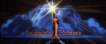
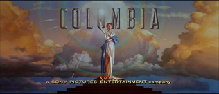
6th Logo
(June 13, 1993- )
Columbia Pictures (1993)Columbia Pictures (1996)Columbia Pictures (2000)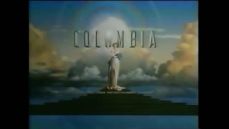
 Columbia Pictures (1996)Columbia (2005)Columbia Pictures - CLG WikiColumbia Pictures (2006-Present)Columbia Pictures (2006- )Columbia 2013 Byline

 Columbia Pictures (1996)Columbia (2005)Columbia Pictures - CLG WikiColumbia Pictures (2006-Present)Columbia Pictures (2006- )Columbia 2013 Byline
Columbia Pictures (Closing, 1993)Columbia Pictures Closing (1993, Released by)Columbia Pictures Columbia Pictures (2002; Closing version)
 Columbia Pictures (2011)

 Columbia Pictures (2002; Closing version)
 Columbia Pictures (2011)


<iframe height="135" src="http://wikifoundrytools.com/wiki/closinglogos/widget/unknown/da153b22d6234fb3944818a0cd836ed5c9207b1d" width="239"></iframe><iframe frameborder="0" height="135" src="http://wikifoundrytools.com/wiki/closinglogos/widget/unknown/3be13d5771fe333d84924e886186d07729e22c04" width="239"></iframe><iframe frameborder="0" height="135" src="http://wikifoundrytools.com/wiki/closinglogos/widget/unknown/71c52b494011d783e53fca73412550d6c8979f94" width="239"></iframe><iframe frameborder="0" height="135" src="http://wikifoundrytools.com/wiki/closinglogos/widget/unknown/cac51d3fba583f8d54327ccc8adbe16e9db6bf3e" width="239"></iframe>
Nicknames: "'90s Torch Lady", Torch Lady V, "Majestic Torch Lady", "The Jenny Joseph Logo"
Logo:
- 1993-2006: This logo has a face lifted Torch Lady from 1936-1976 on her pedestal on a sky background filled with cumulonimbus clouds, giving more detail to the drawing. First, we see a bright light, as if in sunburst, with the cloud background fading in a brief second later. The light is coming from a torch, which zooms out to reveal the lady who's holding it. After the lady, along with the cloud background, are fully zoomed out, on the top "COLUMBIA", seen in a bold, silver chiseled font, fades in afterwards as a ring of light shimmers around the lady, while the cloud background very slowly moves to the right.
- 2006-2014: Starting with The Holiday, released on December 8, 2006, the logo was given a more "enhanced" look, similar to the 2001 Columbia TriStar Home Entertainment logo and Michael J. Deas' original artwork of the logo, which can be seen <a class="external" href="http://www.michaeldeas.com/Columbia_Pictures_Logo.htm" rel="nofollow" target="_blank" title="here">here</a>. The hand is in a different pose in which the finger is at the tip of the torch. The sky is also darker and the "COLUMBIA" text has more silver in it and is slightly off-center. Trailers and TV spots, however, continued to use the 1993 version of the logo until 2008. On The Holiday, it shows the logo already formed; the fully animated variant debuted on Ghost Rider, as between those two films, the 1993 version was still used until The Messengers.
- 2014-: Starting with The Amazing Spider-Man 2, released on May 2, 2014, the logo is preceded by the Sony Corporation logo. This involves the addition of blurry parting clouds with a very bright light between them. The light gets brighter until the clouds are apart and then it fades to the traditional zoom out from the torch.
Trivia:
- The logo's most recent overhaul was undertaken during this era when Sony Corporation of Japan (which bought Columbia on November 8, 1989) commissioned illustrator Michael J. Deas to redesign the lady and return her to her "classic" look. The result, based on Deas' sessions with Mandeville, Louisiana homemaker Jenny Joseph, who posed for him with a makeshift robe and torch, was a taller, slimmer Columbia Torch Lady with lighter, curlier hair and a dimmer torch. Rather than use Joseph's face however, Deas constructed a composite face made up of a couple of computer-generated features. Deas' artwork, created in 1992, was featured in the Columbia TriStar Home Video identity prior to this logo's appearance. The logo was animated at Synthespian Studios by Jeff Kleiser and Diana Walczak. The duo used 2D elements from Deas' painting and converted them to 3D. The clouds were divided up to 66 image maps and Walczak mapped every cloud onto a 3D object and twist-distorted and translated on Wavefront animation software.
- The identity of the Torch Lady's model wasn't divulged until 2004; prior rumors persisted that Annette Bening was the model.
- A face hidden within the clouds can be seen to the left of the Torch Lady as the camera is zooming out of the torch. It is very hard to distinguish in the original 1993 variant, whereas the 2006 version makes it a lot more noticeable.
- It is unknown what animation company did the 2006 and 2014 versions of the logo.
Bylines:
- Starting with the release of The Craft on May 3, 1996, "a SONY PICTURES ENTERTAINMENT company" appears on the bottom. It is slightly off center. However, some post-1996 films such as I Know What You Did Last Summer, Dance with Me, and John Carpenter's Vampires may have this logo without the byline, while trailers and TV spots continued to use the bylineless version of the logo until 1999. The last film to use this byline was Captain Phillips, released on October 11, 2013.
- A prototype version of the SPE byline was used on The Juror, released on February2,1996. The byline is chyroned on cheaply and is a lot bigger and wider than the proportion of the "COLUMBIA" name and the pedestal.
- In late 2013, the byline was shortened to "a Sony Company", with the orange-yellow color of the previous byline changed to a bronze. This version was first spotted on American Hustle (the variant of the logo to use the 1976 logo in 2013), The Monuments Men, and the official trailers for The Amazing Spider-Man 2 and 22 Jump Street.
Variants:
- In 1999, the company celebrated its 75th anniversary. The beginning of the logo started off with the 1936 logo of Columbia Pictures in black & white, leaving the 1993 cloud background intact. The Torch Lady then slowly morphs into the current Torch Lady as the effects from black & white later turn to color. As the camera zooms back, we see a red arched banner dropping from above saying "SEVENTY-FIFTH ANNIVERSARY LIGHTING UP SCREENS AROUND THE WORLD" and the Torch Lady standing on the pedestal, where we see a red box with the gold, giant chiseled name "COLUMBIA" inside on top, and the small word "PICTURES" below in spaced-out letters. We also see the gold giant number "75" unfolding in between the Torch Lady.
- There is one version where the left and right sides of the cloud background are stretched out more and the Torch Lady and the "COLUMBIA" text, along with the byline, are zoomed out a little.
- At the end of Black Hawk Down, the logo zooms out to a much further distance than usual, revealing the bottom of the cloud background below the pedestal. This is because the film was shot in Super 35 1.66:1 negative ratio, and framed for 2.39:1 scope. This variant is seen on 4:3 prints of the film, which exposes more vertical information that was not meant to be seen. This variant can also be found on a trailer for Erin Brockovich (2000).
- On a few Columbia Pictures licensed video games, such as Ghostbusters: Sanctum of Slime and The Smurfs, the print version, seen on most DVD covers of Columbia films, appears on a white background, with the text in black (as with Columbia Pictures Television) and the byline below the stacked words.
- After the end credits of Terminator 3: Rise of the Machines, the logo is still and the print logo is replaced.
Closing Variants:
- The superimposed closing variant features the Torch Lady (and the cloud background) placed inside a rectangular box. The torch, and the cloud BG, overlap the top of the box. Next to the logo are the words "COLUMBIA PICTURES", with "COLUMBIA" over "PICTURES". The phrase below the text reads "A COLUMBIA PICTURES RELEASE" or "RELEASED BY" above the logo with the SPE byline underneath the logo. On some movies such as Stuart Little, the animated short Early Bloomer, Hollywood Homicide, and 13 Going on 30, the SPE byline is smaller, more spaced out, and in a different font.Starting with American Hustle, the byline was shortened to "a Sony Company", though the older SPE byline made a surprise appearance on Pixels, released on July 24, 2015.
- One early closing variant of such featured the boxed Torch Lady logo at center, with "COLUMBIA PICTURES" and the SPE byline below one another. Sometimes, the text and byline are smaller and the logo is bigger to fit the width of the text.
- Beginning with Life in 2017, a revised version of the above-mentioned variant is used. Here, the text and byline are larger.
FX/SFX: The torch shining and the zoom out are good animation for 1993, and the transition from the Sony logo from 2014 onward is well-crafted.
Music/Sounds: A majestic tune is heard, which ends with a brass sounder. Composed by Jonathan Elias.There are three versions of the fanfare: one that sounds orchestrated that's played by a piano with orchestration, one that sounds more synthesized, and the third, which was first heard on John Carpenter's Vampires, released on October 30, 1998, has both themes mixed in together. All three have the same ending. Starting with Sex Tape, released on July 18, 2014, extra build-up is added at the beginning, to match up with the parting clouds. Sometimes it is silent, has the opening theme to any given film, or music from any given soundtrack.
Music/Sounds Variants:
- On the Open Season short "Boog & Elliot's Midnight Bun Run" and The ChubbChubbs Save Xmas, the first half of the Sony Pictures Animation logo music can be heard during the logo, before the Columbia logo cuts into the mentioned logo as the music finishes.
- There is a high tone theme on such films like The Pink Panther, Open Season, Casino Royale (2006), The Pursuit of Happiness, Catch and Release, Ghost Rider, Cloudy with a Chance of Meatballs, How Do You Know, the 2012 remake of Total Recall, and Hotel Transylvania.
- On Finding Forrester, a guitar version of the theme is heard.
- There is also a double-pitched (very high tone) version of the theme, which can be heard on Hollow Man and The Messenger: The Story of Joan of Arc.
- On Palmetto, yet another arrangement of the theme is heard without cymbal hits, ending smoothly with synthesized flutes. This variant was only seen on the original Columbia TriStar releases, as the current releases remove this logo (prior to Time Warner owning Castle Rock library, as Palmetto is a Castle Rock film).
- It is believed that on the Sony region 2 DVDs of Evolution (2002), the 5.1 English track contains the DreamWorks jingle. Oddly enough, a similar thing happened on the DreamWorks logo on the R1 DVD when the 2.0 English track is selected and the 1993 CP jingle is heard.
Availability: Very common. It has been placed in front of Columbia films for over 25 years.
- The first film to use this logo was Last Action Hero (although the teaser trailer and the TV Spot had the previous logo).
- This logo was also seen at the beginning of Ghostbusters: The Video Game.
- Some cable prints and New Line Home Video releases of Castle Rock films such as Needful Things, Malice, Josh and S.A.M., and North actually keep this logo (though don't expect to see it on MGM releases of the former three films, although the Kino Lorber Blu-Rays of Needful Things and Malice have it, the latter after MGM).
- On current prints of City Slickers 2: The Legend of Curly's Gold, this is replaced by the 2001 Warner Bros. Pictures logo (though the 1989 Castle Rock logo is kept).
- Current prints of 1994-1998 Castle Rock films distributed by Columbia have the logo either plastered by a Warner Bros. logo or edited out, altogether. Even the end in-credit notices aren't safe as they're either blacked out or replaced by a WB logo (though it is retained on the 1999 DVD release of City Hall). The 1998 Warner Home Video VHS release of The American President retains this, however.
- Interestingly, the print logo made its first appearance in early 1993 on posters for The Pickle and Lost in Yonkers as well as newspaper ads for Groundhog Day; however, those aforementioned titles use the previous logo.
- This also appears on the 1997 Director's Cut version of Das Boot.
- Also, the 2006 version plasters the original 1993 logo on the Blu-ray of Muppets from Space.
- It also may have been seen on theatrical prints of The Wind in the Willows (1996), later re-titled Mr. Toad's Wild Ride, but it doesn't appear on any VHS or DVD releases of said film due to Disney owning the video rights, as a result it was plastered by the 1985 Walt Disney Pictures logo.
- While the print logo appears on ads for The Angry Birds Movie 2, the logo itself doesn't appear on trailers for the film or the film itself.
- A portion of this logo appears about halfway through The King.
Editor's Note: A beautiful homage to the 1936 logo that has been in use for over 25 years.