Bloodworth-Thomason-Mozark Productions
Jump to navigation
Jump to search
Logo descriptions by bigrene2, Codyfinke2, and Shadeed A. Kelly
Logo captures by Eric S., Shadeed A. Kelly, Logophile, and TheEriccorpinc
Video captures courtesy of AllisonSNLKid
Background: Bloodworth-Thomason-Mozark Productions is a production company founded in 1982 first known as "Linda Bloodworth Productions" and later "L.J. Bloodworth Productions" by writer Linda Joyce Bloodworth-Thomason. In July 1983, Bloodworth married Harry Thomason, whom they've met in 1980 and during the time in 1983, the duo created "Mozark Productions", named after their home states: "MO" for Missouri & "ARK" for Arkansas and an allusion of the overlapping Ozarks region.
1st Logo
(August 9, 1982-June 15, 1983)
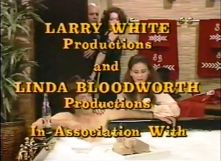
Logo: We have an in-credit text that reads, "LARRY WHITE Productions and LINDA BLOODWORTH Productions In Association With".
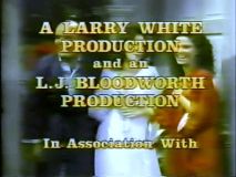
Later variant: The text now reads as "A LARRY WHITE PRODUCTION and an L.J. BLOODWORTH PRODUCTION In Association With".
FX/SFX: None.
Music/Sounds: The end-title theme of Filthy Rich.
Availability: Extinct. It was seen on the short-lived series Filthy Rich.
Editor's Note: None.
2nd Logo
(September 21-October 26, 1985)
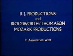
Logo: In a dark blue background, there's text that reads:
Music/Sounds: None.
Availability: Extinct. It was only seen in the short-lived series Lime Street.
Editor's Note: None.
3rd Logo
(September 29, 1986-May 11, 1991)
 [Productions/widget/unknown/-2057397684|//wikifoundrytools.com/wiki/closinglogosBloodworth-Thomason-Mozark Productions/widget/unknown/-2057397684][Productions/widget/unknown/-2057397684|//wikifoundrytools.com/wiki/closinglogosBloodworth-Thomason-Mozark Productions/widget/unknown/-2057397684]<embed align="bottom" height="178" src="http://wikifoundrytools.com/wiki/closinglogos/page/Bloodworth-Thomason-Mozark+Productions/widget/unknown/-2057397684" type="application/x-shockwave-flash" width="223" wmode="transparent"/>
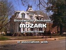
Nicknames: "The Sliding Heart", “The Red-to-White Heart”, "The Designing Women Logo"
Logo: As this logo is superimposed on the Designing Women credits, we see an orange heart sliding to the right, and reveals the red text "MOZARK" (in a bulky font bearing a striking resemblance to the Burger King logo of the time) as the heart turns to red. As the heart disappears, the "MOZARK" turns to white, letter by letter. As it turns white, we see "Bloodworth/Thomason" on top, and "productions" in italics at the bottom of the text. As the logo finishes, the text "in association with" is shown under. It then cuts to the Columbia Pictures Television logo of the time.
Variants:
FX/SFX: The sliding heart revealing the text.
Music/Sounds: A synth chime sound effect.
Availability: Common. It's currently seen on the first five seasons of Designing Women on Logo TV. It's also intact on DVD releases of said show.
Editor's Note:The animation is choppy, the "MOZARK" font is ugly, and the rest of the text is cheaply inserted.
4th Logo
(September 17, 1990-November 11, 2001)
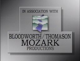
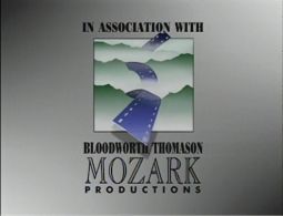
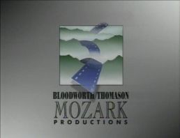
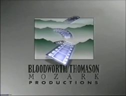
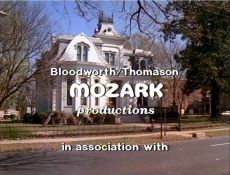
Logo: On a gray background, there is a white square with green mountains emerging from it, which represent the Ozarks with fog below it. Through the Ozarks is a long blue filmstrip, running up and down the gaps and also going over the top and bottom edges, leaving shadows and partially overlapping the text. Under that we see the text arranged like this:
Variants:
FX/SFX: None for the regular version. The glowing on the updated version.
Music/Sounds: Some synth tinkles, followed by an orchestral chord. NBC airings on Emeril used a generic theme.
Availability: Seen on Mozark shows, such as Designing Women (starting with the 6th season), Hearts Afire, and Evening Shade (all 3 shows are on DVD). The updated version appeared on the infamous short-lived sitcom Emeril. This may have been seen on the HBO series 12 Miles of Bad Road, but we'll likely never know as it was cancelled before it debuted and hasn't been released ever since.
Editor's Note: None.
Logo captures by Eric S., Shadeed A. Kelly, Logophile, and TheEriccorpinc
Video captures courtesy of AllisonSNLKid
Background: Bloodworth-Thomason-Mozark Productions is a production company founded in 1982 first known as "Linda Bloodworth Productions" and later "L.J. Bloodworth Productions" by writer Linda Joyce Bloodworth-Thomason. In July 1983, Bloodworth married Harry Thomason, whom they've met in 1980 and during the time in 1983, the duo created "Mozark Productions", named after their home states: "MO" for Missouri & "ARK" for Arkansas and an allusion of the overlapping Ozarks region.
1st Logo
(August 9, 1982-June 15, 1983)


Logo: We have an in-credit text that reads, "LARRY WHITE Productions and LINDA BLOODWORTH Productions In Association With".
Later variant: The text now reads as "A LARRY WHITE PRODUCTION and an L.J. BLOODWORTH PRODUCTION In Association With".
FX/SFX: None.
Music/Sounds: The end-title theme of Filthy Rich.
Availability: Extinct. It was seen on the short-lived series Filthy Rich.
Editor's Note: None.
2nd Logo
(September 21-October 26, 1985)

Logo: In a dark blue background, there's text that reads:
R.J. PRODUCTIONS
and
BLOODWORTH/THOMASON
MOZARK PRODUCTIONS
In Association With
and
BLOODWORTH/THOMASON
MOZARK PRODUCTIONS
In Association With
FX/SFX: None.
Music/Sounds: None.
Availability: Extinct. It was only seen in the short-lived series Lime Street.
Editor's Note: None.
(September 29, 1986-May 11, 1991)

 [Productions/widget/unknown/-2057397684|//wikifoundrytools.com/wiki/closinglogosBloodworth-Thomason-Mozark Productions/widget/unknown/-2057397684][Productions/widget/unknown/-2057397684|//wikifoundrytools.com/wiki/closinglogosBloodworth-Thomason-Mozark Productions/widget/unknown/-2057397684]<embed align="bottom" height="178" src="http://wikifoundrytools.com/wiki/closinglogos/page/Bloodworth-Thomason-Mozark+Productions/widget/unknown/-2057397684" type="application/x-shockwave-flash" width="223" wmode="transparent"/>
Logo: As this logo is superimposed on the Designing Women credits, we see an orange heart sliding to the right, and reveals the red text "MOZARK" (in a bulky font bearing a striking resemblance to the Burger King logo of the time) as the heart turns to red. As the heart disappears, the "MOZARK" turns to white, letter by letter. As it turns white, we see "Bloodworth/Thomason" on top, and "productions" in italics at the bottom of the text. As the logo finishes, the text "in association with" is shown under. It then cuts to the Columbia Pictures Television logo of the time.
Variants:
- On the first few episodes, there were no shadow effects.
- Sometimes, the heart may be either purple or pink.
- On "New Year's Daze" and "Reservations for Eight", the "productions" text is in the same font as the "Bloodworth/Thomason" text, making it look unevenly spaced.
- On "Old Spouses Never Die", the logo is in warp-speed.
- On "Killing All the Right People", the background is black.
- On "Their Finest Hour", the background is a salmon color and the chime is not heard.
- On "La Place sans Souci", the text appears out of sync with the heart wiping in.
FX/SFX: The sliding heart revealing the text.
Music/Sounds: A synth chime sound effect.
Music/Sounds Variants:
- Sometimes, the logo is silent.
- The end theme may play over the chime.
- Sometimes on season 4 and 5, the chime is extended.
Availability: Common. It's currently seen on the first five seasons of Designing Women on Logo TV. It's also intact on DVD releases of said show.
Editor's Note:The animation is choppy, the "MOZARK" font is ugly, and the rest of the text is cheaply inserted.
4th Logo
(September 17, 1990-November 11, 2001)


[Productions/widget/unknown/813962531|//wikifoundrytools.com/wiki/closinglogosBloodworth-Thomason-Mozark Productions/widget/unknown/813962531][Productions/widget/unknown/813962531|//wikifoundrytools.com/wiki/closinglogosBloodworth-Thomason-Mozark Productions/widget/unknown/813962531]<embed align="bottom" height="197" src="http://wikifoundrytools.com/wiki/closinglogos/page/Bloodworth-Thomason-Mozark+Productions/widget/unknown/813962531" type="application/x-shockwave-flash" width="226" wmode="transparent"/>
Nicknames: "Art and Filmstrips", "Filmstrips and Ozarks"
Nicknames: "Art and Filmstrips", "Filmstrips and Ozarks"
Logo: On a gray background, there is a white square with green mountains emerging from it, which represent the Ozarks with fog below it. Through the Ozarks is a long blue filmstrip, running up and down the gaps and also going over the top and bottom edges, leaving shadows and partially overlapping the text. Under that we see the text arranged like this:
BLOODWORTH/THOMASON
MOZARK
P R O D U C T I O N S
MOZARK
P R O D U C T I O N S
All 3 are respectively in a Bold Times New Roman font, a outlined Times New Roman font, and a regular spaced out font.
Variants:
- Sometimes, the words "IN ASSOCIATION WITH" are above the logo.
- On season 1 of Evening Shade and the first episode of the sixth season of Designing Women, the logo is smaller and the text is also larger and in the same font. The logo is enclosed in a large outline made of 2 rectangles connected to each other, casting a shadow over the background.
- In 2001, an updated version was introduced where the box and text were made wider, with the text getting some size differences. The filmstrip also quickly lights up and glows to the twinkles, revealing white holes and frames.
FX/SFX: None for the regular version. The glowing on the updated version.
Music/Sounds: Some synth tinkles, followed by an orchestral chord. NBC airings on Emeril used a generic theme.
Music/Sounds Variant: Earlier on, this logo has a different musical cue that kinda sounds like a lullaby.
Availability: Seen on Mozark shows, such as Designing Women (starting with the 6th season), Hearts Afire, and Evening Shade (all 3 shows are on DVD). The updated version appeared on the infamous short-lived sitcom Emeril. This may have been seen on the HBO series 12 Miles of Bad Road, but we'll likely never know as it was cancelled before it debuted and hasn't been released ever since.
Editor's Note: None.