ABC "Welcome to the Bright New World of ABC" ID
Jump to navigation
Jump to search
Logo descriptions by imacomputergeek and The_Username_15
(1975-1976)
Nickname: "Welcome to the Bright New World"
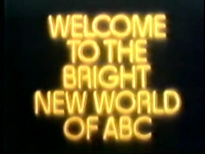
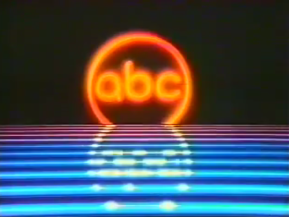
Logo: On a black background, the word "WELCOME" zooms in and hits the screen 3 times. Then the slogan, "WELCOME TO THE BRIGHT NEW WORLD OF ABC" scrolls up. Before it ends, it cross-fades into a blue-red lined floor where in the distance, the ABC logo lifts up from behind the floor and goes into place in mid-air.
Variant: There's a version where the logo is still. This was mainly used as a secondary ident.
FX/SFX: The text and ABC logo rising up. The effects were pretty nifty for 1975, but it was starting to become mainstream to see glints and glows everywhere at around this time.
Music/Sounds: The campaign's song "Welcome to the Bright New World on ABC."
Availability: Extinct, as it was only used as a station ID. However, it made an appearance during the opening montage of the 40th anniversary special.
Editor's Note: None.


