Difference between revisions of "20th Century Fox Television Distribution"
Jump to navigation
Jump to search
Availability: Seen on Marchlands, the first series in The Oaks Trilogy. It's currently unknown if this logo appeared on other shows.
Editor's Note: None.
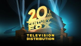
2nd Logo
(2013-2015)
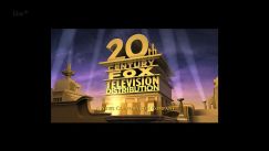

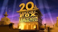
Nicknames: "20th Century Tallness", "The Too-Tall Tower", "The Twentieth Tip-Over", "STST (Super-Tall Searchlight Tower)"
Logo: Similar to the 1995 20th Century Fox Television logo, except the structure and background are in the style of the 2009 theatrical logo, the animation and design are a lot cheaper, and the tower is all metallic and now reads "20th CENTURY FOX TELEVISION DISTRIBUTION".
Variants:
Music/Sounds: The 2008 20th Television fanfare. On Кости (the Russian adaptation of Bones), it uses the 1995 version.
Availability: Uncommon. Appears on Lightfields and some pre-2017 prints of DreamWorks Animation shows, such as DreamWorks Dragons and The Penguins of Madagascar.This logo makes a surprise appearance at the end of Meet the Family Guys, following the Roughcut TV/ITV logos.
Editor's Note: The logo has been widely criticized for looking rushed, poorly-designed and cheaply animated.
(Created page with "<div class="WPC-editableContent" id="WPC-area?cellId=20th+Century+Fox+Television+Distribution&version=81&savePath=%2Fpage%2F20th%2BCentury%2BFox%2BTelevision%2BDistrib...") |
|||
| Line 1: | Line 1: | ||
| − | <div class="WPC-editableContent" id="WPC-area?cellId=20th+Century+Fox+Television+Distribution&version=81&savePath=%2Fpage%2F20th%2BCentury%2BFox%2BTelevision%2BDistribution&saveType=page"><div><font size="3"><font><i><font color="#ffa500">Logo descriptions by </font>Logophile, D.L. Chandell, LogosForTheWin, and WarnerFX<br/><font color="#ffa500">Logo captures by </font>EnormousRat, V of Doom, and LogosForTheWin<br/></i></font><i><font><font color="#ffa500">Video captures courtesy of</font><font color="#333333">Pepsi9072 and LogosForTheWin</font></font></i></font></div><div><font size="3"><i><font color="#ffa500">Logo description edits by</font><font color="#ffa500"> </font><font>mario9000seven</font></i><font color="#ffa500"><font color="#ffa500"><font color="#ffa500"><font><font color="#333333"><i><br/></i><br/><br/>1st Logo<br/>(February 3-March 3, 2011)<br/></font></font></font></font></font></font><div align="center"><font color="#ffa500" size="1"><font color="#ffa500"><font color="#ffa500"><font color="#333333"> | + | <div class="WPC-editableContent" id="WPC-area?cellId=20th+Century+Fox+Television+Distribution&version=81&savePath=%2Fpage%2F20th%2BCentury%2BFox%2BTelevision%2BDistribution&saveType=page"><div><font size="3"><font><i><font color="#ffa500">Logo descriptions by </font>Logophile, D.L. Chandell, LogosForTheWin, and WarnerFX<br/><font color="#ffa500">Logo captures by </font>EnormousRat, V of Doom, and LogosForTheWin<br/></i></font><i><font><font color="#ffa500">Video captures courtesy of</font><font color="#333333">Pepsi9072 and LogosForTheWin</font></font></i></font></div><div><font size="3"><i><font color="#ffa500">Logo description edits by</font><font color="#ffa500"> </font><font>mario9000seven</font></i><font color="#ffa500"><font color="#ffa500"><font color="#ffa500"><font><font color="#333333"><i><br/></i><br/><br/>1st Logo<br/>(February 3-March 3, 2011)<br/></font></font></font></font></font></font><div align="center"><font color="#ffa500" size="1"><font color="#ffa500"><font color="#ffa500"><font color="#333333">[[File:Fba5805af4bb249439e72e39f45b7028.jpeg|311px|20th Century Fox Television Distribution (2011)]]</font></font></font></font><font size="1"><iframe align="bottom" height="175" src="http://wikifoundrytools.com/wiki/closinglogos/widget/genericvideo/a8bc3827c92bd1ccc11bf5336bfeaabfb60767e8" width="287"></iframe></font></div><font color="#ffa500"><font color="#ffa500"><font color="#ffa500"><font><font color="#333333" size="3"><br/><u>Logo</u>: On a greenish blue light background, we see the 1994-2010 20th Century Fox structure with rings that are spinning around seen behind; "<font color="#ffff00"><b><font color="#ad9b32">TELEVISION DISTRIBUTION</font></b></font>" blurs in.<br/><br/><u>FX/SFX</u>: The rings spinning and the blur in of ''TELEVISION DISTRIBUTION.''<br/><br/></font></font></font></font></font></div><font size="3"><font color="#ffa500"><font color="#ffa500"><font color="#ffa500"><font><font color="#333333"><u>Music/Sounds</u>: None.<br/><br/><u>Availability</u>: Seen on <i>Marchlands</i>, the first series in<i> The Oaks Trilogy</i>. It's currently unknown if this logo appeared on other shows.<br/><br/></font></font></font></font></font><u>Editor's Note</u><font color="#333333">: None.</font><font color="#ffa500"><font color="#ffa500"><font color="#ffa500"><font><font color="#333333"><br/><br/><br/><br/>2nd Logo<br/>(2013-2015)</font><br/></font></font></font></font></font><div align="center"><font size="1">[[File:A4fV2RHNQ-yxWjEKWEO-4Q42726.jpeg|243px|20th Century Fox TV Distribution (2013)]][[File:Qmvbf5COHSjBLTHuoEHSPw324695.jpeg|243px|20th Century Fox Television Distribution (2013)]][[File:DOLILbwui0RIutHzBg30fA322737.jpeg|243px|20th Century Fox Television Distribution (2013, Bylineless)]][[File:67238f13623aa6d0f786807f7ad3aa9a.png|235px|20th Century Fox (2015)]]</font></div><div align="center"><font size="1"><br/></font></div><div align="center"><iframe frameborder="0" height="150" src="http://wikifoundrytools.com/wiki/closinglogos/widget/genericvideo/c344d3eae3472bfc36e10782943d03b0007fec18" width="266"></iframe></div><font size="3"><font><br/><u>Nicknames</u>: "20th Century Tallness", "The Too-Tall Tower", "The Twentieth Tip-Over", "STST (Super-Tall Searchlight Tower)"<br/><br/><u>Logo</u>: Similar to the 1995 [[20th Century Fox Television]] logo, except the structure and background are in the style of the 2009 theatrical logo, the animation and design are a lot cheaper, and the tower is all metallic and now reads "20th CENTURY FOX TELEVISION DISTRIBUTION".</font></font><div><font size="3"><font><u><br/>Variants</u>: <br/></font></font></div><div><ul><li><font size="3"><font>Starting in mid-to-late 2013, the logo became bylineless, following the News Corp. split.</font></font></li><li><font size="3"><font><font size="3">A variant of this logo without the "TELEVISION DISTRIBUTION" text but with the same animation as TCF's theatrical logo was spotted on two trade promos for 20th Century Fox's internal websites from 2015, seen <a href="https://vimeo.com/129141464" target="_self">here</a> and <a href="https://vimeo.com/129141465" target="_self">here</a>.</font></font></font></li><li><font size="3"><font>There is also another version on a promo for 20th Century Fox's streaming app "FoxFast" also animated like the theatrical logo, this time with the "TELEVISION DISTRIBUTION" text intact, seen <a href="https://vimeo.com/295263919" target="_self">here</a>.<u><br/></u></font></font></li></ul><font size="3"><font><u><font size="3">FX/SFX</font></u>: Almost the same as the 1995 TCFTV logo. This logo was created by Art & State.<br/><br/></font><font><u><font size="3">Music/Sounds</font></u>: The 2008 [[20th Television]] fanfare. On</font> Кости (the Russian adaptation of<i> Bones</i>), it uses the 1995 version.<font><br/><br/><font size="3"><u>Availability</u>: Uncommon. Appears on <i>Lightfields</i> and some pre-2017 prints of [[DreamWorks Animation Television|DreamWorks Animation]] shows, such as <i>DreamWorks Dragons</i> and <i>The Penguins of Madagascar</i>.This logo makes a surprise appearance at the end of <i>Meet the Family Guys</i>, following the Roughcut TV/ITV logos.<br/><br/></font></font><font size="3"><u><font size="3">Editor's Note</font></u><font color="#333333">: The logo has been widely criticized for looking rushed, poorly-designed and cheaply animated.</font></font></font></div><br/></div> |
Latest revision as of 16:49, 3 November 2020
Logo descriptions by Logophile, D.L. Chandell, LogosForTheWin, and WarnerFX
Logo captures by EnormousRat, V of Doom, and LogosForTheWin
Video captures courtesy ofPepsi9072 and LogosForTheWin
Logo captures by EnormousRat, V of Doom, and LogosForTheWin
Video captures courtesy ofPepsi9072 and LogosForTheWin
Logo description edits by mario9000seven
1st Logo
(February 3-March 3, 2011)
 <iframe align="bottom" height="175" src="http://wikifoundrytools.com/wiki/closinglogos/widget/genericvideo/a8bc3827c92bd1ccc11bf5336bfeaabfb60767e8" width="287"></iframe>
Logo: On a greenish blue light background, we see the 1994-2010 20th Century Fox structure with rings that are spinning around seen behind; "TELEVISION DISTRIBUTION" blurs in.
FX/SFX: The rings spinning and the blur in of TELEVISION DISTRIBUTION.
Music/Sounds: None.1st Logo
(February 3-March 3, 2011)
 <iframe align="bottom" height="175" src="http://wikifoundrytools.com/wiki/closinglogos/widget/genericvideo/a8bc3827c92bd1ccc11bf5336bfeaabfb60767e8" width="287"></iframe>
Logo: On a greenish blue light background, we see the 1994-2010 20th Century Fox structure with rings that are spinning around seen behind; "TELEVISION DISTRIBUTION" blurs in.
FX/SFX: The rings spinning and the blur in of TELEVISION DISTRIBUTION.
Availability: Seen on Marchlands, the first series in The Oaks Trilogy. It's currently unknown if this logo appeared on other shows.
Editor's Note: None.
2nd Logo
(2013-2015)


<iframe frameborder="0" height="150" src="http://wikifoundrytools.com/wiki/closinglogos/widget/genericvideo/c344d3eae3472bfc36e10782943d03b0007fec18" width="266"></iframe>
Nicknames: "20th Century Tallness", "The Too-Tall Tower", "The Twentieth Tip-Over", "STST (Super-Tall Searchlight Tower)"
Logo: Similar to the 1995 20th Century Fox Television logo, except the structure and background are in the style of the 2009 theatrical logo, the animation and design are a lot cheaper, and the tower is all metallic and now reads "20th CENTURY FOX TELEVISION DISTRIBUTION".
Variants:
- Starting in mid-to-late 2013, the logo became bylineless, following the News Corp. split.
- A variant of this logo without the "TELEVISION DISTRIBUTION" text but with the same animation as TCF's theatrical logo was spotted on two trade promos for 20th Century Fox's internal websites from 2015, seen <a href="https://vimeo.com/129141464" target="_self">here</a> and <a href="https://vimeo.com/129141465" target="_self">here</a>.
- There is also another version on a promo for 20th Century Fox's streaming app "FoxFast" also animated like the theatrical logo, this time with the "TELEVISION DISTRIBUTION" text intact, seen <a href="https://vimeo.com/295263919" target="_self">here</a>.
Music/Sounds: The 2008 20th Television fanfare. On Кости (the Russian adaptation of Bones), it uses the 1995 version.
Availability: Uncommon. Appears on Lightfields and some pre-2017 prints of DreamWorks Animation shows, such as DreamWorks Dragons and The Penguins of Madagascar.This logo makes a surprise appearance at the end of Meet the Family Guys, following the Roughcut TV/ITV logos.
Editor's Note: The logo has been widely criticized for looking rushed, poorly-designed and cheaply animated.