Viva Films (Philippines)
Jump to navigation
Jump to search
Editions by SnowflakesOmega, LJVborgSuperSet and Unnepad
Availability: Seen on Viva Films releases of the period, usually releases by Viva Video.
Editor's Note: One of the most clean Philippine logos of the past, despite being short-lived. Likely inspired by the 20th Century Fox logo.
4th Logo
(1990-2003)
<iframe frameborder="0" height="171" src="http://wikifoundrytools.com/wiki/closinglogos/widget/genericvideo/172a9f643a160f4204933eb293bbdd2fe4376dd6" width="225"></iframe><iframe frameborder="0" height="171" src="http://wikifoundrytools.com/wiki/closinglogos/widget/genericvideo/ed26619e4bddae6c566dc9d5a1bf05fd31dc477b" width="225"></iframe><iframe frameborder="0" height="165" src="http://wikifoundrytools.com/wiki/closinglogos/widget/genericvideo/7c5953806e7087a4937debd20394e52d3e545f5c" width="219"></iframe><iframe frameborder="0" height="171" src="http://wikifoundrytools.com/wiki/closinglogos/widget/genericvideo/3ac5e286cc040138b4eceaaba275a0040b533b76" width="225"></iframe>
Nicknames: "Golden VIVA", "Golden Letters of Doom"
Logo: We see a gold screen. Then, four blue laser-like lines shoot from the left of it, and it starts rotating away, revealing that it's actually the "V" from the VIVA logo. The large "V" then zooms away as the laser coming from bottom-left corner and breaking three-equally sized parts from it and settle themselves next to the "V". These parts reveal themselves to be the rest of the letters of the logo "IVA", thus the words form the word "VIVA". Then, two long horizontal gold lines shoot out from below and the gold, italicized word "FILMS" appears sandwiched in-between. This all happens on a black/cadet gradient background.
Variants:
FX/SFX: The slicing, the golden letters spinning and forming and the appearance of the "FILMS" text, all in high-quality 90s CGI.
Music/Sounds: A creepy synthesized pad note, followed by many zapping sounds for the lasers and the gold lines and solemn ringing sounds not unlike bells that echo throughout the logo.
Music/Sounds Variants:
Availability: By far this is one of VIVA's most common logos (mainly because of it's long lifespan). It's seen on many VIVA films from the time, most distributed by VIVA Video or Regal Home Video on VHS/VCD/DVD releases.
Editor's Note: This logo is somewhat infamous, as it unnerved quite a number of people due to the music, zaps/flashes, and ominous color scheme (gold objects on a dark background).
5th Logo
(2003-2010)
 Nicknames: "Viva In Space", "The Comet Triangle"
Logo: On a moving space background we see an explosion which forms a filmstrip in the shape of a circle. The Earth flies through it. An orange triangle flies towards the left as the earth lands on the triangle. A filmstrip then curves around the earth forming a comet shape. The blue text "VIVA" flies in next to the triangle.
FX/SFX: Great CGI animation.
Music/Sounds: A 14-note piano theme played against some faint drum notes. It ends with either the first part of the opening theme, or a synthesized chord. For the short variant, the opening theme.
Availability: Can be seen on films from the period, including co-productions with Star Cinema such as You Changed My Life.
6th Logo
(2010-2015)
Nicknames: "Multi-Colored Zigzag I", "The VIVA Experience", "DTS Theft"
Logo: A light flare on the left zooms towards us in the dark. A zig-zag shape with red, pink, green, yellow and blue colors rotates upwards towards the middle. When it does we see the blue text "VIVA FILMS" beneath the shape. A spotlight forms beneath the logo.
Variant:
Background: VIVA Films is a Philippine movie company which started in 1981. This company is part of the VIVA Entertainment Group, and aren't at all related to the LA-based Viva Pictures, the company who distributed the infamous Foodfight!.
1st Logo
(1981-1984)
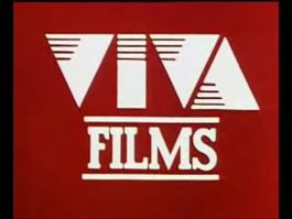
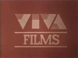 Logo: On a Persian red background, a light gold triangle zooms out, stops for a moment to emit four triangle-shaped waves, then abruptly appears further zoomed out. The triangle moves left as another slides out from behind it and moves to the right a bit. A tall rectangle and an inverted triangle slide in from the top and bottom of the screen, respectively, and then a faint flash occurs, creating slanted lines running in from the left sides of each triangle, and all the way through the rectangle; the shapes now resemble the word "VIVA". Another faint flash creates the word "FILMS" in a slab serif font of the same color as the shapes.
Variants:
FX/SFX: Very simplistic animation for the 80s.
Music/Sounds: None, or possibly the opening theme of the film.
Music/Sounds Variants:
Availability: Seen on their films from the era.
 <iframe frameborder="0" height="202" src="http://wikifoundrytools.com/wiki/closinglogos/widget/genericvideo/4e639f91b960c8a576f55aaea5878d6782b825fa" width="353"></iframe>
(1981-1984)
 Logo: On a Persian red background, a light gold triangle zooms out, stops for a moment to emit four triangle-shaped waves, then abruptly appears further zoomed out. The triangle moves left as another slides out from behind it and moves to the right a bit. A tall rectangle and an inverted triangle slide in from the top and bottom of the screen, respectively, and then a faint flash occurs, creating slanted lines running in from the left sides of each triangle, and all the way through the rectangle; the shapes now resemble the word "VIVA". Another faint flash creates the word "FILMS" in a slab serif font of the same color as the shapes.
Variants:
- There is a short version, which starts on the part where the VIVA text flashes. This is seen on P.S. I Love You, the company's first film.
- On Cross My Heart, an In-credit title card was used on the opening theme of the movie.
FX/SFX: Very simplistic animation for the 80s.
Music/Sounds: None, or possibly the opening theme of the film.
Music/Sounds Variants:
- The short version used a gun shot, followed by a fast fanfare.
- On Cross My Heart, a creepy synth is used.
Availability: Seen on their films from the era.
2nd Logo
(1984-1989)
 <iframe frameborder="0" height="202" src="http://wikifoundrytools.com/wiki/closinglogos/widget/genericvideo/4e639f91b960c8a576f55aaea5878d6782b825fa" width="353"></iframe>
Logo:On a black background, two outlined white triangles (one upside down) appear zooming to us and filling with a red color, making the outline disappear. These triangles zoom out. Then a series of outlined triangles appear and black lines slide up to cover up the right side-up triangle, top corners and the middle vertical line of the upside-down triangle. The animation stops, and the I from the VIVA logo falls down. The now-red triangles from the beginning of the logo zoom in, and the other triangles disappear. Inside the triangles, the V's and A vertically wipe and form. The triangles zoom in even more, filling the background with the red color, and leaving the finished logo. "FILMS" fades in below. The finished version is a little bit bigger than the 1st logo.
FX/SFX: Very simplistic animation once again, but more unique than the first logo.
Music/Sounds: None.
Music/Sounds Variants:
- On Boy Negro, a synth-pop fanfare is used.
- A different synth fanfare is used on Doctor, Doctor, We Are Slok.
Availability: Seen on their films from the era.
3rd Logo
(1989-1990)
 Nicknames: "Searchlights", "Zooming Viva", "20th Century Fox of the Philippines"
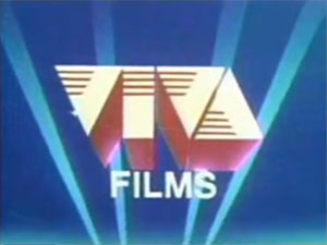
Logo: We start with a black background and a yellow sunburst forming yellow words "VIVA" in 3D. As the sunburst fades out, the "VIVA" zooms in. When the zooming stops, we fade to a sky blue background with moving white searchlights in them. After that, the word "FILMS" in white flash in under the "VIVA."
FX/SFX: The sunburst forming the words "VIVA," the "VIVA" zooming in, the moving searchlights and "FILMS" flashing in.
Music/Sounds: It starts with a cymbal clash and a drumbeat, followed by a majestic synth fanfare.
Music/Sounds Variants:
(1989-1990)
 Nicknames: "Searchlights", "Zooming Viva", "20th Century Fox of the Philippines"
Logo: We start with a black background and a yellow sunburst forming yellow words "VIVA" in 3D. As the sunburst fades out, the "VIVA" zooms in. When the zooming stops, we fade to a sky blue background with moving white searchlights in them. After that, the word "FILMS" in white flash in under the "VIVA."
FX/SFX: The sunburst forming the words "VIVA," the "VIVA" zooming in, the moving searchlights and "FILMS" flashing in.
Music/Sounds: It starts with a cymbal clash and a drumbeat, followed by a majestic synth fanfare.
Music/Sounds Variants:
- A silent version also exists.
- On Hindi Pahuhuli ng Buhay, a triumphant fanfare with pluck is heard.
- On Sa Diyos Lang Isusuko, the opening theme is used.
Availability: Seen on Viva Films releases of the period, usually releases by Viva Video.
Editor's Note: One of the most clean Philippine logos of the past, despite being short-lived. Likely inspired by the 20th Century Fox logo.
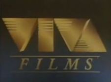
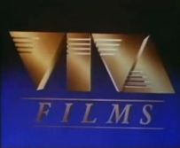
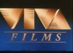
4th Logo
(1990-2003)


<iframe frameborder="0" height="171" src="http://wikifoundrytools.com/wiki/closinglogos/widget/genericvideo/172a9f643a160f4204933eb293bbdd2fe4376dd6" width="225"></iframe><iframe frameborder="0" height="171" src="http://wikifoundrytools.com/wiki/closinglogos/widget/genericvideo/ed26619e4bddae6c566dc9d5a1bf05fd31dc477b" width="225"></iframe><iframe frameborder="0" height="165" src="http://wikifoundrytools.com/wiki/closinglogos/widget/genericvideo/7c5953806e7087a4937debd20394e52d3e545f5c" width="219"></iframe><iframe frameborder="0" height="171" src="http://wikifoundrytools.com/wiki/closinglogos/widget/genericvideo/3ac5e286cc040138b4eceaaba275a0040b533b76" width="225"></iframe>
Logo: We see a gold screen. Then, four blue laser-like lines shoot from the left of it, and it starts rotating away, revealing that it's actually the "V" from the VIVA logo. The large "V" then zooms away as the laser coming from bottom-left corner and breaking three-equally sized parts from it and settle themselves next to the "V". These parts reveal themselves to be the rest of the letters of the logo "IVA", thus the words form the word "VIVA". Then, two long horizontal gold lines shoot out from below and the gold, italicized word "FILMS" appears sandwiched in-between. This all happens on a black/cadet gradient background.
Variants:
- There were 2 redone variants which were from 1993-2003 and early 2003. The only large differences are the color scheme for the letters and background and logo size. The 1993 variant got a brighter gold color variant for the letters, which was made even brighter in the 2003 variant to the point the letters looked more bronze than gold as a result. The 1993 variant also had a black/blue gradient background, and the 2003 variant got a black/medium Persian blue gradient background and a slightly larger logo.
- On Urban Rangers, the logo is more darker.
- On Pacifico Guevarra - Dillinger Ng Dose Pares and Pangako ng kahapon, the logo's even more darker, making the background almost black.
- On Row 4 and Kiss Mo' Ko, the logo is moved down.
- On Noel Juico - Batang Kriminal, the logo has a yellow tint.
- On Bugbog Sarado, the logo fades to white instead of black at the end.
FX/SFX: The slicing, the golden letters spinning and forming and the appearance of the "FILMS" text, all in high-quality 90s CGI.
Music/Sounds: A creepy synthesized pad note, followed by many zapping sounds for the lasers and the gold lines and solemn ringing sounds not unlike bells that echo throughout the logo.
Music/Sounds Variants:
- Some films featured a synthesized fanfare with a different zap sound.
- The 2003 variant got a redone version jingle which featured more electric sound effects throughout.
- A jungle-themed tune with different laser zaps is heard on AB Normal College.
- On Sukdulan and Lupe, a dreamy theme is heard with different laser zaps.
- On a few films, the opening theme plays over it.
- Row 4 and Pretty Boy had the opening theme with the zap sound.
- On S2pid Luve, there's another music variant which consists of a synth drone with whooshes.
- On Gloria, Gloria Labandera, a news theme is heard.
- On The Cecilia Masagca Story: Antipolo Massacre, a drumbeat has been added on the original music which makes it dramatic.
- On Juan and Ted: Wanted, a dramatic fanfare is heard.
Availability: By far this is one of VIVA's most common logos (mainly because of it's long lifespan). It's seen on many VIVA films from the time, most distributed by VIVA Video or Regal Home Video on VHS/VCD/DVD releases.
Editor's Note: This logo is somewhat infamous, as it unnerved quite a number of people due to the music, zaps/flashes, and ominous color scheme (gold objects on a dark background).
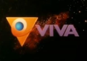
5th Logo
(2003-2010)

Logo: On a moving space background we see an explosion which forms a filmstrip in the shape of a circle. The Earth flies through it. An orange triangle flies towards the left as the earth lands on the triangle. A filmstrip then curves around the earth forming a comet shape. The blue text "VIVA" flies in next to the triangle.
Variants:
- A short version of this also exists. This can be found on Till I Met You.
- Sometimes, the logo appears slightly red.
FX/SFX: Great CGI animation.
Music/Sounds: A 14-note piano theme played against some faint drum notes. It ends with either the first part of the opening theme, or a synthesized chord. For the short variant, the opening theme.
Availability: Can be seen on films from the period, including co-productions with Star Cinema such as You Changed My Life.
6th Logo
(2010-2015)
Nicknames: "Multi-Colored Zigzag I", "The VIVA Experience", "DTS Theft"
Logo: A light flare on the left zooms towards us in the dark. A zig-zag shape with red, pink, green, yellow and blue colors rotates upwards towards the middle. When it does we see the blue text "VIVA FILMS" beneath the shape. A spotlight forms beneath the logo.
Variant:
- Warped and short versions of the logo exist.
- Usually, the logo was cut off a little bit.
- On Girl Boy Bakla Tomboy and Bekikang Ang Nanay Kong Beki, it appears with a slight brown tint.
- Before Hitman, a still version was used.
FX/SFX: The movements of the camera, the background searchlights, and the 3D zigzag object, all in CGI.
Music/Sounds: The first 12 seconds of the 1993-2004 DTS trailer's music.
Availability: Seen on films from the period such as Hating Kapatid. The warped variant has made an appearance in Tumbok.
Editor's Note: Not an impressive successor to the 2003 logo, considering the usage of copyrighted sounds and simplistic concept of the animation.
7th Logo
(2015-2018?)
Nicknames: "Multi-Colored Zigzag II"
Logo: On a black background, we see the same zig-zag shape from before spinning out in the screen as it pans upward and reveals the bottom colors. A lens flare briefly appears during the action. Once the zigzag is fully revealed, it changes from the bottom view as it centers. When it's settled, a light shines briefly in the logo and the words "VIVA" and "films" fade in and zoom out below.
FX/SFX: The logo zooming out and spinning, the lights.
Music/Sounds: The opening theme of the movie.
Availability: Seen on films from the period starting with Felix Manalo the Movie.
Editor's Note: None.