Various Television Vanity Cards
Jump to navigation
Jump to search
Logo descriptions by Adam P., Nicholas Aczel, Matt Williams, Kris Starring, bmasters9, WileE2005, Donny Pearson, and others
Logo captures by Eric S., V of Doom, bmasters9, Pygmalion X, TheEriccorpinc, and others
Editions by V of Doom, mr3urious, Shadeed A. Kelly, shnick1985, TrickyMario7654, indycar, bmasters9, and edunk5
Video captures courtesy of TheEriccorpinc and others
A Foul Tempered Woman Productions
Background: This was the vanity card of Katherine Green, executive producer of the short-lived 1992 Fox comedy Rachel Gunn, R.N.
(December 4, 1981-May 18, 1990)
 Amanda-MF Falcon Crest"
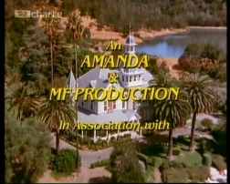
<a class="external" href="http://wikifoundrytools.com/wiki/closinglogos/widget/youtubevideo/f23e334e7bf72559e56550ac3629503ddaf3384c" rel="nofollow" target="_blank" title=", shockwave-flash@http://wikifoundrytools.com/wiki/closinglogos/widget/youtubevideo/f23e334e7bf72559e56550ac3629503ddaf3384c">
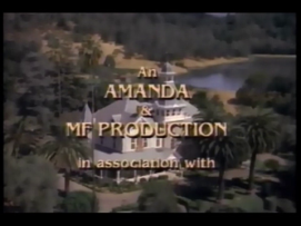
Logo: It's simply in-credit text against a shot of the Falcon Crest mansion (actually the mansion house of the Spring Mountain Winery) that said "An AMANDA & MF PRODUCTION in association with" (italicized until around late 1985), after it faded off the screen, the appropriate Lorimar Television or Lorimar-Telepictures logo.
Variant: In the Falcon Crest TV pilot called The Vintage Years, the in-credit text font is different and is placed on a background with mountains over a sunset.
FX/SFX: None.
Music/Sounds: It's simply the last notes of the Falcon Crest closing theme (which varies by season).
Availability: It's seen on Falcon Crest. The early variant is extinct as it was only seen in the TV pilot of Falcon Crest, which was only re-released when it was on AOL's In2TV website.
Editor's Note: None.
_______________________________________________________________
And Then...
(August 13, 2007-June 29, 2014)
Logo: We see a live action shot of a paper in close view, with the parts of a typewriter and shadows casting by them. The picture slowly zooms out. The clipper goes on, typing the company's name "andAnd Then... (2011) then...".
FX/SFX: The printing and shadows moving on the zoom.
Music/Sounds: The closing theme of the show.
Availability: It's seen on Californication.
Editor's Note: It's yet another logo involving typewriters, of which the concept is a bit overused.
_______________________________________________________________
Ashmont Productions
Background: Ashmont Productions is a production company founded by then husband-and-wife duo, William "Bill" Asher and Elizabeth Montgomery, who were working at Screen Gems for the hit '60s TV series Bewitched. It was founded in 1965 and was in-name-only in the beginning.
(September 15, 1971-April 24, 1976)
Logo: We have in-credit text that reads "An Ashmont Production".
Variants:
FX/SFX: None.
Music/Sounds: The end-title theme from any show.
Availability: Rare. It's only seen on the final season of Bewitched, the two short-lived series The Paul Lynde Show and The New Temperature's Rising Show, and on the 1976 pilot of Tabitha.
Editor's Note: None.
_______________________________________________________________
The Bedford Falls Company
Cardea-Schenck-Baskin-Shulman
(December 30, 1984-April 5, 1987)
Nicknames: "Fox with a Cigar", "Smoking Fox"
Logo: Against a gold background, a cartoon fox apparently wearing a hunting cap is seen on the left in a light blue circle smoking a cigar, the smoke of which is rising continuously (the cigar butt is also glowing). The names "CARDEA", "SCHENCK", "BASKIN", and "SHULMAN" are to the right, and they are stacked on top of each other, each succeeding name moved one space over to the left (this is all in gold). They are bracketed on top and bottom by two thick gold lines and two thin gold lines; thin outside, thick inside. "in association with" in lowercase is below. This is followed by the 1982 CPT logo w/Coke byline. The arrangement of this vanity card is thus:
in association with
Variant: On Still Crazy Like a Fox, the background is brown instead of gold, and it instead says:
and the same cartoon fox is seen below (but the smoke is not there and the cigar butt doesn't glow), with the "in association with" below that.
FX/SFX: The cartoon fox smoking the cigar, and the smoke rising therein. None on the 1987 version.
Music/Sounds: The last bars of the closing theme of Crazy Like a Fox.
Availability: It's seen on the CBS detective series Crazy Like a Fox, and on the 1987 reunion film Still Crazy Like A Fox.
Editor's Note: Note.
Chapman/Dial
(August 16, 1986-September 29, 1990)

Nicknames: "The Ostrich", "OH NO!", "Civil Defense Ostrich"
Logo: On a city skyline at night, a cartoon ostrich with blue feathers and wearing an army helmet is seen as it briefly looking at us before searchlights appear in the background and the ostrich looks at them. The ostrich then says "OH NO!" before putting his head into the ground and a blue metallic Civil Defense logo circle drops down from the sky, shaking the entire screen. The circle has a white triangle and inside the triangle is the red letters "CD" (standing for "civil defense"). At the beginning, "CHAPMAN/DIAL" in white fades in below.
Charles Burrows Charles Productions
(September 30, 1982-December 1993) Nickname: "American Typewriter"
Logo: On a static blue background, we see four words going from either left or right, meeting in the center. "CHARLES" goes first, then "BURROWS", afterwards "CHARLES", and finally "PRODUCTIONS" from top to bottom. All the text is set in ITC American Typewriter, which was popular at the time this logo debuted.
Variant: On The Tortellis and the short-lived 1986 sitcom All is Forgiven, the logo appears slightly enhanced. The word "COMPANY" fades in below after the names slide in.
FX/SFX: The text sliding in.
Music/Sounds: The end theme of the show.
Availability: Common.
Editor's Note: Everything about this logo is very cheap, particularly the animation, which wasn't that bad back then, but was still cheap back in the day.
_______________________________________________________________
(September 28, 1996- )
Nickname: "The Smoke"
Logo: On a shaded gray background, we see a picture of a '50s-era woman with her back turned sitting and smoking, and with a martini glass in her right hand. When the smoke grows, the words "DOROTHY PARKER DRANK HERE"Dorothy Parker Drank Here (2007) appears via shading, and then " P R O D U C T I O N S" surrounded by two lines.
FX/SFX: The smoke growing, and the shading; all computer effects.
Music/Sounds: The ending theme of the show.
Availability: It appears on Gilmore Girls (including the Netflix sequel, subtitled A Year in the Life) and Bunheads. Also seen in the shows Love and Marriage and The Return of Jezebel James.
Editor's Note: None.
_______________________________________________________________
Film in Florida
Film in Florida (2014)
(May 2, 2011- )
Nickname: "Florida"
Logo: On a white background, we see a drawing of the U.S. state of Florida. On the middle of the drawing, it says "film" and "florida.com" in blue, with ".com" smaller than the other words. In the middle of the two words, there is a tiny green circle in between that says "in" on it. On the left of "film", there is a yellow hand-drawn sun on the back of it.
FX/SFX: None.
Music/Sounds: None.
Availability: Current. It was first seen on the Latin American show Grachi and later on its English remake, Every Witch Way.
Editor's Note: None.
_______________________________________________________________
Flody Co.
Background: This is Flody Suarez's vanity company.
(September 17, 2002-May 18, 2004)
Nickname: "The Flody Dogs"
Logo: On a reddish-brown and black gradient background, we see two crudely-drawn squares, one blue and one gold. In the blue square, we see a drawing of a yellow Labrador. In the gold square, we see a chocolate Labrador with Vanity Cards - CLG Wikia blue collar. Underneath the squares, we see the words "FLODY CO." written in a jumbled stencil font in the colors you see here.
FX/SFX: None.
Music/Sounds: The end theme of the show or a generic ABC theme.
Availability: It can be seen on 8 Simple Rules until the end of the 2003-04 season, when Suarez left the show.
Editor's Note: None.
_______________________________________________________________
Four Sycamore
(June 1, 2011-October 22, 2014)
Logo: On a paper background, we see "FOUR SYCAMORE" in green, placed under four trees. There is the word "PRODUCTIONS" below.
Four Sycamore (2011)FX/SFX: None.
Music/Sounds: It's constant bird chirping.
Availability: This can be seen on Franklin & Bash.
Editor's Note: None.
_______________________________________________________________
 Vanity Cards - CLG Wiki[Television Vanity Cards/widget/youtubevideo/2078247676|//wikifoundrytools.com/wiki/closinglogosVarious Television Vanity Cards/widget/youtubevideo/2078247676]
Nicknames: "Guy Falling Off Roof", "Fall of Doom", "GSM", "AAAAHHHHHHHH!"
Logo: We see an old house at night. An insane-looking man walking on the left side of the roof stumbles and falls two stories into some bushes below. Superimposed on the screen is:
The logo then cuts to the current Warner Bros. Television logo of the time.
Trivia: From Steve Marshall, writer/producer of Growing Pains:
Variants:
Logo captures by Eric S., V of Doom, bmasters9, Pygmalion X, TheEriccorpinc, and others
Editions by V of Doom, mr3urious, Shadeed A. Kelly, shnick1985, TrickyMario7654, indycar, bmasters9, and edunk5
Video captures courtesy of TheEriccorpinc and others
Notes:
- 0-9 and A-G production company names will be HERE.
- H-M production company names will be on Part 2.
- N-R production company names will be on Part 3.
- S-Z production company names will be on Part 4.
- If a company has more than one logo description, please give it its own page.
Adam F. Goldberg Productions
(April 6, 2011- )
<iframe align="right" frameborder="0" height="184" src="http://wikifoundrytools.com/wiki/closinglogos/widget/genericvideo/01dae06a9a045e55481f23714e5a6c1491b7f139" width="332"></iframe>
Logo: On a blue background, we see a childhood photo of Adam Goldberg (a different one each episode), with the words "Adam F. Goldberg Productions" below in white.
Variant: On The Goldbergs episode "12 Tapes for a Penny", the company name is "David Hull Productions" (a joke as the episode revolves around the in show Adam discovering and starting to use fake identities).
FX/SFX: None.
Music/Sounds: None.
Availability: Current. It's first seen on Breaking In. Currently seen on The Goldbergs. It was also seen on the short-lived series Imaginary Mary.
Editor's Note: None.
_______________________________________________________________
Music/Sounds: None.
Availability: Current. It's first seen on Breaking In. Currently seen on The Goldbergs. It was also seen on the short-lived series Imaginary Mary.
Editor's Note: None.
_______________________________________________________________
Adelson/Baumgarten Productions
(April 17-24, 1992)
<iframe align="right" frameborder="0" height="171" src="http://wikifoundrytools.com/wiki/closinglogos/widget/genericvideo/84552829849183a28868983c8c4b422ae418c6c4" width="302"></iframe>
Logo: On a black background, we see the yellow outlined letters connected each other, "A", "B", and"P". Then the words appear "ADELSON" and "BAUMGARTEN PRODUCTIONS"as everything changing and flashing colors rapidly, then back to normal.
FX/SFX: The background changing colors rapidly.
Music/Sounds: TBA
Availability: It's only seen on The Fifth Corner.
Editor's Note: TBA
_______________________________________________________________
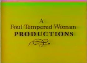
A Foul Tempered Woman Productions
Background: This was the vanity card of Katherine Green, executive producer of the short-lived 1992 Fox comedy Rachel Gunn, R.N.
(June 28-September 4, 1992)

Nickname: "The Grumbling Woman"
Logo: On a gold background, the words "A Foul Tempered Woman" fade in (in upper and lower case), and then "PRODUCTIONS" fades in below that (in all caps). A squiggly curve design with an arrow on the end then fades in and completes its run. An animated woman's arm with a long-sleeve gray dress (the hand has extremely long red fingernails, and there is a red ring on the fourth finger) then reaches up to the top right-hand corner of the screen to rip that background away, revealing the then-current (1991-93) version of the Columbia Pictures Television Torch Lady underneath it (either with the "IAW" text above in the first seven episodes or nothing above for the remainder of the show).
FX/SFX: The words fading in, and the animation on the arrow and the lady's hand pulling the background off.
Music/Sounds: A short piano tune plays as the logo forms, then an angry woman's voice, and the sound of paper being crumpled as the the woman rips the background away.
Availability: Extinct, as it was only seen on the 1992 Fox sitcom called Rachel Gunn, R.N.
Editor's Note: The hand appearing could startle some. The logo does a great job blending the CPT logo into it, but the later variant ruins the effect, as there's nothing underneath the background for a few frames before the CPT logo suddenly appears.
_________________________________________________________________________________
Aggressive Mediocrity, Inc.
1st Logo
(August 13, 2007-June 29, 2014)
Logo: On a black background, full of washed white particles, "AGGRESSIVE MEDIOCRITY INC." is shown in a hasty barbaric font.
Aggressive Mediocrity (2011)<a class="external" href="http://wikifoundrytools.com/wiki/closinglogos/widget/youtubevideo/e402043dc14a06aabfa336cdad6bb05e7798f983" rel="nofollow" target="_blank" title=", shockwave-flash@http://wikifoundrytools.com/wiki/closinglogos/widget/youtubevideo/e402043dc14a06aabfa336cdad6bb05e7798f983">
</a>
Logo: On a black background, full of washed white particles, "AGGRESSIVE MEDIOCRITY INC." is shown in a hasty barbaric font.
FX/SFX: None.
Music/Sounds: Just the closing theme of the show.
Availability: It's seen on Californication.
Editor's Note: The darkness of the logo and ugly font may get to some.This looks like something you would see scratched into a bathroom stall.
Music/Sounds: Just the closing theme of the show.
Availability: It's seen on Californication.
Editor's Note: The darkness of the logo and ugly font may get to some.This looks like something you would see scratched into a bathroom stall.
2nd Logo
(October 15, 2017- )
<iframe align="right" frameborder="0" height="186" src="http://wikifoundrytools.com/wiki/closinglogos/widget/genericvideo/8c4626c67cb78c8758ec34f57ed344f3dabea870" width="338"></iframe>
Logo: We see a pug wearing Santa's hat while it looks at us. The words read on the hat "Aggressive Mediocrity, Inc." in Brush Script.
FX/SFX: None.
Music/Sounds: Just the sound of the pug barking one time.
Availability: It's seen on White Famous.
Editor's Note: None.
_______________________________________________________________
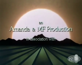
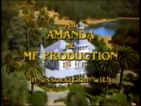
Amanda & MF Productions
Background: Amanda Productions was the production company of Earl Hamner, Jr., creator of The Waltons and Falcon Crest, and MF Productions was the vanity label of executive producer Michael Filerman, and was known both for solo production of the 1980 to 1982 NBC series Flamingo Road and joint production (with Roundelay, vanity card of David Jacobs) of the 1979 to 1993 CBS series Knots Landing. Meanwhile, Amanda Productions was credited on The Waltons.
_______________________________________________________________
Amanda & MF Productions
Background: Amanda Productions was the production company of Earl Hamner, Jr., creator of The Waltons and Falcon Crest, and MF Productions was the vanity label of executive producer Michael Filerman, and was known both for solo production of the 1980 to 1982 NBC series Flamingo Road and joint production (with Roundelay, vanity card of David Jacobs) of the 1979 to 1993 CBS series Knots Landing. Meanwhile, Amanda Productions was credited on The Waltons.
(December 4, 1981-May 18, 1990)
 Amanda-MF Falcon Crest"


<a class="external" href="http://wikifoundrytools.com/wiki/closinglogos/widget/youtubevideo/f23e334e7bf72559e56550ac3629503ddaf3384c" rel="nofollow" target="_blank" title=", shockwave-flash@http://wikifoundrytools.com/wiki/closinglogos/widget/youtubevideo/f23e334e7bf72559e56550ac3629503ddaf3384c">
</a><embed align="bottom" allowfullscreen="true" height="202" src="http://wikifoundrytools.com/wiki/closinglogos/widget/youtubevideo/f23e334e7bf72559e56550ac3629503ddaf3384c" type="application/x-shockwave-flash" width="247" wmode="transparent"/>
Logo: It's simply in-credit text against a shot of the Falcon Crest mansion (actually the mansion house of the Spring Mountain Winery) that said "An AMANDA & MF PRODUCTION in association with" (italicized until around late 1985), after it faded off the screen, the appropriate Lorimar Television or Lorimar-Telepictures logo.
Variant: In the Falcon Crest TV pilot called The Vintage Years, the in-credit text font is different and is placed on a background with mountains over a sunset.
FX/SFX: None.
Music/Sounds: It's simply the last notes of the Falcon Crest closing theme (which varies by season).
Availability: It's seen on Falcon Crest. The early variant is extinct as it was only seen in the TV pilot of Falcon Crest, which was only re-released when it was on AOL's In2TV website.
Editor's Note: None.
_______________________________________________________________
And Then...
(August 13, 2007-June 29, 2014)
FX/SFX: The printing and shadows moving on the zoom.
Music/Sounds: The closing theme of the show.
Availability: It's seen on Californication.
Editor's Note: It's yet another logo involving typewriters, of which the concept is a bit overused.
_______________________________________________________________
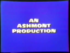
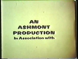
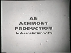
Ashmont Productions
Background: Ashmont Productions is a production company founded by then husband-and-wife duo, William "Bill" Asher and Elizabeth Montgomery, who were working at Screen Gems for the hit '60s TV series Bewitched. It was founded in 1965 and was in-name-only in the beginning.
(September 15, 1971-April 24, 1976)


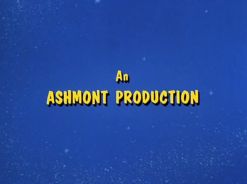
Logo: We have in-credit text that reads "An Ashmont Production".
Variants:
- On The Paul Lynde Show, one variant has the text in yellow and is on a purple background that reads:
AN
ASHMONT
PRODUCTION
ASHMONT
PRODUCTION
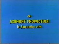
- Another variant exists with the text in brown and appears on a yellow background with the text "In Association with" below.
AN
ASHMONT
PRODUCTION
In Association with
ASHMONT
PRODUCTION
In Association with
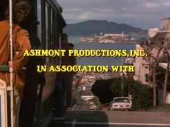
- On the 1976 pilot of Tabitha, the text reads:
ASHMONT PRODUCTIONS, INC.
IN ASSOCIATION WITH
FX/SFX: None.
Music/Sounds: The end-title theme from any show.
Availability: Rare. It's only seen on the final season of Bewitched, the two short-lived series The Paul Lynde Show and The New Temperature's Rising Show, and on the 1976 pilot of Tabitha.
Editor's Note: None.
_______________________________________________________________
The Bedford Falls Company
Background: The Bedford Falls Company is the production company of Marshall Herskovitz and Edward Zwick.
(July 3, 1987- )
Nicknames: "The House", "The Creepy House"
Logo: On a black background is a black-and-white sketch of George Bailey's house (a 19th century 2-story house) connected on the left to a black filmstrip with a white shadow. It is snowing outside. The text "THE BEDFORD FALLS COMPANY" fades in below. A light goes on in the top left window of the house. The text "in association with" fades in at the bottom of the logo. Sometimes, the words "in association with" are omitted.
Trivia: This logo is a homage to the movie It's a Wonderful Life. Bedford Falls was the name of the town in this movie, and the house belongs to the main character, George Bailey. The logo's music is also a homage to the movie; George and Mary sing the song while arriving home from the pool at the high school reunion party.
Variants:
FX/SFX: The text appearing and the light being turned on in a room on the second floor.
Music/Sounds: A man and woman slowly sing the last line of the traditional song "Buffalo Gals" -- "...aaaand dance by the light of the moooon." (A recording of "Buffalo Gals" can be heard in It's a Wonderful Life.) The early variant had a short piano ditty (which is based on the theme of the show). NBC and later ABC airings use its generic theme.
Availability:
Editor's Note: This logo has creeped out some people due to the dark atmosphere and the singing. Nonetheless, it shouldn't harm anybody else, and it is a pretty unique logo.
_______________________________________________________________
B&E Enterprises
Background: This logo is the vanity card logo from Brad Buckner and Eugene Ross Leming, the creators and original executive producers of Scarecrow and Mrs. King.

<iframe frameborder="0" height="167" src="http://wikifoundrytools.com/wiki/closinglogos/widget/unknown/50adb3ee9e5d1491572ad4661944a09869af05c1" width="211"></iframe><iframe frameborder="0" height="167" src="http://wikifoundrytools.com/wiki/closinglogos/widget/unknown/d531194e1429ee89a52d61fac4d1c92a1b2ff694" width="211"></iframe>
Nicknames: "The House", "The Creepy House"
Logo: On a black background is a black-and-white sketch of George Bailey's house (a 19th century 2-story house) connected on the left to a black filmstrip with a white shadow. It is snowing outside. The text "THE BEDFORD FALLS COMPANY" fades in below. A light goes on in the top left window of the house. The text "in association with" fades in at the bottom of the logo. Sometimes, the words "in association with" are omitted.
Trivia: This logo is a homage to the movie It's a Wonderful Life. Bedford Falls was the name of the town in this movie, and the house belongs to the main character, George Bailey. The logo's music is also a homage to the movie; George and Mary sing the song while arriving home from the pool at the high school reunion party.
Variants:
- On this variant, the logo is still, and in a bright-blue color, as well as the text.
- On later series, the house has shrunken, and the text is in a different, bigger font.
FX/SFX: The text appearing and the light being turned on in a room on the second floor.
Music/Sounds: A man and woman slowly sing the last line of the traditional song "Buffalo Gals" -- "...aaaand dance by the light of the moooon." (A recording of "Buffalo Gals" can be heard in It's a Wonderful Life.) The early variant had a short piano ditty (which is based on the theme of the show). NBC and later ABC airings use its generic theme.
Availability:
- It was seen on the shows Once and Again, Thirtysomething, My So-Called Life, and Quarterlife.
- It's most recently seen on season 5 of Nashville.
- The early variant is extinct and was seen on the unsold pilot Sawdust when CBS aired it as part of the CBS Summer Playhouse in 1987.
- Don't expect to see this on the company's movies.
Editor's Note: This logo has creeped out some people due to the dark atmosphere and the singing. Nonetheless, it shouldn't harm anybody else, and it is a pretty unique logo.
_______________________________________________________________
B&E Enterprises
Background: This logo is the vanity card logo from Brad Buckner and Eugene Ross Leming, the creators and original executive producers of Scarecrow and Mrs. King.
(October 3, 1983-December 29, 1986)
Nickname: "Zooming B&E"
Logo: On a dark background, we see a yellow circle zooming in with the words "B&E" in a large script font, and under it is "Enterprises Ltd." and two crossed yellow feathers.
FX/SFX: The zooming of the logo.
Variant: On the first 11 episodes of the 1st season of Scarecrow and Mrs. King, this also has an "In Association With" byline, meaning it will either fade or cut to a WBTV logo.
Music/Sounds: The end theme of the show.
Availability: Ultra-rare. It only produced two television movies, like The Cartier Affair. It also appeared at the end of the first 11 episodes of the first season of Scarecrow and Mrs. King, preceding a WBTV logo.
Editor's Note: The zooming looks cheesy, but nothing too out there.
_______________________________________________________________
The Black/Marlens Company
Background: This is Carol Black and Neal Marlens' production company.
(January 31, 1988-July 22, 1998)
Nicknames: "The Marlin", "The Animated Scribble"
Logo: We see a white background with a black rectangle. Inside the black rectangle, it says "The Black/Marlens Company". On the white background is the CGI animation which makes a black scribble on the background like paper and a pen. The scribble resembles a marlin fish.
Black-Marlens Company (1992)
FX/SFX: The marlin drawing.
Music/Sounds: A fantasy-oriented synthesizer fanfare, or the end theme of the show.
Availability: It appears on The Wonder Years. This also seen on the Corey Feldman special Corey Feldman's Hats Off and Ellen, the 1992-1993 ABC sitcom Laurie Hill, among others.
Editor's Note: None.
_______________________________________________________________
Bob Booker Productions
(September 17, 1987-May 25, 1991)
Logo: Against a starry space background, two hands come in from each side of the screen. The hands touch the tips of their index fingers together, creating a pink/purple spark between them. The hands then leave, and a gray globe with a diagonal ring around it zooms in from the spark. The words “BOB BOOKER PRODUCTIONS” are imposed on the globe in purple with "B" and "R" in "BOOKER" bigger and with "BOB" above and "PRODUCTIONS" below "BOOKER" respectively.
Trivia: This logo was based on the main title of the series Out of This World.
FX/SFX: The hands forming the logo.
Music/Sounds: A whooshing sound and a twinkling sort of sound, or the closing theme of Out of This World.
Availability: Extinct. This logo was only on the show Out of This World.
Editor's Note: The whole logo is pretty cheesy-looking. The hands coming onto the screen and the quickly zooming globe will probably make a few people jittery.
FX/SFX: The marlin drawing.
Music/Sounds: A fantasy-oriented synthesizer fanfare, or the end theme of the show.
Availability: It appears on The Wonder Years. This also seen on the Corey Feldman special Corey Feldman's Hats Off and Ellen, the 1992-1993 ABC sitcom Laurie Hill, among others.
Editor's Note: None.
_______________________________________________________________
Bob Booker Productions
(September 17, 1987-May 25, 1991)
Bob Booker Productions<a class="external" href="http://wikifoundrytools.com/wiki/closinglogos/widget/youtubevideo/eeca02f1ac9456b070f3222d04071a77a3e3ad2c" rel="nofollow" target="_blank" title=", shockwave-flash@http://wikifoundrytools.com/wiki/closinglogos/widget/youtubevideo/eeca02f1ac9456b070f3222d04071a77a3e3ad2c">
</a><embed align="bottom" allowfullscreen="true" height="178" src="http://wikifoundrytools.com/wiki/closinglogos/widget/youtubevideo/eeca02f1ac9456b070f3222d04071a77a3e3ad2c" type="application/x-shockwave-flash" width="217" wmode="transparent"/>
Logo: Against a starry space background, two hands come in from each side of the screen. The hands touch the tips of their index fingers together, creating a pink/purple spark between them. The hands then leave, and a gray globe with a diagonal ring around it zooms in from the spark. The words “BOB BOOKER PRODUCTIONS” are imposed on the globe in purple with "B" and "R" in "BOOKER" bigger and with "BOB" above and "PRODUCTIONS" below "BOOKER" respectively.
Trivia: This logo was based on the main title of the series Out of This World.
FX/SFX: The hands forming the logo.
Music/Sounds: A whooshing sound and a twinkling sort of sound, or the closing theme of Out of This World.
Availability: Extinct. This logo was only on the show Out of This World.
Editor's Note: The whole logo is pretty cheesy-looking. The hands coming onto the screen and the quickly zooming globe will probably make a few people jittery.
_______________________________________________________________
Brad Falchuk Teley-Vision
(September 21, 2010- )
Logo: We see a first person view of a path carved through grass leading to a ocean shore. The words "BRAD FALCHUK TELEY-VISION" are superimposed on the image in a faint white font.Brad Falchuk Teley-Vision (2010)
FX/SFX: None.
Music/Sounds: None.
Availability: This is seen on Glee, beginning with season 2. Also appears on American Horror Story.
Editor's Note: None.
_______________________________________________________________
Cardea-Schenck-Baskin-Shulman
(December 30, 1984-April 5, 1987)
Schenck/Cardea Productions (1987)Cardea-Schenck-Baskin-Shulman<a class="external" href="http://wikifoundrytools.com/wiki/closinglogos/widget/youtubevideo/9f3967c92e4501beea4653288f3d3ac8cfbebb8a" rel="nofollow" target="_blank" title=", shockwave-flash@http://wikifoundrytools.com/wiki/closinglogos/widget/youtubevideo/9f3967c92e4501beea4653288f3d3ac8cfbebb8a">
</a><embed allowfullscreen="true" height="174" src="http://wikifoundrytools.com/wiki/closinglogos/widget/youtubevideo/9f3967c92e4501beea4653288f3d3ac8cfbebb8a" type="application/x-shockwave-flash" width="213" wmode="transparent"/>
Nicknames: "Fox with a Cigar", "Smoking Fox"
Logo: Against a gold background, a cartoon fox apparently wearing a hunting cap is seen on the left in a light blue circle smoking a cigar, the smoke of which is rising continuously (the cigar butt is also glowing). The names "CARDEA", "SCHENCK", "BASKIN", and "SHULMAN" are to the right, and they are stacked on top of each other, each succeeding name moved one space over to the left (this is all in gold). They are bracketed on top and bottom by two thick gold lines and two thin gold lines; thin outside, thick inside. "in association with" in lowercase is below. This is followed by the 1982 CPT logo w/Coke byline. The arrangement of this vanity card is thus:
CARDEA
SCHENCK
BASKIN
SHULMAN
SCHENCK
BASKIN
SHULMAN
in association with
Variant: On Still Crazy Like a Fox, the background is brown instead of gold, and it instead says:
A
SCHENCK/CARDEA
PRODUCTION
SCHENCK/CARDEA
PRODUCTION
and the same cartoon fox is seen below (but the smoke is not there and the cigar butt doesn't glow), with the "in association with" below that.
FX/SFX: The cartoon fox smoking the cigar, and the smoke rising therein. None on the 1987 version.
Music/Sounds: The last bars of the closing theme of Crazy Like a Fox.
Availability: It's seen on the CBS detective series Crazy Like a Fox, and on the 1987 reunion film Still Crazy Like A Fox.
Editor's Note: Note.
_______________________________________________________________
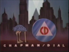
Chapman/Dial
(August 16, 1986-September 29, 1990)


<iframe align="bottom" frameborder="0" height="186" src="http://wikifoundrytools.com/wiki/closinglogos/widget/genericvideo/1e97033cfd4ee46c1b204d3ea8efb8a207e18c7d" width="329"></iframe>
Nicknames: "The Ostrich", "OH NO!", "Civil Defense Ostrich"
Logo: On a city skyline at night, a cartoon ostrich with blue feathers and wearing an army helmet is seen as it briefly looking at us before searchlights appear in the background and the ostrich looks at them. The ostrich then says "OH NO!" before putting his head into the ground and a blue metallic Civil Defense logo circle drops down from the sky, shaking the entire screen. The circle has a white triangle and inside the triangle is the red letters "CD" (standing for "civil defense"). At the beginning, "CHAPMAN/DIAL" in white fades in below.
FX/SFX: The ostrich, and the Civil Defense logo falling down.
Variant: The last episode of E.A.R.T.H. Force that aired has "in association with" fading in below the company name.
Music/Sounds: An air raid siren is heard when the searchlights appear, the ostrich saying his line, and then a "CRASH!" is heard when the Civil Defense circle drops down.
Availability: Extremely rare. It's seen on the failed ABC pilot, The Rowdies and the short-lived CBS series E.A.R.T.H. Force.
Editor's Note: The Civil Defense logo dropping down so suddenly and the siren may scare some, but it's a funny logo.
_______________________________________________________________
(September 30, 1982-December 1993)
Logo: On a static blue background, we see four words going from either left or right, meeting in the center. "CHARLES" goes first, then "BURROWS", afterwards "CHARLES", and finally "PRODUCTIONS" from top to bottom. All the text is set in ITC American Typewriter, which was popular at the time this logo debuted.
Variant: On The Tortellis and the short-lived 1986 sitcom All is Forgiven, the logo appears slightly enhanced. The word "COMPANY" fades in below after the names slide in.
FX/SFX: The text sliding in.
Music/Sounds: The end theme of the show.
Availability: Common.
- It's found intact on all episodes of Cheers on WGN America, Hallmark Channel, and Me-TV, as well as on DVD and VHS releases of said show.
- This was also seen on The Tortellis and the short-lived 1986 sitcom All is Forgiven when A&E last reran that show in the late 1980s.
- It was also spotted in a 1993 unaired TV pilot Gloria Vane.
Editor's Note: Everything about this logo is very cheap, particularly the animation, which wasn't that bad back then, but was still cheap back in the day.
_______________________________________________________________
Circus King Productions
Background: This is the vanity card of Louis CK, the star of Lucky Louie.
(June 11-August 27, 2006)
Logo: On a black background, we see a white circle containing a drawing of a king with his arms stretched out. "Circus King" and "Productions" are shown above and below the logo, respectively, curving around the king.
FX/SFX: None.
Music/Sounds: The end theme of Lucky Louie.
Availability: Extremely rare. It was only seen on the short-lived Lucky Louie.
Editor's Note: None.
______________________________________________________________
Cosmos Studios
(March 9-June 8, 2014)
Background: This is the vanity card of Louis CK, the star of Lucky Louie.
(June 11-August 27, 2006)
FX/SFX: None.
Music/Sounds: The end theme of Lucky Louie.
Availability: Extremely rare. It was only seen on the short-lived Lucky Louie.
Editor's Note: None.
______________________________________________________________
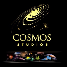
Cosmos Studios
(March 9-June 8, 2014)

Logo: The logo starts out by fading in the word Cosmos, the Spiral Galaxy and the dandelion seedling all in gold in a black backdrop. During the beginning of showing the company's logo, we see two thin gold lines below the Cosmos font moving horizontally in opposite direction with a dark void in between the two lines. This dark void creates a header that would showcase the show in nutshell with numerous objects (a comet, several satellite radar dishes, the moon, Earth, Saturn, Mercury, maple leaf, the Sun, Supernova, etc.). After the text, spiral galaxy, and the seedling are shown, and the picture header is created by the two lines, we see stars blink like paparazzi in the galaxy while it's rotating slightly, we see the seedling drifting slightly while twinkling, the letters shining slightly and the lines rocking gently back and forth.
FX/SFX: The spiral galaxy rotating slightly while the stars are blinking, the dandelion seedling drifting slightly while blinking, and the lines rocking back and forth gently.
Music/Sounds: The sounds of the sea or ocean and seagulls chirping in the background.
Availability: It's seen on Cosmos: A Spacetime Odyssey.
Editor's Note: None. It's a soothing logo.
_____________________________________________________________
Dorothy Parker Drank Here Productions
Background: This is a production company founded by Gilmore Girls creator, Amy Sherman-Palladino in 1996. She named her production company in tribute to a deceased writer/poet Dorothy Parker.
Editor's Note: None. It's a soothing logo.
_____________________________________________________________
Dean Georgaris Entertainment
Background: This is Dean Georgaris' production company.
(September 23, 2019- )
Background: This is Dean Georgaris' production company.
(September 23, 2019- )
Logo: On a room, we see a laptop. Inside the laptop is a transparent typewriter. Over the typewriter is the stacked words "DEAN GEORGARIS ENTERTAINMENT" in a brown Gotham font and next to it was a brown square with "2.0" in white. The logo slowly zooms in.
FX/SFX: The slow zoom in.
Music/Sounds: The end theme of the show, or a NBC generic theme.
Availability: Seen on Bluff City Law.
Editor's Note: None.
Music/Sounds: The end theme of the show, or a NBC generic theme.
Availability: Seen on Bluff City Law.
Editor's Note: None.
_______________________________________________________________
Background: This is a production company founded by Gilmore Girls creator, Amy Sherman-Palladino in 1996. She named her production company in tribute to a deceased writer/poet Dorothy Parker.
(September 28, 1996- )
Nickname: "The Smoke"
Logo: On a shaded gray background, we see a picture of a '50s-era woman with her back turned sitting and smoking, and with a martini glass in her right hand. When the smoke grows, the words "DOROTHY PARKER DRANK HERE"Dorothy Parker Drank Here (2007) appears via shading, and then " P R O D U C T I O N S" surrounded by two lines.
FX/SFX: The smoke growing, and the shading; all computer effects.
Music/Sounds: The ending theme of the show.
Availability: It appears on Gilmore Girls (including the Netflix sequel, subtitled A Year in the Life) and Bunheads. Also seen in the shows Love and Marriage and The Return of Jezebel James.
Editor's Note: None.
_______________________________________________________________
Film in Florida
Film in Florida (2014)
(May 2, 2011- )
Nickname: "Florida"
Logo: On a white background, we see a drawing of the U.S. state of Florida. On the middle of the drawing, it says "film" and "florida.com" in blue, with ".com" smaller than the other words. In the middle of the two words, there is a tiny green circle in between that says "in" on it. On the left of "film", there is a yellow hand-drawn sun on the back of it.
FX/SFX: None.
Music/Sounds: None.
Availability: Current. It was first seen on the Latin American show Grachi and later on its English remake, Every Witch Way.
Editor's Note: None.
_______________________________________________________________
Flody Co.
Background: This is Flody Suarez's vanity company.
(September 17, 2002-May 18, 2004)
Nickname: "The Flody Dogs"
Logo: On a reddish-brown and black gradient background, we see two crudely-drawn squares, one blue and one gold. In the blue square, we see a drawing of a yellow Labrador. In the gold square, we see a chocolate Labrador with Vanity Cards - CLG Wikia blue collar. Underneath the squares, we see the words "FLODY CO." written in a jumbled stencil font in the colors you see here.
FX/SFX: None.
Music/Sounds: The end theme of the show or a generic ABC theme.
Availability: It can be seen on 8 Simple Rules until the end of the 2003-04 season, when Suarez left the show.
Editor's Note: None.
_______________________________________________________________
Four Sycamore
(June 1, 2011-October 22, 2014)
Logo: On a paper background, we see "FOUR SYCAMORE" in green, placed under four trees. There is the word "PRODUCTIONS" below.
Four Sycamore (2011)FX/SFX: None.
Music/Sounds: It's constant bird chirping.
Availability: This can be seen on Franklin & Bash.
Editor's Note: None.
_______________________________________________________________
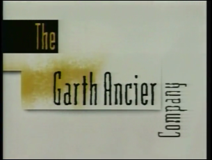
The Garth Ancier Company
(September 13, 1993-May 21, 2004)

Logo: On a white background, a yellow airbrushed patch that covers a majority of the screen pans out to the bottom left. As this happens, a black rectangle moves from the top right passing by. "Garth Ancier" in the same color as the background falls from the top and passes the rectangle. After that, it changes into the rectangle's color before stopping in the middle. The rectangle stops at the left where "The" appears by wiping down matching the patch's color. A shape that combines a large rectangle and a small rectangle is formed around "Garth Ancier" and the patch where some of it fades away. "Company" appears sideways next to it also in black.
FX/SFX: The panning and the formation.
Music/Sounds: The ending theme.
Availability: Extinct. It's only seen on Ricki Lake, which like most other talk shows never reruns after their original broadcast.
Editor's Note: The text is very crooked and shriveled. Also, the patch looks like someone had urinated on the background.
_______________________________________________________________
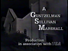
Guntzelman-Sullivan-Marshall Productions
(April 26, 1988-April 24, 1991)
Guntzelman-Sullivan-Marshall Productions
(April 26, 1988-April 24, 1991)
 Vanity Cards - CLG Wiki[Television Vanity Cards/widget/youtubevideo/2078247676|//wikifoundrytools.com/wiki/closinglogosVarious Television Vanity Cards/widget/youtubevideo/2078247676]
Nicknames: "Guy Falling Off Roof", "Fall of Doom", "GSM", "AAAAHHHHHHHH!"
Logo: We see an old house at night. An insane-looking man walking on the left side of the roof stumbles and falls two stories into some bushes below. Superimposed on the screen is:
A
Guntzelman
Sullivan
----Marshall
_________________
P R O D U C T I O N
P R O D U C T I O N
in association with
The logo then cuts to the current Warner Bros. Television logo of the time.
Trivia: From Steve Marshall, writer/producer of Growing Pains:
- "Here's the story behind this logo. We had done a fantasy sequence on Growing Pains involving Ben in a 'war movie' setting. He was on a walkie talkie saying they were down to six men. At that moment, a guy is shot and falls off the roof of an old church behind him. He says into the walkie-talkie, "Make that five men". We had another camera closer in on the stunt man's dive and decided to use that footage for our logo. As I recall, the scream was mine".
- Additionally, you can see what appears to be smoke at the right side of the screen, and as he falls, something comes loose and falls off, while another object hangs off the roof.
Variants:
- An early version exists that has the logo in a different font and the word "Production" placed on the bottom of the screen, above the text "in association with".
- On the Growing Pains Halloween Special, the logo uses a different yelling soundbite accompanied with a comical "falling" sound effect and a thud for when the man falls into the bushes. The theme the logo usually plays over is replaced by crickets chirping.
FX/SFX: It's all live-action.
Music/Sounds: The sound of the guy falling off the roof yelling "AAAAAAAHHHHH!" as he falls playing over the closing theme of the show from Growing Pains and Just the Ten of Us. On what may be syndicated prints, a man or a woman voice-over is heard during the logos: "Growing Pains is a Guntzelman-Sullivan-Marshall Production in association with Warner Bros. Television, and is distributed by Warner Bros. Domestic Television Distribution."
Availability:
Editor's Note: The dark image and the scary-looking man falling off the roof may probably give more than a few the creeps, but those who enjoy black comedy may find this logo hilarious.
Music/Sounds: The sound of the guy falling off the roof yelling "AAAAAAAHHHHH!" as he falls playing over the closing theme of the show from Growing Pains and Just the Ten of Us. On what may be syndicated prints, a man or a woman voice-over is heard during the logos: "Growing Pains is a Guntzelman-Sullivan-Marshall Production in association with Warner Bros. Television, and is distributed by Warner Bros. Domestic Television Distribution."
Availability:
- It's seen on Growing Pains and Just the Ten of Us.
- The Halloween variant is on the Growing Pains Halloween Special.
- The voice-over variation is on syndicated prints of seasons 5 and 6 of Growing Pains.
Editor's Note: The dark image and the scary-looking man falling off the roof may probably give more than a few the creeps, but those who enjoy black comedy may find this logo hilarious.