The Program Exchange
Jump to navigation
Jump to search
Logo descriptions by Jeffrey Gray
Logo captures by V of Doom, Juniorfan88, and snelfu
Editions by V of Doom, Hoa, Juniorfan88, Nathan B., and edunk5
Video captures courtesy of JohnnyL80, mcydodge919, and GDelva2003
Background: In 1979, DFS Program Exchange was formed and founded by Dancer Fitzgerald Sample, more commonly known as "DFS", which was a top-tier Madison Avenue-based company. DFS was renamed "DFS-Dorland" in 1986, and in 1987, the company was acquired by "Saatchi & Saatchi", who took the "DFS-Dorland" out of the company's name (although "DFS" would continue to be listed in their logo until 1993). Ever since 1979, the Program Exchange has been a "barter company", trading shows with TV stations in "exchange" (pun intended) for the stations to run ads for DFS/Saatchi & Saatchi clients such as General Mills, allowing even low-budget stations to air them. In 2008, the Program Exchange was acquired by ZenithOptimedia, itself owned by the French media corporation Publicis Groupe S.A. In 2016, the company's website shut down, and it's presumed the company went defunct. The shutdown of the site coincided with Comcast's purchase of DreamWorks Animation (which included DreamWorks Classics, a major client for TPE).
DFS Program Exchange
(Early-Mid 80s-1986)
 <iframe frameborder="0" height="167" src="http://wikifoundrytools.com/wiki/closinglogos/widget/genericvideo/5e4e9712a3b00c22c191c686b532715570093e78" width="220"></iframe>
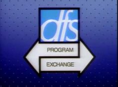
Nicknames: "The Arrows", "Crossing Arrows", "The DFS Arrows"
Logo: Against a black background, a silver outline of the italic lowercase letters "dfs" inside a box streaks out toward the top center of the screen, increasing in brightness and then receding. As the tail end of the streak recedes, a graphic fades in of the letters in white inside a black box with a light-blue fill, on a light-to-dark blue gradient background with a pattern of dark-to-light blue dots. Afterwards, two white arrows with black outlines and off-center tails come from opposite sides of the screen. The arrow coming from the right reads "PROGRAM", points left, and has a tail shifted up; the arrow coming from the left reads "EXCHANGE", points right, and has a tail shifted down. The two arrows cross over each other and lock into position, as the DFS symbol shines.
FX/SFX: Streak photography and backlit shining effects, and the sliding arrows.
Music/Sounds: A very-loud high pitch synthesizer sound, then goes into sounding like an alarm.
Availability: Ultra rare. It appeared on 1980s syndicated prints of Bewitched, I Dream of Jeannie, and The Abbott and Costello Show, as well as the 1986 Dennis the Menace cartoon, including 2007 broadcasts on Boomerang. It is intact on most of the episodes on the DVD Dennis the Menace: Trouble, Trouble Everywhere!.
Editor's Note: This is a diverse mix of both excellent and rough quality. The streak photography and backlit shining effects are very good, but the sliding arrows' sequence looks quite cheap. Some may be startled by the loud synthesizer music, but it's nothing too shocking.
__________________________________________________________________________________________________________________
DFS-Dorland Program Exchange
(1986-1987)
 <iframe frameborder="0" height="186" src="http://wikifoundrytools.com/wiki/closinglogos/widget/youtubevideo/27751b2d03d88e545ae0f4a6c61f606b691d5ea3" width="330"></iframe>
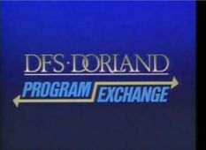
Nicknames: "The Arrows II", "Crossing Arrows II", "The Dorland Crossing Arrow Logo"
Logo: Against a blue/black gradient background, we see "DFS-DORLAND", rendered in a style resembling Goudy Old Style in silver, and with the "D" and "O" and the "L" and "A" linked together zoom in from the bottom of the screen and position itself above the center of the screen in a "light trail" effect. Immediately afterwards, the word "PROGRAM ", featuring a yellow arrow below it, and the word "EXCHANGE ", featuring a yellow arrow beneath it, cross from opposite sides at the screen's bottom. Both words are in a light blue italicized Impact font. The two arrows join by way of a diagonal line in between the words, and the finished arrow flashes briefly. A horizontal line draws itself underneath "DFS-DORLAND" from left to right via a sparkle, and when it's finished, the letters in "DFS-DORLAND" shine.
FX/SFX: The zooming and shining.
Music/Sounds: Same as the first logo, but softer on the volume and heavier on the bass.
Availability: Extremely rare. This logo was very short-lived (only used for one year, from 1986-1987). It appeared on Dennis the Menace episodes of this era, as well as on a VHS tape of the cartoon version of Dennis the Menace from the '80s. The logo can be found on one episode, "Dennis in Venice", on the DVD Dennis the Menace: Trouble, Trouble Everywhere! (the rest of the episodes end with the 1st logo).
Editor's Note: An overall improvement over the previous logo, though the animation is still choppy.
__________________________________________________________________________________________________________________
The Program Exchange
1st Logo
(1987-January 25, 2008)
<iframe frameborder="0" height="186" src="http://wikifoundrytools.com/wiki/closinglogos/widget/youtubevideo/d8bc7aa55734fb608a4c411187683fde230324b2" width="330"></iframe><iframe frameborder="0" height="186" src="http://wikifoundrytools.com/wiki/closinglogos/widget/youtubevideo/888f2be1a0c405109583fe65279349f451d0f077" width="330"></iframe><iframe frameborder="0" height="186" src="http://wikifoundrytools.com/wiki/closinglogos/widget/youtubevideo/738b5bcb825b015e8d7da5c3225ebd975ae17648" width="331"></iframe>
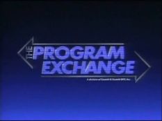
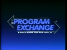
Nicknames: "The Arrows III", "Crossing Arrows III", "Sliding Arrows", "Two Ways", "CGI Crossing Arrows"
Logo: Against a blue/black gradient background with little black scanlines, the words "PROGRAM" come in from the bottom right of the screen, "EXCHANGE" comes in from the top left of the screen [both written in a white (blue for the 1987 version) segmented font], part of a left-facing arrow comes in from the top right of the screen, and part of a right-facing arrow comes in from the bottom left of the screen simultaneously. They all intersect until the silver arrows meet at the middle of the camera shot. The word "THE" (in a smaller font, and situated on the side of the "P" in "PROGRAM") fades-in, along with the Saatchi & Saatchi byline underneath the lower arrow. Then, the logo shines.
Bylines:
Music/Sounds:
Music/Sounds Variant: In some cases, the 1987 logo has often been spotted with the 1993 music and vice versa.
Availability: Rare, although it lived for 21 years. During its run, either variant could be spotted on shows such as The Rocky and Bullwinkle Show, Underdog and Friends, Bewitched, Where on Earth is Carmen Sandiego?, and the 1992 syndie print package of the 1986 Dennis the Menace cartoon, among others; it remains unknown if either version could be seen on late-1980s/early-1990s prints of The Abbott and Costello Show. The 1987 logo appears on seasons 1-4 of Coach on DVD, as well as MCA/Universal Home Video tapes of the show. The 1993 logo was plastered on pretty much every show the Program Exchange offers to TV stations, but has since became less common. The 1993 logo was also spotted on a 2002 rerun of Fantasy Island on TV Land, after the Sony Pictures Television logo. It is also preserved on the Mill Creek DVD of the 1986 Dennis the Menace cartoon.
Editor's Note: Both variants of the logo are favorites of many for their solid CGI animation and music.
2nd Logo
(January 26, 2008-2016?)
Logo: On a white background, a blue ball with a white swoosh arrow (a la Nike) bounces on screen, then "The Program Exchange" in a light, italic weight of Myriad zooms-out into the center, as well as a larger blue swoosh arrow. As the ball bounces off, another white-swooshed blue ball rolls in and jumps on the swoosh, and it spins to place itself next to "Exchange", pointing to the top left of the screen. The italicized light blue text "ZenithOptimedia" fades in, and the ball rolls off the screen to the left.
Trivia: The swoosh arrow happens to be the logo for ZenithOptimedia.
Variant: Surprisingly, there's a shorter version of this logo.
FX/SFX: The balls bouncing and rolling.
Music/Sounds: A synth drumbeat leading into a "beeping" electronic tune.
Availability: Uncommon. First seen on Just Shoot Me! and 3rd Rock from The Sun reruns on TV Land, the latter which can be seen on some local stations.
Editor's Note: Not a popular logo by fans of the previous logos. The animation and music are very simple, the swoosh is just tacky, and the logo simply doesn't look right without arrows.
Logo captures by V of Doom, Juniorfan88, and snelfu
Editions by V of Doom, Hoa, Juniorfan88, Nathan B., and edunk5
Video captures courtesy of JohnnyL80, mcydodge919, and GDelva2003
Background: In 1979, DFS Program Exchange was formed and founded by Dancer Fitzgerald Sample, more commonly known as "DFS", which was a top-tier Madison Avenue-based company. DFS was renamed "DFS-Dorland" in 1986, and in 1987, the company was acquired by "Saatchi & Saatchi", who took the "DFS-Dorland" out of the company's name (although "DFS" would continue to be listed in their logo until 1993). Ever since 1979, the Program Exchange has been a "barter company", trading shows with TV stations in "exchange" (pun intended) for the stations to run ads for DFS/Saatchi & Saatchi clients such as General Mills, allowing even low-budget stations to air them. In 2008, the Program Exchange was acquired by ZenithOptimedia, itself owned by the French media corporation Publicis Groupe S.A. In 2016, the company's website shut down, and it's presumed the company went defunct. The shutdown of the site coincided with Comcast's purchase of DreamWorks Animation (which included DreamWorks Classics, a major client for TPE).
DFS Program Exchange
(Early-Mid 80s-1986)
 <iframe frameborder="0" height="167" src="http://wikifoundrytools.com/wiki/closinglogos/widget/genericvideo/5e4e9712a3b00c22c191c686b532715570093e78" width="220"></iframe>
WARNING: The music in the video is a little loud, we recommend that you should lower the volume before watching.
Nicknames: "The Arrows", "Crossing Arrows", "The DFS Arrows"
Logo: Against a black background, a silver outline of the italic lowercase letters "dfs" inside a box streaks out toward the top center of the screen, increasing in brightness and then receding. As the tail end of the streak recedes, a graphic fades in of the letters in white inside a black box with a light-blue fill, on a light-to-dark blue gradient background with a pattern of dark-to-light blue dots. Afterwards, two white arrows with black outlines and off-center tails come from opposite sides of the screen. The arrow coming from the right reads "PROGRAM", points left, and has a tail shifted up; the arrow coming from the left reads "EXCHANGE", points right, and has a tail shifted down. The two arrows cross over each other and lock into position, as the DFS symbol shines.
FX/SFX: Streak photography and backlit shining effects, and the sliding arrows.
Music/Sounds: A very-loud high pitch synthesizer sound, then goes into sounding like an alarm.
Availability: Ultra rare. It appeared on 1980s syndicated prints of Bewitched, I Dream of Jeannie, and The Abbott and Costello Show, as well as the 1986 Dennis the Menace cartoon, including 2007 broadcasts on Boomerang. It is intact on most of the episodes on the DVD Dennis the Menace: Trouble, Trouble Everywhere!.
Editor's Note: This is a diverse mix of both excellent and rough quality. The streak photography and backlit shining effects are very good, but the sliding arrows' sequence looks quite cheap. Some may be startled by the loud synthesizer music, but it's nothing too shocking.
__________________________________________________________________________________________________________________
DFS-Dorland Program Exchange
(1986-1987)
 <iframe frameborder="0" height="186" src="http://wikifoundrytools.com/wiki/closinglogos/widget/youtubevideo/27751b2d03d88e545ae0f4a6c61f606b691d5ea3" width="330"></iframe>
Nicknames: "The Arrows II", "Crossing Arrows II", "The Dorland Crossing Arrow Logo"
Logo: Against a blue/black gradient background, we see "DFS-DORLAND", rendered in a style resembling Goudy Old Style in silver, and with the "D" and "O" and the "L" and "A" linked together zoom in from the bottom of the screen and position itself above the center of the screen in a "light trail" effect. Immediately afterwards, the word "PROGRAM ", featuring a yellow arrow below it, and the word "EXCHANGE ", featuring a yellow arrow beneath it, cross from opposite sides at the screen's bottom. Both words are in a light blue italicized Impact font. The two arrows join by way of a diagonal line in between the words, and the finished arrow flashes briefly. A horizontal line draws itself underneath "DFS-DORLAND" from left to right via a sparkle, and when it's finished, the letters in "DFS-DORLAND" shine.
FX/SFX: The zooming and shining.
Music/Sounds: Same as the first logo, but softer on the volume and heavier on the bass.
Availability: Extremely rare. This logo was very short-lived (only used for one year, from 1986-1987). It appeared on Dennis the Menace episodes of this era, as well as on a VHS tape of the cartoon version of Dennis the Menace from the '80s. The logo can be found on one episode, "Dennis in Venice", on the DVD Dennis the Menace: Trouble, Trouble Everywhere! (the rest of the episodes end with the 1st logo).
Editor's Note: An overall improvement over the previous logo, though the animation is still choppy.
__________________________________________________________________________________________________________________
The Program Exchange
1st Logo
(1987-January 25, 2008)


<iframe frameborder="0" height="186" src="http://wikifoundrytools.com/wiki/closinglogos/widget/youtubevideo/d8bc7aa55734fb608a4c411187683fde230324b2" width="330"></iframe><iframe frameborder="0" height="186" src="http://wikifoundrytools.com/wiki/closinglogos/widget/youtubevideo/888f2be1a0c405109583fe65279349f451d0f077" width="330"></iframe><iframe frameborder="0" height="186" src="http://wikifoundrytools.com/wiki/closinglogos/widget/youtubevideo/738b5bcb825b015e8d7da5c3225ebd975ae17648" width="331"></iframe>
Nicknames: "The Arrows III", "Crossing Arrows III", "Sliding Arrows", "Two Ways", "CGI Crossing Arrows"
Logo: Against a blue/black gradient background with little black scanlines, the words "PROGRAM" come in from the bottom right of the screen, "EXCHANGE" comes in from the top left of the screen [both written in a white (blue for the 1987 version) segmented font], part of a left-facing arrow comes in from the top right of the screen, and part of a right-facing arrow comes in from the bottom left of the screen simultaneously. They all intersect until the silver arrows meet at the middle of the camera shot. The word "THE" (in a smaller font, and situated on the side of the "P" in "PROGRAM") fades-in, along with the Saatchi & Saatchi byline underneath the lower arrow. Then, the logo shines.
Bylines:
- 1987-1993: "A division of Saatchi & Saatchi DFS, Inc."
- 1993-2008: "A division of Saatchi & Saatchi North America, Inc."
Music/Sounds:
- 1987-1993: Same as the DFS-Dorland logo, but slightly extended.
- 1993-2008: A dreamy synthesizer tune.
Music/Sounds Variant: In some cases, the 1987 logo has often been spotted with the 1993 music and vice versa.
Availability: Rare, although it lived for 21 years. During its run, either variant could be spotted on shows such as The Rocky and Bullwinkle Show, Underdog and Friends, Bewitched, Where on Earth is Carmen Sandiego?, and the 1992 syndie print package of the 1986 Dennis the Menace cartoon, among others; it remains unknown if either version could be seen on late-1980s/early-1990s prints of The Abbott and Costello Show. The 1987 logo appears on seasons 1-4 of Coach on DVD, as well as MCA/Universal Home Video tapes of the show. The 1993 logo was plastered on pretty much every show the Program Exchange offers to TV stations, but has since became less common. The 1993 logo was also spotted on a 2002 rerun of Fantasy Island on TV Land, after the Sony Pictures Television logo. It is also preserved on the Mill Creek DVD of the 1986 Dennis the Menace cartoon.
Editor's Note: Both variants of the logo are favorites of many for their solid CGI animation and music.
2nd Logo
(January 26, 2008-2016?)
<iframe frameborder="0" height="181" src="http://wikifoundrytools.com/wiki/closinglogos/widget/unknown/f202730cd9a8d8708b99e24044333c6dad219b5b" width="323"></iframe>

Nicknames: "The Arrows IV", "Swoosh Arrow", "The Nike Exchange", "Boomerang", "Bouncing CGI Balls", "The Balls of Annoyance", "Balls of Boredom", "The Nike Logo Exchange", "Just Don't Do It"
Logo: On a white background, a blue ball with a white swoosh arrow (a la Nike) bounces on screen, then "The Program Exchange" in a light, italic weight of Myriad zooms-out into the center, as well as a larger blue swoosh arrow. As the ball bounces off, another white-swooshed blue ball rolls in and jumps on the swoosh, and it spins to place itself next to "Exchange", pointing to the top left of the screen. The italicized light blue text "ZenithOptimedia" fades in, and the ball rolls off the screen to the left.
Trivia: The swoosh arrow happens to be the logo for ZenithOptimedia.
Variant: Surprisingly, there's a shorter version of this logo.
FX/SFX: The balls bouncing and rolling.
Music/Sounds: A synth drumbeat leading into a "beeping" electronic tune.
Availability: Uncommon. First seen on Just Shoot Me! and 3rd Rock from The Sun reruns on TV Land, the latter which can be seen on some local stations.
Editor's Note: Not a popular logo by fans of the previous logos. The animation and music are very simple, the swoosh is just tacky, and the logo simply doesn't look right without arrows.