Thames (UK)
Jump to navigation
Jump to search
Logo descriptions by James Fabiano, Jlgarfield, and Shadeed A. Kelly
Logo captures by Shadeed A. Kelly, V of Doom, and others
Editions by Shadeed A. Kelly, V of Doom, Brendan Richards, Wyraachur, Liwakip, and Syn3h
1st Logo
(July 30, 1968-1969)
Nickname: "Early Rising Buildings"
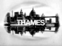
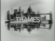
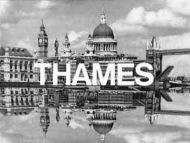
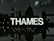
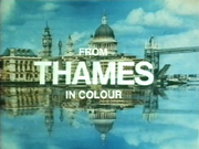
Logo: In an oval-shaped frame, a group of buildings meant to represent London quickly rise up from the middle of the screen. In the bottom half, another set of buildings rise upside-down, giving the effect of a reflection. The word "THAMES" in Helvetica appears in both images, then disappears from the reflection, leaving the right-side-up word. This logo was in black and white, as colour broadcasting was not introduced on ITV until November 15, 1969 at the earliest.
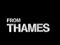
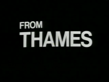
Variant: At first, only London got the standard logo. The rest of the United Kingdom simply got a plain black screen with the words "FROM THAMES", which revealed itself by "opening" vertically, and was the only one of the original Thames idents without a skyline until the name-only logo was introduced in 2001.
Other Variant: A still version of the variant above exists.
FX/SFX: The right-side-up and upside-down buildings rising together. For the "non-London" variant, the black screen "opening" vertically and revealing itself.
Music/Sounds: A loud eight-note horn fanfare, known as the "Salute to Thames", composed by Johnny Hawksworth. The first four notes would be played on a tenor saxophone (the fourth one sounds like a duet with another instrument), and the last four notes would either be played on a trumpet or a French horn.
Music/Sounds Variant: A re-arranged version of the fanfare was also used.
Music/Sounds Demo Variants: According to the <a class="external" href="http://www2.tv-ark.org.uk/itvlondon/thames-main.html" rel="nofollow" target="_blank" title="TV Ark">TVArk</a> website, a test version of the animation was discovered on a Thames demo videotape from 1967 with twenty-two separate tunes dubbed onto the animation, including predecessor ABC Weekend's chime tune; several variants of what would eventually become the standard Thames logo music in 1968 were also used.
Availability: Extremely rare. This was a placeholder logo, made weeks before the station signed on. Seen on very early productions from Thames like Father, Dear Father (intact on Forces TV airings) and Mystery and Imagination. This was also used to plaster over the Rediffusion logo on some of the predecessor company's programmes that were still re-aired on ITV in the early 1970s. It is also preserved on sites such as the aforementioned TVArk.
Editor's Note: None.
2nd Logo
(1969-1992)
 <iframe frameborder="0" height="150" src="http://wikifoundrytools.com/wiki/closinglogos/widget/unknown/e6fa47d1055d3d203ea8a18132c4afa099656f5b" width="188"></iframe><iframe frameborder="0" height="150" src="http://wikifoundrytools.com/wiki/closinglogos/widget/unknown/86369e3615993dbb57d0218c0ad0d170ebe0beb8" width="192"></iframe><iframe frameborder="0" height="150" src="http://wikifoundrytools.com/wiki/closinglogos/widget/unknown/2796ac7854f4548895d2ffad35b9fc681e98bd11" width="189"></iframe><iframe frameborder="0" height="150" src="http://wikifoundrytools.com/wiki/closinglogos/widget/unknown/58bad606376eeb73d77f083e941671278ce10338" width="187"></iframe>
Nicknames: "Rising Buildings II", "Buildings Out of the Water", "The Benny Hill Logo"
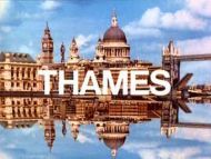
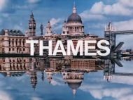
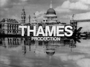
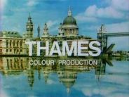
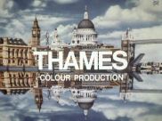
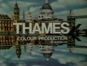
Logo: A colourized version of the previous logo, but it now has a sky background and looks more like a reflection in the water. Slight changes in definition of the image and such were made over the years, but this is basically how the logo went. This was the longest-serving Thames logo, as it ran for over twenty years.
Trivia: According to the <a class="external" href="http://625.uk.com/tv_logos/thames.htm" rel="nofollow" target="_blank">Thames Logo Parade</a> website: "The animated ident was created just as you would imagine. The top half of the image was laid flat and filmed from above. A sheet of foil was used to provide the reflection and was at a slight angle from the perpendicular (hence the tall vertical structures bend in towards St. Paul's dome in the reflection for a more realistic effect). Using stop-frame animation produces the appearance of movement. The skyline image did not have the letters on it. The letters were filmed separately using the same process and then the negatives from both films were married together to produce the final effect. Treating the letters separately allowed for the reflected letters to be faded out."
Variants: There were quite a few variants of this logo:
FX/SFX: The right-side-up and upside-down buildings rising together, the "THAMES" lettering rising with them and the reflection of the lettering fading away. The picture of the Thames skyline was designed by Minale Tattersfield.
Music/Sounds: Same as the last logo. By 1971, the re-arranged version was used more often. On the closing variant, it used the closing theme of the show, or none.
Music/Sounds Variants:
Music/Sounds Trivia: The theme to this logo appears in the first episode of the infamous Netflix series Neo Yokio.
Availability: Uncommon, at least in America. Seen on The Benny Hill Show, Rumpole of the Bailey, Danger Mouse, The Wind in the Willows, Count Duckula, Sooty and Co., Mr. Bean, the original 1970s UK version of The Tomorrow People, Love Thy Neighbor, George and Mildred, Man About the House, just to name a few (it has been tacked on to episodes of the third and fifth shows it did not originally appear on, as well!), and the first series of The Bill, all which are available on DVD.
Editor's Note: This is a fondly remembered logo to a generation of UK TV fans who grew up with television during this time.
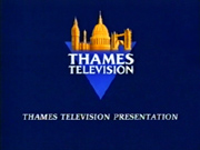
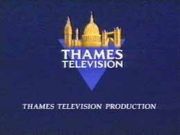
3rd Logo
(July 31-September 1, 1989)
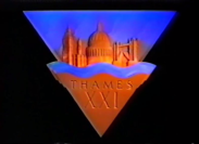
Nicknames: "Rising Buildings III", "CGI Rising Buildings", "Thames Triangle", "CGI Thames Triangle", "Thames XXI", "Thames' 21st Anniversary"
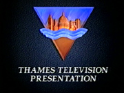
Logo: Against a black background, a triangular shape rises into view from the centre of the screen. As it reveals itself, it looks somewhat like an upside-down Christmas tree shape (two triangles joined together), and the upper triangle has an abstract version of the Thames waterfront scenery against a blue skyline. The lower one is gold in colour, and contains the words "THAMES XXI" ("XXI" is the Roman numeral for 21). As the logo rises, it too has a reflection, though it does not last when it is completely formed. In contrast to the previous logo, this was the shortest-serving Thames logo (because it only lasted for a month).
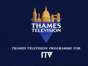
Variant: At the end of programmes, the bottom of the smaller triangle was wordless, and the text "THAMES TELEVISION PRESENTATION/PRODUCTION" or (from September 4, 1989) the text "THAMES TELEVISION PRODUCTION/PROGRAMME FOR" and the then-newly-introduced ITV logo appeared below.
FX/SFX: None for any of the end-credits variants, but very good computer-generated animation, which is a modernization of Thames' "Rising Buildings" design.
Music/Sounds: An orchestral version of the Thames fanfare, with a newly-composed five-note ending. A continuity announcement would follow.
Availability: Very rare. It was only seen in the United Kingdom as it was a special ident for Thames' twenty-first anniversary, but preserved on sites like TVArk. The end-credits version with the ITV logo was originally seen on season 3 (1989-90) episodes of Count Duckula, but it does not appear on the DVD release. It also appears on 1989 episodes of Never The Twain and is intact whenever Forces TV airs this. Season 1 episodes of French Fields keep this intact on UKTV Play and whenever UKTV Drama decides to air it.
Editor's Note: None.
4th Logo
(September 4, 1989-1990)
Nickname: "ITV Generic"
See ITV for descriptions.
5th Logo
(1990-December 31, 1992)
 <iframe frameborder="0" height="186" src="http://wikifoundrytools.com/wiki/closinglogos/widget/unknown/917d2dbc4d841efe66d99d2cfca1d7d680710f0e" width="260"></iframe>
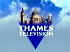
Nicknames: "CGI Thames Triangle II", "Thames Triangle II", "Thames' Final Stand"
Logo: The camera goes through a three-dimensional image of London. As it pans away, one of the buildings "fades" into the ident, which is now on top of a blue triangle. On the triangle are the words "THAMES TELEVISION". The background is again a skyline. This ident was short-lived due to loss of franchise.
FX/SFX: The panning over the towers and fading into the triangle. Just a very nice combination of live-action and CGI.
Music/Sounds: An updated orchestral score. In December, a more festive version of the theme was used, which was heard the last time this logo was seen.
Availability: This was also a London-only station identity, due to the reason covered for the 4th logo, so it is extinct, but it is preserved on sites like TVArk.
Editor's Note: None.
6th Logo
(1990-1997)
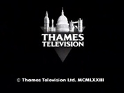
Nickname: "Thames Triangle III", "Thames Reborn (after 1992)"
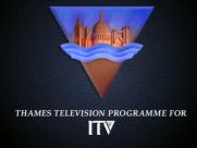
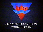
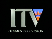
Logo: Against a solid blue background is a blue and gold version of the triangular Thames logo from before. Below that, in an italic font, is the text "THAMES TELEVISION PRODUCTION/PROGRAMME FOR", with the then-current ITV logo. After 1992, this became the primary logo, and the ITV logo was removed.
Byline: In 1996, the byline "A Pearson Television Company" was added below the triangle, and "Production" was moved on to it, now in the same font as the rest of the logo. The copyright text "© Thames Television Limited MCMXCVI" was also added at the bottom of the screen, as it was previously on the credits.
Variants:
FX/SFX: None.
Music/Sounds: The closing theme of the show, or none.
Availability: Uncommon. It was seen on Executive Stress, the latter French Fields (second season onward), series 6 (1990) of Danger Mouse, all episodes of Truckers and Victor and Hugo: Bunglers in Crime, latter Rumpole of the Bailey episodes, and the first five series of The Bill. The first version used to appear on public TV rerun prints of the Mr. Bean Christmas episode, but it has since been removed for current broadcasts. The monochrome version was also seen on The World At War after its "remastering".
Editor's Note: None.
7th Logo
(December 31, 1992)
Trivia: Pearson Television bought Thames in 1996 after a vicious bidding war between Carlton and two investor groups.
Bylines:
FX/SFX: None.
Music/Sounds: The end theme of the show or silence.
Availability: Plastered over older Thames logos (primarily on British cable TV). Otherwise uncommon in America, as recent Thames productions have rarely aired on PBS. Was also seen on The Bill, among other series. Early episodes of the 4th season of the UK version of Fort Boyard on Challenge feature this logo, with the remaining episodes of that season used the next logo. Recent reruns of season 7 of Strike it Lucky on Challenge feature this logo with the Pearson byline, followed by the FremantleMedia logo.
Editor's Note: None.
9th Logo
(2001-2003)
 Nickname: "River Waves"
Music/Sounds: Same as its predecessor.
Availability: Uncommon. It was seen on Pop Idol, The Bill, and Play Your Cards Right, among others that used this logo. Episodes of Take Your Pick that air on Challenge currently has this plaster over the 5th and 6th logos, usually adding in a copyright byline dated the year the series was originally transmitted/aired. A few episodes of the 4th season of the UK version of Fort Boyard when aired on challenge end with this logo.
Editor's Note: None.
10th Logo
(2003-2006)
Editor's Note: None.
Logo captures by Shadeed A. Kelly, V of Doom, and others
Editions by Shadeed A. Kelly, V of Doom, Brendan Richards, Wyraachur, Liwakip, and Syn3h
1st Logo
(July 30, 1968-1969)


Logo: In an oval-shaped frame, a group of buildings meant to represent London quickly rise up from the middle of the screen. In the bottom half, another set of buildings rise upside-down, giving the effect of a reflection. The word "THAMES" in Helvetica appears in both images, then disappears from the reflection, leaving the right-side-up word. This logo was in black and white, as colour broadcasting was not introduced on ITV until November 15, 1969 at the earliest.
Variant: At first, only London got the standard logo. The rest of the United Kingdom simply got a plain black screen with the words "FROM THAMES", which revealed itself by "opening" vertically, and was the only one of the original Thames idents without a skyline until the name-only logo was introduced in 2001.
Other Variant: A still version of the variant above exists.
FX/SFX: The right-side-up and upside-down buildings rising together. For the "non-London" variant, the black screen "opening" vertically and revealing itself.
Music/Sounds: A loud eight-note horn fanfare, known as the "Salute to Thames", composed by Johnny Hawksworth. The first four notes would be played on a tenor saxophone (the fourth one sounds like a duet with another instrument), and the last four notes would either be played on a trumpet or a French horn.
Music/Sounds Variant: A re-arranged version of the fanfare was also used.
Music/Sounds Demo Variants: According to the <a class="external" href="http://www2.tv-ark.org.uk/itvlondon/thames-main.html" rel="nofollow" target="_blank" title="TV Ark">TVArk</a> website, a test version of the animation was discovered on a Thames demo videotape from 1967 with twenty-two separate tunes dubbed onto the animation, including predecessor ABC Weekend's chime tune; several variants of what would eventually become the standard Thames logo music in 1968 were also used.
Availability: Extremely rare. This was a placeholder logo, made weeks before the station signed on. Seen on very early productions from Thames like Father, Dear Father (intact on Forces TV airings) and Mystery and Imagination. This was also used to plaster over the Rediffusion logo on some of the predecessor company's programmes that were still re-aired on ITV in the early 1970s. It is also preserved on sites such as the aforementioned TVArk.
Editor's Note: None.
2nd Logo
(1969-1992)


Nicknames: "Rising Buildings II", "Buildings Out of the Water", "The Benny Hill Logo"
Logo: A colourized version of the previous logo, but it now has a sky background and looks more like a reflection in the water. Slight changes in definition of the image and such were made over the years, but this is basically how the logo went. This was the longest-serving Thames logo, as it ran for over twenty years.
Trivia: According to the <a class="external" href="http://625.uk.com/tv_logos/thames.htm" rel="nofollow" target="_blank">Thames Logo Parade</a> website: "The animated ident was created just as you would imagine. The top half of the image was laid flat and filmed from above. A sheet of foil was used to provide the reflection and was at a slight angle from the perpendicular (hence the tall vertical structures bend in towards St. Paul's dome in the reflection for a more realistic effect). Using stop-frame animation produces the appearance of movement. The skyline image did not have the letters on it. The letters were filmed separately using the same process and then the negatives from both films were married together to produce the final effect. Treating the letters separately allowed for the reflected letters to be faded out."
Variants: There were quite a few variants of this logo:
- The bottom reflection was distorted for a brief period of time.
- One variant had the right-side-up "THAMES" text fade out at the same time as the reflection text, resulting in the logo being textless.
- A still variant was seen on Man About the House.
- There were the closing versions, which were the usual logo with a phrase such as "FROM THAMES", "FROM THAMES IN COLOUR", or "THAMES COLOUR PRODUCTION". Prior to 1985, the last of these variants also included the text "© UK (year in Roman numerals)" below "PRODUCTION".
- During the <a class="external" href="http://en.wikipedia.org/wiki/Colour_Strike" rel="nofollow" target="_blank" title="Colour Strike">Colour Strike</a> (industrial action taken by all ITV companies between November 13, 1970 and February 8, 1971), all shows were broadcast in black-and-white instead of colour. Such programmes produced by Thames featured the end card text "THAMES PRODUCTION" in place of "THAMES COLOUR PRODUCTION" during this time.
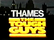
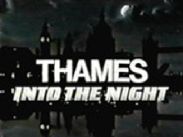
- In 1980, there was a "night-time" version of the logo, with darkened buildings and a night sky. It was primarily seen preceding Armchair Thriller. It was also used for mid-1980s overnight links, with the silver text "Into the Night" sliding in below; other versions were seen before different overnight "strands".
- Another variant was a Christmas version from Teddington in Middlesex, where Thames' studios were in use. It read "Merry Christmas - THAMES - Teddington".
- The Kenny Everett Video Show had a funny variation, as Everett would burst through a large-scale version of the logo, which ripped like paper. The video was played in reverse, giving the appearance that Everett was "fixing" the torn logo. This variation had an extended version of the "Salute to Thames" jingle, with an extended comedy sting at the end.
- Another version of the above variant played the video with no jingle, and after Everett had "fixed" the logo, his voice was heard saying "Is that what you wanted?" to which the audience shouted "YES!", which was followed by him saying "Good!".
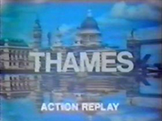
- Yet another Everett variant has him performing an "Action Replay" of the Thames logo in slo-mo, with the added comedy sound effects.
- Another version of the "ripping" variant was used at the end of a Christmas tape from the Teddington Studios, with another person bursting through the logo, uttering "Shoulda made this at Tyne Tees, man. Goin' down the bus club, get some proper tunes".
- Kenny Everett was also responsible for an "adult" version of the logo, which replaced the buildings with women's breasts. This was only seen on a The Station With Knockers promo at the beginning of an episode.
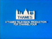
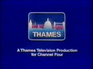
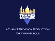
- In 1982, Thames added a new closing logo without the reflections for its Channel Four programmes. Against a black or blue background was a box with a blue/white outline of the buildings, a blue/purple gradient BG and the word "THAMES" inside. Underneath were the words "A THAMES TELEVISION PRODUCTION FOR CHANNEL FOUR" (an early version lacked the box).
- On Pauline's Quirks, the logo animates as normal...then, all of a sudden, Pauline Quirke, dressed up as King Kong, comes out of the ocean and eats and destroys the logo!
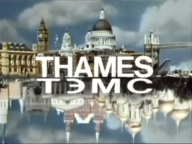
- A variant was made for the Russian market, with the reflection of the landmarks replaced with a reflection of Russian landmarks (including the Kremlin and St. Basil's Cathedral), and Thames in the reflection written out in Russian (as "ТЭMС", which is pronounced "Téms").
- In 1980, a special version of this ident was used to introduce The Dick Emery Hour: the jingle was played on a church organ, and the camera zoomed in on the dome of St. Paul's Cathedral. Emery's buck-toothed vicar character then stepped out from behind the columns and welcomed viewers to "an hour of comedy and music". Oddly enough, on this version, the reflection of the "THAMES" lettering at the bottom of the screen does not fade away.
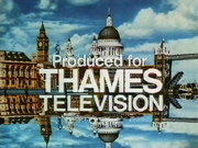
- Another version read "Produced for THAMES TELEVISION", with "Produced for" and "Television" added above and below the Thames text.
FX/SFX: The right-side-up and upside-down buildings rising together, the "THAMES" lettering rising with them and the reflection of the lettering fading away. The picture of the Thames skyline was designed by Minale Tattersfield.
Music/Sounds: Same as the last logo. By 1971, the re-arranged version was used more often. On the closing variant, it used the closing theme of the show, or none.
Music/Sounds Variants:
- On The Kenny Everett Video Show, the tune was extended slightly; there are at least two different endings that were used on the show. Everett would also occasionally subvert the tune by humming it in a campy way, or playing it in slow-motion with the addition of comedy jingles and canned laughter.
- A version with an A Capella rearrangement of the jingle was also used on the 1980 Morecambe and Wise Christmas Special; the animation remained the same, but a male voice choir (rumoured to be The Mike Sammes Singers), sang "Here they are now, Morecambe and Wise!" to the Thames tune.
- In the mid-1980s, Des O'Connor Tonight featured a different version of the jingle (performed by the studio orchestra which appeared in all his shows).
Music/Sounds Trivia: The theme to this logo appears in the first episode of the infamous Netflix series Neo Yokio.
Availability: Uncommon, at least in America. Seen on The Benny Hill Show, Rumpole of the Bailey, Danger Mouse, The Wind in the Willows, Count Duckula, Sooty and Co., Mr. Bean, the original 1970s UK version of The Tomorrow People, Love Thy Neighbor, George and Mildred, Man About the House, just to name a few (it has been tacked on to episodes of the third and fifth shows it did not originally appear on, as well!), and the first series of The Bill, all which are available on DVD.
Editor's Note: This is a fondly remembered logo to a generation of UK TV fans who grew up with television during this time.
3rd Logo
(July 31-September 1, 1989)


<iframe frameborder="0" height="163" src="http://wikifoundrytools.com/wiki/closinglogos/widget/unknown/b86fd33ac190d7d69cf442e5177ff20f93cc44ac" width="221"></iframe>
Nicknames: "Rising Buildings III", "CGI Rising Buildings", "Thames Triangle", "CGI Thames Triangle", "Thames XXI", "Thames' 21st Anniversary"
Logo: Against a black background, a triangular shape rises into view from the centre of the screen. As it reveals itself, it looks somewhat like an upside-down Christmas tree shape (two triangles joined together), and the upper triangle has an abstract version of the Thames waterfront scenery against a blue skyline. The lower one is gold in colour, and contains the words "THAMES XXI" ("XXI" is the Roman numeral for 21). As the logo rises, it too has a reflection, though it does not last when it is completely formed. In contrast to the previous logo, this was the shortest-serving Thames logo (because it only lasted for a month).
Variant: At the end of programmes, the bottom of the smaller triangle was wordless, and the text "THAMES TELEVISION PRESENTATION/PRODUCTION" or (from September 4, 1989) the text "THAMES TELEVISION PRODUCTION/PROGRAMME FOR" and the then-newly-introduced ITV logo appeared below.
FX/SFX: None for any of the end-credits variants, but very good computer-generated animation, which is a modernization of Thames' "Rising Buildings" design.
Music/Sounds: An orchestral version of the Thames fanfare, with a newly-composed five-note ending. A continuity announcement would follow.
Availability: Very rare. It was only seen in the United Kingdom as it was a special ident for Thames' twenty-first anniversary, but preserved on sites like TVArk. The end-credits version with the ITV logo was originally seen on season 3 (1989-90) episodes of Count Duckula, but it does not appear on the DVD release. It also appears on 1989 episodes of Never The Twain and is intact whenever Forces TV airs this. Season 1 episodes of French Fields keep this intact on UKTV Play and whenever UKTV Drama decides to air it.
Editor's Note: None.
4th Logo
(September 4, 1989-1990)


Nickname: "ITV Generic"
See ITV for descriptions.
5th Logo
(1990-December 31, 1992)
 <iframe frameborder="0" height="186" src="http://wikifoundrytools.com/wiki/closinglogos/widget/unknown/917d2dbc4d841efe66d99d2cfca1d7d680710f0e" width="260"></iframe>
Nicknames: "CGI Thames Triangle II", "Thames Triangle II", "Thames' Final Stand"
Logo: The camera goes through a three-dimensional image of London. As it pans away, one of the buildings "fades" into the ident, which is now on top of a blue triangle. On the triangle are the words "THAMES TELEVISION". The background is again a skyline. This ident was short-lived due to loss of franchise.
FX/SFX: The panning over the towers and fading into the triangle. Just a very nice combination of live-action and CGI.
Music/Sounds: An updated orchestral score. In December, a more festive version of the theme was used, which was heard the last time this logo was seen.
Availability: This was also a London-only station identity, due to the reason covered for the 4th logo, so it is extinct, but it is preserved on sites like TVArk.
Editor's Note: None.
6th Logo
(1990-1997)


Nickname: "Thames Triangle III", "Thames Reborn (after 1992)"
Logo: Against a solid blue background is a blue and gold version of the triangular Thames logo from before. Below that, in an italic font, is the text "THAMES TELEVISION PRODUCTION/PROGRAMME FOR", with the then-current ITV logo. After 1992, this became the primary logo, and the ITV logo was removed.
Byline: In 1996, the byline "A Pearson Television Company" was added below the triangle, and "Production" was moved on to it, now in the same font as the rest of the logo. The copyright text "© Thames Television Limited MCMXCVI" was also added at the bottom of the screen, as it was previously on the credits.
Variants:
- For Thames' Channel Four-produced programmes, the text of "A THAMES TELEVISION PRODUCTION FOR CHANNEL FOUR" would be displayed.
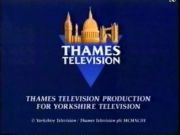
- There was also a version with the text of "THAMES TELEVISION PRESENTATION", and in 1993 and 1996, there were also two variants for Thames' Yorkshire and UKGold-produced programmes, with the text "THAMES TELEVISION PRODUCTION FOR YORKSHIRE TELEVISION" or "UKGOLD".
- In 1996, Thames' then-parent company Pearson remastered the 1973-75 documentary series The World At War, with the following plastered over the original "From THAMES" and "THAMES Colour Production" ending: Following a quick montage of black and white photographs, the Thames Triangle ident (with the colour removed) appears on the screen on a black background, with the copyright date under it. These prints have recently been aired on BBC Two (even though it was originally an ITV programme) during December 2002; no word yet if this version has been sighted in North America.
- Variants of this logo for Thames Video, Euston Films, and Cosgrove Hall Productions (which was a subsidiary of Thames at the time) were also used.
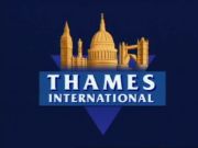
- There was a version with "INTERNATIONAL" replacing "TELEVISION". The name is put on a separate bar, and the logo takes up more of the screen with no other words around it. Oddly enough, this version was seen on Avenger Penguins - which was the first show produced by Cosgrove Hall after Thames had lost their broadcasting license at the end of 1992 (and the third one that was also a co-production with Carlos Alfonso Studios of Spain). However, it was NOT seen when the show was originally screened, as it was produced for Granada Television, and featured their "stripe" end board.
FX/SFX: None.
Music/Sounds: The closing theme of the show, or none.
Availability: Uncommon. It was seen on Executive Stress, the latter French Fields (second season onward), series 6 (1990) of Danger Mouse, all episodes of Truckers and Victor and Hugo: Bunglers in Crime, latter Rumpole of the Bailey episodes, and the first five series of The Bill. The first version used to appear on public TV rerun prints of the Mr. Bean Christmas episode, but it has since been removed for current broadcasts. The monochrome version was also seen on The World At War after its "remastering".
Editor's Note: None.
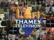
7th Logo
(December 31, 1992)


<iframe frameborder="0" height="161" src="http://wikifoundrytools.com/wiki/closinglogos/widget/unknown/ade3cc5bdc3dc4cbbef5e0dc5b44fc11c5b2fb29" width="296"></iframe>
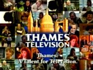
Nicknames: "Thames Video Wall", "Thames Triangle IV", "A Talent for Television"
Logo: A background consisting of various programme scenes configuring themselves into a video wall appear on the screen. As the wall goes out of focus, a blue and gold Thames triangle fades onto the centre of the screen. This was Thames' last ident (and was used on its final broadcast on December 31, 1992).
Trivia: After Thames lost their broadcasting license to Carlton Television in 1991, it refocused itself into the production company it still is today: an active part of FremantleMedia (formerly "Pearson Television"). However, it changed its name to "talkbackThames" in the 2000s, and is now simply called "Thames" again. This was originally taken from a promotional music video which Thames aired in the run up to its closure.
Variant: There was a version of this logo which featured a byline that faded in under the Thames Triangle logo and stated: "Thames. A Talent for Television."
FX/SFX: The programme clips forming a wall, then going out of focus as the Thames Triangle logo fades in, and the "Talent for Television" byline appearing.
Music/Sounds: A synthesized moderate-tempo brass and string fanfare. This was the third and final Thames ident to not use the "Salute to Thames" fanfare. The music video advert which used this featured a cover of "I Only Want to Be with You" by The Tourists, and the video wall/logo appears during the last line of the song.
Availability: Extinct. This was a London-area-only ident, and was seen on The Bill and This is Your Life. However, it is preserved on websites such as TVArk.
Editor's Note: None.
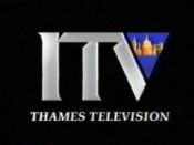
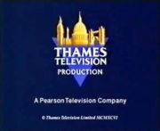
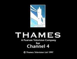
8th Logo
(1997-2002)
Nickname: "The (Pearson) Tower Bridge"
Logo: A background consisting of various programme scenes configuring themselves into a video wall appear on the screen. As the wall goes out of focus, a blue and gold Thames triangle fades onto the centre of the screen. This was Thames' last ident (and was used on its final broadcast on December 31, 1992).
Trivia: After Thames lost their broadcasting license to Carlton Television in 1991, it refocused itself into the production company it still is today: an active part of FremantleMedia (formerly "Pearson Television"). However, it changed its name to "talkbackThames" in the 2000s, and is now simply called "Thames" again. This was originally taken from a promotional music video which Thames aired in the run up to its closure.
Variant: There was a version of this logo which featured a byline that faded in under the Thames Triangle logo and stated: "Thames. A Talent for Television."
FX/SFX: The programme clips forming a wall, then going out of focus as the Thames Triangle logo fades in, and the "Talent for Television" byline appearing.
Music/Sounds: A synthesized moderate-tempo brass and string fanfare. This was the third and final Thames ident to not use the "Salute to Thames" fanfare. The music video advert which used this featured a cover of "I Only Want to Be with You" by The Tourists, and the video wall/logo appears during the last line of the song.
Availability: Extinct. This was a London-area-only ident, and was seen on The Bill and This is Your Life. However, it is preserved on websites such as TVArk.
Editor's Note: None.
8th Logo
(1997-2002)
Nickname: "The (Pearson) Tower Bridge"

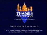
Logo: Against a black background is a tall blue box with a whitishsilhouetteof the Tower Bridge. Under that are the words "THAMES" in Copperplate Gothic Bold font and the respective company byline. On co-productions, the name of the station (e.g. "For Channel Four") would be seen under the byline. A copyright byline is seen below.
Trivia: Pearson Television bought Thames in 1996 after a vicious bidding war between Carlton and two investor groups.
Bylines:
- 1997-2001: "A Pearson Television Company"
- 2001-2002: "A FremantleMedia Company"
FX/SFX: None.
Music/Sounds: The end theme of the show or silence.
Availability: Plastered over older Thames logos (primarily on British cable TV). Otherwise uncommon in America, as recent Thames productions have rarely aired on PBS. Was also seen on The Bill, among other series. Early episodes of the 4th season of the UK version of Fort Boyard on Challenge feature this logo, with the remaining episodes of that season used the next logo. Recent reruns of season 7 of Strike it Lucky on Challenge feature this logo with the Pearson byline, followed by the FremantleMedia logo.
Editor's Note: None.
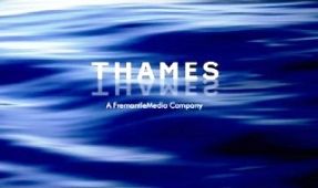
9th Logo
(2001-2003)
 Nickname: "River Waves"
Logo: As we see waves on the surface of a river, the THAMES name in white sans-serif font is seen in the center of the screen. Like the "Rising Buildings", there is a reflection given to the Thames name (in a sky-bluish shade). The byline "A FremantleMedia Company" is under this.
Variant: On co-productions with the BBC (such as the long-running British edition of This Is Your Life), the Thames logo is seen on a black background with the BBC logo under it. Copyright notices for both are seen under the BBC Squares logo.
FX/SFX: A still image rendered in modern CGI.
Variant: On co-productions with the BBC (such as the long-running British edition of This Is Your Life), the Thames logo is seen on a black background with the BBC logo under it. Copyright notices for both are seen under the BBC Squares logo.
FX/SFX: A still image rendered in modern CGI.
Music/Sounds: Same as its predecessor.
Availability: Uncommon. It was seen on Pop Idol, The Bill, and Play Your Cards Right, among others that used this logo. Episodes of Take Your Pick that air on Challenge currently has this plaster over the 5th and 6th logos, usually adding in a copyright byline dated the year the series was originally transmitted/aired. A few episodes of the 4th season of the UK version of Fort Boyard when aired on challenge end with this logo.
Editor's Note: None.
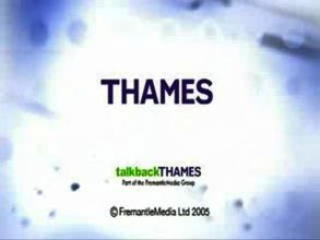
10th Logo
(2003-2006)

Logo: Against a bluish/whitish BG with many dots and lines, we see the words "THAMES" in dark blue. Below that is the talkbackTHAMES logo with "talkback" in green. "Part of the FremantleMedia Group" is shown underneath it in a smaller font. A FremantleMedia copyright date is at the bottom.
Trivia: This logo was used during the talkbackTHAMES era before the company had its own logo in 2006.
Variant: This logo was shared with the 19 Entertainment logo.
FX/SFX: None.
Music/Sounds: Just the end theme from any show.
Availability: Was seen on Pop Idol, The Bill, Play Your Cards Right, Idols!, and Hardware, among others.
Editor's Note: None.
11th Logo
(January 1, 2012-2019?)
Logo: A purple circle zooms in, with the word "thames" (with a massive "t") turning on the circle. The bottom shines. The FremantleMedia byline appears on the bottom of it.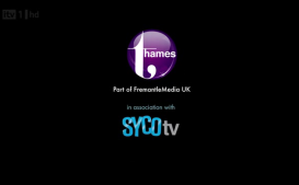
FX/SFX: The circle zooming and "thames" turning in.
Music/Sounds: Just the end theme from any show.
Availability: Seen on Britain's Got Talent and The X Factor from 2012 onwards, and the 2012 series of Blockbusters on Challenge, among others.
Trivia: This logo was used during the talkbackTHAMES era before the company had its own logo in 2006.
Variant: This logo was shared with the 19 Entertainment logo.
FX/SFX: None.
Music/Sounds: Just the end theme from any show.
Availability: Was seen on Pop Idol, The Bill, Play Your Cards Right, Idols!, and Hardware, among others.
Editor's Note: None.
11th Logo
(January 1, 2012-2019?)
Logo: A purple circle zooms in, with the word "thames" (with a massive "t") turning on the circle. The bottom shines. The FremantleMedia byline appears on the bottom of it.

FX/SFX: The circle zooming and "thames" turning in.
Music/Sounds: Just the end theme from any show.
Availability: Seen on Britain's Got Talent and The X Factor from 2012 onwards, and the 2012 series of Blockbusters on Challenge, among others.
Editor's Note: None.
12th Logo
(2018- )
Logo: TBA<iframe align="right" frameborder="0" height="160" src="http://wikifoundrytools.com/wiki/closinglogos/widget/genericvideo/33c8d963eb9bbf7c2fed4eefe7257081d0c1f904" width="279"></iframe>
FX/SFX: TBA
Music/Sounds: Ending theme to any show.
Availability: Brand new and current.
Editor's Note: None.
FX/SFX: TBA
Music/Sounds: Ending theme to any show.
Availability: Brand new and current.
Editor's Note: None.