Standard Video
Jump to navigation
Jump to search
Logo description by mr3urious
 <iframe frameborder="0" height="255" src="http://wikifoundrytools.com/wiki/closinglogos/widget/genericvideo/d8dd738a2da0c48b105e025d2190b29b2247e858" width="453"></iframe>
1st Logo
(1980's)
 <iframe frameborder="0" height="206" src="http://wikifoundrytools.com/wiki/closinglogos/widget/genericvideo/f07245b37d2d82a598c3530e51e2d74979f2ddd9" width="364"></iframe>
Nickname: "Standard Logo", "Appropriately Named Logo", "Ribbon of Boredom"
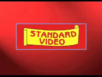
Logo: On a red background, inside a blue rectangular border with rounded corners, we see a yellow ribbon with "STANDARD VIDEO" on it in red.
FX/SFX: No animation whatsoever. It's a very cheap and ugly logo.
Music/Sounds: A odd synth tune with no ending whatsoever.
 <iframe frameborder="0" height="206" src="http://wikifoundrytools.com/wiki/closinglogos/widget/genericvideo/f07245b37d2d82a598c3530e51e2d74979f2ddd9" width="364"></iframe>
Logo: On a red background, inside a blue rectangular border with rounded corners, we see a yellow ribbon with "STANDARD VIDEO" on it in red.
FX/SFX: No animation whatsoever. It's a very cheap and ugly logo.
Music/Sounds: A odd synth tune with no ending whatsoever.
Availability: Rare; seen on adult films distributed by the company, such as Taboo II.
Editor's Note: None.
Editor's Note: None.
2nd Logo
(2000s-)
 <iframe frameborder="0" height="255" src="http://wikifoundrytools.com/wiki/closinglogos/widget/genericvideo/d8dd738a2da0c48b105e025d2190b29b2247e858" width="453"></iframe>
Nickname: "Standard Logo II", "Appropriately Named Logo II", "Ribbon of Boredom II"
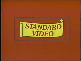
Logo: Same as before, but with cheaper text reminiscent to the "Billboard" font, and a light that's panning is seen.
FX/SFX: Slightly better animation than before. But it's still a very cheap and ugly logo, especially considering the flash animation with even worse text than before.
Music/Sounds: Same as before.
Availability: A lot more common than before. Seen on later adult films distributed by the company.
Editor's Note: None.
Editor's Note: None.