Spotlite Video
Jump to navigation
Jump to search
Logo description, capture and video capture by Matthew Mayfield
Editions by indycar
Background: Spotlite Video was a division of National Telefilm Associates Home Entertainment initially and later of Republic Pictures Home Video that released public domain material.
1st Logo
 (1983-1985)
2nd Logo
(1985-1986)
 <iframe height="195" src="http://wikifoundrytools.com/wiki/closinglogos/widget/unknown/1027e58c46750db6cf8562e060d9583030a5ecd3" width="245"></iframe>
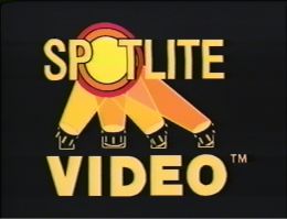
Logo: On a black background, after a triangle shaped iris-in effect, there are four searchlights moving back and forth in a jerky fashion (with two being yellow and the others orange with the last orange one being a darker color). After a moment, the lights meet and the screen flashes yellow from the lights meeting. After the flash dies down, the top where the lights meet has three circles inside each other (red, yellow and orange), which is actually the "O" in "SPOTLITE". Below is "VIDEO". A "™" symbol appears near "VIDEO".
FX/SFX: The swinging lights and the flash.
Music/Sounds: A synthesized fanfare with the last note sustaining itself when the flash appears.
Availability: Seen on public domain VHS releases from the mid-1980s. Some of these include two reel VHS releases of The Little Rascals shorts.
Editor's Note: The animation of the searchlights are extremely choppy and unprofessional, with them having strange positions and improperly sized beams. The music and flash are also extremely cheap. Unlike the previous logo, this at least has had more effort put into it.
Editions by indycar
Background: Spotlite Video was a division of National Telefilm Associates Home Entertainment initially and later of Republic Pictures Home Video that released public domain material.
1st Logo
 (1983-1985)
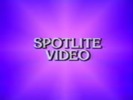
Logo: On a blue background, a purple flash appears from the middle of the screen. As it eases back slightly, the words "SPOTLITE VIDEO" zooms in towards the screen, flipping as it rests in the middle.
FX/SFX: The flash, the company name flipping in.
Music/Sounds: The fanfare from the first Commonwealth United Entertainment logo, where it actually begins playing before the logo appears, during the FBI Warning screen. This was most likely done to plaster the NTA logo on some film prints.
Availability: Seen on public domain releases, such as The Lady Vanishes (1938).
Editor's Note: A very cheap looking logo, just featuring only a flash and text effects. And having the music begin during the FBI Warning screen is a bit jarring, too.
(1985-1986)
 <iframe height="195" src="http://wikifoundrytools.com/wiki/closinglogos/widget/unknown/1027e58c46750db6cf8562e060d9583030a5ecd3" width="245"></iframe>
Logo: On a black background, after a triangle shaped iris-in effect, there are four searchlights moving back and forth in a jerky fashion (with two being yellow and the others orange with the last orange one being a darker color). After a moment, the lights meet and the screen flashes yellow from the lights meeting. After the flash dies down, the top where the lights meet has three circles inside each other (red, yellow and orange), which is actually the "O" in "SPOTLITE". Below is "VIDEO". A "™" symbol appears near "VIDEO".
FX/SFX: The swinging lights and the flash.
Music/Sounds: A synthesized fanfare with the last note sustaining itself when the flash appears.
Availability: Seen on public domain VHS releases from the mid-1980s. Some of these include two reel VHS releases of The Little Rascals shorts.
Editor's Note: The animation of the searchlights are extremely choppy and unprofessional, with them having strange positions and improperly sized beams. The music and flash are also extremely cheap. Unlike the previous logo, this at least has had more effort put into it.