Paramount Pictures
Jump to navigation
Jump to search
Logo descriptions by Jason Jones, Matt Williams, and Argus Sventon
Logo captures by Eric S., V of Doom, and others
Editions by Eric S., V of Doom, Bob Fish, Donny Pearson, Supermarty-O, iheartparamount, Unnepad and others
Video captures courtesy of LogicSmash, simblos, Peakpasha, Jordan Rios, Michael Strum, Paramount Pictures and Jason Malcolm
Famous Players Film Company
Background: Paramount traces its history back to May 8, 1912 when it was originally founded as Famous Players Film Company by the Hungarian-born Adolph Zukor, who had been an early investor in nickelodeons (film theaters that cost 5 cents admission), saw that movies appealed mainly to working-class immigrants. With partners Daniel Frohman and Charles Frohman, he planned to offer feature-length films that would appeal to the middle class by featuring the leading theatrical players of the time (leading to the slogan "famous players in famous plays"). By mid-1913, Famous Players had completed five films and Zukor was on his way to success. That same year, another aspiring producer, Jesse L. Lasky opened his Lasky Feature Play Company with money borrowed from his brother-in-law, Samuel Goldfish, who was later known as "Samuel Goldwyn". The Lasky company hired as their first employee a stage director with no virtually film experience, Cecil B. DeMille, who would find a suitable location site in Hollywood, near Los Angeles for his first film called The Squaw Man.
Music/Sounds: None, or the music added to a silent film.
Availability: Ultra rare, as the Paramount Pictures rebrand would happen just two years later. Can be found on Snow White and Poor Little Peppina.
Background: Beginning in 1914, the former company was renamed Paramount Pictures Corporation, as the second oldest running movie studio in Hollywood, with Universal Studios being founded only eight days earlier. On March 24, 1966, Paramount was acquired by Gulf+Western Industries, which later became Paramount Communications on June 5, 1989. On March 11, 1994, Paramount Communications was merged with Viacom. On December 31, 2005, Viacom split into two companies: one retaining its original name (which owns the BET Networks, MTV Networks and Paramount Pictures) and the other which was once the old Viacom but currently known as the "CBS Corporation" (which owns Paramount's television production and distribution arms, currently known as CBS Television Studios, CBS Television Distribution, and CBS Studios International, respectively); both companies are owned by National Amusements, Inc. Television rights to Paramount's library are now handled by Trifecta Entertainment and Media. On August 13, 2019, it was announced that the two companies will reunite and merge to form ViacomCBS; the merger was completed on December 4, 2019.
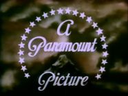
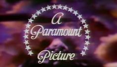
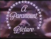
2nd Logo
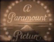
Nicknames: "The Three Mountains in the Credits", Three Paramountains
Logo: We see one of the following bylines at the top of the screen:
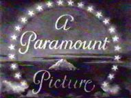
Below this, we see the title of the film and a little more info. Somewhere on the screen, we see the snow capped mountain poking out of a cloud at the bottom. The mountain is surrounded by a ring of stars. We see the text overlapping the mountain reading:
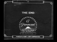
At the bottom of the screen is a box. On either side of the box, there are two Paramount pseudo-logos. Each has a ring of stars inside a ring. On the pseudo-logo on the right, we see the words "Paramount Pictures". On the pseudo-logo on the left, we see some writing. At the top of the box, we see "COPYRIGHT [YEAR]". Inside the box, we see the words "FAMOUS PLAYERS-LASKY CORPORATION" in a large font. Below this, in a slightly smaller font, we see the words "ADOLPH ZUKOR, PRESIDENT". Below Zukor's name, we see the words "NEW YORK CITY". Below the box, we see, in a large font, "ALL RIGHTS RESERVED".
<iframe frameborder="0" height="186" src="http://wikifoundrytools.com/wiki/closinglogos/widget/genericvideo/1f1a910f6a4736ab39c37ce819838441d91767a2" width="329"></iframe><iframe frameborder="0" height="186" src="http://wikifoundrytools.com/wiki/closinglogos/widget/genericvideo/ce1486df7b21e2e4157dc190658581b6748bc45a" width="329"></iframe><iframe frameborder="0" height="185" src="http://wikifoundrytools.com/wiki/closinglogos/widget/genericvideo/c6ad2f96d0276e8d248037553edeb86439a1aa57" width="253"></iframe><iframe frameborder="0" height="186" src="http://wikifoundrytools.com/wiki/closinglogos/widget/genericvideo/eb3c00446550640300f7e43e97e5974f7e779001" width="242"></iframe>
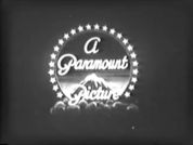
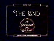
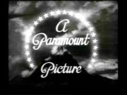
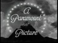
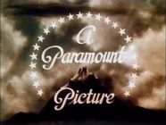
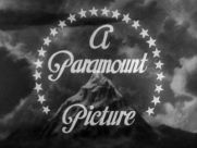
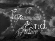
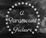
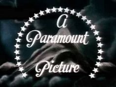
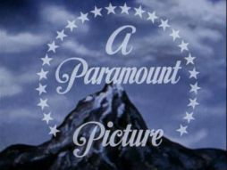
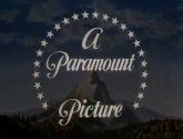
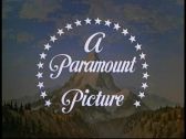
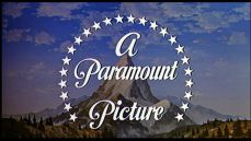
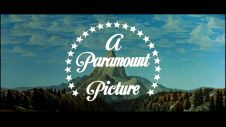
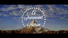
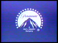
Nicknames: "Majestic Mountain", "Dark Mountain", "Paramountain", "Mount Everest"
Logo: We see a snow-capped mountain against a dark sky. There are clouds that look like smoke over the mountain; sometimes foggy, though. Encircling the mountain are 24 white stars, accompanied by this text in a majestic script font overlapping the mountain, reading:
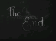
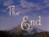
At the end of the movie, we see "The End", in script, overlapping the company name. On many movies, "The End" fades out, leaving only the logo and "A Paramount Picture".
Variants:
Trivia:
FX/SFX: Just the gliding clouds.
Music/Sounds: The beginning/end of a movie's theme. Starting with the 1930 feature Paramount on Parade, almost all of the Paramount feature films used the fanfare Paramount on Parade (written by Elsie Janis and Jack King).
Availability: Uncommon, but it's still retained on films of the era. On old prints of the Paramount films distributed by MCA TV, they are usually plastered with the MCA-TV logo of the time, while on current prints Universal owns from the MCA package, the 1997 Universal logo precedes it. The last films to use this logo were The Country Girl and Mambo. The logo made a surprise appearance at the beginning of Broadway Bill (originally a Columbia Pictures release by Frank Capra; Paramount acquired the rights years after they remade the film as Riding High).
Editor's Note: The darker and more detailed mountain is known to unnerve a few.
3rd Logo
Openings:
FX/SFX: TBA
Music/Sounds:
Availability: Ultra rare. The aforementioned shorts have had barely any exposure since AMC stopped playing them more than a decade ago (where they aired under the umbrella title AMC Short Cuts). But it can be found on a GoodTimes Entertainment DVD release of "Popeye: When Popeye Ruled The World", which is because it contained a short featuring behind-the-scenes footage on the making of a Popeye cartoon.
4th Logo
(December 23, 1950-October 7, 1953)
Nicknames: "Majestic Mountain II, "Twisted Mountain", "Ugly Mountain", Paramountain II, "Lopsided Mountain", "Early Blue Mountain", "Broken Mountain"
Logo: The same as the 2nd logo, only this variation looks more marble and uneven in appearance. The sky background is a bit lighter as well.
Variant: On films released prior to the release of the widescreen feature Shane, the logo appears closer up.
FX/SFX: Just the gliding clouds.
Music/Sounds: Usually the opening music/audio of any given film. Sometimes, it is silent, or on a rare occasion it would use the Paramount on Parade theme.
Availability: Uncommon. It's still seen on Paramount color releases of the period, including Branded, When Worlds Collide!, The Greatest Show on Earth, Shane, Arrowhead, and The War of the Worlds, among others. The last film to use this logo was Botany Bay. Also, it makes a surprise appearance at the beginning of Duckman episode "The Road to Dendron".
Editor's Note: The more lopsided mountain makes it an eyesore, especially with the stars now being disconnected.
5th Logo
(May 27, 1953-September 24, 1975)
![[Untitled]](/images/thumb/0/03/VlN1MIoJcXY6mxBcFUQ84Q180226.png/169px-VlN1MIoJcXY6mxBcFUQ84Q180226.png)
Trivia:
Variants:
FX/SFX: Just the gliding clouds. On the "COMING FROM" variant, the stars appearing, followed by each word one by one and then the G+W byline (or "Pictures" in the corporate Paramount font on trailers prior to 1968).
Music/Sounds: Most of the time, it is silent or has the beginning/end music from any given film. For films shown in VistaVision, the logo has a majestic fanfare composed by Nathan Van Cleave, except on those like Gunfight at the O.K. Corral, Strategic Air Command, and Vertigo, which used their respective opening themes.
Music/Sounds Variants:
Availability: Common. Again, preserved on most Paramount releases of the period.
Nicknames: "Blue Mountain", "Abstract Mountain", "Fading Mountain", "Perumount II"
Logo: We see the same mountain with the canyon-style scenery as the previous logo, only slightly less detailed. 22 white stars fade in, encircling the mountain. The word "Paramount" fades in on the mountain's peak. A byline fades in at the base of the mountain:
The logo fades to a light blue mountain surrounded by a circular navy blue border on a light blue screen. The final product turns out to be Paramount's current print logo from that point onward, but as most print logos, they change over the years, because in the future, the byline for the print vesion of this logo will change twice. This logo is similar to the Paramount Television logo of the period, but has darker colors compared to the TV logo.
Trivia: The design of this logo (namely, its animation being rather quick) allowed it to be used as a full closing logo, rather than a simple still variant.
Variants:
FX/SFX: The clouds moving, the stars, company name, and byline fading in.
Music/Sounds: Often had no music, or the film's opening/closing theme. In some cases, a new orchestral fanfare by Jerry Goldsmith, based loosely on Paramount on Parade, was used on the "Coming From" variant of the logo on trailers for films like Islands in the Stream, Saturday Night Fever, Foul Play, and Airplane!. A few films, such as Starting Over, had this fanfare at the beginning.
Music/Sounds Variants:
Availability: Common. Can be found on most release versions of their mid '70s-mid '80s output. Most films released on VHS, DVD, and Blu-ray, as well as TV airings, have this logo intact or restored as well.
Editor's Note: This is also another famous mountain, and the only one that is fully abstract, though the earlier variants look really awkward and ugly with their odd differences in size.
Bylines:
FX/SFX: The stars circling the mountain, the zoom in, and the text fading in, all in a beautiful mixture of CGI and practical effects that have held up remarkably for over 30 years.
Music/Sounds: Usually silent or the opening theme of the movie, although a few films such as Fatal Attraction, Crocodile Dundee II, The Accused, Pet Sematary, Black Rain, Wayne's World, the demo VHS of Tropical Snow, and post-1998 prints of Grease have synthesized chimes segueing into the 1975 fanfare.
Music/Sounds Variants:
Availability: Very common, even though the logo has not been in use for more than 15 years now. While it has been plastered on some TV airings and video releases of Paramount films, as well as some remastered or restored prints, most of these still retain their original logos.
Editor's Note: Much like some of the previous logos, the logo is among a fan-favorite in the logo community thanks to the seamless use of models and CGI, as well as the fanfare.
8th Logo
(March 1, 2002-2012)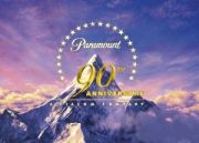
Logo: We pan down from a starry sky in space to a set of clouds, As we fly backwards slowly with the camera, some comet-like objects come flying down. They fly down far enough to reveal themselves as the trademark Paramount stars. The stars zoom past the camera, making us find out we had been watching a reflection all along. The familiar "Paramount" script zooms out as a total of 22 stars shoot past the script and encircle the mountain behind it. The script then continues to zoom out, taking its place at the peak of the mountain. The Viacombyline then fades in below the logo.
Variants:
FX/SFX: Incredibly breathtaking CGI; very reminiscent of the more majestic and stylized 1940s and '50s mountains.
Music/Sounds: Usually it's silent or has the film's opening theme.
Editor's Note: Much like the previous logo, except made with even better CGI.
9th Logo
(December 16, 2011- ) 


Nicknames: "2010s Mountain", "Ultra Majestic Mountain II", "CGI Mountain III", "Perumount V"
Logo: On a dark cloudy background, we see several stars flying towards us, a mirrored reference to the previous logo. As the third star flies towards us, we follow the star to reveal that we were looking at the reflection of a lake. We follow the stars as they skim the lake and create ripples. We continue to fly forward as a total of 22 stars line up and encircle the mountain ahead. Then the word "Paramount" zooms back to take its place on the mountain, which is situated on a cloudy sunset landscape. The byline fades in below.
Trivia: This logo was designed by <a href="https://www.devastudios.com/work/logo/paramount-100-years/" target="_self">DevaStudios, Inc</a>. and animated using the Terragen software from <a href="https://planetside.co.uk/featured-projects/paramounts-100th-anniversary-logo-created-with-terragen/" target="_self">Planetside Software</a>.
Variants:
FX/SFX: Beautifully crafted CGI that combines elements of the 2002 logo with the landscape of the 1986 logo.
Music/Sounds: A light bell and string piece which rises in intensity and becomes more majestic and orchestral, scored by Michael Giacchino. Sometimes it is silent, or it uses the film's opening theme.
Availability: Current. Seen on all Paramount movies since Mission Impossible: Ghost Protocol. Also seen as a de-facto home entertainment logo on Paramount's 4K UHD Blu-ray disc releases starting with Star Trek and Star Trek Into Darkness, and on regular Blu-rays/DVDs starting with the 2019 release of Bumblebee.This logo also appears on the first four films from Paramount Animation before the division got its own logo in 2020. The Viacom byline made its final appearance on Playing with Fire; the ViacomCBS byline first debuted on a Spanish TV spot for Sonic The Hedgehog. It made its theatrical debut on Like a Boss.
Logo captures by Eric S., V of Doom, and others
Editions by Eric S., V of Doom, Bob Fish, Donny Pearson, Supermarty-O, iheartparamount, Unnepad and others
Video captures courtesy of LogicSmash, simblos, Peakpasha, Jordan Rios, Michael Strum, Paramount Pictures and Jason Malcolm
Famous Players Film Company
Background: Paramount traces its history back to May 8, 1912 when it was originally founded as Famous Players Film Company by the Hungarian-born Adolph Zukor, who had been an early investor in nickelodeons (film theaters that cost 5 cents admission), saw that movies appealed mainly to working-class immigrants. With partners Daniel Frohman and Charles Frohman, he planned to offer feature-length films that would appeal to the middle class by featuring the leading theatrical players of the time (leading to the slogan "famous players in famous plays"). By mid-1913, Famous Players had completed five films and Zukor was on his way to success. That same year, another aspiring producer, Jesse L. Lasky opened his Lasky Feature Play Company with money borrowed from his brother-in-law, Samuel Goldfish, who was later known as "Samuel Goldwyn". The Lasky company hired as their first employee a stage director with no virtually film experience, Cecil B. DeMille, who would find a suitable location site in Hollywood, near Los Angeles for his first film called The Squaw Man.
(1912-1916)


<iframe frameborder="0" height="186" src="http://wikifoundrytools.com/wiki/closinglogos/widget/genericvideo/2ef4f60001d4281aaf309e288a852a4801e1caec" width="329"></iframe>
.
Logo: On a black background, we see two masks alongside a mirror or a simple oval, and inside the oval reads:
Variant:
PRODUCED
BY THE
FAMOUS PLAYERS
FILM CO.
ADOLPH ZUKOR
PRES.
BY THE
FAMOUS PLAYERS
FILM CO.
ADOLPH ZUKOR
PRES.
Underneath the logo is a byline reading "Distributed by Paramount Pictures Corporation"
Variant:
- Sometimes, the byline doesn't appear.
- On Poor Little Peppina (and possibly other films) the masks and the mirror are different and other font is used.
Music/Sounds: None, or the music added to a silent film.
Availability: Ultra rare, as the Paramount Pictures rebrand would happen just two years later. Can be found on Snow White and Poor Little Peppina.
------------------------------------------------------------------------------------------------------------
Paramount Pictures Corporation
Paramount Pictures Corporation
Background: Beginning in 1914, the former company was renamed Paramount Pictures Corporation, as the second oldest running movie studio in Hollywood, with Universal Studios being founded only eight days earlier. On March 24, 1966, Paramount was acquired by Gulf+Western Industries, which later became Paramount Communications on June 5, 1989. On March 11, 1994, Paramount Communications was merged with Viacom. On December 31, 2005, Viacom split into two companies: one retaining its original name (which owns the BET Networks, MTV Networks and Paramount Pictures) and the other which was once the old Viacom but currently known as the "CBS Corporation" (which owns Paramount's television production and distribution arms, currently known as CBS Television Studios, CBS Television Distribution, and CBS Studios International, respectively); both companies are owned by National Amusements, Inc. Television rights to Paramount's library are now handled by Trifecta Entertainment and Media. On August 13, 2019, it was announced that the two companies will reunite and merge to form ViacomCBS; the merger was completed on December 4, 2019.
1st Logo
(1914-1917?)


<iframe frameborder="0" height="186" src="http://wikifoundrytools.com/wiki/closinglogos/widget/genericvideo/eec991b386555096111cb8a6c5597dd6d6fd68be" width="329"></iframe>
Nicknames:"The Original Paramountain"
Logo: Against a black background, we see a mountain above a few clouds where the mountain is surrounded by stars. There is text over the mountain reading:
Paramount
Pictures
Variant: Depending of the film, the used colors are different.
FX/SFX: None.
Music/Sounds: Silent or the film's opening music.
Availability: Ultra rare.
Editor's Note: This is the first ever use of the famous mountain, though its design is strange to those familiar to the later designs.
2nd Logo
(1912?-February 15, 1927)


<iframe frameborder="0" height="186" src="http://wikifoundrytools.com/wiki/closinglogos/widget/genericvideo/2363e4212e9c02fffdadf4a9c7133430c15a4b67" width="329"></iframe><iframe frameborder="0" height="186" src="http://wikifoundrytools.com/wiki/closinglogos/widget/genericvideo/39514fd52a9a3ca76efeb8741f76db575be33406" width="329"></iframe><iframe frameborder="0" height="186" src="http://wikifoundrytools.com/wiki/closinglogos/widget/genericvideo/01a84cb9cd59646477f721c0324c2c99944b56fa" width="329"></iframe>
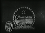
Nicknames: "The Three Mountains in the Credits", Three Paramountains
Logo: We see one of the following bylines at the top of the screen:
- "ADOLPH ZUKOR PRESENTS" (films produced on the East Coast).
- "JESSE L. LASKY PRESENTS" (films produced on the West Coast).
- "ADOLPH ZUKOR AND JESSE L. LASKY PRESENT" (films produced on both coasts).
Below this, we see the title of the film and a little more info. Somewhere on the screen, we see the snow capped mountain poking out of a cloud at the bottom. The mountain is surrounded by a ring of stars. We see the text overlapping the mountain reading:
A
Paramount
Picture
Paramount
Picture
At the bottom of the screen is a box. On either side of the box, there are two Paramount pseudo-logos. Each has a ring of stars inside a ring. On the pseudo-logo on the right, we see the words "Paramount Pictures". On the pseudo-logo on the left, we see some writing. At the top of the box, we see "COPYRIGHT [YEAR]". Inside the box, we see the words "FAMOUS PLAYERS-LASKY CORPORATION" in a large font. Below this, in a slightly smaller font, we see the words "ADOLPH ZUKOR, PRESIDENT". Below Zukor's name, we see the words "NEW YORK CITY". Below the box, we see, in a large font, "ALL RIGHTS RESERVED".
Note: Despite being similar, the 1917 logo is actually different from the 1914 logo, notice the different cloud design in both.
Variant: On some of Paramount's earlier movies, the pseudo-logo "A Paramount Picture" is nowhere to be seen in the movie's title, keeping only the two small pseudo-logos below the title. Instead, the full "A Paramount Picture" logo is seen after it. After a few seconds, the movie's credits overlap the logo. It can be seen on movies like Love 'Em or Leave 'Em (1926).
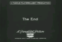
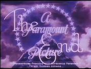
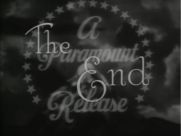
Closing Title: We see the words "THE END" on the screen. At the top of the screen is the title of the movie. Below "THE END", we see the opening logo.
Closing Variants: On some films like the above described, the "A Paramount Picture" logo appears after the movie ends. After a few seconds, the "THE END" overlaps the logo and fades out. Another variant, from Stage Struck (1925), shows the "THE END" in white script with the "T" and E" in fancy lettering. After a few seconds, the "A Paramount Picture" pseudo-logo is seen on a reddish pink background.
FX/SFX/Trivia: None. It was actually a painting that was filmed by a cameraman.
Music/Sounds: None.
Availability: Extremely rare. Most of Paramount's silent output featured its print logo over the opening and ending titles, while later ones featured the on-screen logo fading into the film's title card. Like most silent films before 1924, the rest are in public domain or have passed on to other companies that released versions with copyrighted music scores. Most of these versions use new opening titles due to lost material for the original credits (the current version of Metropolis is an example of this), but some, such as the restored version of J.M Barrie's Peter Pan, have survived with the original Paramount tags intact. A picture showing the filming of this logo can be found on Page 71 of "A Pictorial History of the Western Film". The variants are ultra rare, although it was kept intact on the DVD of Love 'Em or Leave 'Em.
2nd Logo
(January 18, 1926-May 17, 1955)
Variant: On some of Paramount's earlier movies, the pseudo-logo "A Paramount Picture" is nowhere to be seen in the movie's title, keeping only the two small pseudo-logos below the title. Instead, the full "A Paramount Picture" logo is seen after it. After a few seconds, the movie's credits overlap the logo. It can be seen on movies like Love 'Em or Leave 'Em (1926).
Closing Title: We see the words "THE END" on the screen. At the top of the screen is the title of the movie. Below "THE END", we see the opening logo.
Closing Variants: On some films like the above described, the "A Paramount Picture" logo appears after the movie ends. After a few seconds, the "THE END" overlaps the logo and fades out. Another variant, from Stage Struck (1925), shows the "THE END" in white script with the "T" and E" in fancy lettering. After a few seconds, the "A Paramount Picture" pseudo-logo is seen on a reddish pink background.
FX/SFX/Trivia: None. It was actually a painting that was filmed by a cameraman.
Music/Sounds: None.
Availability: Extremely rare. Most of Paramount's silent output featured its print logo over the opening and ending titles, while later ones featured the on-screen logo fading into the film's title card. Like most silent films before 1924, the rest are in public domain or have passed on to other companies that released versions with copyrighted music scores. Most of these versions use new opening titles due to lost material for the original credits (the current version of Metropolis is an example of this), but some, such as the restored version of J.M Barrie's Peter Pan, have survived with the original Paramount tags intact. A picture showing the filming of this logo can be found on Page 71 of "A Pictorial History of the Western Film". The variants are ultra rare, although it was kept intact on the DVD of Love 'Em or Leave 'Em.
2nd Logo
(January 18, 1926-May 17, 1955)


<iframe frameborder="0" height="186" src="http://wikifoundrytools.com/wiki/closinglogos/widget/genericvideo/1f1a910f6a4736ab39c37ce819838441d91767a2" width="329"></iframe><iframe frameborder="0" height="186" src="http://wikifoundrytools.com/wiki/closinglogos/widget/genericvideo/ce1486df7b21e2e4157dc190658581b6748bc45a" width="329"></iframe><iframe frameborder="0" height="185" src="http://wikifoundrytools.com/wiki/closinglogos/widget/genericvideo/c6ad2f96d0276e8d248037553edeb86439a1aa57" width="253"></iframe><iframe frameborder="0" height="186" src="http://wikifoundrytools.com/wiki/closinglogos/widget/genericvideo/eb3c00446550640300f7e43e97e5974f7e779001" width="242"></iframe>
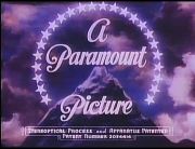
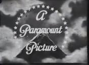
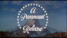
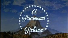
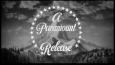
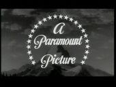
Nicknames: "Majestic Mountain", "Dark Mountain", "Paramountain", "Mount Everest"
Logo: We see a snow-capped mountain against a dark sky. There are clouds that look like smoke over the mountain; sometimes foggy, though. Encircling the mountain are 24 white stars, accompanied by this text in a majestic script font overlapping the mountain, reading:
A
Paramount
Picture
Paramount
Picture
At the end of the movie, we see "The End", in script, overlapping the company name. On many movies, "The End" fades out, leaving only the logo and "A Paramount Picture".
Variants:
- Though the same general design of the logo has remained the same, there have been subtle changes to it over the years, such as having brighter stars on some films or a slightly different design. Sometimes, "A" and "Picture" fade out a little bit and "PRESENTS" fades in below "Paramount".
- There are also sepia variants.
- On the infamous Koch Media widescreen DVD and Blu-ray of the animated 1939 Gulliver's Travels, the opening Paramount logo is still on a (poorly) retouched widescreen background, then the "filmed" portion of the mountain stretches and morphs as its fades into the opening title card. The closing variant is similar to the opening version as well, morphing and all.
- In earlier color films, the logo is colored in blue/purple tones. In later, the logo is more colorized.
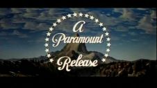
- Sometimes, Pictures is replaced by Release
Trivia:
- The mountain was doodled by William W. Hodkinson during a meeting with Adolph Zukor. It is based off of Ben Lomond Mountain in Utah, which is near where Hodkinson spent his childhood.
- 24 stars surround the mountain: one for each movie star that had a contract with the studio at the time.
FX/SFX: Just the gliding clouds.
Music/Sounds: The beginning/end of a movie's theme. Starting with the 1930 feature Paramount on Parade, almost all of the Paramount feature films used the fanfare Paramount on Parade (written by Elsie Janis and Jack King).
Availability: Uncommon, but it's still retained on films of the era. On old prints of the Paramount films distributed by MCA TV, they are usually plastered with the MCA-TV logo of the time, while on current prints Universal owns from the MCA package, the 1997 Universal logo precedes it. The last films to use this logo were The Country Girl and Mambo. The logo made a surprise appearance at the beginning of Broadway Bill (originally a Columbia Pictures release by Frank Capra; Paramount acquired the rights years after they remade the film as Riding High).
Editor's Note: The darker and more detailed mountain is known to unnerve a few.
3rd Logo
(1934-1949)


<iframe frameborder="0" height="167" src="http://wikifoundrytools.com/wiki/closinglogos/widget/unknown/d296b4b2a858b9bc5e67af1dfa95400fc99219a9" width="296"></iframe><iframe frameborder="0" height="167" src="http://wikifoundrytools.com/wiki/closinglogos/widget/unknown/e7c9b708c52b9f0faf7058ea48d7fc1ffaf56275" width="296"></iframe>
Nickname: "The Popular Science Mountain"
Logos:
- 1934-1936 Variant: We see a mountain shooting above a cloud deck below. A ring of 19 or 24 stars, similar to the one seen on the Paramount blue mountain logo are seen. In an unusual font, we see the words "A Paramount Picture".
- 1936-1949 Variant: We see a brown mountain with a brownish sky. This logo is similar to the Paramount movie logo, except the word "Paramount" is slightly below the top of the mountain. This logo contained 30 stars.
Openings:
- Popular Science: We see a cartoon airplane zooming toward us. After the plane passes, we see either "ADOLPH ZUKOR PRESENTS" or "PARAMOUNT PRESENTS" while we're looking down at the airplane. The words "POPULAR SCIENCE" are seen on the airplane's wings. At the bottom there is a copyright, and a Paramount pseudo-logo. Also present may be another copyright notice for Shields Pictures. This is followed by the credits.
- Unusual Occupations: On a shining red background, we see the above words, except the words "UNUSUAL OCCUPATIONS" are seen.
FX/SFX: TBA
Music/Sounds:
- Popular Science: A variation of the familiar Paramount on Parade march to accompany the sound of the airplane passing.
- Unusual Occupations: A patriotic theme is heard, which leads into a medley of "I've Been Working on the Railroad", "Pop Goes the Weasel", and "Old MacDonald Had a Farm".
Availability: Ultra rare. The aforementioned shorts have had barely any exposure since AMC stopped playing them more than a decade ago (where they aired under the umbrella title AMC Short Cuts). But it can be found on a GoodTimes Entertainment DVD release of "Popeye: When Popeye Ruled The World", which is because it contained a short featuring behind-the-scenes footage on the making of a Popeye cartoon.
4th Logo
(December 23, 1950-October 7, 1953)


<iframe frameborder="0" height="186" src="http://wikifoundrytools.com/wiki/closinglogos/widget/genericvideo/8a57fea326e62a360c0d293cefe502a94b6513f2" width="329"></iframe>
Nicknames: "Majestic Mountain II, "Twisted Mountain", "Ugly Mountain", Paramountain II, "Lopsided Mountain", "Early Blue Mountain", "Broken Mountain"
Logo: The same as the 2nd logo, only this variation looks more marble and uneven in appearance. The sky background is a bit lighter as well.
Variant: On films released prior to the release of the widescreen feature Shane, the logo appears closer up.
FX/SFX: Just the gliding clouds.
Music/Sounds: Usually the opening music/audio of any given film. Sometimes, it is silent, or on a rare occasion it would use the Paramount on Parade theme.
Availability: Uncommon. It's still seen on Paramount color releases of the period, including Branded, When Worlds Collide!, The Greatest Show on Earth, Shane, Arrowhead, and The War of the Worlds, among others. The last film to use this logo was Botany Bay. Also, it makes a surprise appearance at the beginning of Duckman episode "The Road to Dendron".
Editor's Note: The more lopsided mountain makes it an eyesore, especially with the stars now being disconnected.
5th Logo
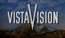
(May 27, 1953-September 24, 1975)


![[Untitled]](/page/File:VlN1MIoJcXY6mxBcFUQ84Q180226.png)


<iframe frameborder="0" height="183" src="http://wikifoundrytools.com/wiki/closinglogos/widget/genericvideo/2298d7c924fba280554af686d16b39fc81772e39" width="243"></iframe><iframe frameborder="0" height="186" src="http://wikifoundrytools.com/wiki/closinglogos/widget/genericvideo/4e53f21b27030e4e0081473436ef5b58acb47abf" width="329"></iframe><iframe frameborder="0" height="186" src="http://wikifoundrytools.com/wiki/closinglogos/widget/genericvideo/13110957c664da061e514a8c3a5a92f513c85962" width="329"></iframe><iframe frameborder="0" height="186" src="http://wikifoundrytools.com/wiki/closinglogos/widget/genericvideo/642a194af9f90bdf7c61496714c3683310caa9fb" width="329"></iframe><iframe frameborder="0" height="186" src="http://wikifoundrytools.com/wiki/closinglogos/widget/genericvideo/7d36f69bcb4d6f7b2d2b9c0962ac49e059fdc2b6" width="329"></iframe>
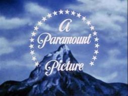
Nicknames: "Majestic Mountain III", "VistaVision Mountain", "Perumount"
Logo: Originally created for Paramount's 3-D process called "Paravision" and later modified especially for widescreen, this logo appears more realistic and features a canyon scenery with trees around it. The sky is more distant in depth and is very contrast. Everything is pretty much the same as before here.
Logo: Originally created for Paramount's 3-D process called "Paravision" and later modified especially for widescreen, this logo appears more realistic and features a canyon scenery with trees around it. The sky is more distant in depth and is very contrast. Everything is pretty much the same as before here.
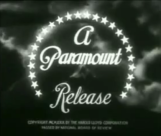
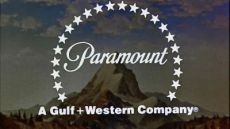
- 1953-1968: The text on the mountain reads "A Paramount Picture"or"A Paramount Release" (written in the Paramount corporate font).
- 1968-1975: "Paramount" (in the same font) is seen on the mountain's peak, with the stars encircling the mountain. The byline "A Gulf+Western Company" appears on the bottom. Sometimes, the font for "Paramount" is different.
Trivia:
- The mountain that you see is known as "Artesonraju", located in Peru.
- The painting of the mountain was created by matte artist Jan Domela.
Variants:
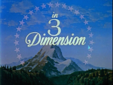
- When this logo--where the text and stars were bigger and the mountain was seen from afar--debuted on Paramount's first 3-D picture Sangaree, the words "A Paramount Picture" faded a few seconds later to the words "in 3 Dimension". At the end of the movie, the "The End" byline appears by itself, right in front of the mountain. It then fades to the company name a few moments later.
- Sometimes, the font for "Paramount" is different.
- On films with VistaVision, the stars and text would fade out, and "in" would fade in. Then it fades out and a big "V" zooming in (a la the Viacom "V of Doom" logo) and "VISTA" left of the V and "ISION" right of the "V" appear in a wiping effect. Then, "MOTION PICTURE" appears under "VISTA" and "HIGH-FIDELITY" under "ISION" fade in.
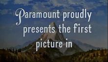
- On White Christmas, "Paramount (with the "P" written in their corporate font) proudly presents the first picture in" would first appear over the mountain, and then the VistaVision logo appeared, without any "MOTION PICTURE" or "HIGH FIDELITY" texts, then the Paramount logo played as usual (with the final notes of the Paramount on Parade march, followed by a bell sound).
- The logo has appeared in Spanish ("Paramount Films Presenta"), French ("C'est un film Paramount", or "Distribué par Paramount"), and German ("Ein Paramount Film").
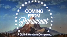
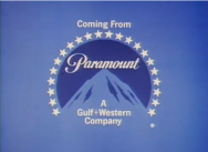
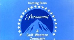
- Another version exists at the beginning of movie trailers, where we see the 24 stars, and then "COMING FROM Paramount Pictures" (or "COMING FROM Paramount" since 1968) appears one by one in the center, with the Gulf+Western byline appearing below in the latter variation. It was used until around 1977. However, trailers for Harold and Maude had the normal version of this logo instead.
- There is a variation that in 1974, two of the stars are clipped away. The mountain looks the same as logo 2's version, but the stars are bigger. "A Gulf+" slides in from the left and "+Western Company" from the right in Helvetica Black typeface. The script name also had a few variations of its own. At least three movies, The Great Gatsby, Brother Sun, Sister Moon and Death Wish, featured the then-current TV logo version, and the standard 1974 logo features the print logo variation, which remains from this day forward.
- A variation that exists has the logo as usual, but this time the mountain is simply a drawing with one color: orange-brown. Seen on War and Peace (1956).
- Some movies, such as Lady Sings the Blues and the original 1969 version of The Italian Job, had a still version of this logo.
- Sometimes, the text and stars appear in shadow mode. This can be found on the original 1969 version of True Grit and the 2002 DVD version of Big Jake (a Cinema Center Films production strangely; seen before the logo of the former company).
- On some movies, like the original 1966 version of Alfie, the clouds move a bit faster than in the normal version.
- The film Is Paris Burning? (1966) has a different drawing of the mountain in the ending. Also, the stars are kept intact and instead of "A Paramount Picture", we see "THE END", in white, overlapping the mountain.
- On Barbarella, the Gulf+Western byline is slightly off-center.
- Sometimes, the 1968-1974 logo may be zoomed in (This variant appears on the 2001 widescreen DVD release of Charlotte's Web, and maybe other films from this period.)
FX/SFX: Just the gliding clouds. On the "COMING FROM" variant, the stars appearing, followed by each word one by one and then the G+W byline (or "Pictures" in the corporate Paramount font on trailers prior to 1968).
Music/Sounds: Most of the time, it is silent or has the beginning/end music from any given film. For films shown in VistaVision, the logo has a majestic fanfare composed by Nathan Van Cleave, except on those like Gunfight at the O.K. Corral, Strategic Air Command, and Vertigo, which used their respective opening themes.
Music/Sounds Variants:
- The VistaVision fanfare was sometimes rearranged specially for films such as The Desperate Hours (Gail Kubik, Daniele Amfitheatrof), The Tin Star (Elmer Bernstein) and Artists and Models, where it was revised by Walter Scharf and also low-toned.
- For the "COMING FROM" variant, a rhythmic timpani sound is heard for each word that appears, followed by a drum beat.
- On Money from Home, it had a different brass fanfare, composed by Leigh Harline.
- Some TV movies, such as Seven in Darkness, had an extended version of the 1969 Paramount Television "Closet Killer" theme from the era.
- On Charlotte's Web, a 13-note orchestra fanfare that utilized part of the opening song "Deep in the Dark" is heard. This is also surprisingly heard on the 2001 DVD release, after you press play from the DVD menu (Also, on this music variant, the music starts before the logo fades in and finishes when the logo fades out).
Availability: Common. Again, preserved on most Paramount releases of the period.
- This logo, without the VistaVision logo, was first seen on Sangaree.
- The VistaVision version is mostly seen on Western films (including Last Train from Gun Hill, the Magnetic Video release of which preserves the logo in its entirety; also on the film's Starmaker Video VHS release) and is also seen on White Christmas (the first film to use that logo's "VistaVision" variation) and Vertigo.
- It was plastered by the 1963 Universal logo at the beginning of four Hitchcock films that Paramount merely released: The Trouble with Harry, The Man Who Knew Too Much, Vertigo, and Rear Window; recent remastered prints of the films restore this on their current DVD and Blu-Ray releases. Another Hitchcock production from Paramount, Psycho, also preserves this logo on its initial MCA Videocassette, Inc. release, as well as all releases from 1989 onward. It is unknown whether this and/or the Universal logo appears on the DiscoVision release.
- This logo surprisingly appeared at the beginning of the Indiana Jones films (but with the Gulf+Western byline as seen in the 6th logo added in) and Big Top Pee-wee.It was most recently seen at the start of the IMAX version of Raiders of the Lost Ark.
- Among the titles released with the 1968-74 variation were The Godfather, Catch-22, On a Clear Day You Can See Forever, Charlotte's Web, Paint Your Wagon, Harold and Maude, Willy Wonka & the Chocolate Factory (now owned by Warner Bros., so you'll have to find it on original prints which are extremely hard to find), Rosemary's Baby, and Chinatown. Also seen at the end of the 2001 DVD release of The Godfather Part II and the 1974 film Chinatown, which had the 2nd logo at the beginning.
- The 1974-75 variation can be found on the original 1974 version of The Longest Yard, The Godfather Part II, The Day of the Locust, Bug, Nashville, Framed and Three Days of the Condor, and also plasters the 1968-74 variation on many current prints of Goodbye, Columbus.
- New prints of Danger: Diabolik and Such Good Friends, the 1995 VHS of Charlotte's Web, and earlier DVD releases of The Godfather and The Godfather Part II have this logo plastered with the 1986 logo, while many current prints of Once Upon a Time in the West, Barbarella, Ace High, Downhill Racer, Fear is the Key, Three Days of the Condor, and Murphy's War have this logo plastered with the 6th logo (although this logo is kept at the end of Barbarella).
- The last film to use this logo was Three Days of the Condor.
Editor's Note: This is one of the more famous mountains made for Paramount, and a favorite among fan of their older films.
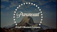
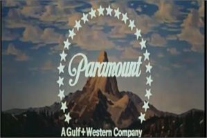
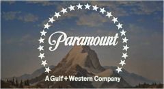
6th Logo
(October 8, 1975-December 12, 1986) 


<iframe frameborder="0" height="186" src="http://wikifoundrytools.com/wiki/closinglogos/widget/genericvideo/f44aef72af082b0916c15a2fc78e7eb599e538cd" width="329"></iframe><iframe frameborder="0" height="186" src="http://wikifoundrytools.com/wiki/closinglogos/widget/genericvideo/1150de240890de36cc90e5118577f97e06514a4c" width="329"></iframe>
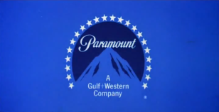
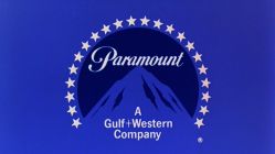
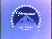
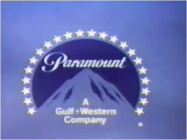
Nicknames: "Blue Mountain", "Abstract Mountain", "Fading Mountain", "Perumount II"
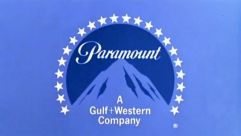
Logo: We see the same mountain with the canyon-style scenery as the previous logo, only slightly less detailed. 22 white stars fade in, encircling the mountain. The word "Paramount" fades in on the mountain's peak. A byline fades in at the base of the mountain:
A
Gulf+Western
Company
Gulf+Western
Company
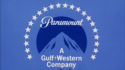
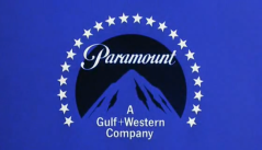
The logo fades to a light blue mountain surrounded by a circular navy blue border on a light blue screen. The final product turns out to be Paramount's current print logo from that point onward, but as most print logos, they change over the years, because in the future, the byline for the print vesion of this logo will change twice. This logo is similar to the Paramount Television logo of the period, but has darker colors compared to the TV logo.
Trivia: The design of this logo (namely, its animation being rather quick) allowed it to be used as a full closing logo, rather than a simple still variant.
Variants:
- The distance between the words and the mountain tip sometimes varies.
- The size and the color tint of the logo may vary.
- One variation (probably the original) has a smaller blue circle around a smaller mountain, both kind of receded. The text for "Paramount" is smaller than usual and the text for "A Gulf+Western Company" is drastically larger, along with the stars. This very strange and some consider ugly variation was seen on Hustle, Leadbelly, The Last Tycoon, Lifeguard, and Looking for Mr. Goodbar, among others. A less uglier version with re-sized text (but still keeping the receded circle and mountain) appears on some films. This version also lacks a registered trademark "®" symbol.
- A variation of this logo was used as a bumper for trailers to upcoming films with the phrase "Coming From" above the logo. However, trailers for Popeye and D.A.R.Y.L. among some other movies had the normal version instead.
- On a promotional film for the studio, a circle of stars is seen and the logo is revealed, but is completely white.
- On some French releases, the finished product looks more like the previous logo. The Gulf+Western byline is larger, in a different font, and moved up the mountain.
FX/SFX: The clouds moving, the stars, company name, and byline fading in.
Music/Sounds: Often had no music, or the film's opening/closing theme. In some cases, a new orchestral fanfare by Jerry Goldsmith, based loosely on Paramount on Parade, was used on the "Coming From" variant of the logo on trailers for films like Islands in the Stream, Saturday Night Fever, Foul Play, and Airplane!. A few films, such as Starting Over, had this fanfare at the beginning.
Music/Sounds Variants:
- In Won Ton Ton, the Dog Who Saved Hollywood, was used another orchestral fanfare, made by Neal Hefti, which sounds more like the original Paramount on Parade song.
- Pre-1998 prints of Grease had a theme, which seems to be a horn re-orchestration of the intro to "Love is a Many-Splendored Thing" or the 1976-77 Jerry Goldsmith fanfare for Paramount Television. The Grease 40th Anniversary DVD/Blu-Ray restores the horn theme.
- On the promotional film variant, a male announcer says, "In 1985, Paramount has a whole new attitude."
Availability: Common. Can be found on most release versions of their mid '70s-mid '80s output. Most films released on VHS, DVD, and Blu-ray, as well as TV airings, have this logo intact or restored as well.
- The first film to use this logo was Mahogany and was used up until Star Trek IV: The Voyage Home.
- It has been restored on the recent Sony DVD release and TV broadcasts of Meatballs, which was previously plastered with the next logo.
- It also appears at the end of the first two Indiana Jones films (and the third film, on the DVD release) and the 1980 film Popeye, which all had the 5th logo at the beginning.
- The 1976 variation can be found on Lipstick, the original The Bad News Bears, Won Ton Ton: The Dog Who Saved Hollywood, the 1996 VHS of Race for Your Life, Charlie Brown, Gallipoli (although the recent 2015 Region 4 DVD release and a Nine Network broadcast of the film on April 25, 2015 [the 100th anniversary of the ANZAC landings at Gallipoli] had it removed, and is replaced at the beginning of the film by a remastered per frame screen, however the 2005 Region 4 DVD release has it intact), US prints of Bugsy Malone and many current prints of Looking for Mr. Goodbar.
- Some films have this plastered over with the next logo in any of its three byline variations, such as Grease starting with its 1998 video releases, the 1976 version of King Kong, and the 2002 DVD of Mahogany (all with the Viacom byline version). Early video releases and some post-2005 prints of Top Gun retain this logo, though all other copies are plastered with the 7th logo (although the 1987 VHS of said film retained this logo only at the very end, as it was plastered by the 7th logo ("75th Anniversary" variant) at the beginning). Late-1990s American TV broadcasts of Dragonslayer were briefly plastered with the Viacom byline version, but recent broadcasts retain the original logo. The 2001 DVD of the Director's Cut of Star Trek: The Motion Picture also replaced this logo with the 1986 one, though it's retained on copies of the theatrical cut.
- The last film to use this logo was The Golden Child (though only at the end; the 7th logo was used at the beginning of the film).
- Of the films released during their distribution pact with Lorimar, An Officer and a Gentleman still has this logo (albeit with Lorimar's logo removed), but the 1981 version of The Postman Always Rings Twice, Escape to Victory, Blake Edwards' S.O.B., and The Sea Wolves all have it removed (since the studio only had North American distribution rights), being replaced by the 1999 Warner Bros. logo on most current prints. Night School, however, had this and Lorimar's logo intact on a recent Movie Channel airing, and on the widescreen laserdisc, with Warner's "Shield of Staleness" preceding it.
- The "Coming From" variant is usually preserved on trailers for films such as Flashdance, Saturday Night Fever, and Islands in the Stream on their DVD and Blu-ray releases. While the 8th logo plasters this (but retains the original fanfare) on the trailer for Airplane! on iTunes and on the Blu-ray release, the DVD release retains this variation.
- It was most recently seen at the end of the IMAX version of Raiders of the Lost Ark.
- This logo is seen on the 1982(?) Paramount Home Video Gateway Video VHS release of the Star Trek episode "Space Seed", following the 1979 Acid Trip warning and preceding the episode (the Betamax version precedes the episode with a trailer for Star Trek II: The Wrath of Khan after the warning, instead of the logo).
- This strangely appears after the credits on the VHS of the 1993 film Jailbait (AKA: Streetwise), at least on the screener VHS.
- This can also be found on Canadian prints of De Laurentiis Entertainment Group films such as The Transformers: The Movie.
Editor's Note: This is also another famous mountain, and the only one that is fully abstract, though the earlier variants look really awkward and ugly with their odd differences in size.
7th Logo
(December 12, 1986-February 4, 2003)
Nicknames: "CGI Mountain", "'90s Mountain", "Majestic Mountain V", "Perumount III"
Logo: We see a model of a mountain, with a CGI lake in front of it and a light blue/yellow gradient sky with a yellow sunset behind it. As the sky darkens, the camera begins to zoom closer to the mountain, as 22 silver stars (also CGI) come from the bottom left and encircle the mountain, forming the familiar logo. the word "Paramount", in its familiar script logo font and redone in a shiny silver color, fades in on the peak of the mountain, along with the registered trademark "®" symbol. Seconds later, one of the three bylines (as seen below; depending on the year(s) seen below) fades in below the logo (not the international version).
Trivia:
(December 12, 1986-February 4, 2003)


![Paramount Pictures [1987]](/page/File:DDmI3hTyfj8Wowpf3am1PQ1062369.jpeg)


<iframe frameborder="0" height="186" src="http://wikifoundrytools.com/wiki/closinglogos/widget/genericvideo/305a1a497831b38a08321a3ff98a0faf26928597" width="329"></iframe><iframe frameborder="0" height="186" src="http://wikifoundrytools.com/wiki/closinglogos/widget/genericvideo/036a3e28fe1046ac4580c40087a6b931f5fde47e" width="329"></iframe><iframe frameborder="0" height="186" src="http://wikifoundrytools.com/wiki/closinglogos/widget/genericvideo/0eb02d8f07c551c924dff3725f76a899f7a76136" width="329"></iframe><iframe frameborder="0" height="186" src="http://wikifoundrytools.com/wiki/closinglogos/widget/genericvideo/4fffb0a9ffb76e8981e69f74c6ce8e8c79582c74" width="329"></iframe>
Nicknames: "CGI Mountain", "'90s Mountain", "Majestic Mountain V", "Perumount III"
Logo: We see a model of a mountain, with a CGI lake in front of it and a light blue/yellow gradient sky with a yellow sunset behind it. As the sky darkens, the camera begins to zoom closer to the mountain, as 22 silver stars (also CGI) come from the bottom left and encircle the mountain, forming the familiar logo. the word "Paramount", in its familiar script logo font and redone in a shiny silver color, fades in on the peak of the mountain, along with the registered trademark "®" symbol. Seconds later, one of the three bylines (as seen below; depending on the year(s) seen below) fades in below the logo (not the international version).
Trivia:
- The logo was designed and composited by Studio Productions (now known as "Flip Your Lid Animation"), who also produced the 1994 20th Century Fox logo and the 1990-1997 Universal Pictures logo. The CGI stars were created by Omnibus/Abel and the mountain scenery was a physical model created and filmed by Apogee, Inc. The 1999 revision is alleged to have been animated at Pixar Animation Studios, though this is unconfirmed. The CGI variant (see below) was created by Pittard Sullivan.
- Paramount used a painting that it commissioned from artist Dario Campanile for its 75th Anniversary as a basis for this logo. Said painting can be seen <a href="https://en.wikipedia.org/wiki/Paramount_Pictures#/media/File:DarioCampanile.Paramount.jpg" target="_self">here</a>.
Bylines:
- December 12, 1986-August 30, 1989: "A Gulf + Western Company" (it fades in together with the Paramount script logo and looks the same as it did in the previous logo).
- September 22, 1989-January 13, 1995: "A Paramount Communications Company" with a line above the byline fades in, in white. On the byline's first year, the byline faded in with the Paramount script logo like the Gulf+Western version and was in gold. On video releases from the era with this variant, the color scheme of the logo is more washed-out than normal.
- February 17, 1995-February 15, 2002, January 28, 2003: "A VIACOM COMPANY" (in the 1990 \/|/\CO/\/\ "Wigga-Wigga" font), with a line above the byline fades in, again, in white.
- One variant, used on the trailer for Mission: Impossible II and international releases, has no byline whatsoever (see below).
Variants: While there have been some variations of the logo depending on the movie, and of course the three byline variants, there are two main logo variations of this logo:
- December 12, 1986-December 18, 1987: For this logo's first official year (1987, even though the logo actually debuted in 1986), the words "75th Anniversary" appear over the mountain, between the Paramount script logo and the Gulf + Western byline. "75th" was in silver with "75" bigger and "th" smaller and "Anniversary" in gold. Also, the "™" symbol was used in place of the standard "®" mark. The first movie to use this logo, The Golden Child, used a more placeholder-like 75th Anniversary logo and a thicker font for the Gulf+Western byline.
- A telecined version existed, as evidenced by the video-generated fade-ins and fade-outs. It starts with an almost fully static logo (only the clouds move), but a few seconds later, the animation starts normally. Also, the color scheme of the logo is the same as the Paramount Communications variant, despite carrying the Viacom byline. This variant can be seen on 1990-2001 VHS releases, such as Peanuts tapes, the Paramount Family Favorites release of Charlotte's Web and Rugrats: Dr. Tommy Pickles. A filmed version of this variant appeared on Bringing Out the Dead.
- On Sliver, the logo animates, but is more zoomed in than usual.
- February 5, 1988-August 30, 1989: The "75th Anniversary" disclaimer is removed, and the Gulf+Western byline is shifted slightly up.
- June 30, 1999-February 15, 2002: Paramount slightly redid their logo. The same basic concept is here, but is reanimated to look nicer. The stars are thicker (with golden sides), shinier, and have a nice motion blur effect. The star's reflection can now be seen in the lake in front of the mountain, and the Paramount script logo and the Viacom byline now shine. The mountain now also turns dark. Also, the "®" symbol now fades in at the same time as the byline. These additions are subtle, but they help prevent a great logo like this from seeming dated. On the 1999 film Runaway Bride, the Viacom byline fades in with the Paramount script logo, just like the Gulf+Western version. This version debuted on South Park: Bigger, Longer and Uncut, and made its final appearance on Crossroads. This variant has been rumored to have been animated by Pixar, though this remains unconfirmed.
- A rare, entirely CGI version of this logo existed in 1999. The camera rotates about an angle until it shows the logo and the stars. There are also sunflares and flashing effects at the beginning. The sky seems to be more realistic than the normal logo and looks a little similar to the 2002 logo. You see the text reversed at the beginning (along with the stars); it seems like "tnuomaraP" (Paramount). However, this variant lacks the byline. It was seen on a trailer for the Tom Cruise film Mission: Impossible II, and it animates in reverse. This variant was created by Pittard Sullivan.
- On CIC Video's The Paramount Movie Show segments, VHS trailers for Chinatown and A Place in the Sun, theatrical trailers for I.Q., The Brady Bunch Movie, Star Trek: Generations, and Braveheart, the TV spot for Milk Money, the teaser trailer for The Indian in the Cupboard, and the second trailer for Forrest Gump, the logo is bylineless.
- Sometimes, if you watch very closely, the animated clouds (and consequently, the logo) become still once the Viacom byline appears. This variant usually appears on VHS releases of TV shows and specials, and sometimes may plaster older logos on VHS and DVD. Examples of this are the 1999 and 2004 DVD releases of Star Trek: Generations.
- At the end of movies, the logo is still. This also appears on syndicated airings of Death Wish 4: The Crackdown before the Cannon logo.
- A black-and-white version of the 75th Anniversary logo appears on the 1987 VHS of The Docks of New York.
FX/SFX: The stars circling the mountain, the zoom in, and the text fading in, all in a beautiful mixture of CGI and practical effects that have held up remarkably for over 30 years.
Music/Sounds: Usually silent or the opening theme of the movie, although a few films such as Fatal Attraction, Crocodile Dundee II, The Accused, Pet Sematary, Black Rain, Wayne's World, the demo VHS of Tropical Snow, and post-1998 prints of Grease have synthesized chimes segueing into the 1975 fanfare.
Music/Sounds Variants:
- On Event Horizon, a more "powerful", slower, rearranged version of the 1975 fanfare, composed by Michael Kamen, plays during the logo, with the last note being held out, then seguing into the movie's main titles.
- On Campus Man, a different fanfare, composed by James Newton Howard, plays during the logo
- On Stepping Out, a different fanfare, composed by Peter Matz, plays during the logo.
- On The Naked Gun 33 1/3: The Final Insult, a different fanfare, composed by Ira Newborn, plays during the logo.
- On the Nickelodeon movie Harriet the Spy, we can hear (if you listen hard enough) some soft-sounded chimes sampled from Mrs. W's garden.
- On another Nickelodeon movie, Snow Day, wind from a snowstorm is heard throughout the logo.
- On a Spanish TV airing of Titanic (1997), the 1994 20th Century Fox fanfare is heard, due to using an international Spanish audio track.
- On the 1998 reissue of Grease (1978), the audio is re-orchestrated to sound more powerful.
- On a French print of The Next Best Thing, the Lakeshore Entertainment theme is heard over the logo, due to a sloppy editing job where the order of the logos are reversed, but the audio isn't.
- On the UK Second Sight Blu-Ray of Creepshow (1982), the 1994 Warner Bros. Television music is playing over the end version of this logo.
- On European TV airings of Braddock: Missing in Action II, the 2001 MGM lion roar is heard over the Viacom byline version of the logo, resulting in one of the sloppiest plastering jobs ever! This is likely due to using a Paramount-owned TV print with audio from an MGM-owned master.
Availability: Very common, even though the logo has not been in use for more than 15 years now. While it has been plastered on some TV airings and video releases of Paramount films, as well as some remastered or restored prints, most of these still retain their original logos.
- It can be seen at the end of Big Top Pee-Wee and Indiana Jones and the Last Crusade, which both have the 5th logo at the beginning (though strangely enough, the DVD of Indiana Jones and the Last Crusade has the "Blue Mountain" at the end instead!).
- The first film to use this logo was The Golden Child, released on December 12, 1986, and the last film to use this logo was Crossroads, released on February 15, 2002; the last releases overall to use this logo were the VHS compilations Rugrats Mysteries and SpongeBob SquarePants: Bikini Bottom Bash, both released on January 28, 2003, and also on the VHS release of Blue's Clues: Blue's Big Band, released on February 4, 2003. Also seen on the region 4 DVD release of SpongeBob SquarePants: Nautical Nonsense and Sponge Buddies.
- Paramount has used the 1995 Viacom variation in all logo plasters and TV movies, such as those made for Showtime.
- The 75th Anniversary logo appeared on 1987 video releases of Top Gun, Ferris Bueller's Day Off, The Whoopee Boys, Crocodile Dundee, Children of a Lesser God, and Star Trek IV: The Voyage Home, and was plastered with its later variations for many years. Paramount nicely preserved this variant later on; it appears on the DVD releases of Planes, Trains and Automobiles and The Untouchables.
- The prototype version of the 75th Anniversary variation can be seen on The Golden Child, Hot Pursuit, and the trailer for Beverly Hills Cop II (which is preserved on iTunes).
- The Viacom variation of this logo plasters the Paramount Communications variant on post-1995 VHS releases and some DVD and Blu-ray releases of films that were released in the final two months of 1994, and among them was Star Trek: Generations. On its 1999 DVD and its 2004 Special Edition release, the Viacom variant appears at both ends instead. On the 2009 Blu-ray and DVD re-release as part of the Star Trek: The Next Generation Motion Pictures Collection, the Paramount Communications variation is preserved.
- The Paramount Communications variant of this logo plasters the 1982 Orion Pictures logo on Spike TV airings of First Blood. The Paramount Communications variant was found on 1989-1995 video releases, and also makes a surprise appearance at the end of Sleepy Hollow (U.S. release only), with the standard 1999 logo at the beginning of the film. The Paramount Communications variant makes surprise appearances on the Mexican DVD of Full Moon's Demonic Toys (released as Juguetes Demoniacos) and Echo Bridge Home Entertainment's DVD releases of Puppet Master 5, likely due to being sourced from older VHS masters. The tail end of it also makes a surprise appearance at the beginning of the rough cut of the final Mystery Science Theater 3000 episode Diabolik (AKA: Danger: Diabolik), while the actual episode itself cuts it out.
- The standard Gulf+Western variant of this logo can be found on 1988-1989 video releases.The Gulf+Western variant makes a surprise appearance on the Razor Digital DVD of the original Puppet Master, which contains a <a class="external" href="http://www.movie-censorship.com/report.php?ID=5734208" rel="nofollow" target="_blank">rare uncut version</a> and a 3-D version as well.
- The Viacom variant of this logo was seen on 1995-2003 video releases, and at the end of AMC airings of Rambo: First Blood Part II and Prancer. Strangely, the 1995-2002 version with the Viacom byline was spotted after the split-screen credits whenever Barnyard aired on Nickelodeon; this was the result of Nickelodeon messing up the ending logos used and instead using the ones for Jimmy Neutron: Boy Genius, which also was an O/Paramount movie.
- Speaking of Jimmy Neutron, this logo appears on DVD and digital prints of the movie, but on its original VHS release, it oddly plastered this logo with the 90th Anniversary variant of the next one.
- A silent version of the Viacom variant was used on Hulu prints of The Lorax (1972) and The Cat in the Hat proceeding the 1973 CBS Special Presentation logo.
Editor's Note: Much like some of the previous logos, the logo is among a fan-favorite in the logo community thanks to the seamless use of models and CGI, as well as the fanfare.
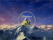
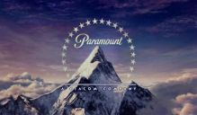
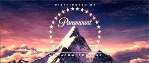
8th Logo
(March 1, 2002-2012)


<iframe frameborder="0" height="186" src="http://wikifoundrytools.com/wiki/closinglogos/widget/genericvideo/2401d8e1a51b94bbb31a544c72702fa464e834d8" width="329"></iframe><iframe frameborder="0" height="186" src="http://wikifoundrytools.com/wiki/closinglogos/widget/genericvideo/b64b2f7ac0a8e49cf32dbf5c82c3b424fea60a8e" width="329"></iframe>
Nicknames: "2000s Mountain", "Ultra Majestic Mountain", "CGI Mountain II", "Perumount IV", "Space Mountain"
Logo: We pan down from a starry sky in space to a set of clouds, As we fly backwards slowly with the camera, some comet-like objects come flying down. They fly down far enough to reveal themselves as the trademark Paramount stars. The stars zoom past the camera, making us find out we had been watching a reflection all along. The familiar "Paramount" script zooms out as a total of 22 stars shoot past the script and encircle the mountain behind it. The script then continues to zoom out, taking its place at the peak of the mountain. The Viacombyline then fades in below the logo.
Bylines:
- March 1, 2002-March 26, 2010: "/\ \/|/\CO/\/\ CO/\/\PANY" in its 1990 Wigga-Wigga font.
- May 7, 2010-December 21, 2011: "A VIACOM COMPANY" in its 2006 font.
Variants:
- March 1-December 18, 2002: During its first year of use, the words "90TH ANNIVERSARY", in gold with "90" bigger and "TH" smaller and on the top right of "90" and "ANNIVERSARY" below, fade in with the Viacom byline and the line, sandwiched between the peak of the mountain. Again, "™" is used in place of "®" in this variation. The logo's general shade of color is also much brighter.
- A prototype variant of the 90th Anniversary logo was spotted (and only appeared) on the video game The Sum of All Fears, where the "90TH ANNIVERSARY" text was bigger and shinier.
- A still version of the logo was spotted on international prints of Sleuth (released by Sony Pictures Classics in the US).
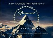
- A variant is used at the end of every trailer for Paramount's movies on online movie stores like iTunes and the PlayStation Store. We see a still version of the Paramount logo with the words "Now Available from Paramount". Below it is a copyright stamp. Has also been seen zoomed in (so the copyright and the "now available" text is not seen) and on the trailer for Airplane!, where the logo plasters the 1975 trailer version of the logo (keeping the music). This is also seen on old Dreamworks movie trailers.
- 2006-October 28, 2011: When distributing films from another company, the words "DISTRIBUTED BY", in white, are seen above the logo with the Viacom byline and the line. Usually seen at the end of DreamWorks films beginning in late 2006. It also oddly appears at the end of Iron Man, before the Marvel Studios logo. It also appears at the beginning of international prints of The Spy Next Door.
- Late 2005-2011: The logo has been enhanced.
- May 7, 2010-December 21, 2011: The logo was enhanced once more with sleeker stars and shinier text, and the Viacom byline is switched to its 2006 font. However, the words "DISTRIBUTED BY" remain in the 1990 font.
- On full screen DVDs of Paramount movies shot in 2.39:1 scope, the logo is incredibly zoomed in, since it is in the 4:3 ratio. On matted films, it is either zoomed in halfway, or it is in open matte.
FX/SFX: Incredibly breathtaking CGI; very reminiscent of the more majestic and stylized 1940s and '50s mountains.
Music/Sounds: Usually it's silent or has the film's opening theme.
Music/Sounds Variants:
- On Mean Girls, the 1987 fanfare is heard. Sadly, this was the only film to use the fanfare.
- On The Longest Yard, a different fanfare plays. This was composed by Teddy Castellucci.
- On an AMC airing of Rambo III, this plasters the Carolco logo and keeps the low-pitched version of the theme in one of the worst logo plastering jobs ever!
- On Twisted, wind is audible in the logo. Skywalker Sound which did the sound for the film, did the same here.
- On Jackass Number Two, a loud jet sound along with wind where the stars flying down then the whoosh sound where Viacom byline fades in was heard.
Availability: Very common. Seen on all Paramount films from 2002 to 2011, as well as Paramount video releases from 2002 to 2006.
- The 90th Anniversary variant was first seen on We Were Soldiers and last appeared on The Hours and sometimes plastered old logos on 2002 video releases as well as the Tri-Star Pictures logo on Encore airings of Rambo III.
- The normal Viacom variation was first used on Tupac: Resurrection; the last movies overall to use this logo officially were Young Adult and The Adventures of Tintin.The last movie to use the Viacom byline in its 1990 font is How to Train Your Dragon, while the first movie to use the 2006 font for the byline is Iron Man 2.
- Also seen at the end of Elizabethtown, Zodiac, and Indiana Jones and the Kingdom of the Crystal Skull, which all had the 5th logo at the beginning.
- It also appears at the end of Grease Sing-a-Long (a re-release of 1978's Grease), which has the 7th logo at the beginning.
- On the Blue's Clues episode "Meet Joe" on VHS, the previous logo is shown at the beginning, while the 90th Anniversary closing variant plays at the end of the tape.
- Also plasters the Weintraub Entertainment Group logo on a recent Encore airing of My Stepmother is an Alien, with the film's opening music; Weintraub previously had a deal with Worldvision Enterprises.
- It also plasters the 1982 Orion Pictures logo on HBO, Comedy Central, and IFC airings of Bill and Ted's Excellent Adventure (also plasters the closing version of the logo at the end, the following Nelson Entertainment logo is kept intact at the beginning), and the 1995 MGM logo on older HBO airings of House Arrest.
- Surprisingly, the full version appears at the beginning of a few early episodes of Hogan's Heroes on Me-TV, including the pilot episode, as well as the HD remasters on Universal HD.
- Strangely, this logo does not appear at the beginning of Strange Wilderness, although the "Distributed by" variant makes an appearance at the end. This might be due to the movie's negative reception.
- It's also seen at the end of 2006-2011 DreamWorks Animation films but don't expect this to appear at the beginning of them, unlike 20th Century Fox. It is likely because Paramount only merely distributed them; it did, however, appear on the VCD release of Flushed Away before the DreamWorks Animation logo.
Editor's Note: Much like the previous logo, except made with even better CGI.
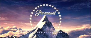
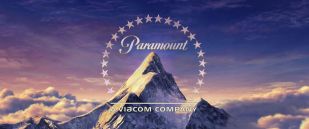
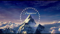
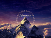
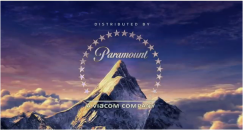
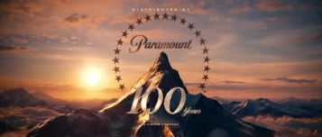
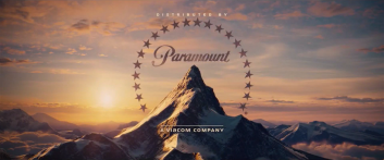
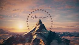
9th Logo
(December 16, 2011- )


<iframe frameborder="0" height="186" src="http://wikifoundrytools.com/wiki/closinglogos/widget/genericvideo/e0785d3b72d56ec25a55109b52c484fbf7528b3d" width="329"></iframe><iframe frameborder="0" height="186" src="http://wikifoundrytools.com/wiki/closinglogos/widget/genericvideo/4c9e150fda82f10e8dbb65a220aba763c88b0055" width="329"></iframe>
Nicknames: "2010s Mountain", "Ultra Majestic Mountain II", "CGI Mountain III", "Perumount V"
Logo: On a dark cloudy background, we see several stars flying towards us, a mirrored reference to the previous logo. As the third star flies towards us, we follow the star to reveal that we were looking at the reflection of a lake. We follow the stars as they skim the lake and create ripples. We continue to fly forward as a total of 22 stars line up and encircle the mountain ahead. Then the word "Paramount" zooms back to take its place on the mountain, which is situated on a cloudy sunset landscape. The byline fades in below.
Trivia: This logo was designed by <a href="https://www.devastudios.com/work/logo/paramount-100-years/" target="_self">DevaStudios, Inc</a>. and animated using the Terragen software from <a href="https://planetside.co.uk/featured-projects/paramounts-100th-anniversary-logo-created-with-terragen/" target="_self">Planetside Software</a>.
Bylines:
- December 16, 2011-November 8, 2019: "A VIACOM COMPANY"
- January 10, 2020-: "A ViacomCBS Company"
Variants:
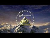
- When the logo debuted and during the logo's first official year, 2012, a bright light shines to reveal "100 Years" with "100" bigger and "Years" smaller, before a small Viacom byline fades in underneath.
- A French version exists.
- On YouTube advertisements from the side of a video (done after a video ad), a picture of the logo appears. This logo has no byline, and has a dark blue to black gradient on the sides.
- Closing: Just like the last logo, sometimes "DISTRIBUTED BY" appears above the logo. This variant was first seen on Mission Impossible – Ghost Protocol and can be seen on some trailers. It was also seen at the end of Star Trek Into Darkness and Wonder Park.
FX/SFX: Beautifully crafted CGI that combines elements of the 2002 logo with the landscape of the 1986 logo.
Music/Sounds: A light bell and string piece which rises in intensity and becomes more majestic and orchestral, scored by Michael Giacchino. Sometimes it is silent, or it uses the film's opening theme.
Music/Sounds Variants:
- On Mission: Impossible - Ghost Protocol, the first film to use this logo, there is an alternate version of the fanfare with some slight changes, in the note of the orchestration, making it sound more powerful.
- An <a href="https://www.youtube.com/watch?v=mVBcJ4YQEBU" target="_self">unused alternate version</a> is heard on the Mission: Impossible - Ghost Protocol OST that features a very different, more sweeping and even more powerful orchestration.
- On Jackass Presents: Bad Grandpa, Zoolander 2, and Baywatch, the music plays while there are whooshes when the stars and the text fly by.
- At the end of a Starz! Network print of Hero and the Terror, a Cannon film, the Viacom "V of Steel" jingle plays over the end variant of this logo due to a plastering error.
Availability: Current. Seen on all Paramount movies since Mission Impossible: Ghost Protocol. Also seen as a de-facto home entertainment logo on Paramount's 4K UHD Blu-ray disc releases starting with Star Trek and Star Trek Into Darkness, and on regular Blu-rays/DVDs starting with the 2019 release of Bumblebee.This logo also appears on the first four films from Paramount Animation before the division got its own logo in 2020. The Viacom byline made its final appearance on Playing with Fire; the ViacomCBS byline first debuted on a Spanish TV spot for Sonic The Hedgehog. It made its theatrical debut on Like a Boss.
Editor's Note: This is a true masterpiece of a logo, with the powerful and majestic theme, perfect CGI, and sheer power it radiates. It's certainly a worthy successor to all the 100 years' worth of Paramountains before it.