Orion Pictures
Jump to navigation
Jump to search
Nicknames: "The Constellation", "Starry Sky", "Orion"
Logo: We first see a starry sky, then a constellation of stars (in the shape of Orion, appropriately) in the middle shine brighter than the rest. It moves to the left, forms a circle, and spins around until, in a small, but bright flash, it forms a letter "O." Then the letters "RION" appear (by a sliding effect) to complete the logo, which is stylized when a line is drawn across it. The traces of the line remain on the left side of each letter except the "I," which has the line across the word. "An" and "PICTURES RELEASE" all in light blue appear above and below the logo accordingly.
Trivia:
FX/SFX: The constellation and "Orion" forming. The animation looks really good more than 35 years later.
Music/Sounds: Most of the time it is silent, or in many cases the opening theme of the film is heard. However, on films such as The Terminator, Dances With Wolves, and UHF, a jingle consisting of futuristic-sounding series of chimes combined with a majestic horn fanfare after the stars merge is heard. This fanfare was composed by Leland Bond.
<iframe height="165" src="http://wikifoundrytools.com/wiki/closinglogos/widget/unknown/86474256d98fdfd8af18e75749f7f1ef560a7547" width="292"></iframe>
Nicknames: "The CGI Constellation", "CGI Starry Sky", "The Constellation II", "Starry Sky II", "Orion II"
Logo: Very much the same as the previous logo, but updated with 1990s computer effects. The starfield behind the logo no longer zooms-out as the logo forms, but shoots out towards the screen. The animation is the same, but the stars now have a "trail" that forms the "O", and the forming of the actual logo, including a laser light, forming the line in the logo, is different. The logo itself is now silvery and 3D, and only "PICTURES" appears below the logo in the same font as last time. Inside the "ORION" text has an animated landscape.
Variant: There is a black and white variant of this logo on American International Pictures films in black and white.
FX/SFX: Now that's what we call a logo update! A suitable successor to the previous "Starry Sky", the computer animation looks very good, even today.
Music/Sounds: An ascending cycle of strings that repeats alongside a horn tune. As the logo begins to form, it picks up tempo, culminating in a majestic hit and a 3-note sounder. This theme was composed by John Pratt. Otherwise, it's none or the opening theme of the film is heard.
Logo descriptions by James Fabiano, Jeffrey Gray, Matt Williams, and indycar
Logo captures by Eric S., Juniorfan88, Shadeed A. Kelly, Logophile, Derrick Anderson, indycar ,TrickyMario7654, and thestudioghibifan2001
Editions by V of Doom, codyfinke, Shadeed A. Kelly, Lee Cremeans, indycar, and DabigLogoCollector
Video captures courtesy of BreadCrustCouncil, Eric S., Logo Archive (OZ_Paramount87), Edifice5151, DudeThatLogo, and indycar
Background: Orion Pictures was formed as the "Orion Pictures Company" in March 1978 as a joint venture between Warner Bros. Pictures and three former executives of United Artists: Arthur B. Krim, Eric Pleskow and Robert S. Benjamin. When the studio was formed, they produced films that would be released by Warner Bros. In 1982, Orion bought Filmways, Inc., after Orion was unhappy with distribution agreements with Warner Bros. In June 1982, Filmways Pictures was reincorporated as "Orion Pictures Corporation". In 1983, Orion introduced Orion Classics as an art-house division. On May 22, 1986, Metromedia purchased a minor stake in the studio and later purchased 67% of the studio on May 20, 1988. In the late 1980s, Orion began to struggle financially and would declare bankruptcy on December 11, 1991. In 1996, Orion Pictures under Metromedia acquired Samuel Goldwyn Entertainment. On April 11, 1997, Metro-Goldwyn-Mayer, Inc. acquired Metromedia's film studios (Orion, Goldwyn and the Motion Picture Corporation of America) and the deal was closed in July. A year later, Orion was folded into Metro-Goldwyn-Mayer and the Motion Picture Corporation of America separated from MGM to become independent. Orion survived as an in-name-only unit of MGM during that time frame. In 2013, MGM relaunched the Orion Pictures brand for use on genre films, which will run theatrical and multi platform campaigns, and became a standalone division with the same purpose in late 2017. Currently, most of Orion's post-1982 films are owned by MGM (with Orion retaining the copyright). Warner Bros. continues to own all pre-1982 films, select films that they released afterwards (although MGM/Orion does own two Orion films they released after the initial deal, A Midsummer's Night Sex Comedy and Zelig) and films produced by The Saul Zaentz Company, StudioCanal owns First Blood through producer Carolco Pictures, HBO Films owns North American distribution rights to Three Amigos (MGM retains TV and foreign rights however), Paramount Pictures owns North American distribution rights to The Addams Family and Lionsgate Films owns films produced by LIVE Entertainment. Films produced by Nelson Entertainment and Hemdale Film Corporation were originally distributed by Orion and became owned by MGM (with Orion holding the copyright) after MGM purchased the pre-March 31, 1996 PolyGram Filmed Entertainment library.
1st Logo
(April 27, 1979-December 18, 1981)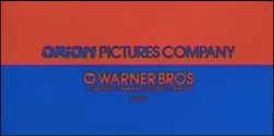
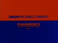
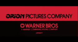
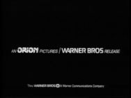
Nicknames: "Red/Blue Split", "Splitting Rectangles", "The Orion/Warner Bros. Combo"
Logo: On a black screen, two rectangles, one blue and one orange, each one tilted forward at a 45 degree angle (making them appear like the floor and ceiling of a tunnel), shoot out towards the center of the screen. When they both connect at the center of the screen, they tilt back 45 degrees, so that they are facing the viewer completely, and enlarge to fill the screen. In the blue rectangle, which is on the top, we see the \\' logo and the words "WARNER BROS" in orange. In the orange rectangle, which is on the bottom, we see the words "ORION (in their trademark font) PICTURES COMPANY (in an ITC Avant Garde Gothic font)" in blue. After a while, the blue and orange rectangles move to each others spot, briefly overlapping. "A WARNER COMMUNICATIONS COMPANY" and "present" fade-in under "WARNER BROS".
Variants:
Music/Sounds: Usually silent or the opening theme of the film.
Availability: Near extinction, due to chronic plastering by the original version (the version with the Warner Communications byline) of the next logo, and on certain cases, the 1973 Warner Bros. logo. Seen on the original WCI/Warner VHS and Betamax releases of Monty Python's Life of Brian, Time After Time, Prince of the City, Sharky's Machine, Arthur (retail copy only as the rental copy has it plastered by the next logo), Wolfen (also intact on a <a href="https://www.youtube.com/watch?v=kqLtrvuUZ64" target="_self" title="1992 HBO broadcast">1992 HBO broadcast</a>), The Great Santini, and Caddyshack, along with a TV Land airing of the latter and AMC airings of former. The only known source for this logo currently is Prince of the City. The second closing variant is available on early home video prints of Arthur.
2nd Logo
(July 4, 1979-March 19, 1997, October 4, 2013- )
Logo captures by Eric S., Juniorfan88, Shadeed A. Kelly, Logophile, Derrick Anderson, indycar ,TrickyMario7654, and thestudioghibifan2001
Editions by V of Doom, codyfinke, Shadeed A. Kelly, Lee Cremeans, indycar, and DabigLogoCollector
Video captures courtesy of BreadCrustCouncil, Eric S., Logo Archive (OZ_Paramount87), Edifice5151, DudeThatLogo, and indycar
Background: Orion Pictures was formed as the "Orion Pictures Company" in March 1978 as a joint venture between Warner Bros. Pictures and three former executives of United Artists: Arthur B. Krim, Eric Pleskow and Robert S. Benjamin. When the studio was formed, they produced films that would be released by Warner Bros. In 1982, Orion bought Filmways, Inc., after Orion was unhappy with distribution agreements with Warner Bros. In June 1982, Filmways Pictures was reincorporated as "Orion Pictures Corporation". In 1983, Orion introduced Orion Classics as an art-house division. On May 22, 1986, Metromedia purchased a minor stake in the studio and later purchased 67% of the studio on May 20, 1988. In the late 1980s, Orion began to struggle financially and would declare bankruptcy on December 11, 1991. In 1996, Orion Pictures under Metromedia acquired Samuel Goldwyn Entertainment. On April 11, 1997, Metro-Goldwyn-Mayer, Inc. acquired Metromedia's film studios (Orion, Goldwyn and the Motion Picture Corporation of America) and the deal was closed in July. A year later, Orion was folded into Metro-Goldwyn-Mayer and the Motion Picture Corporation of America separated from MGM to become independent. Orion survived as an in-name-only unit of MGM during that time frame. In 2013, MGM relaunched the Orion Pictures brand for use on genre films, which will run theatrical and multi platform campaigns, and became a standalone division with the same purpose in late 2017. Currently, most of Orion's post-1982 films are owned by MGM (with Orion retaining the copyright). Warner Bros. continues to own all pre-1982 films, select films that they released afterwards (although MGM/Orion does own two Orion films they released after the initial deal, A Midsummer's Night Sex Comedy and Zelig) and films produced by The Saul Zaentz Company, StudioCanal owns First Blood through producer Carolco Pictures, HBO Films owns North American distribution rights to Three Amigos (MGM retains TV and foreign rights however), Paramount Pictures owns North American distribution rights to The Addams Family and Lionsgate Films owns films produced by LIVE Entertainment. Films produced by Nelson Entertainment and Hemdale Film Corporation were originally distributed by Orion and became owned by MGM (with Orion holding the copyright) after MGM purchased the pre-March 31, 1996 PolyGram Filmed Entertainment library.
1st Logo
(April 27, 1979-December 18, 1981)


<iframe height="150" src="http://wikifoundrytools.com/wiki/closinglogos/widget/unknown/3e9d4838f3bdcff11cd755c4602dbe1eee532420" width="266"></iframe><iframe height="150" src="http://wikifoundrytools.com/wiki/closinglogos/widget/unknown/f1c399b39e3123105f7aa5edfc96c18dba480669" width="266"></iframe><iframe height="150" src="http://wikifoundrytools.com/wiki/closinglogos/widget/unknown/6fb0edec17e67e52efbeb5fc5bda4dfaa6176b95" width="266"></iframe>
Nicknames: "Red/Blue Split", "Splitting Rectangles", "The Orion/Warner Bros. Combo"
Logo: On a black screen, two rectangles, one blue and one orange, each one tilted forward at a 45 degree angle (making them appear like the floor and ceiling of a tunnel), shoot out towards the center of the screen. When they both connect at the center of the screen, they tilt back 45 degrees, so that they are facing the viewer completely, and enlarge to fill the screen. In the blue rectangle, which is on the top, we see the \\' logo and the words "WARNER BROS" in orange. In the orange rectangle, which is on the bottom, we see the words "ORION (in their trademark font) PICTURES COMPANY (in an ITC Avant Garde Gothic font)" in blue. After a while, the blue and orange rectangles move to each others spot, briefly overlapping. "A WARNER COMMUNICATIONS COMPANY" and "present" fade-in under "WARNER BROS".
Variants:
- On the 1983 Warner Home Video VHS release of Time After Time, the color scheme is brighter and is zoomed in.
- On the trailer for Zelig, the logo appears in red and black rather than orange and blue.
Closing Variants:
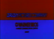
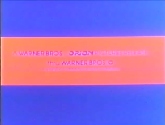
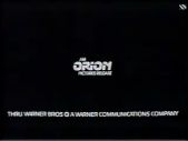
- At the end of the credits, we see the text "AN ORION PICTURES /WARNER BROS RELEASE" with "ORION" in its trademark logo font and "WARNER BROS" in its 1972 font from the theatrical logo. We see the byline,"Thru WARNER BROS, A Warner Communications Company", with the Warner Communications \\' logo in between the name and the company byline.
- Another variant looks close to the opening logo, but has a red stripe on a blue background, inside which it has "A WARNER BROS/ORION PICTURES RELEASE"; below which is "Thru", with the "\\'" to the right, and the Warner Communications byline below (all company names are in their trademark fonts as with the regular closing variant).
FX/SFX: The tilting and sliding.
Music/Sounds: Usually silent or the opening theme of the film.
Availability: Near extinction, due to chronic plastering by the original version (the version with the Warner Communications byline) of the next logo, and on certain cases, the 1973 Warner Bros. logo. Seen on the original WCI/Warner VHS and Betamax releases of Monty Python's Life of Brian, Time After Time, Prince of the City, Sharky's Machine, Arthur (retail copy only as the rental copy has it plastered by the next logo), Wolfen (also intact on a <a href="https://www.youtube.com/watch?v=kqLtrvuUZ64" target="_self" title="1992 HBO broadcast">1992 HBO broadcast</a>), The Great Santini, and Caddyshack, along with a TV Land airing of the latter and AMC airings of former. The only known source for this logo currently is Prince of the City. The second closing variant is available on early home video prints of Arthur.
2nd Logo
(July 4, 1979-March 19, 1997, October 4, 2013- )


<iframe height="135" src="http://wikifoundrytools.com/wiki/closinglogos/widget/unknown/62df2f065206aabf0eb72b2c6d984453c9800ad8" width="239"></iframe><iframe height="135" src="http://wikifoundrytools.com/wiki/closinglogos/widget/unknown/f196e80fc90f222872fcf7c8441dcef9d5f68260" width="239"></iframe><iframe height="135" src="http://wikifoundrytools.com/wiki/closinglogos/widget/unknown/28d11f22a12dbf425f4f7662d7b8f6922fa47c4a" width="180"></iframe>
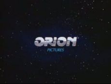
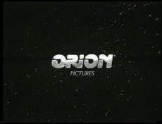
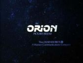
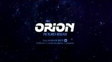
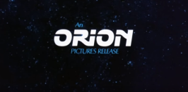
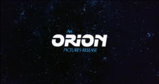
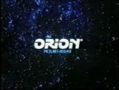
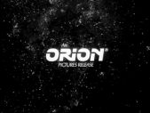
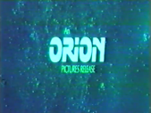
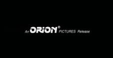
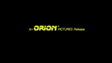
Nicknames: "The Constellation", "Starry Sky", "Orion"
Logo: We first see a starry sky, then a constellation of stars (in the shape of Orion, appropriately) in the middle shine brighter than the rest. It moves to the left, forms a circle, and spins around until, in a small, but bright flash, it forms a letter "O." Then the letters "RION" appear (by a sliding effect) to complete the logo, which is stylized when a line is drawn across it. The traces of the line remain on the left side of each letter except the "I," which has the line across the word. "An" and "PICTURES RELEASE" all in light blue appear above and below the logo accordingly.
Trivia:
- This logo was parodied in the Family Guy season 8 episode "April in Quahog", where Adam West punches the constellation ("Take that Orion!") to form the logo without the additional text and with a little synth jingle. Adam responds "That's right, all you are is a failed production company!"
- On the 2002 MGM DVD release of UHF, if you listen to the commentary, it has "Weird" Al Yankovic sing lyrics to the jingle ("Orion, Orion is bankrupt now!"). This references how Orion nearly killed themselves by releasing the film the same year that many popular franchises were releasing new films.
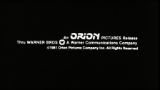
- On films from 1980 to 1982, under the logo itself, there was a byline that said "Thru WARNER BROS, A Warner Communications Company", with a little \\' next to the company name and the Warner byline underneath. Sometimes centered or off-centered. After Orion purchased Filmways, the logo was freeze-framed to hide the Warner Bros. references.
- On a VHS of First Blood, the logo has a green tint and appears to be compressed (stretched to fill 4:3). In the case of the latter, it was most likely due to the anamorphic widescreen ratio of the film not being uncompressed.
- Beginning with Desperately Seeking Susan, there is a registered trademark symbol "®" that appears next to the Orion name.
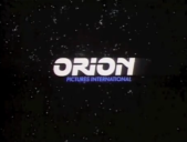
- Another version reads "PICTURES INTERNATIONAL" below the logo; "INTERNATIONAL" replaces "RELEASE".
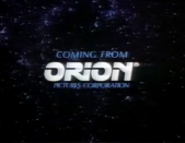
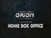
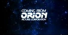
- Starting in 1984 on trailers, the logo is close up and begins from the stars spinning to form the "O", but, instead of the words "An" and "PICTURES RELEASE" fading in, the words "COMING FROM" (in a larger font) and "PICTURES CORPORATION" fade in above and below the logo respectively.
- Starting in 1986, an updated version with the words in blue and smaller size was used.
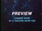
- On some trailers (Bull Durham for example), the Orion logo fades out and the words "PREVIEW" and "COMING SOON TO A THEATER NEAR YOU" fades in.
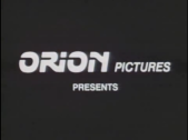
- On the trailer for Gorky Park, right before the announcer states the actors in the movie, a screen is shown with "ORION PICTURES PRESENTS" with the announcer reading the words.
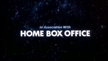
- On Three Amigos, after this logo fades, "IN ASSOCIATION WITH (in the same style as "An" and "PICTURES RELEASE" on the standard logo) HOME BOX OFFICE (in a bold, white font)" fades in.
- On 1980s syndication prints of Green Acres, a shortened version of this logo is seen that starts with the "O" forming "RION".
- Orion Home Video releases would have either of that company's logos merge into this logo.
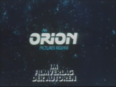
- Some Italian films distributed by Orion use a special variant in that language where "CDI" replaces "Orion" and "COMPAGNIA DISTRIBUZIONE INTERNAZIONALE" appears underneath.
- On current prints of The Arrival, in one of the most sloppiest plasters ever, when the full text appears, it cuts off to the 2006 Lionsgate logo, covering up any reference to the LIVE Entertainment logo.
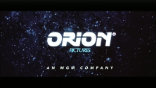
- Starting in 2018, the logo was slightly updated; here the "Pictures Release" text is just replaced with "Pictures" and there is now an MGM byline. The freeze-frame, which was designed to hide the Warner Bros. references, remains on this version.
FX/SFX: The constellation and "Orion" forming. The animation looks really good more than 35 years later.
Music/Sounds: Most of the time it is silent, or in many cases the opening theme of the film is heard. However, on films such as The Terminator, Dances With Wolves, and UHF, a jingle consisting of futuristic-sounding series of chimes combined with a majestic horn fanfare after the stars merge is heard. This fanfare was composed by Leland Bond.
Availability: Common.
- The byline-less version is preserved on most 1982 to 1995 films (usually with the MGM logo), such as The Silence of the Lambs, The Terminator (although the 1991 Hemdale Home Video VHS and 1995 Image Entertainment Laserdisc releases plaster this logo with the Hemdale Film Corporation logo), Madhouse, Bull Durham, the original Robocop trilogy, Hoosiers, Mississippi Burning, Platoon, UHF, Three Amigos, Breathless (1983), Harry and Son, Dances with Wolves (US prints only), and both Bill & Ted films, among others (though the 2001 DVD release of Bill & Ted's Bogus Journey inexplicably cuts the logo, going from the MGM logo straight to the opening credits).
- The earlier variant with the Warner Bros. byline first appeared on the 1980 WCI Home Video VHS and Betamax release of 10 to plaster the previous logo, and was also seen on theatrical releases of the time frame (in tandem with the previous logo). This version plasters the previous logo on current releases of 1979 to 1981 films such as Caddyshack, The Great Santini, Arthur (1981), Sharky's Machine and Wolfen, among others. On First Blood, it was preserved on the 1983 Thorn EMI Video VHS release, appearing on the film all the way up to the 1995 Avid Home Entertainment release, and also appears on the widescreen laserdisc release from Live Home Video; oddly enough, though the film itself is letterboxed, the logo is still anamorphically squeezed into a 4:3 frame.
- The original closing variant appeared from 1979 to 1982, only appearing without the Warner Bros. byline towards the end of its run. The last film to feature it was Split Image, which removed it on all home video releases; currently, the only known sources for the bylineless variant are old video copies of Amityville II: The Possession, the first film to use this logo without the WB byline. Beginning with Lone Wolf McQuade, which doesn’t have “Orion” in its usual stylized font, the closing logo was on a single line of text and usually appeared during the closing credits sequences instead of after.
- This logo is usually removed from current prints of Split Image (one of the first films to feature this logo without the Warner Bros. byline) and instead go straight to the PolyGram logo. Out of the original Amityville films, this is retained only on Amityville 3-D, where the MGM logo does not appear at all on the Blu-ray, even at the end. The R-rated Director's Cut version of Amadeus plasters this logo with the 2001 Warner Bros. logo, since Orion only handled theatrical distribution in the United States and Warner Bros. owns the film via The Saul Zaentz Company. It is intact on some releases of the original Theatrical Cut, such as the Pioneer Entertainment Widescreen Laserdisc release and the 1997 WB R1 DVD release. Recent TV airings and the Blu-ray of No Way Out plasters this with the next logo, although it is retained on the R1 DVD release and also on the 2000s MGM VHS reissue.
- The trailer variants can be found on some theatrical or teaser trailers on DVD releases, such as on The Terminator and UHF (the latter is only on the widescreen side). The International and Italian variants are extremely rare, due to most current releases using domestic prints. The latter can be seen on the 1989 IVE VHS release of Domino. The shortened version could be seen at the end of Green Acres reruns as late as the mid-2000s. The studio produced several films in 1991 that were not released until 1993 and 1994, such as The Dark Half, Robocop 3, Car 54 Where Are You?, There Goes My Baby, Clifford and China Moon.
- The Orion Home Video variant was seen on VHS releases of the studio's material from the company (but not on material licensed to the company).
- When the studio was restarted in 2013, it made its debut on Grace Unplugged (which was co-released by Lionsgate Films and Roadside Attractions and was the first film released under the rebooted studio). Later, it appeared on the Brazilian film Vestido pra Casar (translated as Dressed to Marry), and other recent films from the revived company.
- It was also seen on international VHS prints of The Addams Family, but the DVD release weirdly enough has the Paramount logo instead just like on the domestic release. It was seen on international prints of Crimes of Passion (1984) and Iron Warrior, though the Arrow Video release of the former goes straight to the opening title screen, while the latter was plastered with the 2001 MGM lion. It also appears on the screener VHS of The Arrival from Live Entertainment, followed by a shortened version of Live's logo. This logo is also seen on Behind Enemy Lines (1997).
Editor's Note: This is a very popular logo, to the point where it was revived when Orion was revived in 2013.
3rd Logo
(January 1, 1997-September 24, 1999)
(January 1, 1997-September 24, 1999)


<iframe height="165" src="http://wikifoundrytools.com/wiki/closinglogos/widget/unknown/86474256d98fdfd8af18e75749f7f1ef560a7547" width="292"></iframe>
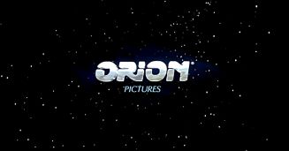
Nicknames: "The CGI Constellation", "CGI Starry Sky", "The Constellation II", "Starry Sky II", "Orion II"
Logo: Very much the same as the previous logo, but updated with 1990s computer effects. The starfield behind the logo no longer zooms-out as the logo forms, but shoots out towards the screen. The animation is the same, but the stars now have a "trail" that forms the "O", and the forming of the actual logo, including a laser light, forming the line in the logo, is different. The logo itself is now silvery and 3D, and only "PICTURES" appears below the logo in the same font as last time. Inside the "ORION" text has an animated landscape.
Variant: There is a black and white variant of this logo on American International Pictures films in black and white.
FX/SFX: Now that's what we call a logo update! A suitable successor to the previous "Starry Sky", the computer animation looks very good, even today.
Music/Sounds: An ascending cycle of strings that repeats alongside a horn tune. As the logo begins to form, it picks up tempo, culminating in a majestic hit and a 3-note sounder. This theme was composed by John Pratt. Otherwise, it's none or the opening theme of the film is heard.
Availability: Uncommon. Can be found on the studio's (limited) output of films from this period until its original demise in 1999, such as The Locusts, City of Industry, Gang Related, and Ulee's Gold. Like the previous logo, the MGM logo precedes this logo on most current prints. It can also be seen on DVD releases and television airings of a few American International Pictures films, such as Coffy, Hell Up In Harlem, and Bucktown. This also plasters the Filmways Pictures logo on the MGM DVD release of Blow Out and it is seen on current prints of the unofficial James Bond film Never Say Never Again (meaning it was not produced by Eon Productions, the production company of the series), by plastering the Warner Bros. "Big W" logo, including the 2001 MGM/UA United Kingdom VHS release, MGM DVD releases, and Netflix's (deleted) streaming print. Some prints of Orion films distributed by MGM plastered the previous logo with the this one , such as No Way Out and The Falcon and The Snowman. Also seen on international prints of One Man's Hero (Orion's final film until they were reactivated in 2013). The Stargate television movie pilot also had this logo.
Here is a logo history of the company:
<iframe frameborder="0" height="186" src="http://wikifoundrytools.com/wiki/closinglogos/widget/unknown/8b5ccfc98907ae9b5f609fe5a5295dbaf7b1d211" width="329"></iframe>