Logo Variations - Trailers - Paramount Pictures
Jump to navigation
Jump to search
____________________________________________________________________________________
The Shootist (1976): The 1975 logo is in black & white.
Grease (1978): On the 1998 re-release trailer, the 1995 logo turns black and white.
Explorers (1985) and Critical Condition (1987): The 1975-1986 logo isn't animated. Also, the realistic mountain in a canyon scenery with trees around it stays on-screen and doesn't fade into the print logo.
Scrooged (1988): Same as the movie itself, but also has the snow coming down from the sky and the camera zooms into the Paramountain. It's seen on the theatrical trailer which is found on the DVD.
On another trailer of the film, there's snow falling from the sky while the camera zooms in towards the mountain.
Harlem Nights (1989): The Paramount script logo glows. The byline is a dark brown.
_______________________________________________________________________________________
Indecent Proposal (1993) andFire in the Sky (1993): The Paramount script logo is darker and the script logo and company byline are in shadow mode.
_______________________________________________________________________________________
Congo (1995): On the teaser trailer, the logo is bylineless.
On the theatrical trailer, it's exactly the same as Ghost, School Ties, Indecent Proposal, and Coneheads.
_______________________________________________________________________________________
Paramount Family Favorites (1995): A trailer for features in Paramount's Family Favorites collection, found on many Paramount kid and family-oriented releases of the time (such as titles from said collection and Rugrats tapes). The standard 1995 logo plays, but after that comes the 1975 logo's cameo appearance in Bon Voyage, Charlie Brown (and Don't Come Back!!), but with the 1975 logo replaced with the 1986 logo.
_______________________________________________________________________________________
The Beautician and the Beast (1997): The logo has a page turning transition effect.
_______________________________________________________________________________________
Good Burger (1997): The logo stretches into the 1997 Nickelodeon Movies logo.
_______________________________________________________________________________________
It Was My Best Birthday Ever, Charlie Brown! (1997, VHS): The logo fades into the Peanuts Home Video logo.
Mission: Impossible II (2000): Exactly just like the Tomb Raider variant, but with different graphics and no byline. 
The Ladies Man (2000): The logo is tinted in violet-blue. 
Rugrats in Paris: The Movie (2000): The logo is printed on a postcard on a red background, along with the Nickelodeon Movies logo. 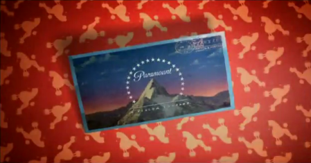
On TV spots, the logo appears on Zak's watch along with the Nickelodeon logo.
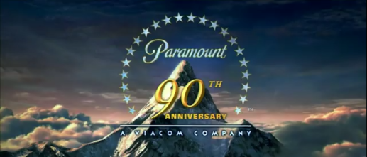
On the home video trailer, the 90th Anniversary logo has a warbling ripple effect like the one used on the 1999 logo above.
_______________________________________________________________________________________
Changing Lanes (2002): The 1999 logo is pixelated. Suddenly, it pixelates back to normal.
_______________________________________________________________________________________
Extreme Ops (2002): The logo is tinted in light slate gray.
_______________________________________________________________________________________
Narc (2002): The logo is tinted in verdigris and blurred out.
_______________________________________________________________________________________
Paycheck (2003): We zoom in to a chip with the same pattern as the logo, the background is dark, the stars and the "Paramount" text is tinted in blue, then it animates in reverse, zooming into the P of Paramount, transitioning to the Dreamworks logo.
_______________________________________________________________________________________
Tomb Raider: The Cradle of Life (2003): On one trailer, it is same one from the Tomb Raider trailer.
On another trailer, the logo turns into an ochre/white color.
_______________________________________________________________________________________
School of Rock (2003): The logo is negative. Suddenly, it turns back to normal and the text "PARAMOUNT PICTURES PRESENTS" is over the logo.
Alfie (2004): The logo is in black & white. 
_______________________________________________________________________________________
Team America: World Police (2004): On one trailer, the text is written in a scrawly font.
_______________________________________________________________________________________
Sahara (2005): The mountain is put upon a golden coin on a black background, along with the Bristol Bay logo. Also, it is bylineless.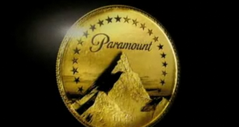
Beowulf (2007, US version): The logo is all dark with black & white and some thunder and lightning.
_______________________________________________________________________________________
Iron Man (2008): The logo is seen tilted, then animates in reverse. This was only shown on the Superbowl TV spot.
_______________________________________________________________________________________
Monsters vs. Aliens (2009, DreamWorks Animation): The mountain jiggles just before the Viacom byline fades in. 
_______________________________________________________________________________________
Watchmen (2009): The logo is on a dark, cloudy background and is liver and nickel antimony titanium yellow. 
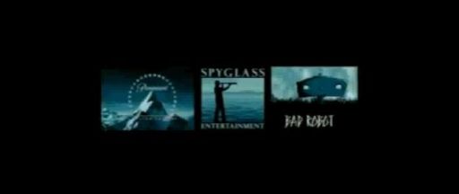
Star Trek (2009): The logo is tinted in robin's egg blue, along with the Spyglass Entertainment and Bad Robot logos. Only on the TV spot.
Paranormal Activity (2009): The logo is shown in a theater. Only on one of the trailers. 
Shutter Island (2010): The mountain goes from black & white to negative black & white with splattered stars.
The Fighter (2010): The Viacom byline fades in early when the logo gets done.
_______________________________________________________________________________________
Little Fockers (2010): The logo is bylineless. 
On the Super Bowl spot, it is like the Rango variant with the purple surrounding the mountain, but much darker.
_______________________________________________________________________________________
Rango (2011): On the teaser trailer, it's the same one from the Super 8 and True Grit trailers.
On the trailer, the stars and "Paramount" are in a slight shade of purple.
_______________________________________________________________________________________
No Strings Attached (2011): The words "DISTRIBUTED BY" are omitted and the logo is slightly in a shade of brown.
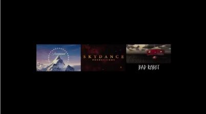
Mission: Impossible - Ghost Protocol (2011): On the trailer and TV spots, the 2010 Paramount, Skydance, and Bad Robot logos are all in boxes set next to each other on a black background.
____________________________________________________________________________________
The Avengers (2012): On the first trailer, the 2010 Viacom font is used, but is cut so that the word "Paramount" zooming out is seen for a split-second, then it cuts to the completed logo.
World War Z (2013): The 2010 print logo is made of steel and zooms in along with the GK Films, Plan B, and Skydance Productions logos.
____________________________________________________________________________________
G.I. Joe: Retaliation (2013): The 2010 logo is on the left with the MGM logo in the middle and the Skydance Productions logo on the right. Seen on the TV spot.
Nebraska (2013): The 1953 widescreen logo appears with the contemporary Viacom byline below.
These are the logo variations seen on trailers throughout the years by Paramount Pictures.
Wings (1927): On the trailer for the 2012 re-release of this film shown in Cinemark theaters with XD screens, the 2002 logo zooms in and morphs into the 1926 logo. Also, the 2010 Viacom byline is excluded.

____________________________________________________________________________________
Blue (1968) and The Parallax View (1974): The company name and byline fade into the background.
____________________________________________________________________________________
Chinatown (1974): It's the same one from the Blue and The Parallax View trailers.

_______________________________________________________________________________________
The Shootist (1976): The 1975 logo is in black & white.
_______________________________________________________________________________________
Grease (1978): On the 1998 re-release trailer, the 1995 logo turns black and white.

_____________________________________________________________________________________
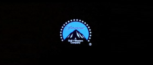
Star Trek: The Motion Picture (1979): We see a shot of the finished Paramount mountain logo with the Gulf+Western byline on a black background. The Registered trademark symbol "®" later disappears, ten additional stars fade in below, the light blue near-circle fades out, the Paramount print logo and the G+W byline later disappear, and red and blue stars fade in while the stars burst into many stars and start to zoom in. While the stars are zooming, we hear the sound of the USS Enterprise flying. Only appears on the teaser trailer.

_______________________________________________________________________________________
Explorers (1985) and Critical Condition (1987): The 1975-1986 logo isn't animated. Also, the realistic mountain in a canyon scenery with trees around it stays on-screen and doesn't fade into the print logo.
_____________________________________________________________________________________
Star Trek IV: The Voyage Home (1986): On a teaser TV spot, the 1975 logo appears to be more narrow than usual and the entire logo appears to use lighter shades of blue.

_______________________________________________________________________________________
Scrooged (1988): Same as the movie itself, but also has the snow coming down from the sky and the camera zooms into the Paramountain. It's seen on the theatrical trailer which is found on the DVD.

On another trailer of the film, there's snow falling from the sky while the camera zooms in towards the mountain.

_______________________________________________________________________________________
Harlem Nights (1989): The Paramount script logo glows. The byline is a dark brown.

_______________________________________________________________________________________
Indecent Proposal (1993) andFire in the Sky (1993): The Paramount script logo is darker and the script logo and company byline are in shadow mode.

_______________________________________________________________________________________
Congo (1995): On the teaser trailer, the logo is bylineless.
On the theatrical trailer, it's exactly the same as Ghost, School Ties, Indecent Proposal, and Coneheads.
_______________________________________________________________________________________
Paramount Family Favorites (1995): A trailer for features in Paramount's Family Favorites collection, found on many Paramount kid and family-oriented releases of the time (such as titles from said collection and Rugrats tapes). The standard 1995 logo plays, but after that comes the 1975 logo's cameo appearance in Bon Voyage, Charlie Brown (and Don't Come Back!!), but with the 1975 logo replaced with the 1986 logo.
_______________________________________________________________________________________
The Beautician and the Beast (1997): The logo has a page turning transition effect.

_______________________________________________________________________________________
Good Burger (1997): The logo stretches into the 1997 Nickelodeon Movies logo.

_______________________________________________________________________________________
It Was My Best Birthday Ever, Charlie Brown! (1997, VHS): The logo fades into the Peanuts Home Video logo.
_______________________________________________________________________________________
Titanic (1997, US release): The logo flashes in the beginning, Seen on the TV Spots & Trailer. On the other TV Spots, The logo fades to clips of the film.
_______________________________________________________________________________________
FairyTale: A True Story (1997): A meteor comes up and strikes the logo, then the logo turns normal. Also on a TV spot.
________________________________________________________________________________________
_______________________________________________________________________________________
FairyTale: A True Story (1997): A meteor comes up and strikes the logo, then the logo turns normal. Also on a TV spot.

________________________________________________________________________________________
Star Trek: Insurrection (1998): A zooming in effect (similar to the Warp Speed effect from Star Trek: The Next Generation, the television series from which this film was based on) reveals the 1995 version of the 1986 logo.


On the teaser trailer, the stars and text disappear, and zooms out from the mountain revealing the open scenery.
_______________________________________________________________________________________
Unknown Film (1990s): the 1999 logo freezes for one second and then speeds up, however, it's unknown what film used this variant. It's been said that it could possibly be Shaft (2000).
_______________________________________________________________________________________
_______________________________________________________________________________________
The Wood (1999):The mountain is shown on the label of a record, and spins on the turntable.
_______________________________________________________________________________________
_______________________________________________________________________________________
Mission: Impossible II (2000): Exactly just like the Tomb Raider variant, but with different graphics and no byline.

_______________________________________________________________________________________
The Ladies Man (2000): The logo is tinted in violet-blue.

_______________________________________________________________________________________
Rugrats in Paris: The Movie (2000): The logo is printed on a postcard on a red background, along with the Nickelodeon Movies logo.

_______________________________________________________________________________________
Lara Croft: Tomb Raider (2001): The logo is different than the original version, with ice and snow around and on the mountain.
Lara Croft: Tomb Raider (2001): The logo is different than the original version, with ice and snow around and on the mountain.

_______________________________________________________________________________________
Pootie Tang (2001): The logo is swirled. Suddenly, it swirls back to normal. If you look closely in one part of the logo, it quickly turns in negative tone.
_________________________________________________________________________________________________
Hardball (2001): The 1999 logo is tilted.
__________________________________________________________________________________________________
Jimmy Neutron: Boy Genius (2001): The 1999 logo is sped-up very fast.
_______________________________________________________________________________________
Clockstoppers (2002): The 1999 logo has a warbling ripple effect.
Pootie Tang (2001): The logo is swirled. Suddenly, it swirls back to normal. If you look closely in one part of the logo, it quickly turns in negative tone.

_________________________________________________________________________________________________
Hardball (2001): The 1999 logo is tilted.

__________________________________________________________________________________________________
Jimmy Neutron: Boy Genius (2001): The 1999 logo is sped-up very fast.
_______________________________________________________________________________________
Clockstoppers (2002): The 1999 logo has a warbling ripple effect.

On TV spots, the logo appears on Zak's watch along with the Nickelodeon logo.
On the home video trailer, the 90th Anniversary logo has a warbling ripple effect like the one used on the 1999 logo above.
_______________________________________________________________________________________
Changing Lanes (2002): The 1999 logo is pixelated. Suddenly, it pixelates back to normal.

_______________________________________________________________________________________
Extreme Ops (2002): The logo is tinted in light slate gray.

_______________________________________________________________________________________
Narc (2002): The logo is tinted in verdigris and blurred out.


_______________________________________________________________________________________
Star Trek: Nemesis (2002):The logo is inside of the eye of Shinzon (Tom Hardy) and it starts at the point where the name goes in front of the mountain, but stops just before the name gets to its place. Shinzon then blinks and the normal, finished product appears.
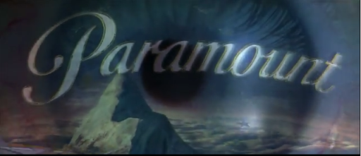
Star Trek: Nemesis (2002):The logo is inside of the eye of Shinzon (Tom Hardy) and it starts at the point where the name goes in front of the mountain, but stops just before the name gets to its place. Shinzon then blinks and the normal, finished product appears.


_______________________________________________________________________________________
Timeline (2003): Exactly just like on Lemony Snicket's A Series of Unfortunate Events and Last Holiday, but the logo is dark blue.
Timeline (2003): Exactly just like on Lemony Snicket's A Series of Unfortunate Events and Last Holiday, but the logo is dark blue.

_______________________________________________________________________________________
Paycheck (2003): We zoom in to a chip with the same pattern as the logo, the background is dark, the stars and the "Paramount" text is tinted in blue, then it animates in reverse, zooming into the P of Paramount, transitioning to the Dreamworks logo.
_______________________________________________________________________________________
Tomb Raider: The Cradle of Life (2003): On one trailer, it is same one from the Tomb Raider trailer.

On another trailer, the logo turns into an ochre/white color.

_______________________________________________________________________________________
School of Rock (2003): The logo is negative. Suddenly, it turns back to normal and the text "PARAMOUNT PICTURES PRESENTS" is over the logo.


Another trailer of that movie starts out in negative tone, and shifts to normal.
_______________________________________________________________________________________
Alfie (2004): The logo is in black & white.

_______________________________________________________________________________________
Team America: World Police (2004): On one trailer, the text is written in a scrawly font.
_______________________________________________________________________________________
Lemony Snicket's A Series of Unfortunate Events (2004) and Last Holiday (2006): Only on one of the trailers. The Viacom byline fades in when the logo is almost done.
_______________________________________________________________________________________
Sahara (2005): The mountain is put upon a golden coin on a black background, along with the Bristol Bay logo. Also, it is bylineless.

_______________________________________________________________________________________
Jackass: Number Two (2006): The camera pulls back away from the mountain, segueing into the MTV Films logo.
_______________________________________________________________________________________
Charlotte's Web (2006): The logo is tinted in blue with clouds and a yellow light surrounding it. It is also raining on the logo along with the Walden, Kerner and Nickelodeon Movies logos.
____________________________________________________________________________________
Flushed Away (2006, DreamWorks Animation): It's the "Distributed by" version, and a slug pops up in the bottom-left corner and says "Rated PG!" Only on a TV spot.
____________________________________________________________________________________
Dreamgirls (2006): The logo is in medium blue with lights around it, replacing the stars.
_______________________________________________________________________________________
Charlotte's Web (2006): The logo is tinted in blue with clouds and a yellow light surrounding it. It is also raining on the logo along with the Walden, Kerner and Nickelodeon Movies logos.

____________________________________________________________________________________
Flushed Away (2006, DreamWorks Animation): It's the "Distributed by" version, and a slug pops up in the bottom-left corner and says "Rated PG!" Only on a TV spot.
____________________________________________________________________________________
Dreamgirls (2006): The logo is in medium blue with lights around it, replacing the stars.

_______________________________________________________________________________________
Beowulf (2007, US version): The logo is all dark with black & white and some thunder and lightning.

_______________________________________________________________________________________
Iron Man (2008): The logo is seen tilted, then animates in reverse. This was only shown on the Superbowl TV spot.

_______________________________________________________________________________________
Monsters vs. Aliens (2009, DreamWorks Animation): The mountain jiggles just before the Viacom byline fades in.

_______________________________________________________________________________________
Watchmen (2009): The logo is on a dark, cloudy background and is liver and nickel antimony titanium yellow.

________________________________________________________________________________________
Star Trek (2009): The logo is tinted in robin's egg blue, along with the Spyglass Entertainment and Bad Robot logos. Only on the TV spot.

___________________________________________________________________________________
Paranormal Activity (2009): The logo is shown in a theater. Only on one of the trailers.

___________________________________________________________________________________
Case 39 (2009): The stars and company name fade away, leaving only the mountain and the Viacom byline.
 _______________________________________________________________________________________
Case 39 (2009): The stars and company name fade away, leaving only the mountain and the Viacom byline.

Shutter Island (2010): The mountain goes from black & white to negative black & white with splattered stars.

____________________________________________________________________________________
Iron Man 2 (2010): The logo is still, then animates in reverse.
____________________________________________________________________________________
The Last Airbender (2010): The logo blurs in and is seen a little bit tilted.

_______________________________________________________________________________________
Jackass 3D (2010): The logo has the same variation as the Jackass: Number Two trailer, but with the new Viacom byline.

_______________________________________________________________________________________
Megamind (2010, DreamWorks Animation): It is the same as the Shrek Forever After closing variant. Also seen on the teaser trailer. On the theatrical trailer, the logo has the Viacom byline in its post-2005 font.
Megamind (2010, DreamWorks Animation): It is the same as the Shrek Forever After closing variant. Also seen on the teaser trailer. On the theatrical trailer, the logo has the Viacom byline in its post-2005 font.
_______________________________________________________________________________________
The Fighter (2010): The Viacom byline fades in early when the logo gets done.
_______________________________________________________________________________________
Little Fockers (2010): The logo is bylineless.

_______________________________________________________________________________________
True Grit (2010): A brighter version of the Super 8 variant.
_______________________________________________________________________________________
Super 8 (2011): The logo is much darker than the original version. Seen on the teaser trailer.

On the Super Bowl spot, it is like the Rango variant with the purple surrounding the mountain, but much darker.
_______________________________________________________________________________________
Rango (2011): On the teaser trailer, it's the same one from the Super 8 and True Grit trailers.

On the trailer, the stars and "Paramount" are in a slight shade of purple.

_______________________________________________________________________________________
No Strings Attached (2011): The words "DISTRIBUTED BY" are omitted and the logo is slightly in a shade of brown.
_______________________________________________________________________________________
Captain America: The First Avenger (2011): Exactly the same as Timeline, Lemony Snicket's A Series of Unfortunate Events, and Last Holiday, but with the new Viacom byline instead. Only on the TV spot.
Captain America: The First Avenger (2011): Exactly the same as Timeline, Lemony Snicket's A Series of Unfortunate Events, and Last Holiday, but with the new Viacom byline instead. Only on the TV spot.

_______________________________________________________________________________________
Thor (2011): The logo animates in reverse.
_______________________________________________________________________________________
Thor (2011): The logo animates in reverse.
_______________________________________________________________________________________
Mission: Impossible - Ghost Protocol (2011): On the trailer and TV spots, the 2010 Paramount, Skydance, and Bad Robot logos are all in boxes set next to each other on a black background.

____________________________________________________________________________________
The Avengers (2012): On the first trailer, the 2010 Viacom font is used, but is cut so that the word "Paramount" zooming out is seen for a split-second, then it cuts to the completed logo.
____________________________________________________________________________________
World War Z (2013): The 2010 print logo is made of steel and zooms in along with the GK Films, Plan B, and Skydance Productions logos.
____________________________________________________________________________________
G.I. Joe: Retaliation (2013): The 2010 logo is on the left with the MGM logo in the middle and the Skydance Productions logo on the right. Seen on the TV spot.
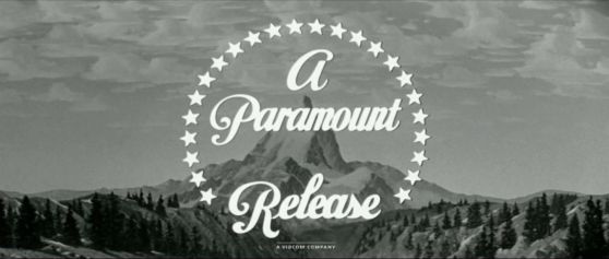
Nebraska (2013): The 1953 widescreen logo appears with the contemporary Viacom byline below.

____________________________________________________________________________________
Rings (2017): The logo goesstatic twice. When it goes static, you will see an aqua blue TV screen and the ring motif behind the mountain, instead of using stars.

_________________________________________________________________________________________
Ghost in the Shell (2017):The logo glitchestwice and is colored midnight blue.
_________________________________________________________________________________________
Bumblebee (2018): On an <a href="https://www.youtube.com/watch?v=C9lq-vnkdQQ" target="_self">April Fools Day 2019 trailer</a> advertising a "VHS release" of said film, the 1980 Paramount Home Video logo was used.
_________________________________________________________________________________________
Sonic the Hedgehog (2020):The stars are replaced with gold rings. The rings spin around all at once, like in the 'Sonic' video games. The top ring zooms in and transitions to the Sega logo.
