Logo Variations - DreamWorks Pictures
Jump to navigation
Jump to search
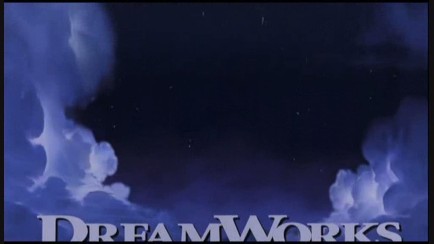
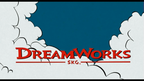
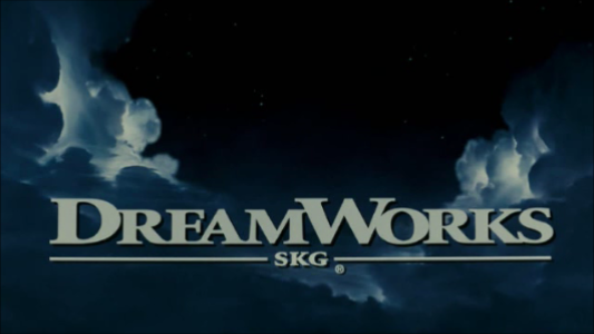
The Road to El Dorado (2000): The logo pans up into the clouds.
_______________________________________________________________________________________
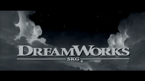
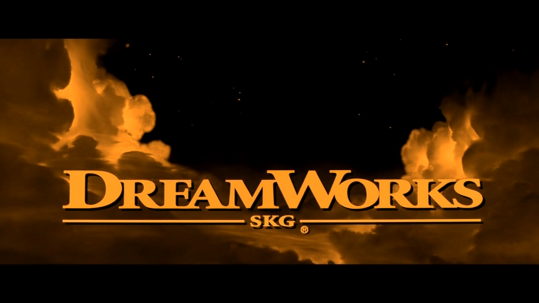
Gladiator (2000): The logo is sepia-toned. 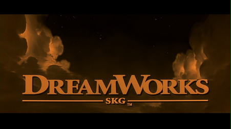
Sweeney Todd: The Demon Barber of Fleet Street (2007): The logo is darker. Ominous funeral music plays over the logo, starting during the Warner Bros. logo.
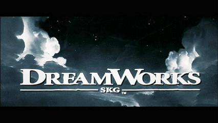
The Kite Runner (2007): The logo isn't animated.
________________________________________________________________________________________
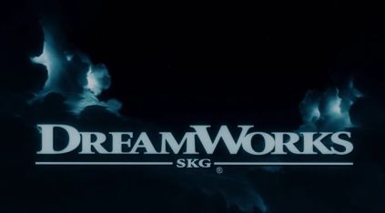
Transformers: Revenge of the Fallen (2009): The logo is darker than usual.
_______________________________________________________________________________________
Fright Night (2011): The logo has an ominous dark viridian color and the camera pans down into the opening of the movie when it's complete.
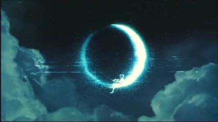
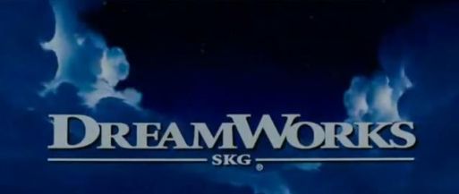
These are the logo variations seen throughout the years by DreamWorks Pictures.
The Road to El Dorado (2000): The logo pans up into the clouds.

_______________________________________________________________________________________
Gladiator (2000): The logo is sepia-toned.

_______________________________________________________________________________________
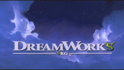
Shrek (2001): The two S's in the logo turn green and grow ogre ears.
Shrek (2001): The two S's in the logo turn green and grow ogre ears.

________________________________________________________________________________________________________________________________________
Minority Report (2002): The DreamWorks logo and the 20th Century Fox logo take place in an underwater scenery.
Minority Report (2002): The DreamWorks logo and the 20th Century Fox logo take place in an underwater scenery.

___________________________________________________________________________________________________________________________________
The Ring (2002): The logo is tinted in verdigris, and half of the titular ring is put onto the moon. The logo also has a VHS effect to it as well.
The Ring (2002): The logo is tinted in verdigris, and half of the titular ring is put onto the moon. The logo also has a VHS effect to it as well.


__________________________________________________________________________________________________________________________________________________
Sinbad: Legend of the Seven Seas (2003):The company name goes flying to start the movie. This was the last animated film by DreamWorks to use the regular DreamWorks logo.
Sinbad: Legend of the Seven Seas (2003):The company name goes flying to start the movie. This was the last animated film by DreamWorks to use the regular DreamWorks logo.

___________________________________________________________________________________________________________________________________________
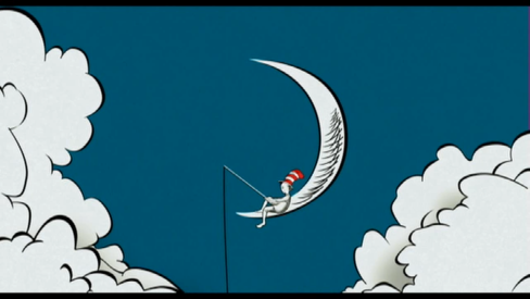
The Cat in the Hat (2003): The logo is done in a style similar to the film's parent book. The boy on the moon is also wearing the titular Cat's hat.
The Cat in the Hat (2003): The logo is done in a style similar to the film's parent book. The boy on the moon is also wearing the titular Cat's hat.


________________________________________________________________________________________________________________________
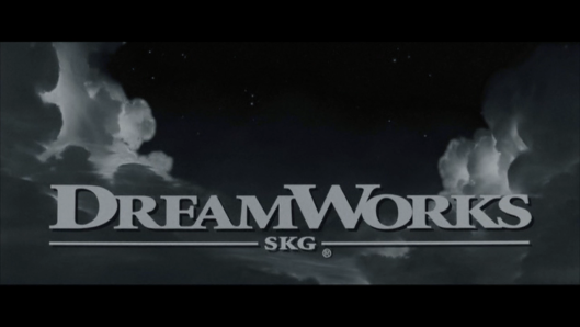
Collateral (2004): The DreamWorks and Paramount logos are in black and white.
Collateral (2004): The DreamWorks and Paramount logos are in black and white.

_______________________________________________________________________________________
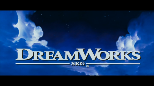
Just Like Heaven (2005): The camera pans down into the clouds. 

_______________________________________________________________________________________
The Island (2005): The "DREAMWORKS" text is sea blue and outlined yellow and zooms toward us, as the Warner Bros. logo follows suit.
The Island (2005): The "DREAMWORKS" text is sea blue and outlined yellow and zooms toward us, as the Warner Bros. logo follows suit.

_______________________________________________________________________________________
Flags of Our Fathers (2006): Same as the Collateral variant.
Flags of Our Fathers (2006): Same as the Collateral variant.

____________________________________________________________________________________________
Letters from Iwo Jima (2006): Same as the Collateral and Flags of Our Fathers variants.

_______________________________________________________________________________________
Sweeney Todd: The Demon Barber of Fleet Street (2007): The logo is darker. Ominous funeral music plays over the logo, starting during the Warner Bros. logo.

_______________________________________________________________________________________
The Kite Runner (2007): The logo isn't animated.

________________________________________________________________________________________
Transformers: Revenge of the Fallen (2009): The logo is darker than usual.

_______________________________________________________________________________________
Fright Night (2011): The logo has an ominous dark viridian color and the camera pans down into the opening of the movie when it's complete.

_______________________________________________________________________________________
Need for Speed (2014): Same as the Gladiator variant, but the logo begins where the company name is revealed. The Reliance and EA logos are also in sepia.

_______________________________________________________________________________________
Bridge of Spies (2015): The logo is sped up and silent.

________________________________________________________________________________
The Girl on the Train (2016): Same as the Bridge of Spies variant, though this one has the opening theme of the movie playing during it.