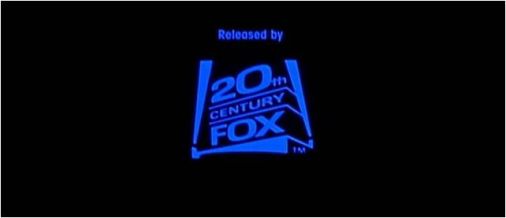
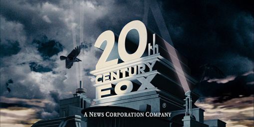
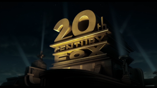
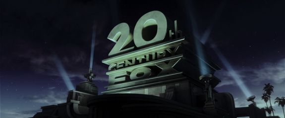
Logo Variations - 20th Century Fox Film Corporation
Jump to navigation
Jump to search
Logo descriptions by Sean Beard, Matt Williams, Nicholas Aczel, Randomkid0627, and others.
Logo captures by Eric S., wolfie14, userjt, 20thCenturyFoxLover, EnormousRat, Donny Pearson, filmbaza.net, Logos2010, and Mr.Logo
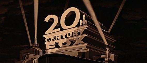
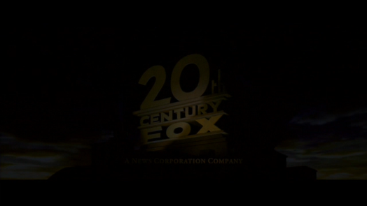
Wee Willie Winkie (1937) and Star! (1968): The logo is in a sepia-tone.
_______________________________________________________________________________________
The Robe (1953): The sky background is replaced with a curtain background. The Robe itself is 20th Century Fox's first Cinemascope movie 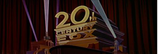
_______________________________________________________________________________________
The Girl Can't Help It (1956): As the film is CinemaScope and transforms from black and white into color in the opening scene, the 1935 logo is shown with re-orchestrated music.
_______________________________________________________________________________________
Peyton Place (1957): The 1953 logo is in a shade of orange.
_______________________________________________________________________________________
Cleopatra (1963, 2001 DVD): The logo is tinted in amber and is in 3D. Only appears before the DVD menu.
_______________________________________________________________________________________
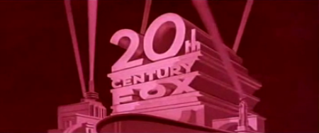
What a Way to Go! (1964): The 1953 logo is tinted in raspberry pink, corresponding to Gene Kelly's character in the film. Also, the "0" is slightly tilted.
_______________________________________________________________________________________
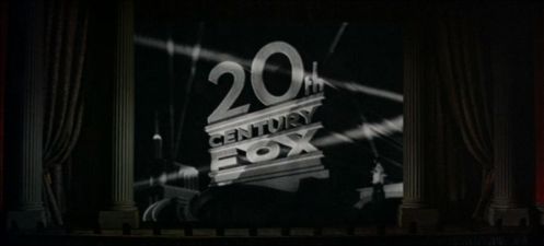
Those Magnificent Men in Their Flying Machines (1965): The opening shows a vaudeville-era curtain with a piano playing. As the 20th Century Fox drums start, the curtain lifts to show the black & white 1935 20th Century Fox logo. The pre-CinemaScope fanfare is played by the piano and an off-kilter trumpet. One of the last films to use the 1935 logo.
_______________________________________________________________________________________
Deadfall (1968): The 1935 logo is used.
_______________________________________________________________________________________
Butch Cassidy and the Sundance Kid (1969): The logo is sepia-toned in the same style of the opening credits for the movie.
_______________________________________________________________________________________
At Long Last Love (1975): Again, the 1935 logo is used, but it seems to be vaguely flashing through different colors.
All This and World War II (1976): Following a series of old 1940s Fox press video clips of various stars and executives supporting the studio and film, the 1935 logo tinted in blue appears for only a second, then fades out to show the word "PRESENTS" in white on a black background. Also, the opening drum roll of the fanfare segues into the opening music of the film.
Chariots of Fire (1981, Non-USA): The 1953 logo is zoomed in and silent. This is very rare and so far has been seen on recent SKY TV and Fox Classics airings, along with some Blu-ray prints; all other prints have had the 1994 logo plastered over. While US Prints will most likey use the The Ladd Company logo.
Edward Scissorhands (1990): Snow is falling on the 1981 logo. The structure is also covered with snow. Also, it's tinted in a steel blue color. 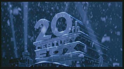
Die Hard 2: Die Harder (1990, DVD): It's snowing on the logo again and the logo is in 3D. This appears only before the DVD menu. 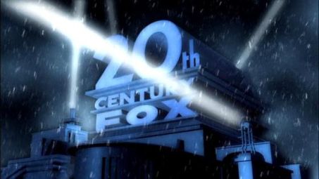
Speed 2: Cruise Control (1997): The logo gets swept away by water and the fanfare segues into the main title music (it is re-orchestrated for that purpose). 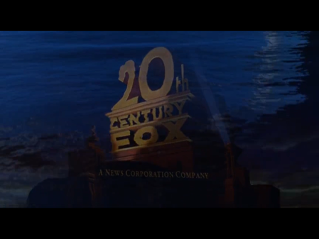
Home Alone 3 (1997): After the logo's 1994 fanfare finishes, the logo stays on-screen for an extra second before fading out.
______________________________________________________________________________________
Casper Meets Wendy (1998, 20th Century Fox Home Entertainment): Lightning strikes the logo from the movie, Casper: A Spirited Beginning. Only seen on the trailer.
_________________________________________________________________________________________________
Bulworth (1998): The logo's fanfare is out-of-sync.
______________________________________________________________________________________
How Stella Got Her Groove Back (1998): The 1994 logo is in a shade of orange.
_______________________________________________________________________________________
Ever After: A Cinderella Story (1998): Exactly like on Miracle on 34th Street, but the logo is in a shade of brown.
_______________________________________________________________________________________
Drive Me Crazy (1999): The 1994 logo is in a shade of vermilion.
_______________________________________________________________________________________
![Fox Studios Australia Logo [A]](/images/thumb/3/35/38e328d7a6da3a6a5d23459338cb9a97.jpeg/435px-38e328d7a6da3a6a5d23459338cb9a97.jpeg)
![Fox Studios Australia Logo [B]](/images/thumb/2/23/D675aa4e9031adb4cd9188381ecc93b5.jpeg/432px-D675aa4e9031adb4cd9188381ecc93b5.jpeg)
______________________________________________________________________________________
Digimon: The Movie (2000): The logo is tinted dark blue.
______________________________________________________________________________________
Moulin Rouge (2001): Footage of the Fox logo plays on screen in a concert hall behind draped red curtains. There is a conductor on stage directing a symphony playing the fanfare, which can be seen below the stage. 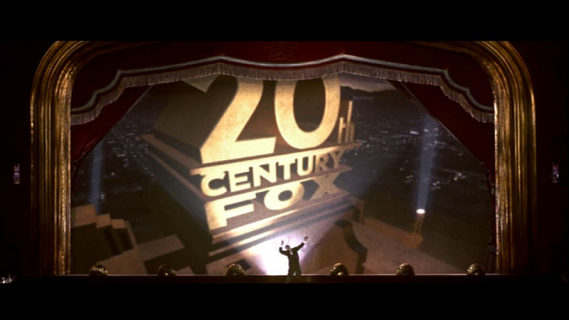
Planet of the Apes (2001): The background in the logo changes to space and the Fox structure slowly fades into the opening sequence. Also the logo is not centered right and has a slight green-yellow tint. 
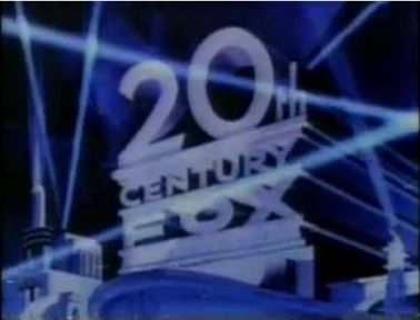
Dr. Dolittle 2 (2001): The logo is in international Klein blue.
_______________________________________________________________________________________
Ice Age (2002): The logo is stretched out a bit and snowing sounds are heard at the end of the logo.
_______________________________________________________________________________________
Minority Report (2002): The 20th Century Fox logo takes place in underwater scenery. 
Phone Booth (2003): The logo fades into a mist of clouds. 
The League of Extraordinary Gentlemen (2003): The logo does its normal animation, but at the end it turns dark and the structure turns into some obscure buildings. 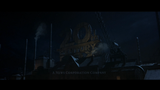
_____________________________________________________________________________________________________________
Down with Love (2003): Exactly as Young Guns II and Naked Lunch, but with the News Corporation byline and 1997 fanfare. 
The Day After Tomorrow (2004): The logo turns lapis lazuli blue and a thunderstorm starts to appear in the background.
________________________________________________________________________________________________
The Girl Next Door (2004): The logo is film deteriorated.
_______________________________________________________________________________________
Kingdom of Heaven (2005): The logo is tinted in dark yellow-ochre. 
Garfield: A Tale of Two Kitties (2006): The logo fades out from a red flag. 
Eragon (2006): On the Nintendo DS version of the video game, the logo is inside a box on a windy background.
__________________________________________________________________________________
The Simpsons Movie (2007): Ralph Wiggum sings along on the second half of the Fox Fanfare. The logo then turns black & white as the camera pans up to the moon. 
_______________________________________________________________________________________
The Seeker: The Dark is Rising (2007): The logo plays normally until the end, when the logo turns selective yellow and a pair of swirls, representing the first sign, appear in the sky. 
Marmaduke (2010): On the title card of the DVD bonus feature "Canine Casting", the last four notes of the extended version of the 1950s 20th Century Fox fanfare that was used during the CinemaScope era are heard._______________________________________________________________________________________
Predators (2010): On all five character video profiles for the movie, the 1994 logo is tinted in blood red.
_______________________________________________________________________________________
Diary of a Wimpy Kid: Rodrick Rules (2011): The 2009 logo plays as normal, but then at the end turns into a paper sheet drawing, then pans down.
_______________________________________________________________________________________
Prometheus (2012): The logo has a blue tint.
Aliens: Colonial Marines (PS3/Wii U/Xbox 360) (2013): The 2009 logo is zoomed out further than usual.
_______________________________________________________________________________________
X-Men: Days of Future Past (2014) and X-Men: Apocalypse (2016): Part of the X-Men theme is heard at the end of the fanfare and just like the previous X-Men movies, only the X is visible at the end.
Gone Girl (2014): The logo is cut short and ends before the animation is even complete. Also, the logo is in a darker tint and ominous music is heard during both Fox and Regency logos.
Logo captures by Eric S., wolfie14, userjt, 20thCenturyFoxLover, EnormousRat, Donny Pearson, filmbaza.net, Logos2010, and Mr.Logo
These are most of the logo variations seen throughout the years by 20th Century Fox.
Wee Willie Winkie (1937) and Star! (1968): The logo is in a sepia-tone.
_______________________________________________________________________________________
The Robe (1953): The sky background is replaced with a curtain background. The Robe itself is 20th Century Fox's first Cinemascope movie

_______________________________________________________________________________________
The Girl Can't Help It (1956): As the film is CinemaScope and transforms from black and white into color in the opening scene, the 1935 logo is shown with re-orchestrated music.
_______________________________________________________________________________________
Peyton Place (1957): The 1953 logo is in a shade of orange.
_______________________________________________________________________________________
Will Success Spoil Rock Hunter? (1957): Tony Randall appears onscreen during the logo and, using a trumpet, a snare, and a bass, plays along to the fanfare.
________________________________________________________________________________________________
Cleopatra (1963, 2001 DVD): The logo is tinted in amber and is in 3D. Only appears before the DVD menu.

_______________________________________________________________________________________
What a Way to Go! (1964): The 1953 logo is tinted in raspberry pink, corresponding to Gene Kelly's character in the film. Also, the "0" is slightly tilted.

_______________________________________________________________________________________
Those Magnificent Men in Their Flying Machines (1965): The opening shows a vaudeville-era curtain with a piano playing. As the 20th Century Fox drums start, the curtain lifts to show the black & white 1935 20th Century Fox logo. The pre-CinemaScope fanfare is played by the piano and an off-kilter trumpet. One of the last films to use the 1935 logo.

_______________________________________________________________________________________
Deadfall (1968): The 1935 logo is used.
_______________________________________________________________________________________
Butch Cassidy and the Sundance Kid (1969): The logo is sepia-toned in the same style of the opening credits for the movie.

_______________________________________________________________________________________
The French Connection (1971): The logo begins in black-and-white and slowly fades in to color. Appears on the version currently streaming on Vudu. Also appears on TCM's prints of said movie.
_____________________________________________________________________________________
Young Frankenstein (1974): The logo is in black & white, in the style of the movie.
_______________________________________________________________________________________
The Rocky Horror Picture Show (1975): The fanfare is played on a piano.
Young Frankenstein (1974): The logo is in black & white, in the style of the movie.

_______________________________________________________________________________________
The Rocky Horror Picture Show (1975): The fanfare is played on a piano.
_______________________________________________________________________________________
The Adventure of Sherlock Holmes' Smarter Brother (1975): The 1935 logo is used.
_______________________________________________________________________________________
The Adventure of Sherlock Holmes' Smarter Brother (1975): The 1935 logo is used.

_______________________________________________________________________________________
At Long Last Love (1975): Again, the 1935 logo is used, but it seems to be vaguely flashing through different colors.

______________________________________________________________________________________
Silent Movie (1976): The 20th Century Fox logo is seen about a minute into the movie after the three main characters take the pregnant woman in the car with them; the camera pans, and a 20th Century Fox billboard is seen, but the letter "O" seems to be coming out at the audience, and from it comes a red screen and the opening credits begin.
_______________________________________________________________________________________
Silent Movie (1976): The 20th Century Fox logo is seen about a minute into the movie after the three main characters take the pregnant woman in the car with them; the camera pans, and a 20th Century Fox billboard is seen, but the letter "O" seems to be coming out at the audience, and from it comes a red screen and the opening credits begin.

_______________________________________________________________________________________
All This and World War II (1976): Following a series of old 1940s Fox press video clips of various stars and executives supporting the studio and film, the 1935 logo tinted in blue appears for only a second, then fades out to show the word "PRESENTS" in white on a black background. Also, the opening drum roll of the fanfare segues into the opening music of the film.

_______________________________________________________________________________________
The World's Greatest Lover (1977): Normal 1953 Fox logo, but the fanfare is a 1920s-style rendition.
The World's Greatest Lover (1977): Normal 1953 Fox logo, but the fanfare is a 1920s-style rendition.
_______________________________________________________________________________________
Health (1980): Normal 1953 Fox logo, but an extra drumroll is added after the usual roll. Instead of the fanfare, the opening song is used. The logo cuts to the opening scene, rather than fading out.
_______________________________________________________________________________________
The Cannonball Run (1981): The 1953 logo begins as usual, but then a searchlight is taken out, causing the music to wind down to a stop. Police sirens and car engines are then heard. Another searchlight is taken out, and an animated Ferrari colored red appears. It makes itself into the "0" while the cop takes out the last three searchlights. Unexpectedly, the police car crashes into the searchlight on the right. The Ferrari comes out of the "0", honks, and laughs in a Burt Reynolds fashion. Sadly, this logo is usually edited out of television airings. The 1953 logo also looks a little different than its original design (most likely because this variation was designed by Hal Needham, the director of the movie, and not Rocky Longo).
The Cannonball Run (1981): The 1953 logo begins as usual, but then a searchlight is taken out, causing the music to wind down to a stop. Police sirens and car engines are then heard. Another searchlight is taken out, and an animated Ferrari colored red appears. It makes itself into the "0" while the cop takes out the last three searchlights. Unexpectedly, the police car crashes into the searchlight on the right. The Ferrari comes out of the "0", honks, and laughs in a Burt Reynolds fashion. Sadly, this logo is usually edited out of television airings. The 1953 logo also looks a little different than its original design (most likely because this variation was designed by Hal Needham, the director of the movie, and not Rocky Longo).

_______________________________________________________________________________________
Chariots of Fire (1981, Non-USA): The 1953 logo is zoomed in and silent. This is very rare and so far has been seen on recent SKY TV and Fox Classics airings, along with some Blu-ray prints; all other prints have had the 1994 logo plastered over. While US Prints will most likey use the The Ladd Company logo.

_______________________________________________________________________________________
Johnny Dangerously (1984): When the fanfare finishes, the logo freezes and turns into a picture of colorful shapes that form the 1981 logo.
_______________________________________________________________________________________
Revenge of the Nerds (1984): In an obvious homage to Star Wars, the 1953 logo (newer prints have it plastered with the 1981 logo, however) fades to black after ten seconds, but the 1981 fanfare continues playing as we fade into the film's logo, seen on a black background, over which the fanfare finishes.
Johnny Dangerously (1984): When the fanfare finishes, the logo freezes and turns into a picture of colorful shapes that form the 1981 logo.

_______________________________________________________________________________________
Revenge of the Nerds (1984): In an obvious homage to Star Wars, the 1953 logo (newer prints have it plastered with the 1981 logo, however) fades to black after ten seconds, but the 1981 fanfare continues playing as we fade into the film's logo, seen on a black background, over which the fanfare finishes.
_______________________________________________________________________________________
The Sicilian (1987): The 1981 logo is in black and white with a shade of ice blue.
_______________________________________________________________________________________
Die Hard (1988, DVD): The logo is tinted in dodger blue, put on a space background, and is in 3D. Only appears before the DVD menu.
_______________________________________________________________________________________
The Abyss (1989): The logo is heavily cropped. The film was shot in Super 35, a process that created a widescreen image by cropping the top and bottom portions of the frame. Thus, the pan-and-scan version looks normal.
The ending uses the Fox print logo used in the 1980s and intermittently in the early 1990s.
_______________________________________________________________________________________
The Sicilian (1987): The 1981 logo is in black and white with a shade of ice blue.

_______________________________________________________________________________________
Die Hard (1988, DVD): The logo is tinted in dodger blue, put on a space background, and is in 3D. Only appears before the DVD menu.

_______________________________________________________________________________________
The Abyss (1989): The logo is heavily cropped. The film was shot in Super 35, a process that created a widescreen image by cropping the top and bottom portions of the frame. Thus, the pan-and-scan version looks normal.

The ending uses the Fox print logo used in the 1980s and intermittently in the early 1990s.

_______________________________________________________________________________________
Edward Scissorhands (1990): Snow is falling on the 1981 logo. The structure is also covered with snow. Also, it's tinted in a steel blue color.

_______________________________________________________________________________________
Young Guns II (1990): The 1953 logo is used with the 1979 fanfare. Only seen on the CBS/FOX/Fox Video VHS releases. Theatrical prints as well as the widescreen Laserdisc release use the standard logo of the time with long fanfare. Current prints edit the logo out.

_______________________________________________________________________________________
Die Hard 2: Die Harder (1990, DVD): It's snowing on the logo again and the logo is in 3D. This appears only before the DVD menu.

_______________________________________________________________________________________
Naked Lunch (1991): Exactly the same as Young Guns II (home video release only).
_______________________________________________________________________________________
Point Break (1991): The logo starts its animation when it fades in, and then freezes when it's about to fade out.
_______________________________________________________________________________________
White Men Can't Jump (1992): Standard 1981 Fox logo, but the fanfare is in a "funk/rap" style.
_______________________________________________________________________________________
Alien³ (1992): Standard 1981 logo, but the fanfare is redone and "freezes" when it is nearly finished, complete with bending strings and wailing French horns until the fanfare finishes with a crash, segueing into the opening titles.
Alien³ (1992): Standard 1981 logo, but the fanfare is redone and "freezes" when it is nearly finished, complete with bending strings and wailing French horns until the fanfare finishes with a crash, segueing into the opening titles.
_______________________________________________________________________________________
Miracle on 34th Street (1994): The 1994 logo is zoomed out further than usual and jingle bell sounds are heard at the end of the logo.
______________________________________________________________________________________
Far from Home: The Adventures of Yellow Dog (1995): The logo has a tawny tint.
_______________________________________________________________________________________
Mighty Morphin Power Rangers: The Movie (1995): The logo's 1994 fanfare is out-of-sync.
_______________________________________________________________________________________
Braveheart (1995, International release) and The Legend of Bagger Vance (2000, US release): The logo's 1994 fanfare can't be heard.
_______________________________________________________________________________________
Volcano (1997): The Fox logo moves up until the screen is black and the credits start. The logo also has a golden tint to it.
Miracle on 34th Street (1994): The 1994 logo is zoomed out further than usual and jingle bell sounds are heard at the end of the logo.

______________________________________________________________________________________
Far from Home: The Adventures of Yellow Dog (1995): The logo has a tawny tint.

_______________________________________________________________________________________
Mighty Morphin Power Rangers: The Movie (1995): The logo's 1994 fanfare is out-of-sync.
_______________________________________________________________________________________
Braveheart (1995, International release) and The Legend of Bagger Vance (2000, US release): The logo's 1994 fanfare can't be heard.
_______________________________________________________________________________________
Volcano (1997): The Fox logo moves up until the screen is black and the credits start. The logo also has a golden tint to it.

_______________________________________________________________________________________
Speed 2: Cruise Control (1997): The logo gets swept away by water and the fanfare segues into the main title music (it is re-orchestrated for that purpose).

______________________________________________________________________________________
Home Alone 3 (1997): After the logo's 1994 fanfare finishes, the logo stays on-screen for an extra second before fading out.
______________________________________________________________________________________
Turbo: A Power Rangers Movie (1997): The logo has a golden tint, just like Volcano.

_________________________________________________________________________________________________
Casper Meets Wendy (1998, 20th Century Fox Home Entertainment): Lightning strikes the logo from the movie, Casper: A Spirited Beginning. Only seen on the trailer.
_________________________________________________________________________________________________
Bulworth (1998): The logo's fanfare is out-of-sync.

______________________________________________________________________________________
How Stella Got Her Groove Back (1998): The 1994 logo is in a shade of orange.

_______________________________________________________________________________________
Ever After: A Cinderella Story (1998): Exactly like on Miracle on 34th Street, but the logo is in a shade of brown.

_______________________________________________________________________________________
Drive Me Crazy (1999): The 1994 logo is in a shade of vermilion.

_______________________________________________________________________________________
Fox Studios Australia Promotional Videos (2000s): A series of videos promoting Fox Studios Australia features its own version of the 1994 Fox logo animation: The structure now reads "FOX STUDIOS AUSTRALIA" and the Los Angeles cityscape is replaced with the skyline of Sydney, Australia.
![Fox Studios Australia Logo [A]](/page/File:38e328d7a6da3a6a5d23459338cb9a97.jpeg)
![Fox Studios Australia Logo [B]](/page/File:D675aa4e9031adb4cd9188381ecc93b5.jpeg)
_______________________________________________________________________________________
Men of Honor (2000): Exactly like on Miracle on 34th Street, but the logo is zoomed out way further than usual and is in a shade of metallic gold.

______________________________________________________________________________________
Digimon: The Movie (2000): The logo is tinted dark blue.

______________________________________________________________________________________
X-Men (2000), X2: X-Men United (2003), and X-Men: The Last Stand (2006): On every X-Men film, the "X" in the Fox logo remains visible to the end although the rest of the logo has already faded out.
On trailers and TV spots for X-Men and on one theatrical trailer for X-Men: The Last Stand, the logo appears made out of metal as if water flowed along a window. Drops of blueish water leave gradually, and then the logo becomes clearer.
On the teaser trailer for X-Men: The Last Stand, the variant on Titan A.E. and Solaris is used.

On trailers and TV spots for X-Men and on one theatrical trailer for X-Men: The Last Stand, the logo appears made out of metal as if water flowed along a window. Drops of blueish water leave gradually, and then the logo becomes clearer.

On the teaser trailer for X-Men: The Last Stand, the variant on Titan A.E. and Solaris is used.
On another theatrical trailer for X-Men: The Last Stand, the one seen on Miracle on 34th Street and Cheaper by the Dozen is used.
On TV spots for X-Men: The Last Stand, the logo is in lavender.
On the trailer for the X-Men Trilogy on Blu-ray, the logo is steel blue/ghost white and is on a stormy background.
On TV spots for X-Men: The Last Stand, the logo is in lavender.

On the trailer for the X-Men Trilogy on Blu-ray, the logo is steel blue/ghost white and is on a stormy background.

______________________________________________________________________________________
From Hell (2001): The logo plays as normal, but after several seconds, the logo animates in reverse and speeds up. Only appears before the DVD menu.
_______________________________________________________________________________________
Moulin Rouge (2001): Footage of the Fox logo plays on screen in a concert hall behind draped red curtains. There is a conductor on stage directing a symphony playing the fanfare, which can be seen below the stage.

_______________________________________________________________________________________
Planet of the Apes (2001): The background in the logo changes to space and the Fox structure slowly fades into the opening sequence. Also the logo is not centered right and has a slight green-yellow tint.

_______________________________________________________________________________________
Dr. Dolittle 2 (2001): The logo is in international Klein blue.

_______________________________________________________________________________________
_______________________________________________________________________________________
Minority Report (2002): The 20th Century Fox logo takes place in underwater scenery.

_______________________________________________________________________________________
Phone Booth (2003): The logo fades into a mist of clouds.

_______________________________________________________________________________________
The League of Extraordinary Gentlemen (2003): The logo does its normal animation, but at the end it turns dark and the structure turns into some obscure buildings.

_____________________________________________________________________________________________________________
Daredevil (2003): The logo turns into something seen though Matt Murdock's enhanced senses. Only appears before the DVD menu.

______________________________________________________________________________________
Down with Love (2003): Exactly as Young Guns II and Naked Lunch, but with the News Corporation byline and 1997 fanfare.

_______________________________________________________________________________________
The Day After Tomorrow (2004): The logo turns lapis lazuli blue and a thunderstorm starts to appear in the background.

________________________________________________________________________________________________
The Girl Next Door (2004): The logo is film deteriorated.

_______________________________________________________________________________________
Kingdom of Heaven (2005): The logo is tinted in dark yellow-ochre.

________________________________________________________________________________________________________________
Fantastic Four (2005): When the logo finishes, The Logo turns into red and it segues and fading to the 2002 Marvel logo while it turns to the Flipbook page (Almost the similar as The Punisher).

_______________________________________________________________________________________
Garfield: A Tale of Two Kitties (2006): The logo fades out from a red flag.

_______________________________________________________________________________________
Eragon (2006): On the Nintendo DS version of the video game, the logo is inside a box on a windy background.

__________________________________________________________________________________
Borat: Cultural Learnings of America for Make Benefit Glorious Nation of Kazakhstan (2006): The fanfare changes from stereo to mono. This is only on UK prints.
__________________________________________________________________________________
Live Free or Die Hard (a.k.a Die Hard 4.0) (2007): The searchlights go out due to a power outage.

________________________________________________________________________________________________
Fantastic Four: Rise of the Silver Surfer (2007): Exactly like the first movie, but the fanfare plays at the end while the logo turns into blue when the Flipbook Page appears.

_______________________________________________________________________________________
The Simpsons Movie (2007): Ralph Wiggum sings along on the second half of the Fox Fanfare. The logo then turns black & white as the camera pans up to the moon.


_______________________________________________________________________________________
The Seeker: The Dark is Rising (2007): The logo plays normally until the end, when the logo turns selective yellow and a pair of swirls, representing the first sign, appear in the sky.

_______________________________________________________________________________________
Krabat (2008): When the animation finishes, the logo turns stormy and several crows pass over. The 1994 fanfare is also used.
_______________________________________________________________________________________
Krabat (2008): When the animation finishes, the logo turns stormy and several crows pass over. The 1994 fanfare is also used.

_______________________________________________________________________________________
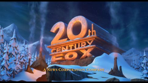
Ice Age: Dawn of the Dinosaurs (2009): The logo appears carved out of stone, with snow topping above it among a prehistoric backdrop, which is surrounded by snow-covered pine trees. A volcano pit replaces the "stage", and the front-most searchlight, front-least searchlight and rear searchlights are replaced with an assortment of smoke spewing geysers. The byline, "A NEWS CORPORATION COMPANY", appears in a Times New Roman font in ivory. This variant is only seen on the 3D version; the 2D version uses the regular 1994 logo instead. However, it is on the 2010 Blu-ray 3D release as well as the 2009 TrioScopics 3D DVD release.
_______________________________________________________________________________________
My Name Is Khan (2010): The 2009 logo plays, but it appears to be a bit darker. This was only on international prints of this movie, while domestic prints use the Fox Searchlight Pictures logo.
________________________________________________________________________________________
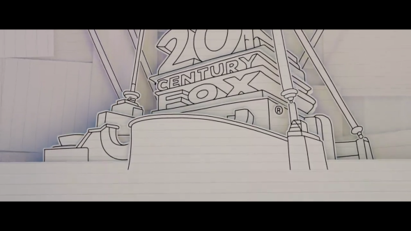
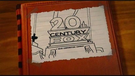
Diary of a Wimpy Kid (2010): The 75th Anniversary variant of the 2009 logo plays as usual, but when the logo finishes, it transforms into a paper sheet drawing. The word "CENTURY" appears to be shaded.
________________________________________________________________________________________

_______________________________________________________________________________________
My Name Is Khan (2010): The 2009 logo plays, but it appears to be a bit darker. This was only on international prints of this movie, while domestic prints use the Fox Searchlight Pictures logo.

________________________________________________________________________________________
Diary of a Wimpy Kid (2010): The 75th Anniversary variant of the 2009 logo plays as usual, but when the logo finishes, it transforms into a paper sheet drawing. The word "CENTURY" appears to be shaded.

________________________________________________________________________________________
Marmaduke (2010): On the title card of the DVD bonus feature "Canine Casting", the last four notes of the extended version of the 1950s 20th Century Fox fanfare that was used during the CinemaScope era are heard.
Predators (2010): On all five character video profiles for the movie, the 1994 logo is tinted in blood red.

_______________________________________________________________________________________
Diary of a Wimpy Kid: Rodrick Rules (2011): The 2009 logo plays as normal, but then at the end turns into a paper sheet drawing, then pans down.

_______________________________________________________________________________________
Prometheus (2012): The logo has a blue tint.

_______________________________________________________________________________________
Diary of a Wimpy Kid: Dog Days (2012): Exactly like on the trailer, but the full logo plays, and it pans down slower.

__________________________________________________________________________________________
Aliens: Colonial Marines (PS3/Wii U/Xbox 360) (2013): The 2009 logo is zoomed out further than usual.

_______________________________________________________________________________________
X-Men: Days of Future Past (2014) and X-Men: Apocalypse (2016): Part of the X-Men theme is heard at the end of the fanfare and just like the previous X-Men movies, only the X is visible at the end.

____________________________________________________________________________________
Rio 2 (2014): The fanfare is remixed to sound like a carnival.
_______________________________________________________________________________________
The Fault in Our Stars (2014): The logo is seen at nighttime and when the animation is complete, the camera pans up towards the starry night sky to start the movie.
The Fault in Our Stars (2014): The logo is seen at nighttime and when the animation is complete, the camera pans up towards the starry night sky to start the movie.

__________________________________________________________________________________________________
Gone Girl (2014): The logo is cut short and ends before the animation is even complete. Also, the logo is in a darker tint and ominous music is heard during both Fox and Regency logos.

_______________________________________________________________________________________
Alien: Isolation (2014, Video Game): The 1981 logo is used and the shortened fanfare of the 1953 logo is heard. When the logo is finished, it flickers out like the TV.
_______________________________________________________________________________________
Fantastic Four (2015): The F remains visible to the end, although the rest of the logo has already faded out.

_______________________________________________________________________________________
Aloha (2015, International release): The 1953 logo is used (Same as Young Guns II and Naked Lunch). Only shown in international prints.

_______________________________________________________________________________________
Bridge of Spies (2015): On US prints, the logo is sped up, and no fanfare is heard. On International prints, the logo is sped up on the second half of the animation.
_______________________________________________________________________________________
Joy (2015): The Fox Fanfare abruptly cuts into the background music.
_______________________________________________________________________________________
The Peanuts Movie (2015): The 2009 logo is zoomed out further than usual, and the fanfare is accompanied by Schroeder on his piano, who is revealed to be placed in front of the structure as the logo finishes turning into its position.

______________________________________________________________________________________________
A Cure for Wellness (2016): Same as in Gone Girl, just slightly darker.

____________________________________________________________________________________________________
Logan (2017): Exactly the same as Down with Love, but the logo is now in black and white. Appears only on the Noir edition.
________________________________________________________________________________________________
Alien: Covenant (2017): The logo is in a shade of dark blue-gray.

___________________________________________________________________________________________________________
Diary of a Wimpy Kid: The Long Haul (2017): As the fanfare ends, a paper drawing of the logo pops up from the bottom of the screen while a bunch of paper covering the sky falls from the top.
Then, as in the previous two films, it pans down.
Then, as in the previous two films, it pans down.

_______________________________________________________________________________________________
War for the Planet of the Apes (2017): The fanfare is played in an ominous tribal manner.
_______________________________________________________________________________________________
_______________________________________________________________________________________________
The Greatest Showman (2017): Two versions of the logo are used. First, we see the 1953 logo with the shortened 1997 fanfare.
Then, we see the 2009 logo in black and white and at double speed. The film's opening song is heard.


___________________________________________________________________________________________________________
The Flip Side (2018): The fanfare is played on an xylophone.
___________________________________________________________________________________________________________
Bohemian Rhapsody (2018): The fanfare is played on an electric guitar, performed by Queen guitarist Brian May.
___________________________________________________________________________________________________________
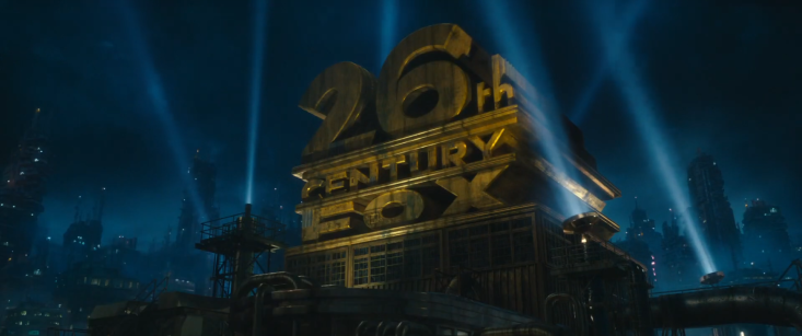
Alita: Battle Angel (2019): The logo plays as normal until the end, when two searchlights swoop across the screen, turning the structure into a dilapidated version in the future reading "26th CENTURY FOX".

___________________________________________________________________________________________________________
X-Men: Dark Phoenix (2019): Similar to the previous X-Men variants, except once the logo reaches its final position, the "X" in "FOX" turns a molten red.
The "X" fades out after the rest of the logo does.
____________________________________________________________________________________________________
Terminator: Dark Fate (2019): Exactly the same as Bridge of Spies and Gone Girl except this time, the logo has VHS buzz over it and it briefly flashes to its version from 1981. It is also incorporated in the opening dialogue.