KCTS-TV
Jump to navigation
Jump to search
Background: KCTS is a PBS affiliate located in Seattle, Washington.
1st Logo
 <iframe frameborder="0" height="201" src="http://wikifoundrytools.com/wiki/closinglogos/widget/youtubevideo/78f33438522585d44569a268c832990416763b08" width="354"></iframe>
2nd Logo
Editor's Note: None.
1st Logo
(????, 1994)
 <iframe frameborder="0" height="201" src="http://wikifoundrytools.com/wiki/closinglogos/widget/youtubevideo/78f33438522585d44569a268c832990416763b08" width="354"></iframe>
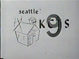
Logo: A crude drawing of a school is seen, next to "KCTS" with a big "9" behind it, and "seattle" above it all. All of this is seen in a white background, possibly a sheet of cardboard.
FX/SFX: None.
Music/Sounds: Possibly silent.
Availability: Extinct.
Editor's Note: None.
(1976-1979)
<iframe align="bottom" frameborder="0" height="150" src="http://wikifoundrytools.com/wiki/closinglogos/widget/genericvideo/4cb4c30d788e782a2ce9776d8d66c131190a6526" width="266"></iframe>
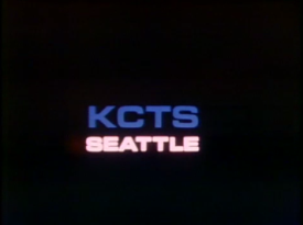
Logo: Against a black background, four white number "9"s come together from each side of the screen (top, bottom, left, and right), then they zoom in towards the screen leaving a trail effect behind. then we fade to "KCTS" in big bold letters and 3D, with "SEATTLE" moving up towards the "KCTS" text and stopping once it's close enough to that text, leaving a trail effect behind.
FX/SFX: The trail effects, zooming and slides.
Music/Sounds:An analog synth drone, followed by an female announcer saying "A production of KCTS Seattle". Afterwards, an upward piano sweep.
Availability: Only seen so far on The Boldt Decision.
Editor's Note: None.
3rd Logo
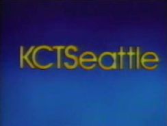
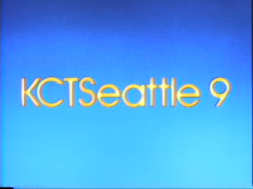
Nickname: "KCTSeattle"
Logo: Over a faded bright cerulean background, we see the word "Seattle", in Century Gothic font, and colored yellow, zoom out to the right, very quickly. As it does this, "KCTS", in the same font and color, zoom out from the top to the left, very slowly. When both "KCTS" and "Seattle" meet, forming "KCTSeattle", a yellow flash occurs, and the logo seems to sparkle a bit before we fade out.
Trivia: This logo was made at Alpha Cine.
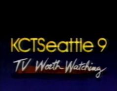
Variant: Among other PBS-Affiliated stations of this time, KCTS used a bunch of local station IDs promoting their channel. In this promo, we see many clips of shows (either produced by KCTS itself and/or PBS, and other affiliates) being shown to us. After a whole bunch of shows are seen, then we see the KCTSeattle logo (which animates the same way as it does in the above-mentioned logo,only with a black/dark sapphire gradient BG instead of the usual bright cerulean), and then the channel station number "9" animates itself by flying away from the viewer, and place itself next to the text. Then, we see the text "TV Worth Watching" in a white script font write itself under the text. Another version has the normal background without "TV Worth Watching".
FX/SFX: The words zooming out, the flash, the sparkles
Music/Sounds: A rapid (and dramatic) orchestral tune, with a solo viola.
Music/Sounds/Variant: The local station ID features a long piece of music from PBS's slogan "TV Worth Watching". The music is an 80's synth/electric guitar theme which includes a female singer (with a quite strong voice!!) and a male singer. The female singer though, sings throughout most of the jingle. The jingle may also be referred to as the "You'll Turn Us On and You'll Love It!" jingle and was also used by WNED in Buffalo.
Availability: Rare. A VHS or DVD of The Miracle Planet should have this logo.
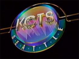
4th Logo
(1992-1999)
 <iframe frameborder="0" height="198" src="http://wikifoundrytools.com/wiki/closinglogos/widget/unknown/de78abb5194c7117f4bf6ac80a8188d91f327935" width="347"></iframe>
Logo: Against a black background, we zoom out from what appears to be a glass circle with a spectrum shining through, and "KCTS" in copper carved into the circle. While we zoom out, the solid "KCTS" logo pushes into the circle, and the word "S E A T T L E", in Hattenschweiler font, colored beige, and on a teal-colored dip, rotates into place, plus two glass tubes draw themselves in going on both sides, then we fade out.
FX/SFX: The zoom-out, and the drawing in of the tubes. It's not too bad animation for the 1990s.
Music/Sounds: A synthesized wind sounder, and then a four-note synth-chime tune.
Availability: Rare. Bill Nye the Science Guy had this logo after the funding credits in the mid-'90s, as well as a few medical programs from KCTS at the time.
5th Logo
(1993-1998)
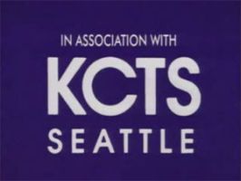
Logo: Just the words "KCTS" and "SEATTLE" in Fusion font after the credits. "IN ASSOCIATION WITH" may also be shown above it.
FX/SFX: None.
Music/Sounds: The closing theme of whatever show was playing.
Availability: Rare. Seen at the end of Bill Nye the Science Guy which occasionally runs on MeTV. The tapes for said show are somewhat difficult to find, but it's incorporated into most elementary/middle-school curriculums.
6th Logo
(1999-December 2006, July 17, 2010)
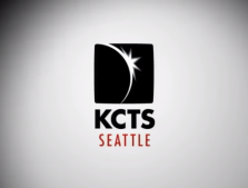
Logo: On a white spotlight background, a black box containing a stylized drawing of an eclipse flips into the screen very fast along with the word KCTS, in black Century Gothic font. Soon after, the word SEATTLE, in maroon, flies in from the bottom-left of the screen. Sometime in the mid-2000's, a different variant was used and looked similar, but the logo just simply zooms in.
FX/SFX: The black box with the eclipse flipping into the screen along with the KCTS text, the SEATTLE flying from the bottom-left of the screen.
Music/Sounds: A simple jazz-pop tune combined with two piano notes and two fast bass violin notes as the words slide into place. All accompanied by a groovy beat box.
Availability: Common. Can be seen on The Eyes of Nye on select PBS stations. It does not appear on VHS releases of the show.
(1979-1983)

Logo: An updated version of the previous logo, with the same concept and similar animation/music. Against a black background, four blue abstract number "9"s come together with a trail effect to form a square like shape. As they come together, a beige colored outline of the shape forms as the trails suck into the logo. The numbers separate and rotate beyond the screen as the name "KCTS" in blue zooms in. The "KCTS" stops and the text "SEATTLE" in the same font, but white and glowing.
FX/SFX: The numbers merging together; the outline; the numbers moving away; "KCTS" zooming in; "Seattle" appearing and glowing. Similar to the last logo, though slightly more primitive on the animation side (not the design, though).
Music/Sounds: Same as the last logo, although the announcer is not as robotic. Sometimes, the announcer will say 'The following is a production KCTS Seattle." instead of simply "A production of KCTS Seattle." instead. Sometimes a male announcer will also be used instead.
Availability: Near extinction. Can be seen on Trident: Super Sub or Dinosaurand Subversive? The Life and Times of Terry Pettus, both of which can be found on the American Archive of Public Broadcasting. The variant with the original female announcer with the alternate line/dialogue appears onTarheels in the Northwest.
Editor's Note: None.
3rd Logo
(1983-1992)


<iframe frameborder="0" height="164" src="http://wikifoundrytools.com/wiki/closinglogos/widget/unknown/c670287d3d0cba8a163c9dd21a02f624acfac19d" width="292"></iframe>
Nickname: "KCTSeattle"
Logo: Over a faded bright cerulean background, we see the word "Seattle", in Century Gothic font, and colored yellow, zoom out to the right, very quickly. As it does this, "KCTS", in the same font and color, zoom out from the top to the left, very slowly. When both "KCTS" and "Seattle" meet, forming "KCTSeattle", a yellow flash occurs, and the logo seems to sparkle a bit before we fade out.
Trivia: This logo was made at Alpha Cine.
Variant: Among other PBS-Affiliated stations of this time, KCTS used a bunch of local station IDs promoting their channel. In this promo, we see many clips of shows (either produced by KCTS itself and/or PBS, and other affiliates) being shown to us. After a whole bunch of shows are seen, then we see the KCTSeattle logo (which animates the same way as it does in the above-mentioned logo,only with a black/dark sapphire gradient BG instead of the usual bright cerulean), and then the channel station number "9" animates itself by flying away from the viewer, and place itself next to the text. Then, we see the text "TV Worth Watching" in a white script font write itself under the text. Another version has the normal background without "TV Worth Watching".
FX/SFX: The words zooming out, the flash, the sparkles
Music/Sounds: A rapid (and dramatic) orchestral tune, with a solo viola.
Music/Sounds/Variant: The local station ID features a long piece of music from PBS's slogan "TV Worth Watching". The music is an 80's synth/electric guitar theme which includes a female singer (with a quite strong voice!!) and a male singer. The female singer though, sings throughout most of the jingle. The jingle may also be referred to as the "You'll Turn Us On and You'll Love It!" jingle and was also used by WNED in Buffalo.
Availability: Rare. A VHS or DVD of The Miracle Planet should have this logo.
4th Logo
(1992-1999)
 <iframe frameborder="0" height="198" src="http://wikifoundrytools.com/wiki/closinglogos/widget/unknown/de78abb5194c7117f4bf6ac80a8188d91f327935" width="347"></iframe>
Nicknames: "Futuristic Circle", "KCTS Circle"
Logo: Against a black background, we zoom out from what appears to be a glass circle with a spectrum shining through, and "KCTS" in copper carved into the circle. While we zoom out, the solid "KCTS" logo pushes into the circle, and the word "S E A T T L E", in Hattenschweiler font, colored beige, and on a teal-colored dip, rotates into place, plus two glass tubes draw themselves in going on both sides, then we fade out.
FX/SFX: The zoom-out, and the drawing in of the tubes. It's not too bad animation for the 1990s.
Music/Sounds: A synthesized wind sounder, and then a four-note synth-chime tune.
Availability: Rare. Bill Nye the Science Guy had this logo after the funding credits in the mid-'90s, as well as a few medical programs from KCTS at the time.
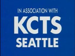
5th Logo
(1993-1998)


Logo: Just the words "KCTS" and "SEATTLE" in Fusion font after the credits. "IN ASSOCIATION WITH" may also be shown above it.
FX/SFX: None.
Music/Sounds: The closing theme of whatever show was playing.
Availability: Rare. Seen at the end of Bill Nye the Science Guy which occasionally runs on MeTV. The tapes for said show are somewhat difficult to find, but it's incorporated into most elementary/middle-school curriculums.
Editor's Note: None.
6th Logo
(1999-December 2006, July 17, 2010)


<iframe frameborder="0" height="167" src="http://wikifoundrytools.com/wiki/closinglogos/widget/unknown/6c7e5f9956a5c7f598332f4a3bc87a53a4284eb4" width="222"></iframe><iframe frameborder="0" height="167" src="http://wikifoundrytools.com/wiki/closinglogos/widget/unknown/afc4a8dc180a286f1794a58dc0098556677fa8cf" width="296"></iframe>
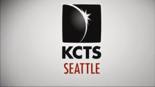
Logo: On a white spotlight background, a black box containing a stylized drawing of an eclipse flips into the screen very fast along with the word KCTS, in black Century Gothic font. Soon after, the word SEATTLE, in maroon, flies in from the bottom-left of the screen. Sometime in the mid-2000's, a different variant was used and looked similar, but the logo just simply zooms in.
FX/SFX: The black box with the eclipse flipping into the screen along with the KCTS text, the SEATTLE flying from the bottom-left of the screen.
Music/Sounds: A simple jazz-pop tune combined with two piano notes and two fast bass violin notes as the words slide into place. All accompanied by a groovy beat box.
Availability: Common. Can be seen on The Eyes of Nye on select PBS stations. It does not appear on VHS releases of the show.
Editor's Note: None.
7th Logo
(2006-)

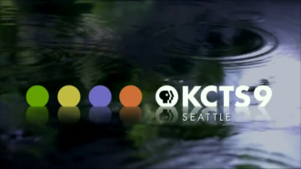
Logo: On a water background, we seen water drops rippling and four colored circles (in order: green, yellow, violet, and orange) drop and float. "KCTS9" drops down at the last circle. "SEATTLE" fades in below.
FX/SFX: The dropping.
Music/Sounds: The water.
Availability: Current. Seen on some Rick Steves specials which Oregon Public Broadcasting didn't present, such as Dynamic Europe, European Travel Skills, and The Holy Land: Israelis and Palestinians Today.