José Frade, P.C. (Spain)
Jump to navigation
Jump to search
Logo descriptions by bigladiesman
Logo captures by Eric S.
Videos courtesy of LogicSmash and isaaxperez
Background: José Frade (b. 1938) is a retired film producer who spent his career between Spain and Italy. He owns the rights to several of Samuel Bronston's films as well. His company now works on television series and specials.
1st Logo
(1965-1980)
3rd Logo
(Late '90s-)
<embed align="right" allowfullscreen="true" height="252" src="http://wikifoundrytools.com/wiki/closinglogos/widget/youtubevideo/c2abe84fdb810a4af89f3dfa65bb480e6aac4c6d" type="application/x-shockwave-flash" width="313" wmode="transparent"/>Logo: On a blue background, the J and the F from the previous logo come zooming out and place themselves about the middle of the screen. They rotate towards each other as a blue sphere zooms in. The letters move and spin around the sphere, turning it into a red-blue circle. The two parts separate and elongate to turn into the narrower parts of the J and the F. The four parts merge and form the full JF logo, flashing when complete. It shines via stars on its sides, and tilts side by side, placing itself in the upper part of the screen. "JOSE FRADE" and "PRODUCCIONES CINEMATOGRÁFICAS S.A." fade in below the logo in a cyan Gill Sans font with modifications, as letters slide in to form "PRESENTA".
FX/SFX: Standard CGI at the time.
Music/Sounds: See the first logo.
Availability: Common; seen on Spanish DVD prints of El Cid and For A Few Dollars More.
Editor's Note: Fine CGI, to be honest even by its dated standards, but the fanfare is becoming just more and more grainy-sounding.
<iframe frameborder="0" height="217" src="http://wikifoundrytools.com/wiki/closinglogos/widget/unknown/7b030d1748bc82cd3cce3d640a2c68fb98ec9809" width="290"></iframe>
Logo: On a pink background, we see 2 white circles both with a horrid color outline. "JF" in a weird font fades in, divided in each circle. They zoom out, and then a box with "FILMS" in it appears, surrounded with a yellow outline. Another box and 3 yellow lines appear, forming a movie camera-like object. "DE DISTRIBUCION, S.A" appears also, and a yellow line draws below it. The background then changes to a black background with a blue/red vortex-like overlay zooming towards the screen.
FX/SFX: Simple and choppy animation.
Music/Sounds: A somewhat random orchestral piece (sounds a bit like four pieces of music arranged together).
Availability: Very
Editor's Note: The fanfare is quite bombastic and random, so it might scare some people.
2nd Logo
(1980-1993)
 <embed align="bottom" allowfullscreen="true" height="238" src="http://wikifoundrytools.com/wiki/closinglogos/widget/youtubevideo/302c15c6b29132ae9b5b0e020221ca91e4ed26e6" type="application/x-shockwave-flash" width="297" wmode="transparent"/>
Logo: On a sky blue background, two shiny white lines slide from the left and right parts of the screen and merge in the center. The merged line rotates counter-clockwise and zooms out until the merged part engulfs the screen. It then fades out to reveal a leaf (or eye)-like logo consisting on a stylized orange-red F and a blue-sky blue J merged together. The camera pans backwards to reveal the logo being on a space background. Once it stops, "JOSE FRADE" in hot pink, flickers in above the logo glows like neon. Then "PRODUCCIONES CINEMATOGRÁFICAS S.A." fades in below and "presenta" appears at the end at the very bottom of the finished logo, the same font as the previous text, but glows the same way as the 1st row.
FX/SFX: Traditional 2D animation.
Music/Sounds: See the last logo.
Availability: Scarce; some Spanish DVD prints of films by this producer should contain it.
Editor's Note: Same as before, as well as the bright colors at the beginning
3rd Logo
(Late '90s-)
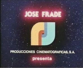
<embed align="right" allowfullscreen="true" height="252" src="http://wikifoundrytools.com/wiki/closinglogos/widget/youtubevideo/c2abe84fdb810a4af89f3dfa65bb480e6aac4c6d" type="application/x-shockwave-flash" width="313" wmode="transparent"/>Logo: On a blue background, the J and the F from the previous logo come zooming out and place themselves about the middle of the screen. They rotate towards each other as a blue sphere zooms in. The letters move and spin around the sphere, turning it into a red-blue circle. The two parts separate and elongate to turn into the narrower parts of the J and the F. The four parts merge and form the full JF logo, flashing when complete. It shines via stars on its sides, and tilts side by side, placing itself in the upper part of the screen. "JOSE FRADE" and "PRODUCCIONES CINEMATOGRÁFICAS S.A." fade in below the logo in a cyan Gill Sans font with modifications, as letters slide in to form "PRESENTA".
FX/SFX: Standard CGI at the time.
Music/Sounds: See the first logo.
Availability: Common; seen on Spanish DVD prints of El Cid and For A Few Dollars More.
Editor's Note: Fine CGI, to be honest even by its dated standards, but the fanfare is becoming just more and more grainy-sounding.