Intrepid Pictures
Jump to navigation
Jump to search
Logo descriptions by EnourmousRat, Yeow95, and others
Video captures courtsey of EnourmousRat
Background: Intrepid Pictures is a film production company founded in 2004 by Trevor Macy and Marc D. Evans. The film company specializes in producing and co-financing commercial horror, thriller, action, and comedy genre films for the young adult demographic.
1st Logo
(June 23, 2006-May 30, 2008)
 <embed allowfullscreen="true" height="204" src="http://wikifoundrytools.com/wiki/closinglogos/widget/youtubevideo/954b39eb3ec34a8bcc52fc4a60d1723c7d6c1065" type="application/x-shockwave-flash" width="248" wmode="transparent"/>
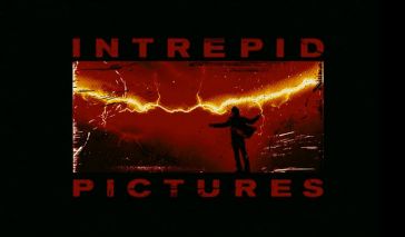
Logo: We fade into a dark red background, which features a very stormy sky with lightning (which can be seen in yellow) striking all about the logo. Among the commotion is a black silhouette of a man slowly raising his arms, as if to embrace the stormy weather. The man's jacket can be seen flapping about throughout the storm. As the storm gets more violent, a scratchy-print appearance begins to take form on the logo. One lightning strike happens very close to the man and creates a large flash, causing the logo to be freeze in mid-action with a scratchy appearance on it. After the flash, the logo zooms out very quickly
and boxes itself against a black background. The word "INTREPID PICTURES" appear surrounding the box, with "INTREPID" located at the top and "PICTURES" located at the bottom respectively. The text appears in the same color and style as the rest of the logo.
FX/SFX: Lightning appearing throughout the logo, and the man and his cloak waving. Seems to be 2D animation throughout the entire logo.
Music/Sounds: A dramatic choir that quickly grows in loudness, and after the flash in the logo fades out with a loud, eerie chord. Sounds of rumbling thunder can be heard throughout the logo up until the flash.
Availability: Can be seen on films they co-produced in the period such as Doomsday and The Strangers.
Editor's Note: The logo overall has a very ominous feel to it, thanks to the dark background, thunderstorm and animation as well as the threatening music.
2nd Logo
(April 27, 2012-) 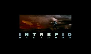 <embed allowfullscreen="true" height="237" src="http://wikifoundrytools.com/wiki/closinglogos/widget/youtubevideo/28a0a46e376fc5b7243ad0e3a96e59d2837fafeb" type="application/x-shockwave-flash" width="288" wmode="transparent"/>
Logo: The entire logo is a live-action remake of the first logo with a more detailed environment. We first pan out of the man's cloak, which is flapping around fiercely in the wind. As the camera pans away from the man out to a more comfortable distance, more of the environment of the logo is revealed. The background is now a stormy sky with a gradient crimson-gray color and a mountain-canyon landscape, which can be seen at the bottom of the screen. Lightning strikes all around the logo throughout. The man is revealed to be standing on a ledge, and as the camera pans away from him he slowly raises his arms upward, as if to embrace the stormy weather. As the camera stops at a comfortable position, the word INTREPID, in a sky blue-white gradient color, zoom outward into the action. As it does, lightning strikes very close to the man, creating a bright flash on the screen. When the flash is over, the finished logo is revealed in place-the action is now boxed against a black background, with the word "INTREPID" now still and positioned below the logo. "PICTURES" also appears after the flash, positioned directly under "INTREPID." The boxed action within the logo continues until the logo fades out.
Trivia: The logo was made by Picture Mill, and the live-action man is played by Christian Roberts.
FX/SFX: Mostly live-action, with use of chroma-key technology for the background and some minimal use of CGI for the text of the logo company.
Music/Sounds: Sounds of thunder and howling wind.
Availability: Can be seen on The Raven, The Cold Light of Day, among others.
Editor's Note: The logo is quite mellower than its predecessor with the more realistic/modern effects. Some people who preferred the animated first logo might also dislike this logo for its use of live-action.
Video captures courtsey of EnourmousRat
Background: Intrepid Pictures is a film production company founded in 2004 by Trevor Macy and Marc D. Evans. The film company specializes in producing and co-financing commercial horror, thriller, action, and comedy genre films for the young adult demographic.
1st Logo
(June 23, 2006-May 30, 2008)
 <embed allowfullscreen="true" height="204" src="http://wikifoundrytools.com/wiki/closinglogos/widget/youtubevideo/954b39eb3ec34a8bcc52fc4a60d1723c7d6c1065" type="application/x-shockwave-flash" width="248" wmode="transparent"/>
Logo: We fade into a dark red background, which features a very stormy sky with lightning (which can be seen in yellow) striking all about the logo. Among the commotion is a black silhouette of a man slowly raising his arms, as if to embrace the stormy weather. The man's jacket can be seen flapping about throughout the storm. As the storm gets more violent, a scratchy-print appearance begins to take form on the logo. One lightning strike happens very close to the man and creates a large flash, causing the logo to be freeze in mid-action with a scratchy appearance on it. After the flash, the logo zooms out very quickly
and boxes itself against a black background. The word "INTREPID PICTURES" appear surrounding the box, with "INTREPID" located at the top and "PICTURES" located at the bottom respectively. The text appears in the same color and style as the rest of the logo.
FX/SFX: Lightning appearing throughout the logo, and the man and his cloak waving. Seems to be 2D animation throughout the entire logo.
Music/Sounds: A dramatic choir that quickly grows in loudness, and after the flash in the logo fades out with a loud, eerie chord. Sounds of rumbling thunder can be heard throughout the logo up until the flash.
Availability: Can be seen on films they co-produced in the period such as Doomsday and The Strangers.
Editor's Note: The logo overall has a very ominous feel to it, thanks to the dark background, thunderstorm and animation as well as the threatening music.
(April 27, 2012-)
 <embed allowfullscreen="true" height="237" src="http://wikifoundrytools.com/wiki/closinglogos/widget/youtubevideo/28a0a46e376fc5b7243ad0e3a96e59d2837fafeb" type="application/x-shockwave-flash" width="288" wmode="transparent"/>
Trivia: The logo was made by Picture Mill, and the live-action man is played by Christian Roberts.
FX/SFX: Mostly live-action, with use of chroma-key technology for the background and some minimal use of CGI for the text of the logo company.
Music/Sounds: Sounds of thunder and howling wind.
Availability: Can be seen on The Raven, The Cold Light of Day, among others.
Editor's Note: The logo is quite mellower than its predecessor with the more realistic/modern effects. Some people who preferred the animated first logo might also dislike this logo for its use of live-action.