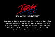
Interplay
Jump to navigation
Jump to search
1st (known) Logo
(February 10, 1988-October 31, 1999; 2009)
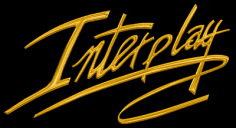
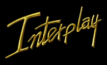
Nicknames: "Signature", "The Interplay Signature"
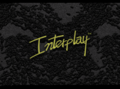
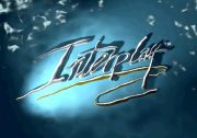
Logo: A custom-drawn word "Interplay" in gold, with a swirl signature line below.
Variants:
FX/SFX: None.
Music/Sounds: None.
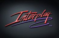
Availability: Native gold logo can be seen in Earth 2140, Blood & Magic and other games. The red and blue logo first appeared after the company's revival on Earthworm Jim for iPhone.
Editor's Note: None.
2nd Logo
(1994-1999)
Nicknames: "The Interplay Signature II", "Interplay in Space"
Logo: On a space background, we see a green marble rectangle flying from the left side of the screen, tilting and spinning around slowly, until it zooms so far away, it appears to be just a little green dot. Then, a red laser comes out of nowhere, engraving something on the rectangle. The camera suddenly zooms in, and we turn 90 degrees to see that it is drawing the Interplay logo, consisting of the word "Interplay" in a cursive font with a lasso-like swirl underneath. When the laser stops drawing the logo, the logo centers itself as fiery sparks shoot out.
Variant: The logo may be still and take the whole screen.
FX/SFX: The marble rectangle moving and the laser writing.
Music/Sounds: An ominous synth-bass hum, then, a choir sounder, then, an uplifting orchestral tune that sounds like something you hear from an action movie from the 1990s.
Availability: Can be seen on games like Cyberia and Norse by Norsewest for DOS. Some games still contained the 1st signature logo. The static version appeared on Virtual Pool and Crime Killer.
Editor's Note: None.
3rd Logo
(September 30, 1997-2004)
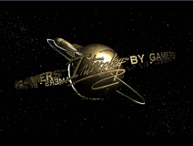
Nicknames: "The Interplay Signature III", "The Interplay Orbit"
Logo: We see a planet with an orbit around it, with the rocket spinning around the planet by that orbit (all made of metal). The circle made of Interplay's tagline, "BY GAMERS FOR GAMERS" spin around the planet too. Suddenly the word "Interplay" appear in the words line, it centers on the planet and stops. Then the logo fades while the rocket keep flying, leaving only "Interplay" in its familiar font.
Trivia: The planet in the logo (along with its rocket) was originally the logo for the fictional Galaxy News Network in the Fallout introduction cinematic.
Variants:
FX/SFX: CGI animation.
Music/Sounds: The last few seconds from the previous logo, albeit without the laser sounds.
Availability: Appears on games like Fallout (the first game with this logo) and its sequel, Fallout 2. Also seen onWild 9, Icewind Dale, and Lionheart.
Editor's Note: None.
Final Note: After the well-known financial struggle, when Interplay was in one step from total bankruptcy, the fate of this logo is unknown for now. The still logo (see 1st logo) has popped up on the iPhone.
Background:Interplay Entertainment Corp. is an American video game developer and publisher based in Los Angeles. The company was founded in November 1983 as Interplay Productions by developers Brian Fargo, Jay Patel, Troy Worrell and Bill Heineman, as well as investor Chris Wells.
(February 10, 1988-October 31, 1999; 2009)


Nicknames: "Signature", "The Interplay Signature"
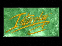
Logo: A custom-drawn word "Interplay" in gold, with a swirl signature line below.
Variants:
- On ClayFighter for SNES, it scrolls to the back of the screen, then turns 90º towards the front of the screen, zooms out and immediately zooms back on to the front of the screen, then splits apart to the left and right of the screen.
- On ClayFighter 63⅓ for N64, the signature is in rainbow color and made out of plasticine, the letter P drips down into a C, making "Interclay,"and there is a announcer that says "Interplay Presents...ClayFighter 63⅓".
- On Descent, the logo lies on stone and looks more realistic, like it's made of gold. On Descent 2 for PS, the background is space and has "presents" below.
- Early version is tilted left a little bit, and has no signature line. On Blackthorne for 32X, this logo is small and placed on a stone background. This variant was used until 1997.
- The signature-less logo was seen on a green marble plate, different from one used in second logo. This was spotted on Battle Chess 4000 and Buzz Aldrin's Race Into Space.
- On Atomic Bomberman, the purple logo hangs over a bomb.
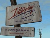
- On Redneck Rampage and its add-ons, we see logo on the holed up sign. There are words "POPULATION 414", "BY GAMERS FOR GAMERS" and the website URL.
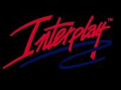
- Another usual colors feature red text and blue signature. This was seen on M.A.X. and newer iPhone games. On Earthworm Jim 3D, the background is white and has the slogan below. On MDK 2 and Virtual Pool 3, the neon logo lies on a stone-like surface.
- On Radical Racers, the background is blue water and has a ripple.
FX/SFX: None.
Music/Sounds: None.
Availability: Native gold logo can be seen in Earth 2140, Blood & Magic and other games. The red and blue logo first appeared after the company's revival on Earthworm Jim for iPhone.
Editor's Note: None.
2nd Logo
(1994-1999)

Nicknames: "The Interplay Signature II", "Interplay in Space"
Logo: On a space background, we see a green marble rectangle flying from the left side of the screen, tilting and spinning around slowly, until it zooms so far away, it appears to be just a little green dot. Then, a red laser comes out of nowhere, engraving something on the rectangle. The camera suddenly zooms in, and we turn 90 degrees to see that it is drawing the Interplay logo, consisting of the word "Interplay" in a cursive font with a lasso-like swirl underneath. When the laser stops drawing the logo, the logo centers itself as fiery sparks shoot out.
Variant: The logo may be still and take the whole screen.
FX/SFX: The marble rectangle moving and the laser writing.
Music/Sounds: An ominous synth-bass hum, then, a choir sounder, then, an uplifting orchestral tune that sounds like something you hear from an action movie from the 1990s.
Availability: Can be seen on games like Cyberia and Norse by Norsewest for DOS. Some games still contained the 1st signature logo. The static version appeared on Virtual Pool and Crime Killer.
Editor's Note: None.
3rd Logo
(September 30, 1997-2004)


Nicknames: "The Interplay Signature III", "The Interplay Orbit"
Logo: We see a planet with an orbit around it, with the rocket spinning around the planet by that orbit (all made of metal). The circle made of Interplay's tagline, "BY GAMERS FOR GAMERS" spin around the planet too. Suddenly the word "Interplay" appear in the words line, it centers on the planet and stops. Then the logo fades while the rocket keep flying, leaving only "Interplay" in its familiar font.
Trivia: The planet in the logo (along with its rocket) was originally the logo for the fictional Galaxy News Network in the Fallout introduction cinematic.
Variants:
- On Wild 9, the logo, along with the music is sped-up.
- On Draconus: Cult of the Wyrm, the logo is still with the rocket at lower point.
FX/SFX: CGI animation.
Music/Sounds: The last few seconds from the previous logo, albeit without the laser sounds.
Availability: Appears on games like Fallout (the first game with this logo) and its sequel, Fallout 2. Also seen onWild 9, Icewind Dale, and Lionheart.
Editor's Note: None.
Final Note: After the well-known financial struggle, when Interplay was in one step from total bankruptcy, the fate of this logo is unknown for now. The still logo (see 1st logo) has popped up on the iPhone.