Great Plains National Television
Jump to navigation
Jump to search
 <iframe frameborder="0" height="224" src="http://wikifoundrytools.com/wiki/closinglogos/widget/unknown/66c83c9b5ce0d853303739621950ff2ba60374c1" width="298"></iframe>
2nd Logo
(1983-1987?)
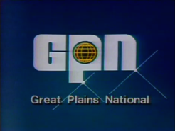
Logo: Set on a blue background, we see the letters "Gpn" (with a wireframe globe inside the "P") in a futuristic font and has 2 still stars on the logo. The text "Great Plains National" fades in below.
Availability: Rare. Preserved on episodes of Saludos on <a class="external" href="http://www.ket.org/itvvideos/offering/foreign/saludos.htm" rel="nofollow" target="_blank" title="this website">this website</a>.
Editor's Note: The ugly logo and somewhat strange music could bother a few, but this is an interesting logo.
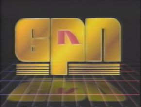
3rd Logo
(1987?-1995)
 <iframe frameborder="0" height="224" src="http://wikifoundrytools.com/wiki/closinglogos/widget/unknown/7248cb46ea45ab3a959506e0e148e6966ffa488b" width="298"></iframe>
Music/Sounds: A downward synth chime sounder, then a three-note synth tune with four "dings".
Availability: Extremely rare, appears on Mathnet. Also may appear on some old GED-based programs.
Editor's Note: None.
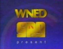
4th Logo
(August 15, 1988-1993)
 <iframe frameborder="0" height="184" src="http://wikifoundrytools.com/wiki/closinglogos/widget/unknown/16dd7aa29a93fab5bb4681b4a5f776ed17b85093" width="244"></iframe>
Nickname: "The Reading Rainbow Logo"
Logo: Against a blue background, a rainbow quickly forms, then slowly fades away, as the words "WNED", in gold, appear from the left and stop at the top of the screen, followed by the Great Plains National Television logo from the 3rd logo, coming in from the left and arranging itself in the center. "present", in spaced-out white letters, appears below via a "glowing" effect.
FX/SFX: The zooming and the fading rainbow.
Music/Sounds: A nine-note synth fanfare with some "dinging" sounds.
Availability: Rare. Appears on some old Reading Rainbow tapes from Pacific Arts and GPN themselves. Pre-1988 episodes don't use a logo at all.
Editor's Note: None.
1st (known) Logo
(1976?-1983)
 <iframe frameborder="0" height="224" src="http://wikifoundrytools.com/wiki/closinglogos/widget/unknown/66c83c9b5ce0d853303739621950ff2ba60374c1" width="298"></iframe>
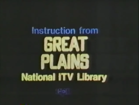
Logo: We see "Instruction from" on a black background. Then, text fades in arranged like this:
GREAT
PLAINS
National ITV Library
A dark blue outline of the GPN logo then fades in.
FX/SFX: The fade-in of the text and GPN logo.
Music/Sounds: An analog synth ditty consisting of a bubbly synth and a synth-horn.
Availability: Extremely rare. Can be seen on Celebrate.
Editor's Note: None.
(1983-1987?)


<iframe frameborder="0" height="183" src="http://wikifoundrytools.com/wiki/closinglogos/widget/unknown/a4189c658676d4e8a73f059c1863f681b8e2bee6" width="243"></iframe><iframe frameborder="0" height="186" src="http://wikifoundrytools.com/wiki/closinglogos/widget/unknown/3fd8a22e177bc5f79082dd8db1d3e701573dc5f0" width="247"></iframe>
Logo: Set on a blue background, we see the letters "Gpn" (with a wireframe globe inside the "P") in a futuristic font and has 2 still stars on the logo. The text "Great Plains National" fades in below.
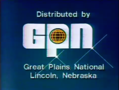
Closing variant: The words "Distributed by" are seen above "GPN", and below "Great Plains National" are the words "Lincoln, Nebraska".
FX/SFX: Just the text fading in, simple 80's effects.
Music/Sounds: A nine-note synth-horn tune that echos (the echo having a slightly different melody), followed by a "gurgling" telephone-like synthesizer tune that repeats twice, then ascends in pitch and slows down a bit. It sounds very similar to a slow version of the first couple measures of "Reveille" as well as the first logo.
Availability: Rare. Preserved on episodes of Saludos on <a class="external" href="http://www.ket.org/itvvideos/offering/foreign/saludos.htm" rel="nofollow" target="_blank" title="this website">this website</a>.
Editor's Note: The ugly logo and somewhat strange music could bother a few, but this is an interesting logo.
3rd Logo
(1987?-1995)
 <iframe frameborder="0" height="224" src="http://wikifoundrytools.com/wiki/closinglogos/widget/unknown/7248cb46ea45ab3a959506e0e148e6966ffa488b" width="298"></iframe>
Logo: On a black background, we see a blue-red gradient grid extending into the horizon. The logo, but in gold and the "P" having the Nebraska ETV logo in it, sliding in, with the "G" sliding in from the left, the "P" sliding from the top, and the "n" sliding in from the right. After they rest, a ping appears on the "G" as lines fade in below and the logo filling in with cordovan. 4 pings then appear in sync with the "dings".
FX/SFX: The logo sliding in and shining.
Music/Sounds: A downward synth chime sounder, then a three-note synth tune with four "dings".
Availability: Extremely rare, appears on Mathnet. Also may appear on some old GED-based programs.
Editor's Note: None.
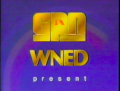
4th Logo
(August 15, 1988-1993)

 <iframe frameborder="0" height="184" src="http://wikifoundrytools.com/wiki/closinglogos/widget/unknown/16dd7aa29a93fab5bb4681b4a5f776ed17b85093" width="244"></iframe>
Nickname: "The Reading Rainbow Logo"
Logo: Against a blue background, a rainbow quickly forms, then slowly fades away, as the words "WNED", in gold, appear from the left and stop at the top of the screen, followed by the Great Plains National Television logo from the 3rd logo, coming in from the left and arranging itself in the center. "present", in spaced-out white letters, appears below via a "glowing" effect.
Variants:
- Subsequent uses of this logo from 1990 to 1993, begin after the rainbow is formed and ends four seconds early.
- There is an alternate variant that exists on several 1990-1993 episodes of Reading Rainbow, in which "GPN" is at the top and "WNED" is at the bottom.
FX/SFX: The zooming and the fading rainbow.
Music/Sounds: A nine-note synth fanfare with some "dinging" sounds.
Availability: Rare. Appears on some old Reading Rainbow tapes from Pacific Arts and GPN themselves. Pre-1988 episodes don't use a logo at all.
Editor's Note: None.