Gramercy Pictures
Jump to navigation
Jump to search
Logo descriptions by kidinbed and LogosForTheWin
Logo captures by thehugetvfan, EnormousRat, V of Doom, LogosForTheWin, Supermarty-o, Sagan Blob, and Derrick Anderson
Editions by thehugetvfan and V of Doom
Video captures courtesy of phasicblu, Paperking99, Sagan Blob, and MonofiedKuma (TheUnknownLogoFan)
Background: Gramercy Pictures was founded in May 1992 as a joint venture between PolyGram Filmed Entertainment and Universal Pictures; at the time Universal and MCA were owned by Panasonic Corporation. The name of the company is derived from its parent companies, though it could also be a reference to Gramercy Park in New York City. Gramercy served as PolyGram Filmed Entertainment's US theatrical distributor and as Universal's art-house division. The Seagram Company would sell half of the studio to PolyGram on January 11, 1996, thus Gramercy became fully owned by the latter. When Seagram (then parent owner of Universal) bought PolyGram, they acquired Gramercy, but sold it (along with October Films) to Barry Diller's USA Networks (which Seagram owned a partial stake in), who renamed the combined operations USA Films (now "Focus Features"). In May 2015, Focus Features revived Gramercy for genre films; the label went dormant after the release of Ratchet & Clank (probably due to the movie's critical and commercial failure).
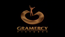
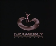
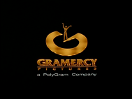
1st Logo
(May 14, 1993-March 5, 1999)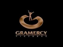
<iframe height="154" src="http://wikifoundrytools.com/wiki/closinglogos/widget/genericvideo/baaab1606c9aefb403a13594b3d77fc261d62bee" width="272"></iframe><iframe height="150" src="http://wikifoundrytools.com/wiki/closinglogos/widget/unknown/ae94756b38577374243eafe5208cc9ba0c6afb81" width="266"></iframe><iframe height="150" src="http://wikifoundrytools.com/wiki/closinglogos/widget/unknown/ce0db19ee4408ebbc92f024921970448db77e423" width="268"></iframe>
Nicknames: "Spotlight on Statue", "The Spotlight", "G"
Logo: We see an outline of a circle, then a flash that illuminates it. The circle zooms out to form a statue that holds his arms up. A yellowish spotlight then shines on him, and then a blue spotlight shines on him as well. The two spotlights move a bit and form an abstract "G" under the statue. The statue and abstract "G" zoom out and the text:
fades-in.
Trivia: The logo was created by Rod Dyer Design. They were also responsible for creating the 1972-1996 logo for Gramercy's co-parent company MCA.
Variants:
FX/SFX: The spotlights forming the "G". Great animation.
Music/Sounds: Generally is silent or the opening theme of the movie.
Music/Sounds Variants:
2nd Logo
(June 5, 2015-April 29, 2016)
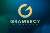


Nicknames: "Modern G", "G III", "No Statue", "Light Circles"
Logo: A flock of yellow-green dots fly and go round over a bluish darkness. They form two dim circles, rotate several times and more circles appear until they all become the big "G" from the logo, and the name and a Comcast byline appear below.
Closing Variant: It's only a still in-credit version of the logo.
FX/SFX: The circles spinning. A bit reminiscent of the Focus Features logo.
Music/Sounds: None or the opening theme of the movie.
Availability: Debuted on Insidious: Chapter 3, and later appeared on Self/Less, Sinister 2, The Forest, London Has Fallen, and Ratchet & Clank. Strangely, digital prints and HBO airings of Self/Less uses Focus Features' logo instead.
Editor's Note: None.
Logo captures by thehugetvfan, EnormousRat, V of Doom, LogosForTheWin, Supermarty-o, Sagan Blob, and Derrick Anderson
Editions by thehugetvfan and V of Doom
Video captures courtesy of phasicblu, Paperking99, Sagan Blob, and MonofiedKuma (TheUnknownLogoFan)
Background: Gramercy Pictures was founded in May 1992 as a joint venture between PolyGram Filmed Entertainment and Universal Pictures; at the time Universal and MCA were owned by Panasonic Corporation. The name of the company is derived from its parent companies, though it could also be a reference to Gramercy Park in New York City. Gramercy served as PolyGram Filmed Entertainment's US theatrical distributor and as Universal's art-house division. The Seagram Company would sell half of the studio to PolyGram on January 11, 1996, thus Gramercy became fully owned by the latter. When Seagram (then parent owner of Universal) bought PolyGram, they acquired Gramercy, but sold it (along with October Films) to Barry Diller's USA Networks (which Seagram owned a partial stake in), who renamed the combined operations USA Films (now "Focus Features"). In May 2015, Focus Features revived Gramercy for genre films; the label went dormant after the release of Ratchet & Clank (probably due to the movie's critical and commercial failure).
1st Logo
(May 14, 1993-March 5, 1999)


<iframe height="154" src="http://wikifoundrytools.com/wiki/closinglogos/widget/genericvideo/baaab1606c9aefb403a13594b3d77fc261d62bee" width="272"></iframe><iframe height="150" src="http://wikifoundrytools.com/wiki/closinglogos/widget/unknown/ae94756b38577374243eafe5208cc9ba0c6afb81" width="266"></iframe><iframe height="150" src="http://wikifoundrytools.com/wiki/closinglogos/widget/unknown/ce0db19ee4408ebbc92f024921970448db77e423" width="268"></iframe>
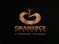
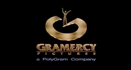
Logo: We see an outline of a circle, then a flash that illuminates it. The circle zooms out to form a statue that holds his arms up. A yellowish spotlight then shines on him, and then a blue spotlight shines on him as well. The two spotlights move a bit and form an abstract "G" under the statue. The statue and abstract "G" zoom out and the text:
GRAMERCY
P--I--C--T--U--R--E--S
P--I--C--T--U--R--E--S
fades-in.
Trivia: The logo was created by Rod Dyer Design. They were also responsible for creating the 1972-1996 logo for Gramercy's co-parent company MCA.
Variants:
- An enhanced version debuted on Def Jam's How to Be a Player in 1997. The logo is more golden than before, and the animation is cleaner and smoother. A PolyGram byline was also added below.
- On Double Dragon, the logo has a pinkish/brownish/silverish/bronzish tint.
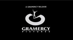
- At the end of Clay Pigeons, the print logo is used. The text "A GRAMERCY RELEASE" appears above the logo.
FX/SFX: The spotlights forming the "G". Great animation.
Music/Sounds: Generally is silent or the opening theme of the movie.
Music/Sounds Variants:
- On Grace of My Heart, a dark pound, then a soft yet very majestic string and piano fanfare is heard.
- Sometimes, it had a dark and dramatic piano tune with an ominous synth. This was on Dream Lover, Spike Lee's Drop Squad, Foreign Student, I'm Not Rappaport, and Double Dragon.
Editor's Note: This is a very nice logo, with some good animation (which is improved even more in the 1997 variant) and a memorable concept.
2nd Logo
(June 5, 2015-April 29, 2016)


<iframe height="166" src="http://wikifoundrytools.com/wiki/closinglogos/widget/genericvideo/2fb14cdfd8ea1aa0d18bd4843418849f2f9b5a83" width="297"></iframe>
Nicknames: "Modern G", "G III", "No Statue", "Light Circles"
Logo: A flock of yellow-green dots fly and go round over a bluish darkness. They form two dim circles, rotate several times and more circles appear until they all become the big "G" from the logo, and the name and a Comcast byline appear below.
Closing Variant: It's only a still in-credit version of the logo.
FX/SFX: The circles spinning. A bit reminiscent of the Focus Features logo.
Music/Sounds: None or the opening theme of the movie.
Availability: Debuted on Insidious: Chapter 3, and later appeared on Self/Less, Sinister 2, The Forest, London Has Fallen, and Ratchet & Clank. Strangely, digital prints and HBO airings of Self/Less uses Focus Features' logo instead.
Editor's Note: None.