Gannett
Jump to navigation
Jump to search
Editions by mr3urious, Michael Bass, TheMisterFree and Synthavision
Background: The Gannett Company is a media company founded in 1923 as an outgrowth of a small newspaper business in Elmira, New York that was founded in 1906. They eventually got into the broadcasting industry by acquiring many affiliates of NBC, CBS, and ABC, as well as a few independent stations. By 1979, they owned 79 newspapers. They eventually spun off their broadcast assets into a new company called Tegna, Inc. in 2015.
Availability: See 1st logo, unless America Todaywas released on VHS
Editor's Note: The massive size of the "G", zooming and the synth tune won't set well for some viewers, but this is a favorite of many.
Logo: On a purple/black gradient background, a 3D rendition of the Gannett logo zooms up, turns 2-D, and zooms to the bottom-right hand corner of the screen. The station's logo appears at the top left. "An Equal Opportunity Employer" appears below the Gannett logo.
Variants: Every station that used this put their logo in it. Here is a list of them.
FX/SFX: The spinning of the logo, and the zoom out effects of the station logo.
Music/Sounds: Same as the extended or normal variants of the previous logos' music, or the end of the station's news music package.
Availability: See above.
Editor's Note: None.
Nickname: "KUSA G Globe"
Logo: On a blue/black gradient background, a 3D version of the Gannett logo zooms out, the "Gannett" name zooms in, and zooms to the bottom-right corner of the screen. The website URL <a class="external" href="http://www.gannett.com/" rel="nofollow" target="_blank">www.gannett.com</a> and "An Equal Opportunity Employer" appears below the logo and the station's logo zooms in at the middle-right. Thee zooming effects are accompanied by a blue trailing effect.Around 2009, the background features two filmstrip-like objects.
Variants: Stations that use this put their own logo on this. Another list is used for these stations:
FX/SFX: The animation.
Music/Sounds: The same as before.
Availability: Same as the previous logos. As of now, it was only known to exist on Denver's KUSA and Washington, DC's WUSA; there were no other sightings confirmed.
Editor's Note: None.
Editor's Note:Compared to the previous logos, this one is really simple and corporate, even by modern standards, as the iconic globe logo is nowhere to be seen. It is just as bad as the current Starz logos.
Background: The Gannett Company is a media company founded in 1923 as an outgrowth of a small newspaper business in Elmira, New York that was founded in 1906. They eventually got into the broadcasting industry by acquiring many affiliates of NBC, CBS, and ABC, as well as a few independent stations. By 1979, they owned 79 newspapers. They eventually spun off their broadcast assets into a new company called Tegna, Inc. in 2015.
1st (known) Logo
(January 1979-1984)
(January 1979-1984)


<iframe frameborder="0" height="167" src="http://wikifoundrytools.com/wiki/closinglogos/widget/unknown/53f56f94fbc9eedd9db34c7635c9489b73198602" width="222"></iframe><iframe frameborder="0" height="167" src="http://wikifoundrytools.com/wiki/closinglogos/widget/unknown/03ec6d949c0ad697d282506403539d315ff32694" width="222"></iframe><iframe frameborder="0" height="167" src="http://wikifoundrytools.com/wiki/closinglogos/widget/unknown/2bd768d41a5edd406ce30e6e3b5a3ed1b7921799" width="222"></iframe><iframe frameborder="0" height="167" src="http://wikifoundrytools.com/wiki/closinglogos/widget/unknown/600cf2ed41d134485e488d66871c08a9243b9775" width="222"></iframe><iframe frameborder="0" height="167" src="http://wikifoundrytools.com/wiki/closinglogos/widget/unknown/a0bb9bad52a03d009e171a01a9e2f9369303fa1e" width="222"></iframe><iframe frameborder="0" height="158" src="http://wikifoundrytools.com/wiki/closinglogos/widget/unknown/beba6643fe51dd1e5c6f32442a7964156faf527b" width="209"></iframe><iframe frameborder="0" height="167" src="http://wikifoundrytools.com/wiki/closinglogos/widget/unknown/39a9b51c65599d0917b44511760b9d9150aacd43" width="222"></iframe>
Nicknames: "Early Gannett Death Star", "Laser Death Star"
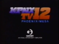
Logo: Against a black background, we see a multicolored wireframe globe zooming out. The globe turns blue-green, and an outline of a "G" rotates toward us and moves to the left as the globe becomes solid with the "G" cut out of the left side and wireframe lines cut across the "solid" part. The word "GANNETT" in its corporate font fades in below, and the logo turns white, flashes (with sparkles), and zooms out rapidly with the station's logo. The words "AN EQUAL OPPORTUNITY EMPLOYER" (in white) also appear and zoom out below the Gannett logo.
Variants: Depending on what the local station was, the local station identity appeared above the globe:
FX/SFX: The rotation and "solidifing" of the globe; pretty neat effects for the time.
Music/Sounds: A "creeping" synth tune, followed by a three note synth piano stinger.
Availability: Extinct. It was only seen on newscasts, which only enthusiasts will preserve.
Editor's Note: The music and flash/zoom in effect will scare a few, but the graphics will unease less than in the succeeding logo.
Variants: Depending on what the local station was, the local station identity appeared above the globe:
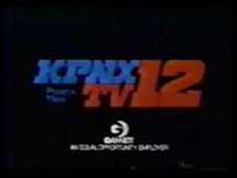
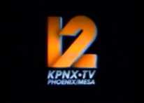
- KPNX: 3 total versions are known to exist:
- 1979-1981: The words "KPNX" and "TV" (in blue) are stacked vertically with "12" (in red) at its right, all of which are written in a large, blocky font. The words "Phoenix" and "Mesa" (in blue, much smaller, and in Gill Sans) are stacked vertically below "KPNX". The logo flashes.
- 1981-1983?: Same as before, but the Gannett logo zooms out differently (you can see a square outline), and the KPNX logo, now 3D and in a different font, flashes in and shines. "Phoenix", "Mesa", the Gannett logo, and "An Equal Opportunity Employer" are also now blue-green, and the latter text is lowercase except for the first letter of each word.
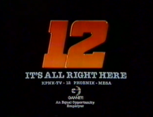
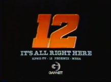
- 1983?-1984: Same as the one before this, but the globe simply zooms out without flashing. Also, an orange "12" flashes in, shines and shimmers, which is in the same font as used originally, and "IT'SALL RIGHT HERE"and "KPNX-TV· 12 PHOENIX· MESA" fade in below. "An Equal Opportunity Employer" fades in below the Gannett logo. Sometimes, it may be absent.
- WXIA:
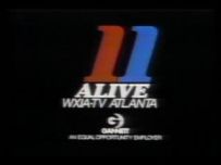
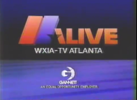
- 1980-1983?: Similar to the KPNX variant, but with a red-and-blue "11" above the word "ALIVE", with "WXIA-TV ATLANTA" below that; all the text is italicized, except for the EOE disclaimer and "GANNETT", and the logo flashes.
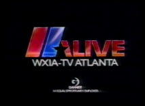
- 198?-1984: This now features a 3D "11ALIVE" in red with the "11" being both red and blue (first 1 is red and the second 1 is blue. The second "1" and a "\" , form an "A" with a star cut. Thisflashes, and shimmers. Below this is "WXIA-TV ATLANTA".
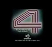
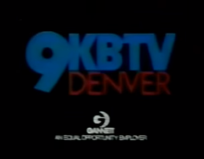
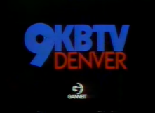
- KBTV: Like the last two, the logo flashes and is colored red and blue; the "9" and "KBTV" calls are blue, while "DENVER" is in red. Sometimes the EOE notice is missing.
- KARK: Like KBTV's version, the logo flashes and is colored red and white, the "4" is red and "KARK-TV" calls and city name are white.
FX/SFX: The rotation and "solidifing" of the globe; pretty neat effects for the time.
Music/Sounds: A "creeping" synth tune, followed by a three note synth piano stinger.
Availability: Extinct. It was only seen on newscasts, which only enthusiasts will preserve.
Editor's Note: The music and flash/zoom in effect will scare a few, but the graphics will unease less than in the succeeding logo.
2nd Logo
(1984-1995)
![[Untitled]](/images/thumb/d/df/79e28ebc74314a040f31f0c7c6a3d457.jpeg/194px-79e28ebc74314a040f31f0c7c6a3d457.jpeg)
Nicknames: "Gannett Death Star", "The Evil Orb"
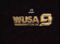
Logo: On a black background, a grey spherical like object emerges from the top-left of the screen. Many blue light streaks run across the object giving it the illusion of latitude and longitude lines of a globe. There is a red glow in the gap of the object. Once it centers itself to the middle of the screen, it is revealed to be a spherical "G". We zoom through the sphere as a grey dot with "GANNETT" in white zooms in. The dot turns into a white globe like shape with the latitude and longitude lines as a black "G" slides onto the globe. It then zooms to the bottom of the screen as "An Equal Opportunity Employer" appears below the globe.
Variants: Depending on what the local station was, the local station identity appeared above the globe.
Music/Sounds: A warbly synth, followed the 1st logo's music. The difference here is when the previous logo's music starts, a whoosh can be heard.
(1984-1995)


![[Untitled]](/page/File:79e28ebc74314a040f31f0c7c6a3d457.jpeg)


<iframe frameborder="0" height="132" src="http://wikifoundrytools.com/wiki/closinglogos/widget/genericvideo/ab47d991f0df0584547c4099e0ceeb407c4f20ef" width="232"></iframe><iframe frameborder="0" height="133" src="http://wikifoundrytools.com/wiki/closinglogos/widget/genericvideo/c1c7c7e0fe1b47ad9f58a5350a508003b6ea212f" width="236"></iframe><iframe frameborder="0" height="134" src="http://wikifoundrytools.com/wiki/closinglogos/widget/genericvideo/8d3bd4ad6fbebbf9bd508eb4843bb6a6248fc8b2" width="239"></iframe><iframe frameborder="0" height="135" src="http://wikifoundrytools.com/wiki/closinglogos/widget/genericvideo/d9d291a1f4821d223f9d9b42777ceee7e171c681" width="235"></iframe>
Logo: On a black background, a grey spherical like object emerges from the top-left of the screen. Many blue light streaks run across the object giving it the illusion of latitude and longitude lines of a globe. There is a red glow in the gap of the object. Once it centers itself to the middle of the screen, it is revealed to be a spherical "G". We zoom through the sphere as a grey dot with "GANNETT" in white zooms in. The dot turns into a white globe like shape with the latitude and longitude lines as a black "G" slides onto the globe. It then zooms to the bottom of the screen as "An Equal Opportunity Employer" appears below the globe.
Variants: Depending on what the local station was, the local station identity appeared above the globe.
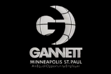
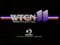
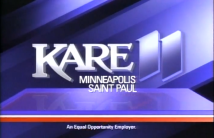
- WTCN: We see the top of a 3D "WTCN11" with the "WTCN" in white and the "11" in blue appear from the top of the screen and flip to face the viewer as it goes above the globe, and it's all backed by a red/white/blue stripe. "Minneapolis/St. Paul" appears below the "WTCN".
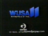
- WUSA (Minnesota): A 3D "WUSA11" tilted to its top zooms out above the Gannett logo."Minneapolis/St. Paul" appears below "WUSA11".
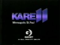
- KARE:
- Same as WUSA before changing to KARE, but "KARE11" in blue appears from the top of the screen like a flipping 2D image above the globe.
- A later version has the KARE logo coming in from the right as three rectangles (red white and blue) moved underneath as a platform; it animates on a blue/black background; small red/white/blue streaks occasionally pass by. From 1990 to 1992, a simple version, with "Minneapolis St. Paul" and the EOE message under the Gannett logo was used.
- WXIA:
- A 3D "11ALIVE" in red with the "11" being both red and blue and a star cut between the second "1" and the A appears from the top of the screen above the globe. "WXIA-TV Atlanta" appeared below the "11 ALIVE". This usually played during the beginning of the news.
- A later version simply had the logo zooming out onto a gray background, then slide to the left; this would also play at the beginning of the news. When the short-lived 11News name was introduced in 1994, this ident was no longer used; instead a small Gannett logo and the EOE message were incorporated into an ident where Paul Turner says: "You're watching 11Alive, WXIA-TV, Atlanta's News Channel."
- KVUE:
- An angular, gold "24" with the call letters below zooms down over a blue background.
- A later version had the logo (the gold "24", now thinner and the letters "KVUE", which also look angular, with a blue line underneath) showing up on a purple background, then zooming down slightly as the logo flips over and lands at the top, with "Austin" fading in; the logo then shines.
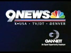
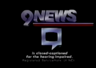
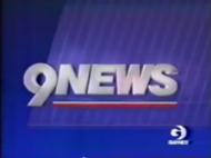
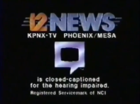
- KUSA: The blue "9 K*USA-TV" logo zooms out, and a star flies underneath, creating a line as it passes. We also see "Denver" under the line. A variant occasionally appeared where the Gannett logo zoomed away, and the "9NEWS" logo zooms out along with "is closed-captioned for the hearing impaired.", with a copyright for the NCI underneath that; a large "closed-captioning" symbol, silvery like the logo above, slides down out of the logo. A different version appeared before the news from 1988 to 1992; here the animation is on a blue background with slanted vertical lines taking up most of it; the Gannett logo moves down to the bottom right corner, then flips around and disappears. The "9NEWS" logo appears in the center, flies and turns to the right as the lines flip like blinds; the bottom portion of the "9" slides open to segue into the news. As that happens, the news theme, "It's All Right Here" by Frank Gari, plays while Ernie Anderson announces: "From KUSA in Denver, this is 9NEWS; number one in Colorado." Yet another version was used before news intros, from 1992 to 1994; this version was simply the unmodified logo, playing in reverse. From 1994-1995, the logo was not used, instead, a small Gannett logo and the EOE message was simply placed at the beginning of news opens.
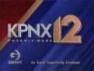
- KPNX: When the Gannett logo is done animating, the background changes to blue, as an orange-gold "12" flies from the side flipping into place, covering the logo, then "KPNX" flies in from the left and "PHOENIX-MESA" appears below that (this is incorrect; the station is licensed to Mesa and that city should be acknowledged first). Finally, the Gannett logo appears on the bottom-left. The end result is pushed to the left, as the station's news open (by Television By Design) starts.
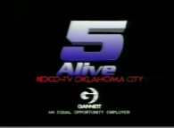
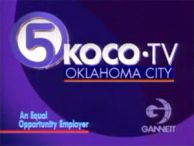
- KOCO:
- The first version of the logo resembled the WLVI variant. After that, another version was used that had a horizontal "5 Alive" logo in silver over a blue background with stripes. (A variant that was sped up was also used. Instead of the normal music, the station's news theme (by Frank Gari) started over the logo, which, in this instance, either lacked a voiceover or had one (from Ed O'Brien) that said: "Now from the station where you get more news...", which would then segue into the news.)
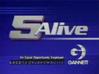
- Around 1994, another version came into use, supplanting the previous two. On a purple background, after the Gannett globe is done animating, it stops, and a curved 5 in a circle comes from the right, and the text "KOCO-TV Oklahoma City" appears. An announcer (Mike Lewis) says "This is KOCO-TV, Oklahoma City".
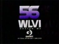
- WLVI: The blue "56" (still in the Field Communications-era font) and "WLVI" in white simply flip down over a plain black background.
- WUSA (Washington, DC):
- Had a far different version in the late '80s animated by PDI (right after Gannett bought it; the "WUSA" callsign was moved over from what is now KARE). The station logo was displayed, in space, with the Gannett logo above it. We zoom up to the Gannett logo, which turns around and takes on the features of Washington, DC (including the Washington Monument, which served as a transition from the animation into the news).
- A version used after the WUSA callsigns were implemented but before the variant above (when the station was still using it's 1982 opens, when the station was WDVM, with the "And You" theme), had the normal animation with a silver version of the WUSA logo zooming down on a purple-grey background.
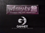
- WFMY: The logo zooms out on a grey stone BG, and the logo (the call letters in a lowercase font and an abstract, "curvy" 2, with the text "Greensboro/High Point/Winston-Salem"), in a purple/white gradient box, zooms out with the Gannett logo; it would then fade into the news open.
- One variant was used on a syndicated news program made by Gannett for public TV stations (though it was aired on some Gannett stations), titled America Today; at the end, the unmodified logo plays, with a copyright notice below.
Music/Sounds: A warbly synth, followed the 1st logo's music. The difference here is when the previous logo's music starts, a whoosh can be heard.
Music/Sounds Variants:
- Occasionally a warbling sound and a five note synth sounder would preface the warbly synth and the stinger; this was only known to be used at KARE in the late-1980's.
- The America Today variant had some extended synth noises before the first logo's music, while a voiceover intones "This has been a presentation of the Gannett Broadcasting Group, in association with the Gannett Company, Inc."
- The KUSA "Closed-Captioned" variant had a VO stating that "9NEWS is closed-captioned for the hearing impaired."
- The WTCN variant used the 1st logo's unmodified music.
- The 1984 KUSA variant has the short version or this logo, starting with the "creeping" and whoosh.
Availability: See 1st logo, unless America Todaywas released on VHS
Editor's Note: The massive size of the "G", zooming and the synth tune won't set well for some viewers, but this is a favorite of many.
3rd Logo
(1995-2011)
(1995-2011)


<iframe frameborder="0" height="165" src="http://wikifoundrytools.com/wiki/closinglogos/widget/unknown/a7df75bcdb3b6fbb0dc75e2a28bdf7cc8931eda2" width="218"></iframe><iframe frameborder="0" height="167" src="http://wikifoundrytools.com/wiki/closinglogos/widget/unknown/eb3e52e1954d5ef4ceb6cfdbc8929d913de756b8" width="222"></iframe><iframe frameborder="0" height="165" src="http://wikifoundrytools.com/wiki/closinglogos/widget/unknown/feaa334422d63ee2830559473d60b39dfd5be1fe" width="218"></iframe><iframe frameborder="0" height="167" src="http://wikifoundrytools.com/wiki/closinglogos/widget/unknown/753593c1f809e64f3f7388c068102b2a178099bc" width="222"></iframe><iframe frameborder="0" height="165" src="http://wikifoundrytools.com/wiki/closinglogos/widget/unknown/4b577e7af1dd5bbb12a4027a71c5e636d60ea77f" width="218"></iframe><iframe frameborder="0" height="165" src="http://wikifoundrytools.com/wiki/closinglogos/widget/unknown/d8a2aec55198fc0a4d6b8dcf3881f770fd277976" width="218"></iframe><iframe frameborder="0" height="167" src="http://wikifoundrytools.com/wiki/closinglogos/widget/unknown/6abc7ec5bc49b785a13f7f92f4ac59046af92acb" width="222"></iframe><iframe frameborder="0" height="167" src="http://wikifoundrytools.com/wiki/closinglogos/widget/unknown/e1a21e647fdf04f9e296443a859b916a64d0e9eb" width="296"></iframe>
Note: For the first video at the top, the logo starts at 2:20.
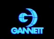
Nickname: "Metallic G Globe"
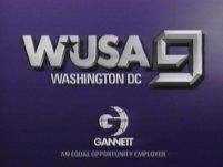
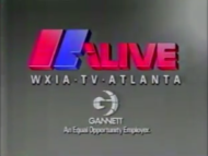
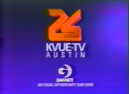
Logo: On a purple/black gradient background, a 3D rendition of the Gannett logo zooms up, turns 2-D, and zooms to the bottom-right hand corner of the screen. The station's logo appears at the top left. "An Equal Opportunity Employer" appears below the Gannett logo.
Variants: Every station that used this put their logo in it. Here is a list of them.
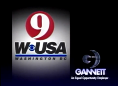
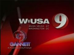
- WUSA: The background resembles the station's Giant Octopus-created graphics that were used from 2006-2008. Before the Gannett logo appears, a giant version of the station's 9 logo flies to the left. The CBS eye separates "W" and "USA" in the station logo. Also, the Gannett logo goes to the bottom left and not the right. An older version exists with the purple/black background and an older version of the station's logo; here the Gannett logo goes to the bottom right.
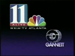
- WXIA: Cuts in in the midst of the animation; the station's "11 Alive" logo and the NBC peacock zoom up to the upper right corner, but not before a flash announces its arrival. The zooming logo also has a cheap looking glowing effect around it while zooming out. "An Equal Opportunity Employer" is absent from below the Gannett logo.
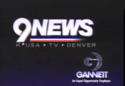
- KUSA:The same as the 2nd logo, but instead of a star drawing the line, the logo slides in.
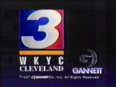
- WKYC: The Gannett logo animated, then as it zooms out, a large white "3" in a square with blue and red coloration surrounding the "3" zooms in from the top of the screen; at the same time, a yellow line zooms out from the bottom and both meet in the top-center of the screen; the "WKYC" call letters follow shortly thereafter, and "CLEVELAND" fades in underneath that. A copyright with the Gannett logo fades in underneath, and no EOE message is present.
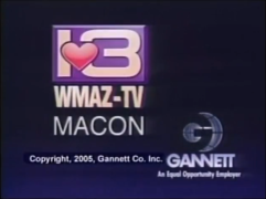
- WMAZ: Once the Gannett logo starts zooming out, a purple rectangle with a 13 with a pink heart in the middle faces downward and then flips into view while zooming out. "WMAZ-TV", slightly turned facing its right, zooms out and slightly turns, facing a straight angle, and is placed just below the rectangle. A copyright notice fades in somewhat far below the rectangle and call sign. And finally, "MACON" fades in below the call letters.
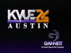
- KVUE: The KVUE logo with the 26 next to it zooms out just like the logos used by KUSA and WUSA. "AUSTIN" zooms out into the space below the KVUE logo.
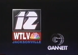
- WTLV: A white outlined, black square with an italicized, stylized 12 zooms out in the same manner as WUSA, KUSA, and KVUE: zooming out, while slightly turning to a straight view. A red rectangle with "WTLV" next to the NBC logo, zooms out below the 12. Below that fades in "JACKSONVILLE". This variation has no EOE notice below the Gannett logo.
- KPNX: TBA
Music/Sounds: Same as the extended or normal variants of the previous logos' music, or the end of the station's news music package.
Availability: See above.
Editor's Note: None.
4th Logo
(2005-2011)
(2005-2011)


<iframe frameborder="0" height="162" src="http://wikifoundrytools.com/wiki/closinglogos/widget/unknown/c22cdbe2f6fd7ac87f8c212875b676644f8f5394" width="216"></iframe><iframe frameborder="0" height="166" src="http://wikifoundrytools.com/wiki/closinglogos/widget/unknown/a4de5f89a3cf22cb1dc009f2ab73273070649a25" width="293"></iframe><iframe frameborder="0" height="165" src="http://wikifoundrytools.com/wiki/closinglogos/widget/unknown/bf48efeb1cfa5822690292a837d2d05cbea3f434" width="292"></iframe>
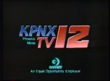
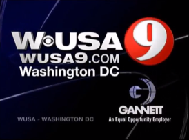
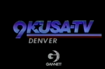
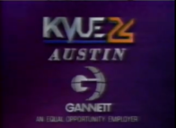
Logo: On a blue/black gradient background, a 3D version of the Gannett logo zooms out, the "Gannett" name zooms in, and zooms to the bottom-right corner of the screen. The website URL <a class="external" href="http://www.gannett.com/" rel="nofollow" target="_blank">www.gannett.com</a> and "An Equal Opportunity Employer" appears below the logo and the station's logo zooms in at the middle-right. Thee zooming effects are accompanied by a blue trailing effect.Around 2009, the background features two filmstrip-like objects.
Variants: Stations that use this put their own logo on this. Another list is used for these stations:
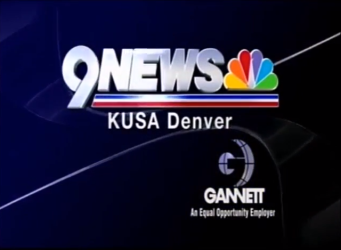
- KUSA: The KUSA logo is similar to that of the 3rd logo, but the line is extended, and the NBC peacock is also seen. Sometimes, "TV/DT" replaces "TV". The variant with the filmstrips has "K*USA · TV/DT · DENVER" replaced with "KUSA Denver"
- WUSA:Same animation as KUSA; it utilizes the unitalicized WUSA logo with a 9 in a red circle next to it. Below the WUSA text is "WUSA9.COM", and below the URL is "Washington DC". In the beginning,
FX/SFX: The animation.
Music/Sounds: The same as before.
Availability: Same as the previous logos. As of now, it was only known to exist on Denver's KUSA and Washington, DC's WUSA; there were no other sightings confirmed.
Editor's Note: None.
5th Logo
(2011-2013)
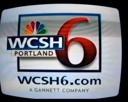
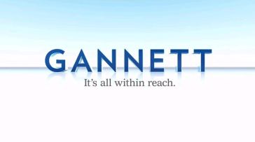
Logo: On a white background, Gannett's 2011 corporate logo zooms in slightly, then shines with a wipe effect from left to right. Gannett's slogan, "It's all within reach." appears below with a similar wipe effect and shrinks, with ripples appearing shortly afterward.
Variant: A variant used as the ID for WCSH in Portland had the station's logo on a white background, with the station's website wcsh6.com appearing below first, and then text reading "A GANNETT COMPANY" appears below the website.
FX/SFX: The wiping and shrinking effects described above.
Music/Sounds: A four-note sounder similar to that used in NBC's "The More You Know" public service announcements, with a computer sounder in the background similar to that used in the 1981 Gannett theme. The WCSH ID also contained the voiceover, "You're watching WCSH 6 Portland, a Gannett company."
Availability: Extinct.
Availability: Extinct.
Editor's Note:Compared to the previous logos, this one is really simple and corporate, even by modern standards, as the iconic globe logo is nowhere to be seen. It is just as bad as the current Starz logos.
6th Logo
(2013-2015)

Logo: As glass panels pass by, the camera is close up and swings past the Gannett Logo. It then zooms out. The logo is on a sky blue/white gradient background. The Gannett slogan, "It's all within reach.", appears below the logo.
FX/SFX: All CGI animation.
Music/Sounds: An orchestrated 6-note tune.
Availability: Used on all stations until the spinoff of Tegna, including on acquired ex-Belo and London Broadcasting stations.
Editor's Note: None.