EMI Films (UK)
Jump to navigation
Jump to search
Logo descriptions by Sean Beard
Logo captures by Eric S., Bob Fish, V of Doom, Supermarty-o and ThatLogoDude
Editions by V of Doom
Background: This company was the former Associated British Corporation (best known for producing The Avengers). Associated British went bankrupt in 1968 and its assets (Associated British Film Distributors, Elstree Studios, the ABC Cinemas movie theater chain and Thames Television) were purchased by EMI Records. They later bought Anglo-Amalgamated in 1971 and British Lion Films in 1976, the latter being folded it into the company. Also, EMI opened its American subsidiary in 1977, with a television division and its own distribution unit, but in 1979, the distribution unit was closed and they went through ITC's Associated Film Distribution unit for its theatrical releases. Currently, the rights to their films are with StudioCanal.
1st Logo
(1968-1976)
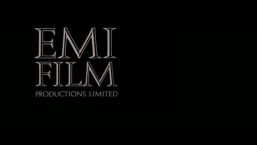
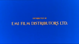
Nicknames: "Black Monument", "The Black Tombstone", "The Filmreels", "Extreme Fast Letters", "Royal EMI".
Logo: On a black screen, we see the company name stacked in a "castellar" font, not unlike that carved into monuments, positioned near the upper-right of the screen. The placement is like this:
Variants:
FX/SFX: None, apart from the name fading onto the screen.
Music/Sounds: Silent, or the films opening music, for both variants.
Availability: Not widely seen in the U.S. due to replacement with American distributors' logos. It was discovered on the mid 1990s Republic Pictures Home Video release of Hammer Films' Scars of Dracula, and Demons Of The Mind. The second Nat Cohen variant was found on Are You Being Served? (the movie, not the TV show) and a Showtime Networks print of the Roger Corman sex comedy Candy Stripe Nurses (apparently a UK print was used). It was seen after the Paramount logo on Murder on the Orient Express, while the newer copies have the 2013 Universal Pictures and the 2011 StudioCanal logos. It also may have appeared on the UK theatrical release of Dougal and the Blue Cat, but current prints delete the logo.
Logo: On a black background we see multiple rectangle outlines zoom forward bringing forth a blue rectangle. The text "EMI" in its corporate font appears.The text fades out and we zoom into the blue rectangle bringing forth either the 3rd Associated British Productions logo or the Anglo Amalgamated Film Distributors logo.
FX/SFX: The zooming of the logo.
Music/Sounds: None.
Availability: Can be found on earlier EMI films from 1970, such as those made by Associated British and Anglo Amalgamated. Strangely, it appears on some prints of the 1977 film To a Devil a Daughter.
Editor's Note: None.
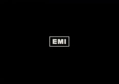
3rd Logo
(1976-1980)
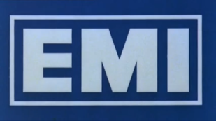
Nickname: "The EMI Block"
Logo: On a black screen, we see the letters "EMI" (in the familiar logo's font) zoom toward the center of the screen. As the letters move, the background turns into blue and a box zooms out itself into place forming the familiar EMI logo.
Variants:
FX/SFX: The EMI lettering zoom-in, and the rectangle drawing itself in.
Music/Sounds: Usually silent, or on rare occasions, the films opening music.On international prints of Can't Stop the Music, the logo plasters the Associated Film Distribution logo, keeping the music from the logo intact.
Availability: Extremely rare in the U.S due to replacement with other distributors logos, while bordering on rare to uncommon in international territories. The easiest place to find this is on International prints of The Driver (after the StudioCanal logo). The later version was used during 1980, as was allegedly seen on international prints of these movies, the U.S. versions of these movies plaster with the Associated Film Distribution logo. It is unknown if it appears on international prints of Convoy, though it does not appear on international prints of The Deer Hunter.
4th Logo
(1977-1983)
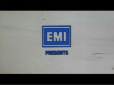
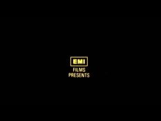
Nicknames: "The EMI Block II", "Blue EMI", "The Record Dudes"
Logo: In the opening scene of a movie, a superimposed EMI logo appears just like its British counterpart, except that the legend EMI FILMS, INC. appears under it. "PRESENTS" is also below everything else.
Variants:
FX/SFX: The same as the second EMI Film Distributors logo; also appeared as a still image on later films.
Music/Sounds: Usually silent, or on rare occasions, the films opening music.
Availability: Rare. Given the rather low output of its US branch, it is far easier to find than the British counterpart. It is retained on Convoy, The Jazz Singer (1980) and Can't Stop The Music, among others (having been used as an in-credit logo in the States).
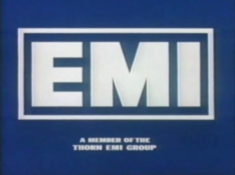
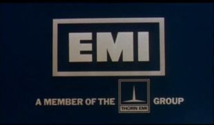
5th Logo
(1978-1984)
<iframe height="186" src="http://wikifoundrytools.com/wiki/closinglogos/widget/unknown/af56a7f069b7f80cd67d90ef1d4b8637c4aab3e9" width="329"></iframe><embed height="186" src="http://wikifoundrytools.com/wiki/closinglogos/widget/youtubevideo/74aa475c1577228ef5c9b05fdf39c74538284876" type="application/x-shockwave-flash" width="223" wmode="transparent"/>
Nicknames: "The EMI Block III", "Blue EMI II"
Logo: On a blue screen, we see the letters "EMI" (in the familiar logo's font) zoom toward the center of the screen. As the letters move, the box draws itself into place forming the familiar EMI logo. The phrase "EMI FILM DISTRIBUTORS" then fades into place.
Variant: In later years, the byline "A MEMBER OF THE THORN GROUP" along with the Thorn logo appears instead of the company name (EMI merged with Thorn plc. around 1979, hence the name and logo described below). On some films, this was superimposed onto the film's opening credit sequence.
FX/SFX: The EMI lettering zoom-in, and the rectangle drawing itself in.
Music/Sounds: Usually silent, or on rare occasions, the film's opening music.
Availability: Uncommon. Not widely seen in the U.S. due to replacement with American distributors' logos. Can be seen on some films of the era on old VHS's and DVD releases, such as the Anchor Bay releases of Tender Mercies and Bad Boys (1983), among others. Most current prints are usually preceded by a StudioCanal logo. This might have appeared on UK theatrical prints of First Blood, but given that Thorn EMI Video normally removed even their own logos on either side of either pond this likely doesn’t appear on early UK VHS releases.
Logo captures by Eric S., Bob Fish, V of Doom, Supermarty-o and ThatLogoDude
Editions by V of Doom
Background: This company was the former Associated British Corporation (best known for producing The Avengers). Associated British went bankrupt in 1968 and its assets (Associated British Film Distributors, Elstree Studios, the ABC Cinemas movie theater chain and Thames Television) were purchased by EMI Records. They later bought Anglo-Amalgamated in 1971 and British Lion Films in 1976, the latter being folded it into the company. Also, EMI opened its American subsidiary in 1977, with a television division and its own distribution unit, but in 1979, the distribution unit was closed and they went through ITC's Associated Film Distribution unit for its theatrical releases. Currently, the rights to their films are with StudioCanal.
1st Logo
(1968-1976)


<iframe frameborder="0" height="167" src="http://wikifoundrytools.com/wiki/closinglogos/widget/genericvideo/51986db6f9f06835c172c88c1025563c0f4c6e95" width="295"></iframe><iframe frameborder="0" height="164" src="http://wikifoundrytools.com/wiki/closinglogos/widget/genericvideo/fec33115e6890eaa7b0c70c6bebf7f9089c8ba5a" width="292"></iframe><iframe frameborder="0" height="157" src="http://wikifoundrytools.com/wiki/closinglogos/widget/unknown/45655ab5889e094cc9b8d18409213a102992fa91" width="300"></iframe><iframe frameborder="0" height="162" src="http://wikifoundrytools.com/wiki/closinglogos/widget/unknown/376b23a7dbcbc1aeb383b999ec0628858a82df7d" width="312"></iframe>
Nicknames: "Black Monument", "The Black Tombstone", "The Filmreels", "Extreme Fast Letters", "Royal EMI".
Logo: On a black screen, we see the company name stacked in a "castellar" font, not unlike that carved into monuments, positioned near the upper-right of the screen. The placement is like this:
EMI
FILM
DISTRIBUTORS LIMITED
FILM
DISTRIBUTORS LIMITED
Variants:
- For produced movies, the word "PRODUCTIONS" appeared in place of "DISTRIBUTORS".
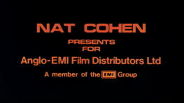
- On Up Pompeii (1971), a still logo with the words "NAT COHEN PRESENTS FOR Anglo-EMI Film Distributors Ltd." appears in orange with the byline "A member of the EMI Group" with the EMI logo in place of text. This is most likely a placeholder logo.
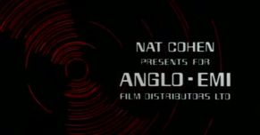
- 1971-1973: We see the words "EMI" zoom back as red and blue lines come from the top of screen to form a spinning film reel. The camera zooms on the red reel and letters spin around it quickly and fly from it which say "NAT COHEN" in the computerized font, then some letters fly in from the top of the screen to the right to form "PRESENTS FOR ANGLO-EMI FILM DISTRIBUTORS LTD." below "NAT COHEN" in the same computerized font, letters on the reel disappears when it's almost formed.
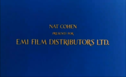
- 1973-1979: We see on the blue background this text centered in the middle of the screen: "NAT COHEN PRESENTS FOR EMI FILM DISTRIBUTORS LTD.". Movies with this version end with the text "A NAT COHEN PRESENTATION FOR EMI FILM DISTRIBUTORS". The text is a variant of the font used for the standard logo. On some others, the logo is silent, and has a black background, and the letters look more colored orange.
FX/SFX: None, apart from the name fading onto the screen.
Music/Sounds: Silent, or the films opening music, for both variants.
- For the second Nat Cohen version, a bombastic fanfare is used.
- On Demons Of The Mind: It uses a dramatic music composition on the Anglo-EMI variant.
Availability: Not widely seen in the U.S. due to replacement with American distributors' logos. It was discovered on the mid 1990s Republic Pictures Home Video release of Hammer Films' Scars of Dracula, and Demons Of The Mind. The second Nat Cohen variant was found on Are You Being Served? (the movie, not the TV show) and a Showtime Networks print of the Roger Corman sex comedy Candy Stripe Nurses (apparently a UK print was used). It was seen after the Paramount logo on Murder on the Orient Express, while the newer copies have the 2013 Universal Pictures and the 2011 StudioCanal logos. It also may have appeared on the UK theatrical release of Dougal and the Blue Cat, but current prints delete the logo.
2nd Logo
(1970)
(1970)
Logo: On a black background we see multiple rectangle outlines zoom forward bringing forth a blue rectangle. The text "EMI" in its corporate font appears.The text fades out and we zoom into the blue rectangle bringing forth either the 3rd Associated British Productions logo or the Anglo Amalgamated Film Distributors logo.
FX/SFX: The zooming of the logo.
Music/Sounds: None.
Availability: Can be found on earlier EMI films from 1970, such as those made by Associated British and Anglo Amalgamated. Strangely, it appears on some prints of the 1977 film To a Devil a Daughter.
Editor's Note: None.
3rd Logo
(1976-1980)


<embed allowfullscreen="true" height="177" src="http://wikifoundrytools.com/wiki/closinglogos/widget/youtubevideo/4e225ba51588d17503df5b12f72952b1c2615f33" type="application/x-shockwave-flash" width="324" wmode="transparent"/>
Nickname: "The EMI Block"
Logo: On a black screen, we see the letters "EMI" (in the familiar logo's font) zoom toward the center of the screen. As the letters move, the background turns into blue and a box zooms out itself into place forming the familiar EMI logo.
Variants:
- Sometimes the logo is shown in 4:3 "open matte" format and exposes more vertical space, therefore the EMI "rectangle" fills in a letterbox position.
- For films shot in scope format, the logo is squashed or cropped depending on the film.
- A later version exists with the Thorn EMI notice.
FX/SFX: The EMI lettering zoom-in, and the rectangle drawing itself in.
Music/Sounds: Usually silent, or on rare occasions, the films opening music.On international prints of Can't Stop the Music, the logo plasters the Associated Film Distribution logo, keeping the music from the logo intact.
Availability: Extremely rare in the U.S due to replacement with other distributors logos, while bordering on rare to uncommon in international territories. The easiest place to find this is on International prints of The Driver (after the StudioCanal logo). The later version was used during 1980, as was allegedly seen on international prints of these movies, the U.S. versions of these movies plaster with the Associated Film Distribution logo. It is unknown if it appears on international prints of Convoy, though it does not appear on international prints of The Deer Hunter.
4th Logo
(1977-1983)


Nicknames: "The EMI Block II", "Blue EMI", "The Record Dudes"
Logo: In the opening scene of a movie, a superimposed EMI logo appears just like its British counterpart, except that the legend EMI FILMS, INC. appears under it. "PRESENTS" is also below everything else.
Variants:
- In The Jazz Singer (the 1980 Neil Diamond version), the still EMI logo appears superimposed in the style of the opening credit sequence.
- The notorious Village People movie Can't Stop The Music had the EMI logo appearing as if it was made of solid silver.
- The Deer Hunter opened with the Universal Globe (on U.S. prints) followed by a white EMI Film Distributors ID. When "PRESENTS" fades in, the logo fades out to make room for it.
FX/SFX: The same as the second EMI Film Distributors logo; also appeared as a still image on later films.
Music/Sounds: Usually silent, or on rare occasions, the films opening music.
Availability: Rare. Given the rather low output of its US branch, it is far easier to find than the British counterpart. It is retained on Convoy, The Jazz Singer (1980) and Can't Stop The Music, among others (having been used as an in-credit logo in the States).
5th Logo
(1978-1984)

<iframe height="186" src="http://wikifoundrytools.com/wiki/closinglogos/widget/unknown/af56a7f069b7f80cd67d90ef1d4b8637c4aab3e9" width="329"></iframe><embed height="186" src="http://wikifoundrytools.com/wiki/closinglogos/widget/youtubevideo/74aa475c1577228ef5c9b05fdf39c74538284876" type="application/x-shockwave-flash" width="223" wmode="transparent"/>
Nicknames: "The EMI Block III", "Blue EMI II"
Logo: On a blue screen, we see the letters "EMI" (in the familiar logo's font) zoom toward the center of the screen. As the letters move, the box draws itself into place forming the familiar EMI logo. The phrase "EMI FILM DISTRIBUTORS" then fades into place.
Variant: In later years, the byline "A MEMBER OF THE THORN GROUP" along with the Thorn logo appears instead of the company name (EMI merged with Thorn plc. around 1979, hence the name and logo described below). On some films, this was superimposed onto the film's opening credit sequence.
FX/SFX: The EMI lettering zoom-in, and the rectangle drawing itself in.
Music/Sounds: Usually silent, or on rare occasions, the film's opening music.
Availability: Uncommon. Not widely seen in the U.S. due to replacement with American distributors' logos. Can be seen on some films of the era on old VHS's and DVD releases, such as the Anchor Bay releases of Tender Mercies and Bad Boys (1983), among others. Most current prints are usually preceded by a StudioCanal logo. This might have appeared on UK theatrical prints of First Blood, but given that Thorn EMI Video normally removed even their own logos on either side of either pond this likely doesn’t appear on early UK VHS releases.