Buena Vista Pictures Distribution
Jump to navigation
Jump to search
Logo descriptions by Matt Williams and Matt Anscher
Logo captures by Eric S., Logoboy95, Wisp2007, and others
Editions by Bob Fish, V of Doom, wisp2007, Nathan B and iheartparamount.
Video captures courtesy of 8to16to35
Background: The Buena Vista distribution company was established in 1953 after Walt Disney broke off his distribution deal with RKO Radio Pictures, using a logo in some form until about 1984. It is named after the street on which the Disney Studios reside. In 2007, the company was renamed and rebranded as "Walt Disney Studios Motion Pictures".
Buena Vista Distribution Co., Inc.
1st Logo
(November 10, 1953-December 14, 1984)
 <embed height="157" src="http://wikifoundrytools.com/wiki/closinglogos/widget/genericvideo/f4f71a479d8afd1d776a2c6cc97677e22a572b68" type="application/x-shockwave-flash" width="156" wmode="transparent"/>

<embed allowfullscreen="true" height="214" src="http://wikifoundrytools.com/wiki/closinglogos/widget/youtubevideo/fdeae9c16eb1bd2a5c28573c73c0f5f8cbd904b1" type="application/x-shockwave-flash" width="259" wmode="transparent"/><iframe frameborder="0" height="203" src="http://wikifoundrytools.com/wiki/closinglogos/widget/unknown/4fcb253084054981a544130780b86fc5e4e93c20" width="269"></iframe><embed allowfullscreen="true" height="214" src="http://wikifoundrytools.com/wiki/closinglogos/widget/youtubevideo/4a25015bf5a077789f9df2fb05c1f0538a7b6978" type="application/x-shockwave-flash" width="258" wmode="transparent"/>
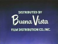
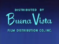
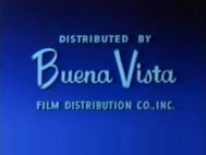
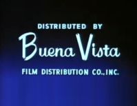
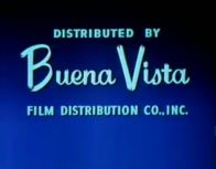
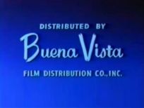
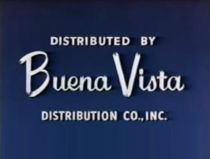
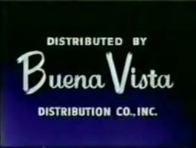
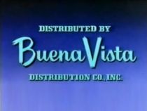
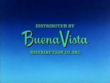
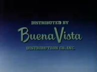
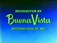
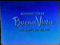
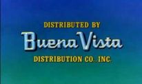
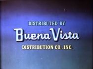
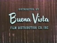
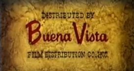
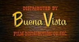
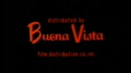
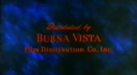
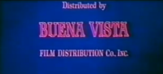
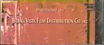
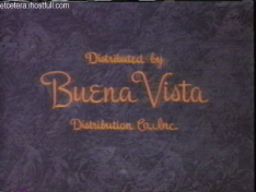
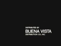
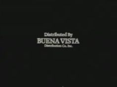
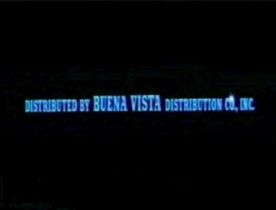
Logo: On a blue/black gradient background, we see the text "DISTRIBUTED BY Buena Vista FILM DISTRIBUTION CO., INC." in pale blue, with "Buena Vista" in a weird signature-like logo font, and the other words in a font that looks like carved wood.
Variants:
2nd Logo
(August 7, 1981)
Nicknames: "The Sparkles", "Zooms"
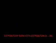
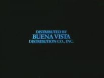
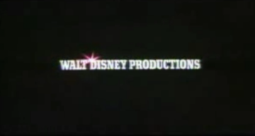
Logo: On a black background, a blurry object zooms out. When it fully sharpens, it is revealed to be the text "DISTRIBUTED BY BUENA VISTA DISTRIBUTION CO., INC." (in azure), with "BUENA VISTA" in a taller, bolder font. The words sparkle, and then fade out to be replaced by "WALT DISNEY PRODUCTIONS" (in white). The words then blur up again and zoom in towards us.
FX/SFX: The zooming, the "sparkles".
Music/Sounds: "Pings" timed to go with the sparkling of the words, "whoosh" noises that sound during the zooms, and a thud noise just before the "WALT DISNEY PRODUCTIONS" logo zooms in.
Availability: An oddity; only seen on Condorman.
Buena Vista Pictures Distribution
Variant: On Good Morning, Vietnam, the words are positioned at the bottom of the screen and the word "Inc." is added to the end.

Logo captures by Eric S., Logoboy95, Wisp2007, and others
Editions by Bob Fish, V of Doom, wisp2007, Nathan B and iheartparamount.
Video captures courtesy of 8to16to35
Background: The Buena Vista distribution company was established in 1953 after Walt Disney broke off his distribution deal with RKO Radio Pictures, using a logo in some form until about 1984. It is named after the street on which the Disney Studios reside. In 2007, the company was renamed and rebranded as "Walt Disney Studios Motion Pictures".
Buena Vista Distribution Co., Inc.
1st Logo
(November 10, 1953-December 14, 1984)
The Standard Logos and their Variations
1953-1960


1960-1966


1966-1981


1978
 <embed height="157" src="http://wikifoundrytools.com/wiki/closinglogos/widget/genericvideo/f4f71a479d8afd1d776a2c6cc97677e22a572b68" type="application/x-shockwave-flash" width="156" wmode="transparent"/>
 1979-1984


Walt Disney Educational Media

Custom Title Cards
1954-1959


1960-1983


Videos
<embed allowfullscreen="true" height="214" src="http://wikifoundrytools.com/wiki/closinglogos/widget/youtubevideo/fdeae9c16eb1bd2a5c28573c73c0f5f8cbd904b1" type="application/x-shockwave-flash" width="259" wmode="transparent"/><iframe frameborder="0" height="203" src="http://wikifoundrytools.com/wiki/closinglogos/widget/unknown/4fcb253084054981a544130780b86fc5e4e93c20" width="269"></iframe><embed allowfullscreen="true" height="214" src="http://wikifoundrytools.com/wiki/closinglogos/widget/youtubevideo/4a25015bf5a077789f9df2fb05c1f0538a7b6978" type="application/x-shockwave-flash" width="258" wmode="transparent"/>
Logo: On a blue/black gradient background, we see the text "DISTRIBUTED BY Buena Vista FILM DISTRIBUTION CO., INC." in pale blue, with "Buena Vista" in a weird signature-like logo font, and the other words in a font that looks like carved wood.
Variants:
- There are many custom variants where the text is designed to blend in with a film's opening credits.
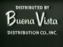
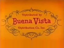
- In 1960, starting withToby Tyler, or Ten Weeks with a Circus, the word"FILM" was removed.
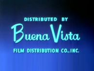
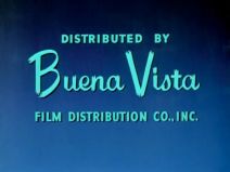
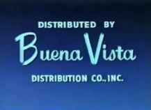
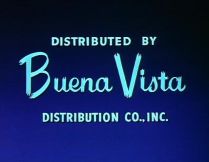
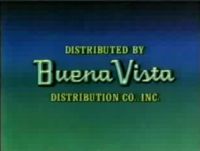
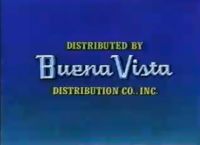
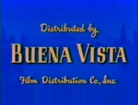
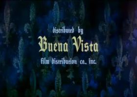
- This logo was redone in 1966, brightening up the background to a blue/white gradient and changing the letters to a turquoise color. Also, the font for the "DISTRIBUTED BY" and "DISTRIBUTION CO., INC." text would change into a more normal font. This variant was first used on Follow Me, Boys!
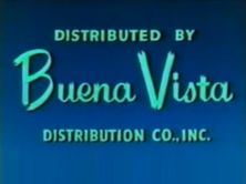
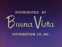
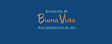
- The logo was changed again in 1979, changing the background to a blue/medium sea green gradient and making the "Buena Vista" text blocky. This variant was first used on Footloose Fox.
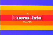
- From June 9, 1978 to April 1979, the background is a set of red, yellow, and orange stripes on a blue background, and the text is modified to "A BuenaVista RELEASE" (Buena Vista is one word; the "B" and "V" are outlined) in Helvetica font. This logo follows a special logo commemorating Mickey Mouse's 50th birthday.
- On the Italian releases of Peter Pan(1979 reissue) andHot Lead and Cold Feet, the text is not there, leaving us with just the color bars (the logo Cinema International Corporation, which distributed DIsney's films in Italy at the time, would follow). On the original 1980 video release of the latter, the logo is plastered with the 1979 Buena Vista logo.
- On the custom variant for The Last Flight of Noah's Ark, the Buena Vista text fades out and is replaced by the text "From Walt Disney Productions".
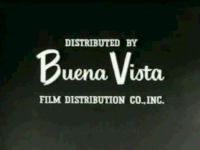
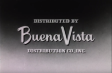
- The logo was also seen in black-and-white. On Frankenweenie, the background for the 1979 version is completely black.
- The black and white variant of the 1966 version also exists. It is only seen on two Mickey Mouse cartoons from 1932 which were "Touchdown Mickey" and "Mickey's Good Deed", both reissued in 1974.
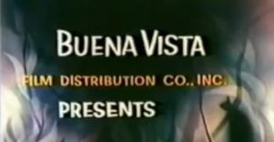
- There is a variation where the text reads "Buena Vista FILM DISTRIBUTION CO., INC. Presents" (with "Presents" in the same signature font). This was seen on the featurette Alaskan Sled Dog; a custom variant appeared in Nature's Strangest Creatures.
- On Zorro the Avenger (a feature-length compilation of episodes of the Zorro TV show), there is a custom variant with the text "A BUENA VISTA PRESENTATION" is superimposed over the opening shot.
- On some late-1980s/early-1990s reissues of classic animated features, which had the Walt Disney Pictures logo tacked on at the beginning, the films' respective BV logos were placed at the end of the film, where they played silently. This phenomenon is intact on the 1990 Laserdisc of Peter Pan (this also happened on early-90s Disney Channel airings), the 1992 VHS of 101 Dalmatians, the 1999 VHS and 2003 DVD of The Rescuers, and a late-1980s print of the animated short Goofy and Wilbur.
- On The Big Fisherman (a non-Disney film that BV distributed), the text is an in-credit notice placed at the end of the movie.
FX/SFX: None.
Music/Sounds: Either a customized fanfare composed just for the movie, the beginning of the film's score, or silence.
Music/Sounds Variants: However, there are a few re-occuring themes that go with this logo.
Music/Sounds: Either a customized fanfare composed just for the movie, the beginning of the film's score, or silence.
Music/Sounds Variants: However, there are a few re-occuring themes that go with this logo.
- On reissues of cartoon shorts, as well as Son of Flubber, a horn stinger, composed by George Bruns, is heard.
- On several films, such asDarby O'Gill and the Little People, Mysteries of the Deep, In Search of the Castaways, and a few cartoon reissues, an ominous-sounding melody, composed by Oliver Wallace, is heard. The music's pitch varies.
- On a few late-50s/early 60s featurettes, such as Noah's Ark, Goliath II and Gala Day at Disneyland, a majestic horn fanfare, composed by George Bruns, is heard.
- On Nikki, Wild Dog of the North, Big Red and The Legend of Lobo,a majestic string/brass fanfare, composed by Oliver Wallace, is heard. On the two latter movies, the fanfare is re-orchestrated.
- On The Absent-Minded Professor, Emil and the Detectives and Run, Appaloosa, Run, a suspenseful theme, composed by George Bruns was heard.
- On the Winnie the Pooh films (except Winnie the Pooh and a Day for Eeyore), an ascending stinger, composed by Buddy Baker, was heard. It was re-orchestrated on Winnie the Pooh and the Blustery Day.
- On The Rescuers, we hear a thunderclap over the logo.
Availability: This logo was cut on most video releases between 1985 and 1991 (with some exceptions, including the 1986 video release of Sleeping Beauty and the 1989 video release of Mary Poppins), but is now preserved on most Disney features from this era, and sometimes also replaces the still RKO logo used on earlier Disney films (such as Pinocchio, Cinderella, Peter Pan, Bambi, Dumbo, Alice in Wonderland, Treasure Island, Saludos Amigos, Melody Time, So Dear to my Heartand Song of the South). The only place where this is accidentally plastered over is on Old Yeller, which has its custom Buena Vista music playing over the end of the Walt Disney Pictures logo. The Rescuers version has also been restored on the 2011 DVD and Blu-ray releases of the film. While the "Color Bars" variant is not present on the Anchor Bay releases of The Cat from Outer Space, the 2004 Disney release has it intact. Mary Poppins has this logo on the following releases of the film: the 1980 Betamax and VHS, the 1989 VHS, the 1998 and 2000 DVDs, and the new 2013 DVD and Blu-ray. It was replaced with the 1990 Walt Disney Pictures logo on the 1997 VHS release and the 3rd, and 4th DVD releases. This was also the case on The Aristocats, with its logo restored beginning with the Blu-ray release, however previous releases (such as the 1996 VHS release and the 2000 and 2008 DVD releases) had it replaced with the 1990 Walt Disney Pictures logo, also the 1987 VHS of Lady and the Tramp had the logo blacked out (you can still hear the fanfare playing!, however it was restored on the 1998 VHS release of said film). All other 1954-1984 titles have them intact. Sometimes, the logo is preceded by the Walt Disney Pictures logo. This also appears on the 1992 and 1994 VHS releases of So Dear to my Heart, albeit silent.
2nd Logo
(August 7, 1981)


Nicknames: "The Sparkles", "Zooms"
Logo: On a black background, a blurry object zooms out. When it fully sharpens, it is revealed to be the text "DISTRIBUTED BY BUENA VISTA DISTRIBUTION CO., INC." (in azure), with "BUENA VISTA" in a taller, bolder font. The words sparkle, and then fade out to be replaced by "WALT DISNEY PRODUCTIONS" (in white). The words then blur up again and zoom in towards us.
FX/SFX: The zooming, the "sparkles".
Music/Sounds: "Pings" timed to go with the sparkling of the words, "whoosh" noises that sound during the zooms, and a thud noise just before the "WALT DISNEY PRODUCTIONS" logo zooms in.
Availability: An oddity; only seen on Condorman.
Buena Vista Pictures Distribution
1st logo
(July 1-December 23, 1987)

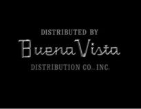
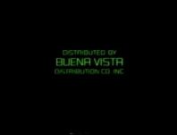
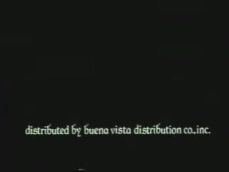
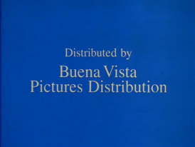
Logo: On a grainy blue background, the words "Distributed by Buena Vista Pictures Distribution" are seen in a Times New Roman font, arranged in a stacked position in the center of the screen.
Variant: On Good Morning, Vietnam, the words are positioned at the bottom of the screen and the word "Inc." is added to the end.
FX/SFX: None; just the logo either cutting or fading in and out.
Music/Sounds: None.
Availability: Rare. Seen on a few Touchstone films, such as Adventures in Babysitting, Stakeout, Can't Buy Me Love and Good Morning, Vietnam.
2nd Logo
(June 15, 1990)

Logo: On a black background, a blue triangle rotates along the side of the screen until it's split into two triangles, all while a blue diamond grows below them, and they're positioned vertically. The end result is that top half of the screen is blue and the bottom half black, with a black triangle on the top half forming a stylized "A" and a blue triangle on the bottom half forming a "V". On the top half, the black letters "BUEN" slide in left from behind the "A", while the "V" slides left to reveal the blue letters "ISTA". After the "BUENA VISTA" text is revealed, the black words "DISTRIBUTED BY" and "PICTURES" wipe in on the top half, while the blue words "DISTRIBUTION CO., INC." wipe in on the bottom half. Finally, both "A"s in "BUENA VISTA" receive proper strikes through them.
FX/SFX: The triangles/diamonds rotating and forming, and the words sliding and revealing themselves.
Music/Sounds: None.
Availability: Only seen on the Roger Rabbit short Roller Coaster Rabbit.