Brentwood Communications
Jump to navigation
Jump to search
Brentwood Home Video
1st Logo
(1980s-1990s)
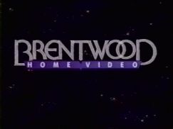
2nd Logo
(1992-2000)
 <embed allowfullscreen="true" height="185" src="http://wikifoundrytools.com/wiki/closinglogos/widget/youtubevideo/3e682a53dee6b0e57bcfd1ae6351420c8999446e" type="application/x-shockwave-flash" width="236" wmode="transparent"/>
Logo: On a black space background, there is a close-up of a glass "R". It eases to the back of the screen, revealing it to be part of the word "BRENTWOOD". The "O"s in "BRENTWOOD" are interlocked, a la the Bloomingdale's and Kool Cigarette logos, and the entire logo is in a stylized font with larger letters on each end. As it zooms back, a purple box slides in turns up. The box is in the shape of an open book and it says "HOME VIDEO" in a sans font. The logo rests on the the upper center of the screen.
FX/SFX: The zoom back and the "HOME VIDEO" box turning up. Decent early 90s animation.
Music/Sounds: A looped synthesized new age tune with 80s-style drumbeats on the first part and jingles towards the end.
Availability: Seen on VHS releases of TV shows. One of the series is Animation Classics (with one of the videos Popeye.).
Editor's Note: None.
Brentwood Communications
1st Logo
(2000-2005)
Nickname: "The Lightbeams"
Logo: We see a blue background with moving lights, with eventually the text:
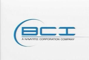
Logo: On a white background, we see a print version of the 1992 Brentwood Home Video logo in black. We then zoom out as the background fades to a transparent gray color to reveal that it's being shown on a big screenTV in a living room with and the sun gleaming in through the window. We zoom out to the C in the current BCI logo, which consists of "BCI" in a blue futuristic font with a crescent at the left. Underneath that is a line and "A NAVARRE CORPORATION COMPANY".
FX/SFX: The zooming, the CGI living room.
Music/Sounds: A dramatic synth bell tune.
Availability: Can be seen on many DVDs of TV shows and some specials including DVD Classic Cartoons volumes 1&2. Also appeared on a DVD release of A Killing Affair and the 25th Anniversary DVD release of H.B. Halicki's Gone in 60 Seconds.
Editor's Note: None. A pretty nice logo.
3rd Logo
(2007-2008)
Logo: On a white background, a light blue eclipse-like ring appear and zooms in. A line is drawn and "BCI" flips up, shining in the process, and the Navarre byline appears below, when the eclipse fades into the crescent. The "BCI" text then shines and, while the logo fades out, the crescent shoots towards the screen at a high speed. If you look closely at the last second, the logo disappears.
FX/SFX: The eclipse forming the logo.
Music/Sounds: A rather dramatic stinger with strings and drums.
Availability: Used with the 2nd logo. Can be seen on The Best of The Price is Right: Volume 1.
Editor's Note: None.
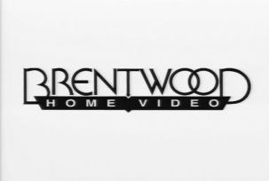
1st Logo
(1980s-1990s)

Logo:On a black background, an all-green version of the Brentwood Home Video print logo dives down and zooms in from the top of the screen.
FX/SFX:The zooming.
Music/Sounds: An ascending synth note followed by another synth note, sounding vaguely familiar to the THX "Deep Note".
Availability: Rare. Seen on releases from the time.
Editor's Note:None.
2nd Logo
(1992-2000)
 <embed allowfullscreen="true" height="185" src="http://wikifoundrytools.com/wiki/closinglogos/widget/youtubevideo/3e682a53dee6b0e57bcfd1ae6351420c8999446e" type="application/x-shockwave-flash" width="236" wmode="transparent"/>
Logo: On a black space background, there is a close-up of a glass "R". It eases to the back of the screen, revealing it to be part of the word "BRENTWOOD". The "O"s in "BRENTWOOD" are interlocked, a la the Bloomingdale's and Kool Cigarette logos, and the entire logo is in a stylized font with larger letters on each end. As it zooms back, a purple box slides in turns up. The box is in the shape of an open book and it says "HOME VIDEO" in a sans font. The logo rests on the the upper center of the screen.
FX/SFX: The zoom back and the "HOME VIDEO" box turning up. Decent early 90s animation.
Music/Sounds: A looped synthesized new age tune with 80s-style drumbeats on the first part and jingles towards the end.
Availability: Seen on VHS releases of TV shows. One of the series is Animation Classics (with one of the videos Popeye.).
Editor's Note: None.
Brentwood Communications
1st Logo
(2000-2005)

Nickname: "The Lightbeams"
Logo: We see a blue background with moving lights, with eventually the text:
BRENTWOOD
COMMUNICATIONS
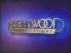
2nd Logo
(2004-2008)
COMMUNICATIONS
zooming in, with "COMMUNICATIONS" in an open-book shape and the entire logo colored silver, tilted at a right angle. It looks exactly like the Brentwood Home Video logo.
FX/SFX: The lights, the text zooming.
Music/Sounds: A synth choir, which culminates into a dramatic synth sounder with drumbeats.
Availability: This can be seen on many DVDs of TV shows and public domain films, such as DVDs of Fangs of the Living Dead and Classic Cartoons volumes 1&2.
Editor's Note: None.
2nd Logo
(2004-2008)


Logo: On a white background, we see a print version of the 1992 Brentwood Home Video logo in black. We then zoom out as the background fades to a transparent gray color to reveal that it's being shown on a big screenTV in a living room with and the sun gleaming in through the window. We zoom out to the C in the current BCI logo, which consists of "BCI" in a blue futuristic font with a crescent at the left. Underneath that is a line and "A NAVARRE CORPORATION COMPANY".
FX/SFX: The zooming, the CGI living room.
Music/Sounds: A dramatic synth bell tune.
Availability: Can be seen on many DVDs of TV shows and some specials including DVD Classic Cartoons volumes 1&2. Also appeared on a DVD release of A Killing Affair and the 25th Anniversary DVD release of H.B. Halicki's Gone in 60 Seconds.
Editor's Note: None. A pretty nice logo.
3rd Logo
(2007-2008)
Logo: On a white background, a light blue eclipse-like ring appear and zooms in. A line is drawn and "BCI" flips up, shining in the process, and the Navarre byline appears below, when the eclipse fades into the crescent. The "BCI" text then shines and, while the logo fades out, the crescent shoots towards the screen at a high speed. If you look closely at the last second, the logo disappears.

FX/SFX: The eclipse forming the logo.
Music/Sounds: A rather dramatic stinger with strings and drums.
Availability: Used with the 2nd logo. Can be seen on The Best of The Price is Right: Volume 1.
Editor's Note: None.