BoB and Partners Co. Ltd. (Hong Kong)
Jump to navigation
Jump to search
Logo descriptions by CooleyBoy10
Video captures courtesy of Amovielogos11
BoB and Partners Co. Ltd.
 <iframe frameborder="0" height="230" src="http://wikifoundrytools.com/wiki/closinglogos/widget/genericvideo/fc53cdb5c65c79e894ad8a452bd505e2eee6cf41" width="407"></iframe>
FX/SFX: The explosion, "BoB" forming, the bar and letters flying, the bar transforming.
Music/Sounds: A bang, followed by an Oriental percussion theme ending in a male chorus singing "最佳拍檔!" (meaning "Best Partner" in Cantonese) and tinkling sounds. On earlier films with this logo, the theme is slower, lower-pitched and ends in 4 synth notes. And on the some others, it's just the same music with the chorus.
Availability: Appears on Cantonese films from the period, such as the company's first film Young and Dangerous 2.
Editor's Note: None.
2nd Logo
(Late 1990s?-2003)
Video captures courtesy of Amovielogos11
BoB and Partners Co. Ltd.
1st Logo
(1996-Late 1990s?)
(1996-Late 1990s?)
 <iframe frameborder="0" height="230" src="http://wikifoundrytools.com/wiki/closinglogos/widget/genericvideo/fc53cdb5c65c79e894ad8a452bd505e2eee6cf41" width="407"></iframe>
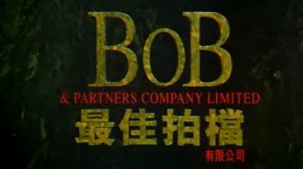
Logo: On a black background, a fiery explosion occurs, bringing forth the black stone background and a stone object whose parts spin around as it zooms up. Eventually, it unravels to reveal the giant letters "BoB". A stone bar and four Cantonese letters fly under "BoB', and the stone bar turns into the red text "& PARTNERS COMPANY LIMITED".
FX/SFX: The explosion, "BoB" forming, the bar and letters flying, the bar transforming.
Music/Sounds: A bang, followed by an Oriental percussion theme ending in a male chorus singing "最佳拍檔!" (meaning "Best Partner" in Cantonese) and tinkling sounds. On earlier films with this logo, the theme is slower, lower-pitched and ends in 4 synth notes. And on the some others, it's just the same music with the chorus.
Availability: Appears on Cantonese films from the period, such as the company's first film Young and Dangerous 2.
Editor's Note: None.
2nd Logo
(Late 1990s?-2003)


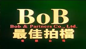
Logo: On a mountain landscape background, the high mountain morphs into a "BoB" from the previous logo. The camera than looks around while this happens. After the mountains completely morphed, red beams of light erupts from creases, causing the gold version of themselves to burst from them, and then the red text "Bob & Partners Co. Ltd." places under the "BoB", with gold chinese text under the text and them small red four chinese text below while the background turns black/murky green, forming the logo from before, only the red chinese characters are now in the center.
Variant: On some films, the logo takes place against the plains with hills, the mountain/hill morphing animation, camera movements and the way the logo forms are different and has the different gold texture.
FX/SFX: All CGI animation, including the mountain morphing.
Music/Sounds: See the 1st logo.
Availability: Rare.
Editor's Note: None.
____________________________________
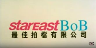
Stareast BoB
(2001)
Logo: On a black background, the pink letters of "starEast" (with the capital E made small to fit the size of the other letters) are moving in a shading effect. Meanwhile, the 3 BoB letters from the previous two logos are doing the same thing from the right, but this time, they're colored in aquamarine. After the letters place, the screen flashes to white, making a white background, with black eight chinese characters under the text.
FX/SFX: The letters forming in shade effect, and the flash.
Music/Sounds: Same as the previous logo.
Availability: So far, it has appeared on the film Qing mi da hua wang.
Editor's Note: None.
Note: Here is a logo history of the company and the redux of the logo history, consisting of all 4 logos played in the 2x2 grid, on this page.
<iframe frameborder="0" height="195" src="http://wikifoundrytools.com/wiki/closinglogos/widget/genericvideo/c8201a2db048ca2611915a6172708b52140c86fa" width="304"></iframe><iframe frameborder="0" height="196" src="http://wikifoundrytools.com/wiki/closinglogos/widget/genericvideo/c1f434ff72eb089afed208c377d3e9027ae67f07" width="346"></iframe>