Associated Television (UK)
Jump to navigation
Jump to search
Logo descriptions by Matt Williams
Logo captures by Eric S., Mr. Logo Lord, and others
Edited by mr3urious, Mr. Logo Lord and PerryLuv2001
Video captures by Paul Hatfield and bbctim123
Background: Originally formed as "ABC" (not to be confused with the American or Australian "ABC") by impresario Lew Grade, Associated Television Ltd. was the ITV franchise for the Midlands, as well as the parent company of ITC Entertainment. In 1982, ATV re-branded itself to Central Television.
1st Logo
(September-October 1955)
 Nicknames: "Early ATV", "The Eyes"
<iframe frameborder="0" height="167" src="http://wikifoundrytools.com/wiki/closinglogos/widget/unknown/450613ab0cb07f64abdb9a84bc28d07b433854af" width="223"></iframe>
Nicknames: "Sound and Vision III", "The Eyes IV"
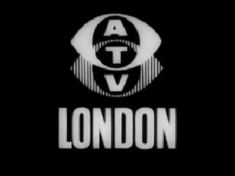
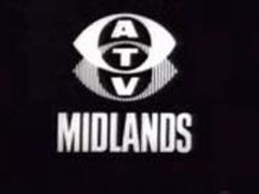
Logo: We see the ATV logo from before, only slightly smaller and moved to the top of the screen. Then, the words "LONDON" or "MIDLANDS" slowly zoom up below the eyes.
FX/SFX: The zooming.
Music/Sounds: Same as the 2nd logo.
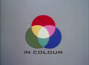
Nicknames: "ATV Zoom III", "ATV Zoom in Color/Colour", "ATV IN COLOUR", "Coloured Circles", "The Eyes VII"
Variants:
FX/SFX: The appearance of the colored circles, and the "rainbow" effects.
Music/Sounds: A loud, proud, and bombastic orchestral theme composed by Jack Parnell, arranged by Wally Stott (later Angela Morley). In its early years (?), the music was lower in pitch and sounded more low-budget. The black & white variant used a abridged version of the music.
Availability: This can be seen on any British program produced by ATV during this time. A good source on which to find this on home video is the 1981 Magnetic Video release of the Rudolf Nureyev version of Giselle. This has a Flash remake of the black & white one, the more low-budget sounding one, and the more familiar one at <a class="external" href="http://625.uk.com/tv_logos/flash.htm#atv" rel="nofollow" target="_blank">625.uk.com</a>. The logo is preserved on Challenge airings of the first series of Bullseye and can also be found on DVD's of Crossroads released by Network DVD.
Editor's Note: This is a popular logo and probably one of the most fondly remembered logos in ITV's history.
Logo captures by Eric S., Mr. Logo Lord, and others
Edited by mr3urious, Mr. Logo Lord and PerryLuv2001
Video captures by Paul Hatfield and bbctim123
Background: Originally formed as "ABC" (not to be confused with the American or Australian "ABC") by impresario Lew Grade, Associated Television Ltd. was the ITV franchise for the Midlands, as well as the parent company of ITC Entertainment. In 1982, ATV re-branded itself to Central Television.
1st Logo
(September-October 1955)
 Nicknames: "Early ATV", "The Eyes"
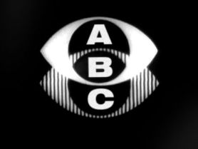
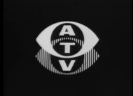
Logo: We see a gray "eye" (inspired by the CBS logo) with a striped (or "shadowed") eye below it. The letters "A", "B", and "C" are shown in the spaces of the intersecting logo.
FX/SFX: None.
Music/Sounds: None, or three "chimes" based, perhaps unsurprisingly, on the musical notes A, B and C, followed by three drumbeats, composed by Bob Sharples.
Availability: Long extinct. This was withdrawn after threats of legal action by Associated British Corporation, which was about to launch its own TV channel, causing the hasty reworking described below. There is also no known recording of this logo, likely due to its short lifespan.
Editor's Note: None.
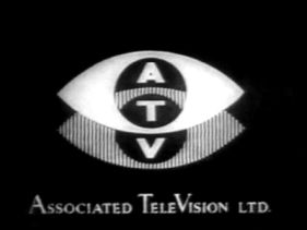
2nd Logo
(October 1955-1958)
 Nicknames: "Sound and Vision", "The Zooming Eyes", "Zooming A-T-V", "The Eyes II"
Logo: On a black background, we see the eye from before, except wider, zooming toward us. It then moves upward, revealing a striped (or "shadowed") eye logo below it. It then stops at a point whereboth circles intersect. The letters "A", "T", and "V" appear in the spaces of the intersecting logo in sequence accompanied by three chimes. "ASSOCIATED TELEVISION LTD." then appears.
Trivia: After only a couple of weeks or so of operation, the company had no choice but to change its name from ABC (as another company with that particular name was operating within the ITV network in the same region) to ATV. The logo was re-drawn by the draftsman in a hurry, resulting in the mis-proportioned rendering we see here.
FX/SFX: The eye logo animation, the appearance of the letters, and the "wiping" on of the full company name.
Music/Sounds: The three "chimes" used as the letters appear, which increase in pitch. Composed by Wally Stott (later known as Angela Morley).
Availability: Extinct. This would continue to be used at the end of sign-ons until colour broadcasts began.
Editor's Note: None.
3rd Logo
(1958-July 1964)
2nd Logo
(October 1955-1958)
 Nicknames: "Sound and Vision", "The Zooming Eyes", "Zooming A-T-V", "The Eyes II"
Logo: On a black background, we see the eye from before, except wider, zooming toward us. It then moves upward, revealing a striped (or "shadowed") eye logo below it. It then stops at a point whereboth circles intersect. The letters "A", "T", and "V" appear in the spaces of the intersecting logo in sequence accompanied by three chimes. "ASSOCIATED TELEVISION LTD." then appears.
Trivia: After only a couple of weeks or so of operation, the company had no choice but to change its name from ABC (as another company with that particular name was operating within the ITV network in the same region) to ATV. The logo was re-drawn by the draftsman in a hurry, resulting in the mis-proportioned rendering we see here.
FX/SFX: The eye logo animation, the appearance of the letters, and the "wiping" on of the full company name.
Music/Sounds: The three "chimes" used as the letters appear, which increase in pitch. Composed by Wally Stott (later known as Angela Morley).
Availability: Extinct. This would continue to be used at the end of sign-ons until colour broadcasts began.
3rd Logo
(1958-July 1964)
<iframe frameborder="0" height="186" src="http://wikifoundrytools.com/wiki/closinglogos/widget/unknown/52b4c6e3c16019238093c27f284ec038126dff71" width="247"></iframe>
1

Nicknames: "The Zooming Eyes II", "Zooming A-T-V II", "Sound and Vision II", "The Eyes III"
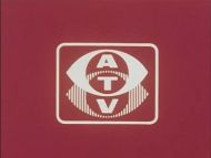
Logo: Against a black background, a white logo similar to the one above, except with more correct proportions just like the 1st logo, zooms into view, fully formed. The letters "A", "T", and "V"appear in the spaces as the logo moves in, accompanied by the same chimes as before.
FX/SFX: The zooming in of the eye logo and the appearance of the letters. Pretty simple, but effective animation.
Music/Sounds: Same as the 2nd logo.
Availability: Extremely rare. It was commonly seen on ATV programming seen on the ITV network, but most ATV programming from this time is lost and/or wiped (a common practice done by ATV until they became Central).
Editor's Note: None.
4th Logo
(1961-1964, 1992)


<iframe frameborder="0" height="167" src="http://wikifoundrytools.com/wiki/closinglogos/widget/unknown/450613ab0cb07f64abdb9a84bc28d07b433854af" width="223"></iframe>
Logo: We see the ATV logo from before, only slightly smaller and moved to the top of the screen. Then, the words "LONDON" or "MIDLANDS" slowly zoom up below the eyes.
Variants:
- One variant of the 'Midlands' variant had a slightly different "S".
- The first variant of this logo had an even smaller eye and the word was zoomed in slightly differently.
FX/SFX: The zooming.
Music/Sounds: Same as the 2nd logo.
Music/Sounds Variant: Sometimes, the theme would be higher-pitched.
Availability: Extremely rare. The Midlands variant can be found on surviving black & white episodes of Crossroads released on DVD by Network DVD. The London variant is extinct, though it was seen on Challenge reruns of episodes of The Golden Shot from the era a while back.
Editor's Note: None.
5th Logo
(1964-1969)
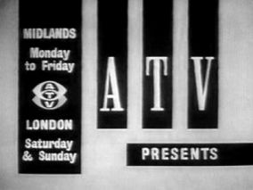 Nicknames: "The Schedule", "ATV Eyes V"
Logo: On a gray background, a rectangle protruding from the top right lists "MIDLANDS Monday to Friday", a small ATV eye logo, and then "LONDON Saturday and Sunday". 3 rectangles dropdownbeside it and a rectangle slides in from the right below the three rectangles. The letters "A", "T", and "V" appear in the rectangles with "PRESENTS" being wiped in on the rectangle below.
FX/SFX: The sliding in of the rectangles.
Music/Sounds: Same as the 2nd, 3rd, and 4th logos.
Availability: Extinct. This was seen in both areas ATV broadcast to (as seen in this ident) until the 1968 ITV franchise renewal round. The London franchise was lost to a David Frost-led investor group (which became London Weekend Television; LWT would share the London area with Thames). The Midlands-area franchise was renewed, due to ABC losing their franchise, and was expanded to seven days a week. There's a Flash remake of this logo at <a class="external" href="http://625.uk.com/tv_logos/flash.htm#atv" rel="nofollow" target="_blank">625.uk.com/tv_logos/flash.htm#atv</a>.
6th Logo
(November 1969-December 31, 1981; 1994; October 1, 2005; June 16, 2007)
(November 1969-December 31, 1981; 1994; October 1, 2005; June 16, 2007)


<iframe frameborder="0" height="165" src="http://wikifoundrytools.com/wiki/closinglogos/widget/unknown/a172549827e9a244dd94a68137cb0f2667ae4268" width="221"></iframe><iframe frameborder="0" height="165" src="http://wikifoundrytools.com/wiki/closinglogos/widget/genericvideo/41107d5ef17afe308f42de56c08ee9c0a1ab6fd8" width="223"></iframe><iframe frameborder="0" height="167" src="http://wikifoundrytools.com/wiki/closinglogos/widget/unknown/fb9b39007da129182cd030bf5144f9e8ec17b0c2" width="211"></iframe>
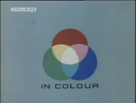
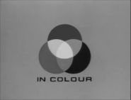
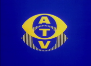
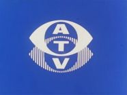
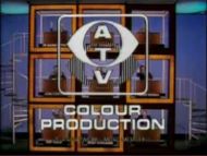
Logo: On a gray or light blue background, 3 colored circles, red, green, and blue, grow in one after the other, intersecting each other and forming different colors. The caption "IN COLOUR" fades in underneath. The 3 circles then slide towards each other, forming one white circle as the background fades to blue. The white circle grows out into an eye shape and bands of color sweep across it, cutting out the circle part and adding in the striped "shadow" underneath. The logo turns yellow and the letters "A", "T", and "V" appear in the spaces.
Trivia:
Trivia:
- Troika Design Group of Hollywood, California used the "IN COLOUR" segment of this logo for one of their video reels, which you can see <a href="https://vimeo.com/161253666" target="_self">here</a>.
- This logo's jingle was oddly featured in the intro for a history quiz on ABC Radio's Nightlife program in Australia.
Variants:
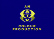
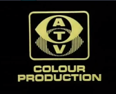
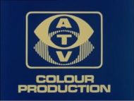
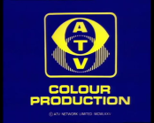
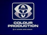
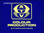
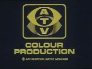
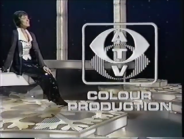
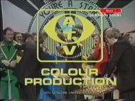
- A still variant at the end of shows, which was sometimes in-credit, was used, which read "AN ATV COLOUR PRODUCTION" on a blue background (the shade of blue may vary). It made a surprise reappearance on an ITV Central news report on Crossroads's 50th anniversary.
- Another variant where the logo is white on a red background also exists.
- Sometimes, the eye might be in white instead of yellow.
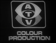
- For any black & white production, a dedicated variant was used, which replaced the three colored circles with a white one growing into place. The rest of the animation was identical, however. Any black & white prints of programs made in color just used the normal version, albeit in black & white.
- A variant of the endcap with a black background was used on some productions, possibly early color productions.
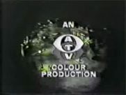
- An even earlier variant of the endcap lacked the box around the shadowed eye and had the word "AN" in yellow above it, and the words "COLOUR PRODUCTION".
- It's been reported that at the end of You're Telling Me, the later endcap variant (the one with the box around the shadowed eye) had the word "an" above it (much like the earlier endcap), although no photo/video proof has turned up of this variant yet.
- Another version of the endcap has the text in white.
- On Crossroads episodes 1884 & 1886, the endcap is in black and white. Both episodes were originally broadcast in color, but the videotapes that they were originally stored on were wiped by ATV shortly after broadcast and only managed to survive due to 16mm telerecordings existing. This variant is also seen on B&W ITC prints of early '70s episodes of The Golden Shot.
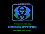
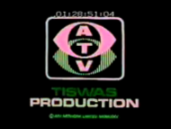
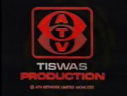
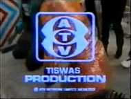
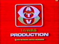
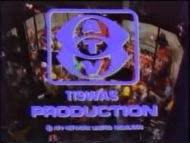
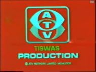
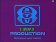
- On early episodes of Tiswas, the endcap slowly flashes blue & pink repeatably, and the word below the ATV logo says "TISWAS" instead of "COLOUR".
- Many other variations of the endcap also exist too, of which some can be found <a class="external" href="http://www.sub-tv.co.uk/atvendcaps.asp" rel="nofollow" target="_blank">here</a>.
- On an Elstree Christmas promo tape from 1982, after the logo forms, there are no letters that appear in the spaces.
- This logo also made surprise appearances (along with it's jingle) on the Crossroads: 30 Years On special, Ant and Dec's Gameshow Marathon (during the Golden Shot segment), as well as the 2007 Tiswas Reunited special (both of which aired on ITV). The latter had the logo in widescreen and zoomed in more than usual.
FX/SFX: The appearance of the colored circles, and the "rainbow" effects.
Music/Sounds: A loud, proud, and bombastic orchestral theme composed by Jack Parnell, arranged by Wally Stott (later Angela Morley). In its early years (?), the music was lower in pitch and sounded more low-budget. The black & white variant used a abridged version of the music.
Availability: This can be seen on any British program produced by ATV during this time. A good source on which to find this on home video is the 1981 Magnetic Video release of the Rudolf Nureyev version of Giselle. This has a Flash remake of the black & white one, the more low-budget sounding one, and the more familiar one at <a class="external" href="http://625.uk.com/tv_logos/flash.htm#atv" rel="nofollow" target="_blank">625.uk.com</a>. The logo is preserved on Challenge airings of the first series of Bullseye and can also be found on DVD's of Crossroads released by Network DVD.
Editor's Note: This is a popular logo and probably one of the most fondly remembered logos in ITV's history.