American Public Television
Jump to navigation
Jump to search
Background: APT was founded in 1961 as the Eastern Educational Television Network (EEN), distributing public TV shows such as The French Chef, Mister Rogers Neighborhood, and Washington Week to public television stations on a regional basis, and then nationwide when NET (now PBS) was formed. They changed their name to Interregional Program Service in the 1980s (though it still used the old name on some shows, such as Travels in Europe with Rick Steves, until 1992), became American Program Service (APS) in 1992, and changed to their current name, American Public Television in 1999. It didn't appear to use a logo until 1970, and then stopped using its own logo for nearly two decades after that.
2nd Logo
(1992-1999)
Logo: On a maroon-colored background, we see the text
in Copperplate, which zooms in slightly. There is a shining wipe on the text.
Variant:There is a variant which has "BOSTON" under the text.
FX/SFX: The name zooming in, and the "shimmer".
Music/Sounds: None. In other cases, it uses the end theme of the show. Bloopy's Buddies, however, used their own generic theme over the logo (as well as two other logos that produced Bloopy's Buddies as well).
Availability: Extinct on television, but preserved on VHS tapes of Bloopy's Buddies and the "Cyber Cafes" and "Macworld" episodes of Computer Chronicles on the Internet Archive. It also appeared on American PBS airings of The Big Comfy Couch episodes from the era. Don't expect to see this on Nightly Business Report, which used in-credit notices until 1999.
Editor's Note: Very much a simple logo. Despite looking like a placeholder, this logo was used for eight years.
3rd Logo
(1994-April 25?, 1999)
 <iframe frameborder="0" height="227" src="http://wikifoundrytools.com/wiki/closinglogos/widget/genericvideo/392a38481e73b9dd58b958943b3bd687e40201df" width="401"></iframe>Nicknames: "APS", "Programs For Public Television"
Logo: On a black background with 2 orange/brown squares, we the letters "Aps" in orange/brown with the words "American Program Service" below the letters zooming out from us, with the "p" slightly on top of the "A", a white bracket revealing the "p", and a black bracket revealing the "s". Once the letters shift into place, the words:
FX/SFX: The animation in the logo.
Music/Sounds: A rather triumphant synth tune with snare drumroll sounds, produced on the E-mu Proteus 2 Orchestral synthesizer using the Percussion 1 (Patch #58) instrument patch.
Availability: Rare. Was seen on 1994-1998 episodes of Computer Chronicles; a few episodes from the era on the Internet Archive retain this. Can also be seen on 1997-1998 episodes of The Kidsongs Television Show on iTunes. Again, this didn't appear at all on Nightly Business Report.
Editor's Note: A good effort for its time. It also bears the first appearance of the familiar APT theme.
4th Logo
(April 26?, 1999-2010; July 25, 2014)
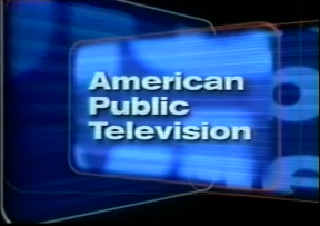
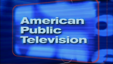
Nickname: "The Squares"
Logo: On a black background, we see two squares, one with white outlining and the other with red outlining, shifting throughout, and each one is blue with watermarks of the name on them. Then a red outline forms another square, which appears in the same color also with watermarks of the name as it finishes, with the text "American Public Television" on it in a somewhat squashed version of Helvetica.
Variants:
FX/SFX: The animation in the logo.
Music/Sounds: Same as the last logo.
Availability: Uncommon, but when it was in use, it was basically the PBS equivalent to Sony Pictures Television. It was tacked onto the end of practically every program shown on PBS during the period, such as The Saddle Club and A Place of Our Own, as well as shows on independent public TV stations such as KCET and on the digital broadcast network Create (which APT partially owns). With the logo ending in 2008 and being replaced by the 5th logo, its presence has dipped down, but it can still be found on older prints of programs on PBS. It made an appearance on the 2010 documentary Greece: Quest For the Gods. Though APT normally doesn't show its logos at the end of The McLaughlin Group, this made a surprise appearance on a 2009 episode thereof. The original 1999 variant strangely appears before the 1993 Connecticut Public Television logo on a 2014 episode of Scully: The World Show.
Editor's Note: This is a very memorable logo, but like the Sony Pictures Television logo, it wasn't for good reasons back then. Nowadays, it's seen in a more positive light due to its nice music and animation. It helps that, despite its (former) omnipresence, it never actually plastered over logos.
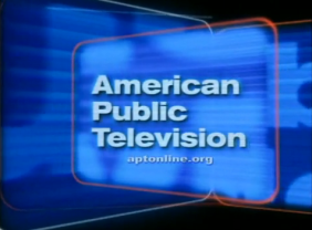
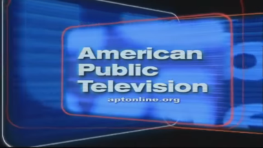
5th Logo
(2008-February 5, 2011)
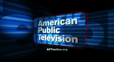
Nickname: "The Squares II"
Logo: Nearly the same as before, but animated for HD, darker and seemingly quicker in pace. The company name is also stretched.
Variant: Originally, there was no URL in the logo, but starting in late-2009, the URL text "APTonline.org" appears under the company's name.
FX/SFX: Same as the last logo.
Music/Sounds: Same as the 2nd and 3rd logos.
Availability: Appeared on WORLDFOCUS episodes from the era. Due to its short life, it wasn't nearly as common as the previous logo. It still appears on old episodes of Doc Martin.
Editor's Note: A decent update to the last logo.
6th Logo
(February 6, 2011- )
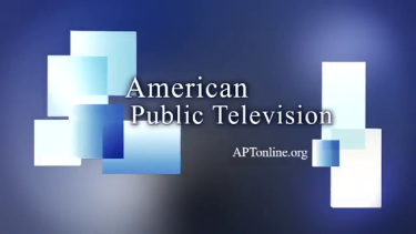
Nicknames: "Shady Squares", "The 50th Anniversary Logo"
Logo: On a shady steel gray/blue gradient background, we see the words "American Public Television" in a Garamond font appear. Then, several blue/aqua/white-textured squares zoom out from the sides of the screen and the URL "aptonline.org" appears below.
Trivia: This logo was made by Zydeco Design as part of a rebrand of APT coinciding with the latter's 50th anniversary.
Variants:
FX/SFX: The zooming, done in modern computer animation.
Music/Sounds: A re-arranged version of the last 3 notes of the 1994 fanfare. Otherwise, the actual 1994 theme is used.
Availability: Current and common. Seen on current prints of PBS's archival programming such as Mr. Bean and The Joy of Painting, and newer (episodes of) PBS shows such as WORLDFOCUS and Nightly Business Report, among others. The version with the 1994 fanfare can be seen at the end of Doc Martin, Midsomer Murders, Mystery Science Theater 3000, Royalty Close-Up, A Daring Journey: From Immigration to Education, The Reformation: This Changed Everything, Free to Rock, the fifth season of Fit 2 Stitch, and a series of 78 movies licensed from 20th Century Fox, Warner Bros., Paramount, and Sony (though the telefilm Doc Martin and the Legend of the Cloutie uses the later fanfare).
Editor's Note: Simple but effective. However, the 1994 theme does not fit well with this logo.
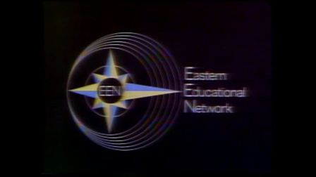
1st Logo
(1970-1975)

Nickname: "The 2.5D Compass"
Logo: Against a black background, we see six overlapping circles of varying sizes. In the center is a compass with the north, west, and south arrows pointing to the innermost circle and the east arrow pointing to the outermost circle. Behind it is a seventh, smaller circle to which the four ordinal directions point. At its core is a black circle with "EEN" inside it. To the right is the text
Eastern
Educational
Network
in what appears to be ITC Avant Garde Gothic.
FX/SFX: None.
Music/Sounds: Just an announcer saying, "This is the Eastern Educational Television Network."
Availability: Extinct, and more well-hidden than any Holy Grail-class public television logo before it, to the point where it was only discovered in 2020 on episodes of Wall $treet Week on the American Archive of Public Broadcasting. How elusive did it prove to be? The tail end of a 1975 episode of WNED's One Man Show that had it was part of a recording of WNET's Where Have All the Rebels Gone? that had been on the Internet Archive and gone unnoticed by the logo community for just over five years before being discovered the next month!
Editor's Note: After Wall $treet Week became a PBS program around 1972, the EEN would not use another logo for two decades, by which point it had already rebranded itself twice.
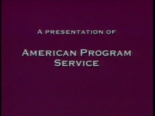
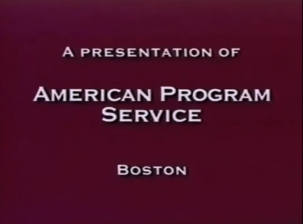
(1992-1999)


Nickname: "A Production of..."
Logo: On a maroon-colored background, we see the text
A PRESENTATION OF
AMERICAN PROGRAM
SERVICE
SERVICE
in Copperplate, which zooms in slightly. There is a shining wipe on the text.
Variant:There is a variant which has "BOSTON" under the text.
FX/SFX: The name zooming in, and the "shimmer".
Music/Sounds: None. In other cases, it uses the end theme of the show. Bloopy's Buddies, however, used their own generic theme over the logo (as well as two other logos that produced Bloopy's Buddies as well).
Availability: Extinct on television, but preserved on VHS tapes of Bloopy's Buddies and the "Cyber Cafes" and "Macworld" episodes of Computer Chronicles on the Internet Archive. It also appeared on American PBS airings of The Big Comfy Couch episodes from the era. Don't expect to see this on Nightly Business Report, which used in-credit notices until 1999.
Editor's Note: Very much a simple logo. Despite looking like a placeholder, this logo was used for eight years.
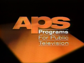
3rd Logo
(1994-April 25?, 1999)
 <iframe frameborder="0" height="227" src="http://wikifoundrytools.com/wiki/closinglogos/widget/genericvideo/392a38481e73b9dd58b958943b3bd687e40201df" width="401"></iframe>
Logo: On a black background with 2 orange/brown squares, we the letters "Aps" in orange/brown with the words "American Program Service" below the letters zooming out from us, with the "p" slightly on top of the "A", a white bracket revealing the "p", and a black bracket revealing the "s". Once the letters shift into place, the words:
________
Programs
For Public
Television
Programs
For Public
Television
appear below the letters "ps", while a small flash appears above the "A" in the top left hand corner. Also, one of the squares disappears, leaving one square in the background, which rotates.
FX/SFX: The animation in the logo.
Music/Sounds: A rather triumphant synth tune with snare drumroll sounds, produced on the E-mu Proteus 2 Orchestral synthesizer using the Percussion 1 (Patch #58) instrument patch.
Availability: Rare. Was seen on 1994-1998 episodes of Computer Chronicles; a few episodes from the era on the Internet Archive retain this. Can also be seen on 1997-1998 episodes of The Kidsongs Television Show on iTunes. Again, this didn't appear at all on Nightly Business Report.
Editor's Note: A good effort for its time. It also bears the first appearance of the familiar APT theme.
4th Logo
(April 26?, 1999-2010; July 25, 2014)


<iframe frameborder="0" height="206" src="http://wikifoundrytools.com/wiki/closinglogos/widget/genericvideo/35cdfad415d5c6f3661577866adb4cb0bf3e8654" width="366"></iframe><iframe frameborder="0" height="206" src="http://wikifoundrytools.com/wiki/closinglogos/widget/genericvideo/ff0a2951f0e635e0bf425827ceb6510307b77f93" width="366"></iframe><iframe frameborder="0" height="207" src="http://wikifoundrytools.com/wiki/closinglogos/widget/genericvideo/ff8b862e384513fa24d6ae5058f80b5acec330d5" width="366"></iframe>
Nickname: "The Squares"
Logo: On a black background, we see two squares, one with white outlining and the other with red outlining, shifting throughout, and each one is blue with watermarks of the name on them. Then a red outline forms another square, which appears in the same color also with watermarks of the name as it finishes, with the text "American Public Television" on it in a somewhat squashed version of Helvetica.
Variants:
- Starting in 2000, the URL text "aptonline.org" appeared under the company's name. The first few seconds of the animation are also cut off. In more recent years, it reads "APTonline.org".
- On The Organ Wise Guys shorts, the logo appears at the bottom of the screen with the text: "Copyright (C) (Year) American Public Television" to the left of the logo.
- Each variant may appear in widescreen.
FX/SFX: The animation in the logo.
Music/Sounds: Same as the last logo.
Availability: Uncommon, but when it was in use, it was basically the PBS equivalent to Sony Pictures Television. It was tacked onto the end of practically every program shown on PBS during the period, such as The Saddle Club and A Place of Our Own, as well as shows on independent public TV stations such as KCET and on the digital broadcast network Create (which APT partially owns). With the logo ending in 2008 and being replaced by the 5th logo, its presence has dipped down, but it can still be found on older prints of programs on PBS. It made an appearance on the 2010 documentary Greece: Quest For the Gods. Though APT normally doesn't show its logos at the end of The McLaughlin Group, this made a surprise appearance on a 2009 episode thereof. The original 1999 variant strangely appears before the 1993 Connecticut Public Television logo on a 2014 episode of Scully: The World Show.
Editor's Note: This is a very memorable logo, but like the Sony Pictures Television logo, it wasn't for good reasons back then. Nowadays, it's seen in a more positive light due to its nice music and animation. It helps that, despite its (former) omnipresence, it never actually plastered over logos.
5th Logo
(2008-February 5, 2011)

Nickname: "The Squares II"
Logo: Nearly the same as before, but animated for HD, darker and seemingly quicker in pace. The company name is also stretched.
Variant: Originally, there was no URL in the logo, but starting in late-2009, the URL text "APTonline.org" appears under the company's name.
FX/SFX: Same as the last logo.
Music/Sounds: Same as the 2nd and 3rd logos.
Availability: Appeared on WORLDFOCUS episodes from the era. Due to its short life, it wasn't nearly as common as the previous logo. It still appears on old episodes of Doc Martin.
Editor's Note: A decent update to the last logo.
6th Logo
(February 6, 2011- )

<iframe frameborder="0" height="206" src="http://wikifoundrytools.com/wiki/closinglogos/widget/genericvideo/df652633504298203ade8870a95659cb02bbe0d6" width="366"></iframe><iframe frameborder="0" height="206" src="http://wikifoundrytools.com/wiki/closinglogos/widget/genericvideo/9f7c9c110f65a996a2bcfc6553f07e82bdd5cc22" width="366"></iframe><iframe frameborder="0" height="206" src="http://wikifoundrytools.com/wiki/closinglogos/widget/genericvideo/60efbf2054703dd4c563c6f822d580207af0fd8e" width="366"></iframe>
Nicknames: "Shady Squares", "The 50th Anniversary Logo"
Logo: On a shady steel gray/blue gradient background, we see the words "American Public Television" in a Garamond font appear. Then, several blue/aqua/white-textured squares zoom out from the sides of the screen and the URL "aptonline.org" appears below.
Trivia: This logo was made by Zydeco Design as part of a rebrand of APT coinciding with the latter's 50th anniversary.
Variants:
- On Doc Martin and the Legend of the Cloutie and The Whole Truth with David Eisenhower, the 4:3 version of the logo is stretched to fill the 16:9 image.
- Sometimes, as seen on Nightly Business Report and Rough Cut: Woodworking with Tommy Mac, the logo fades in and out.
FX/SFX: The zooming, done in modern computer animation.
Music/Sounds: A re-arranged version of the last 3 notes of the 1994 fanfare. Otherwise, the actual 1994 theme is used.
Availability: Current and common. Seen on current prints of PBS's archival programming such as Mr. Bean and The Joy of Painting, and newer (episodes of) PBS shows such as WORLDFOCUS and Nightly Business Report, among others. The version with the 1994 fanfare can be seen at the end of Doc Martin, Midsomer Murders, Mystery Science Theater 3000, Royalty Close-Up, A Daring Journey: From Immigration to Education, The Reformation: This Changed Everything, Free to Rock, the fifth season of Fit 2 Stitch, and a series of 78 movies licensed from 20th Century Fox, Warner Bros., Paramount, and Sony (though the telefilm Doc Martin and the Legend of the Cloutie uses the later fanfare).
Editor's Note: Simple but effective. However, the 1994 theme does not fit well with this logo.