ABC "In Color" ID's
Jump to navigation
Jump to search
Logo description by mr3urious, videomaster13 (for the edits)
Editions by: Chowchillah,StephenCezar15, and Edc4
Logo capture and videos courtesy of broadcastDesign, and Mercurialis Logos
1st (known) Logo
(1962-1970?)
Nickname: "Froot Loops"
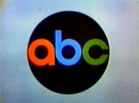
Logo: Against a black background, six circles come in from the left, colored red, pink, blue, light blue, green, and yellow. They all disappear off to the right except the red, blue, and green circles, which transform into an "A", "B", and "C", respectively, and in the corporate font used for the network. The letters then zoom out a bit and the black area shrinks to a circle, forming the ABC logo against a beige background.
FX/SFX: All 2D animation.
Editor's Note:The first half of the logo is animated quite smoothly, but the second half with the zoom-out of the logo is somewhat rough. Also, the string variant's music is very poorly played. Despite that, this logo is a favorite of many.
Editions by: Chowchillah,StephenCezar15, and Edc4
Logo capture and videos courtesy of broadcastDesign, and Mercurialis Logos
1st (known) Logo
(1962-1970?)

<iframe frameborder="0" height="218" src="http://wikifoundrytools.com/wiki/closinglogos/widget/unknown/adce6b27b4baeb13572dbf70d2d681de423ef984" width="388"></iframe><iframe frameborder="0" height="224" src="http://wikifoundrytools.com/wiki/closinglogos/widget/unknown/4de8958d114528339f574972d79855441725ead4" width="397"></iframe><iframe frameborder="0" height="216" src="http://wikifoundrytools.com/wiki/closinglogos/widget/unknown/33143d7304258e702e06d6bf553a05ed153c1c5c" width="385"></iframe>
Nickname: "Froot Loops"
Logo: Against a black background, six circles come in from the left, colored red, pink, blue, light blue, green, and yellow. They all disappear off to the right except the red, blue, and green circles, which transform into an "A", "B", and "C", respectively, and in the corporate font used for the network. The letters then zoom out a bit and the black area shrinks to a circle, forming the ABC logo against a beige background.
FX/SFX: All 2D animation.
Trivia: The ABC logo was designed by Paul Rand (1914-1996), who is better known for designing the logos for IBM and Westinghouse, among others.
Music/Sounds: A dramatic horn fanfare, sometimes coupled with a man saying "This is an ABC color presentation.". Sometimes, the announcer is not used.
Music/Sounds: A dramatic horn fanfare, sometimes coupled with a man saying "This is an ABC color presentation.". Sometimes, the announcer is not used.
Music/Sounds Variant:
- There was an earlier version that used an orchestral string fanfare and no announcer.
- Another version was used, which was a news theme-like orchestra fanfare, with an uplifting finish. This was seen on The Bullwinkle Show.
Editor's Note:The first half of the logo is animated quite smoothly, but the second half with the zoom-out of the logo is somewhat rough. Also, the string variant's music is very poorly played. Despite that, this logo is a favorite of many.