Difference between revisions of "PIK Sat (Cyprus)"
Jump to navigation
Jump to search

(Created page with "<div class="WPC-editableContent"><div><font size="3">1st Logo</font></div><font size="3">(20??-)</font><div><font size="3"><br/></font></div><div><img align="right" alt="RIK/P...") |
|||
| Line 1: | Line 1: | ||
| − | <div class="WPC-editableContent"><div><font size="3">1st Logo</font></div><font size="3">(20??-)</font><div><font size="3"><br/></font></div><div> | + | <div class="WPC-editableContent"><div><font size="3">1st Logo</font></div><font size="3">(20??-)</font><div><font size="3"><br/></font></div><div>[[File:Cd4df3633b0a6dff71aa7813bf98dfac.jpeg|280px|RIK/PIK Sat]]</div><div><font size="3"><u>Logo</u>: There is a map of Earth taking up the superimposition of a digital satellite. A light comes in and draws a curve. Then, a real satellite (that you would expect from Space) flies around with a ghost/shadow of it following. The light draws away and blue rectangles that consist of the yellow word "R I K" rise up. After that, the metal word "Sat" wipes in.</font></div><div><font size="3"><br/></font></div><div><font size="3"><u>FX/SFX</u>: Not bad animation.</font></div><div><font size="3"><br/></font></div><div><font size="3"><u>Music/Sounds</u>: A groovy-like 4-note tune.</font></div><div><font size="3"><br/></font></div><div><font size="3"><u>Availability</u>: It was seen on the channel.</font></div><div><font size="3"><br/></font></div><div><font size="3"><u>Editor's Note</u>: None.</font></div><div><font size="3"><br/></font></div><div><font size="3"><br/></font></div><div><font size="3"><br/></font></div><div><font size="3">2nd Logo</font></div><div><font size="3">(201?-)</font></div><div><font size="3"><br/></font></div><div>[[File:1fc8467ce1498bf3b5ddf890436472c9.jpeg|278px|RIK/PIK Sat (2)]]</div><div><font size="3"><u>Logo</u>: TBA</font></div><div><font size="3"><br/></font></div><div><font size="3"><u>FX/SFX</u>: Very good animation here!</font></div><div><font size="3"><br/></font></div><div><font size="3"><u>Music/Sounds</u>: A calm note with whooshes plays, then it becomes a powerful fanfare. 3 notes (or 4?) and a flourish are heard at the end.</font></div><div><font size="3"><br/></font></div><div><font size="3"><u>Availability</u>: See the previous logo.</font></div><div><font size="3"><br/></font></div><div><font size="3"><u>Editor's Note</u>: None.</font></div></div> |
Latest revision as of 23:57, 5 November 2020
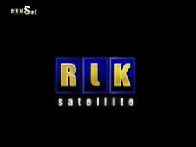
1st Logo
(20??-)
Logo: There is a map of Earth taking up the superimposition of a digital satellite. A light comes in and draws a curve. Then, a real satellite (that you would expect from Space) flies around with a ghost/shadow of it following. The light draws away and blue rectangles that consist of the yellow word "R I K" rise up. After that, the metal word "Sat" wipes in.
FX/SFX: Not bad animation.
Music/Sounds: A groovy-like 4-note tune.
Availability: It was seen on the channel.
Editor's Note: None.
2nd Logo
(201?-)

Logo: TBA
FX/SFX: Very good animation here!
Music/Sounds: A calm note with whooshes plays, then it becomes a powerful fanfare. 3 notes (or 4?) and a flourish are heard at the end.
Availability: See the previous logo.
Editor's Note: None.